

Member X
-
Posts
1,376 -
Joined
-
Last visited
Posts posted by Member X
-
-
I forgot to say in my earlier post, please add me as 'tentative' to the list, depending on price!

-
Damn these rich people, I need to find a niche and exploit it! lol

-
RA modded 1675

-
For me, it's gotta be the Blue Cerachrome Sub:

Looks stunning in the sunlight
 and I will be amazed if it can't be made waterproof - it feels a real quality piece! I've not tested it for waterproof-ness yet but I'd like to as it really would be great to be able to swim in it
 -
Thnx for the input. Dosent sound good tomhorn. Lets follow this crown issue. I think i will email Josh. Lol if you notice on the pics the 6`dial marker is not set to 12. Now it wont reset back to 12. I think this watch need a vacation in china...
If you're in the EU, I think I'd sent it to Bricciola or Domi!
-
Hi Robbie, good to see you back on the board! I hope your health problems aren't getting you down too much, although it's never nice being ill.
With regards to watches, I think I am increasingly coming round to your viewpoint! The comfort issue is what often decides what I choose from the box - although I love the ones I have, sometimes that mesh bracelet is a little too heavy, and that leather strap a little too stiff... (although that probably serves me right for not sorting out decent straps yet! lol) You are right in what you say, Rolex just seem to disappear off the wrist because they are so comfortable to wear
And the size is 'just right', being not too small and not too big, even for my skinny 6.75" wrists!I came to the boards looking for anything but Rolex - to me they were worn by sleazy "look at me, I'm [censored] great because I have a Rolex" types who I definitely did NOT want to be associated with - yet the classic designs are timeless, and I've really been getting into the vintage Rolex stuff recently because it is different from the usual everyday watch but still looks amazing after however many years! The newer ones are still a bit 'bling' for my taste, although I do admit that the Blue Cerachrome I picked up from BK is extremely comfortable on the wrist and flashy without being gaudy, with the Glidelock clasp being so handy when you go from the hot weather outside to a cool room inside
Overall... I'm just waffling on... lol... but I can see me adding a lot more Rolex to the box when I get some funds together!
-
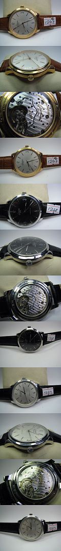
Glashutte Senator Sixties in gold.
Thread closed.

(That picture is from Robert - not a dealer on here but he is on RWG1.1 and RWI I think.)
-
Blue sub from BK today
-
Plenty of Rolex in this thread!
How about one more

-
I've just seen this thread - I'm interested as I saw a gen the other week and now I need a rep!
Thanks for the excellent pictures
If my untrained eye may be so bold as to offer a comment...
... I would perhaps say that the font is a little 'fat'?
The font looks correct, but it looks a bit like someone's pressed the 'Bold' button on the keyboard?
For example, look at the circles in the centre of the 8 in the comparison picture (great idea to have them next to each other, by the way!). The centre circles seem a little small?
And the line at the top of the 5 seems to meet the 'curve' of the lower part rather than being clearly separate from it?
I hope I'm not speaking out of turn as this is looking great so far, it is just what my untrained eye sees! Sorry!

-
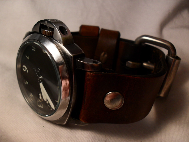
New arrival today

-
Well, it's got everyone talking about it, which I'm sure wasn't entirely unintentional...
-
I really don't know where you get all these rarer-than-hen's-teeth parts, I'm jealous! lol
-
You may want to contact Mary at WatchInternational with a picture of what it is you're looking for. Sometimes she can get parts
-
If you're in the UK, I wouldn't worry about customs. I don't think I've heard of anyone in the UK having a watch seized!
-
If this isn't already, someone should make this a sticky
-
Anyone else found that the link PDFs fine on the front and back pages but seems to look 'aged' on all the pages with the reference material on them?
Seems that even the brochure goes vintage
lol -
Choose 5, then

This one .. I'm sorry, I forget to whom it belongs ... is burned into my brain .. WOW.

That's a one-off custom build by JohnG, I think!
-
Dammit, can't download off that site at work...
Will have to PDF it all myself!
 lol
lol -
They are not direct-drive seconds hand, are they?
So they can 'stutter' a little, but they are relatively cheap to just replace.
-
Nice
PVD coated movement?
Any issues with clearance of the moving parts?
-
Which watch?
The All Black?
Or the U Black?
-
You can't say that without any evidence, even anecdotal, that what you say is true! At least 4 people in this thread have been told by dealers that it is, and we can't all be asking the same dealer...
Where did you hear it's not coming out??
-
Run from that site, run!!
Using gen pics is a sure sign that something is wrong and it's a scam site.
Stick to the trusted dealers here and they can get anything on the market, without the risk of getting scammed.
travel insurance and watches?
in The looney bin
Posted
Great post ^^^