

wheaton26
-
Posts
1,833 -
Joined
-
Last visited
-
Days Won
1
Posts posted by wheaton26
-
-
that's one way to list your watch for sale without paying for a membership. delete.
-
I hope this post has come across right...apologies if it hasnt it wasnt meant too

[censored] you pete!
just kidding buddy. to be honest, i didn't realize this was a project being taken on by one dealer. i figured it was just the same process as any others in the past. either way, i don't see the negative in pointing out flaws ... it's nothing personal. and like i said, these are very picky flaws that 99% of people wouldn't even notice. but you're right ... pams have come a long way in the past year and it's great to see. hats off to angus for taking this on! oh and one last thing ...
[censored] you pete!
-
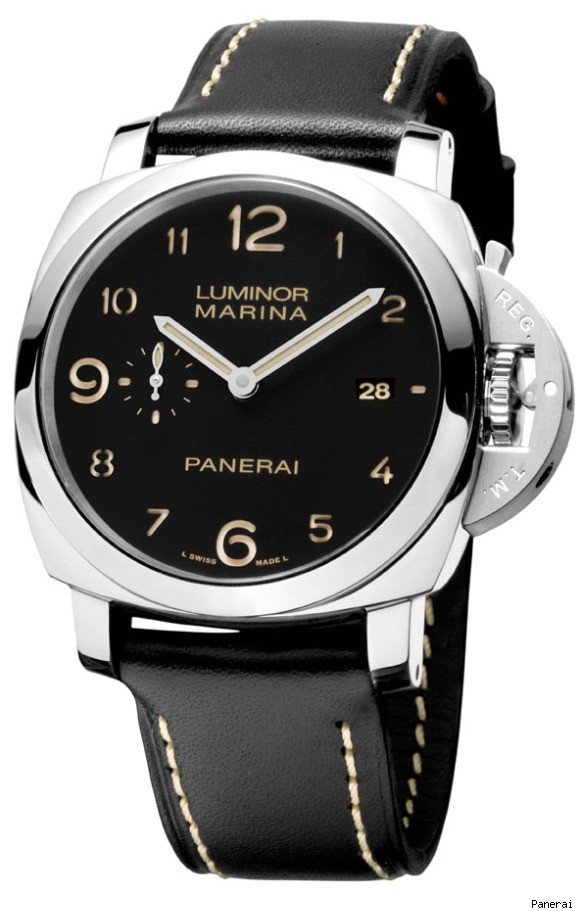
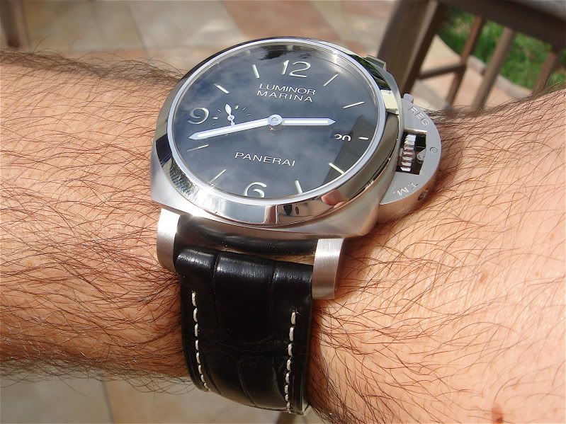
How does it look compared to your Gen C?
well i have the 312, so just a different dial and a brushed case. everything looks pretty good, but if you want me to get picky ... here's what i see. first off, i agree with chad. the "luminor marina panerai" font is too bold. the date window sits too far left, but i think the date font and color is good. the crown doesn't sit as close to the case. regarding the lever ... it doesn't sit as close to the case and the shape is too sharp. it also doesn't sit flush with the crown guard (like the latest chrono versions). the "reg. t.m." font on the crown guard is wrong. onto the back, they did a good job on the caseback and engraving. you obviously can't rep their in house movement, but they did a nice job with the rotor and it masks most of the movement. the movement should not be decorated though ... it should have just a plain brushed look. again, everything i mentioned above is very picky. and if the 312 looks as good as this upon release, i will pick one up for comparison. please feel free to add to my pickyness, agree or disagree. all the best.
p.s. anything i didn't comment on is because i think it is 1 to 1 or very close. see stock gen pic below for reference ...
-
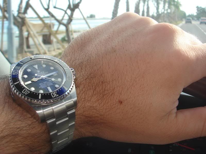
Great bezel numbers! Which version is that?
it's the swiss ultimate version with correct bezel. also serviced and lumed by the zigmeister and single ar coated by chief. thanks for the compliment buddy!
-
wow ... impressive!
-
on my way to work ...
-
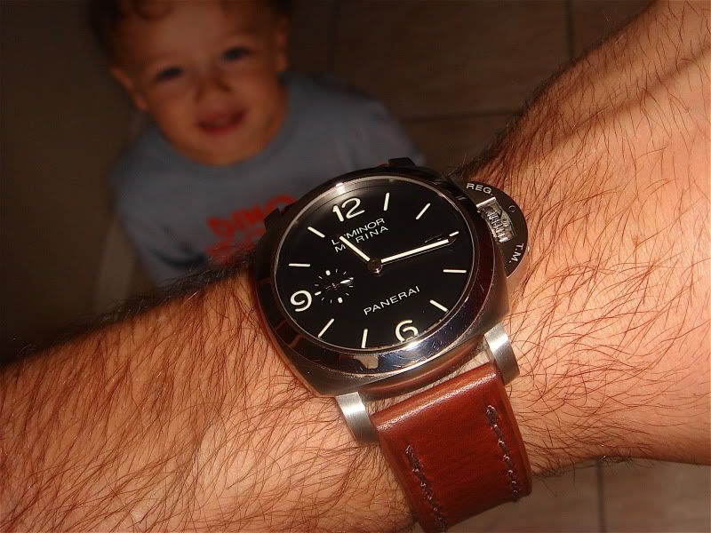
312 on vintage brown leather from the watch boys ...
-
i would like to know how to do the plain white backgrounds if it's easy enough?
-
why would someone pre-order ... is the price going to increase?
-
i'll play along. teaser pic ...
-
wheaton26: It's an Omega Seamaster 300 (166.0324). Pure franken made out of NOS parts, except for the movement, which is an early-60s Cal.552. 40mm diameter, wears closer to the wrist than a Speedmaster.
thanks for the quick reply. i love the simplicity of it and am going to keep my eye open for a used one. all the best.
-
sweet!
-

i'm really digging this omega! i assume it's an older model ... could you give me some more details (name, model #, size, etc.)? thanks in advance. oh, and i'm going with the 312 today ...
-
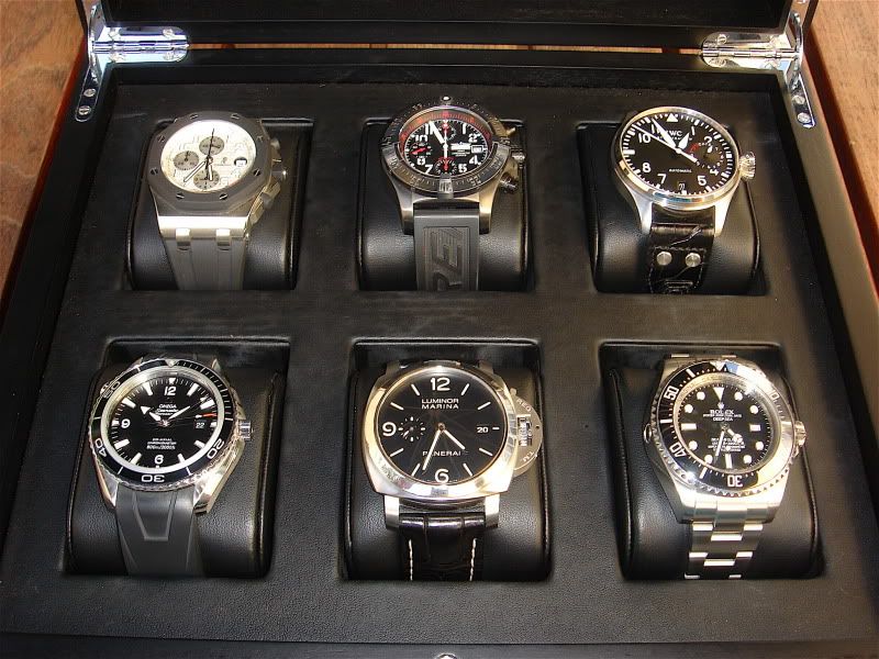
that's a very good deal for anyone on the fence. see below a picture of mine ...
-
looks great, congratulations!
-
very cool! i'm going to try this when i get a little time. thanks for posting.
-
I have the limited red as well as the black plastic if anyone wants. Never bought the Nano and don't really see myself doing it. Not a runner, walker or bus rider. I bought it because I liked the idea but practically for me it's not going to happen.
pm sent for the tiktok.
-
you can find most raymond weil gens for the price of a rep.
-
Good idea and it sounds like it's superbly made, my only gripe is that everything is now going touch screen iphone, android etc. So us blindies have nothing tactile to work around, number pads have the raised dot on the number 5 for exactly that reason, it's the centre key and you can find all numbers from there. It was originally designed by a blind engineer who figured it would be quicker to dial in the dark, especially for emergency calls, no raised dots on a touch screen.
Sixx

sixx, have you heard of the haptica braille watch? check it out ...

-
Just got a reply from them and a tracking number! Thanks for all the help wheaton! Its much appreciated.

great news buddy. to get you even more excited ... mine actually arrived a few days earlier than the expected delivery date. we look forward to seeing a pic or yours soon!
p.s. be careful when you're wearing it. i bumped a door handle in my house the other day and put a small smudge in the case. luckily it wasn't the nano screen.
-
OK. So here is the deal. First off the span of the built in spring bars is too short (at least for my PO Chrono). Perhaps the regular PO isn't as thick and may be closer to fitting but I have my doubts. Also, the sleve where the spring bar is fitted to the strap is designed for one location only so there is no possibility of inserting it at a different location. So the only possibility is to thread it through the PO spring bars the old fashioned way (sorry for my lame photos. Best I could do in my man cave at night
).The only drawback was that the fit was quite tight with the buckle in the last hole on the strap. I have a 7.5" wrist so that should help you gauge it. Again I think this would be less of a problem on the normal PO since the PO Chrono is very thick.
Hope this helps.
well this was extremely helpful ... thank you! of the different options posted, i personally like the look of the tudor nato the best.
... it just doesn't fit the way i was hoping, so i'm going to cool off for now. i really appreciate everyone's input and pictures. thanks again. -
I know this isn't the same as the Tudor strap, but similar concept...
This is my 42 PO on a two piece thick nylon strap from ebay. Mine's a 20mm, but i think they also come in 22mm. It also has a gen Omega buckle. My PO has a black insert now BTW. I get comments on the combo all the time!
very cool ... thanks for posting!
-
nice strap. but wasn't tan marino a quarterback?
-
i'm not sure if this is the brand you saw, but vacheron constantin has these ...

Massive update of the payment system
in General Discussion
Posted
hey pete, i had to go to support (under client area) and make a new request to have my vip status confirmed. it was handled very quickly. good luck!