
Alan72
-
Posts
730 -
Joined
-
Last visited
-
Days Won
53
Posts posted by Alan72
-
-
So here's my finished article,jk/tiger concept hands and heavily aged dial


-
So here is my attempt using your decal,I've gone for a Radium dusty effect,the lume is maybe a bit more textured than I would have liked but it's more noticeable in photos than in person

-
 2
2
-
-
-
So I've made a couple of changes,hands are lightly aged and I changed the dial for a phong date version that I re lumed and aged, also added a red date wheel


-
-
-
-
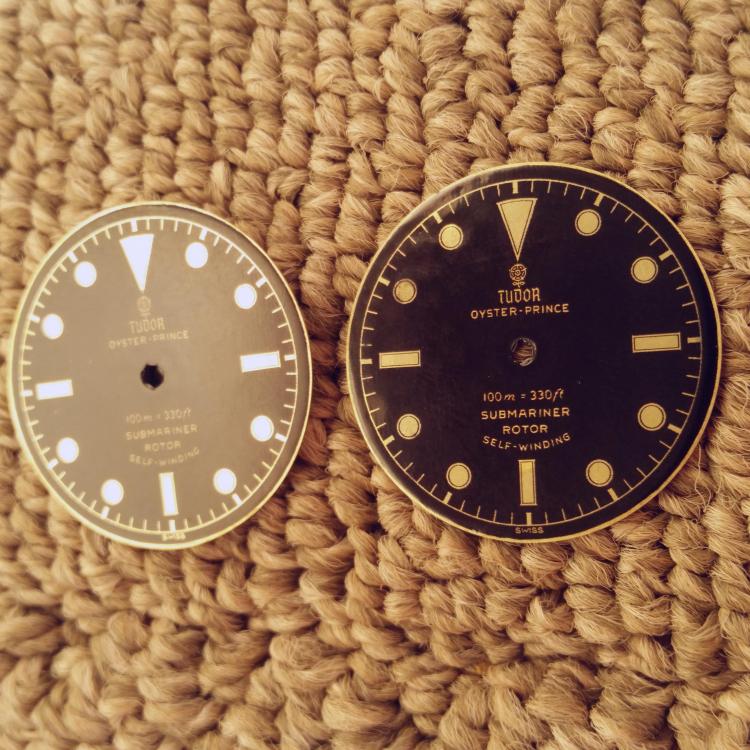
Looks good, hope the lume goes wellStage 2: Gilt chapter ring with gold print text
Some things I've noticed in working on these:
-Decal setting solutions like microset/sol are not a good idea. The decal paper you can buy to print on, at least the stuff I got "Kodiak", is too delicate for them. The microsol solution, which is supposed to make decals basically sink into the surface of the base, just eats right through the decal.
-Be prepared to cut out and apply about 5 decals for every 1 you get to set properly with no damage. Between defects in the paper and print, trying to smooth out wrinkles, and random ink bleeding from the water, most decals do not end up looking pristine and you have to start over.
-There is a perfect medium of gloss lacquer over the decal. Too little and the decal isn't protected, too much and all the gold detail starts to look dull. I found that 3 coats of about 4 quick spray passes each is the ideal. The stuff I've been using, Krylon crystal clear, dries really quickly, so this step can be completed in just a couple hours.
-There is such a thing as too glossy. After the lacquer dries, the dial is super glossy but the blacks are full of a vertical "scan line" texture from the decal film that looks very bad. Sanding with polishing cloth is a must. I found that anywhere between 1200 and 4000 grit looks good, with 4000 retaining the deepest black but 1200 doing the best at removing the annoying scan line texture. It sounds paradoxical, but the less glossy your dial, the more the gilt details will stand out.
-For this to be done right you really need to gold plate the dial. I haven't tried this yet, but the polished brass, while attractive, is really too dark and pale to be convincing.
-If you need to produce colored text, oil based paint pens work very well. These dials have gold paint text with the polished brass chapter rings and indices, similar to how Tudor produced them.
Next step is luming these and hopefully not ruining them as I did my first batch. All I can say is that getting the right lume mixture is not easy.
-
-
-
Looks promising

-
Just needs lume and putting together now


-
So this one should turn out nice

-
3
-
-
-


Sent from my Lenovo P2a42 using Tapatalk-
2
-
-
That one was already like it, I did paint the other one a bit thoAwesome mod work mate! - I notice you repainted the central red dot on the rad logo?
Sent from my Lenovo P2a42 using Tapatalk
-
I also did this one , different dial and another dsn insert which looks pretty good

Sent from my Lenovo P2a42 using Tapatalk-
1
-
-
Mate, I have the same watch but with dsn insert (trimmed) and hands,bezel was also super loose but I managed to find some thicker bezel wires that fit and make the bezel action much firmer,
Pm me your details and I'll send you one

Sent from my Lenovo P2a42 using Tapatalk-
1
-
 1
1
-
-


Sent from my Lenovo P2a42 using Tapatalk-
1
-
-


Sent from my Lenovo P2a42 using Tapatalk -
Aqualung no radiations


Sent from my Lenovo P2a42 using Tapatalk-
1
-
-
Blancpain fifty fathoms aqualung,no radiations

Sent from my Lenovo P2a42 using Tapatalk-
1
-
-


Sent from my Lenovo P2a42 using Tapatalk-
2
-
-


Sent from my Lenovo P2a42 using Tapatalk-
3
-


Wristies - thread consolidation?
in General Discussion
Posted