When you buy through links on our site, we may earn an affiliate commission.


Boirefish
-
Posts
4 -
Joined
-
Last visited
About Boirefish

Boirefish's Achievements
")
Newbie (1/15)
0
Reputation
-
Intime is also good
-
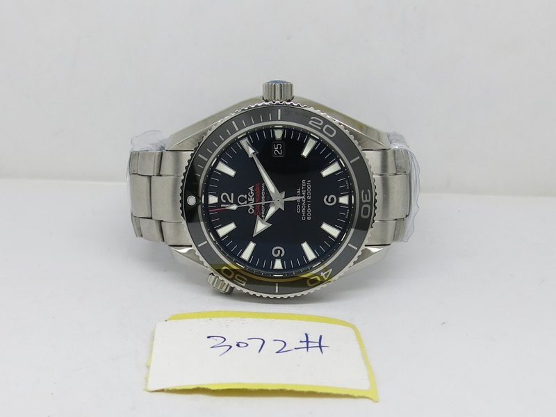
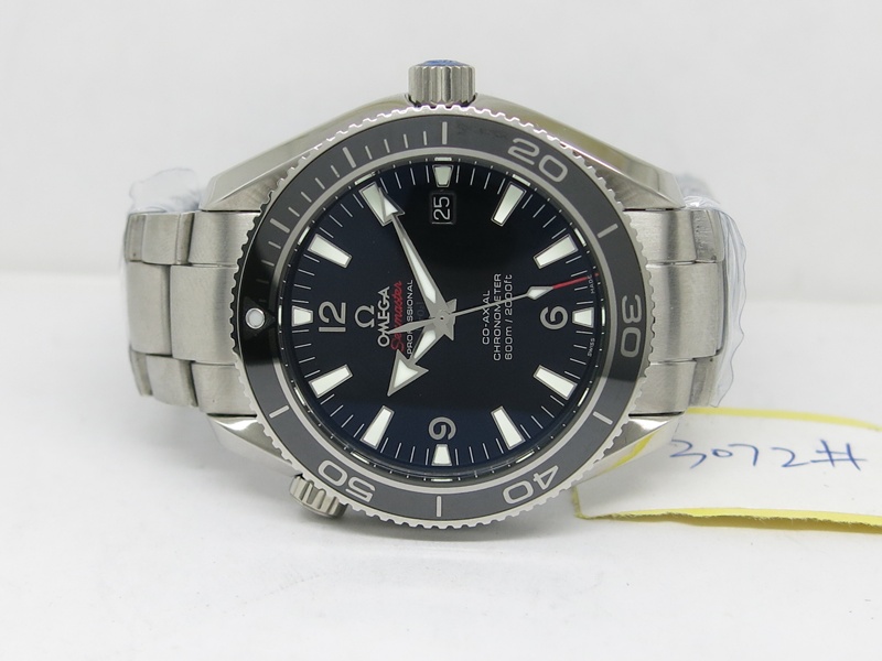
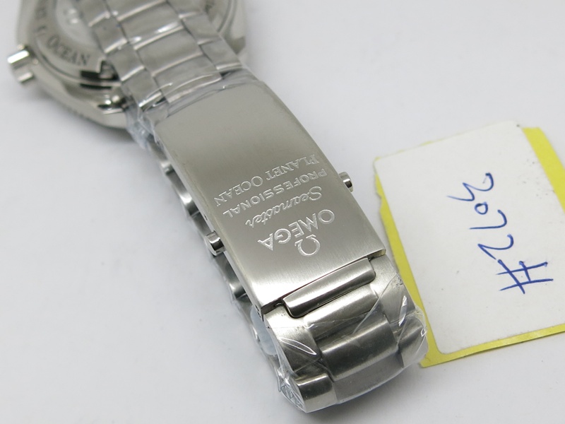
New QC pictures arrived and all of my initial concerns have been addressed! Very happy with how it looks and I've confirmed that with Jordan. Can't wait to get it!! Thank you guys for all the feedback as well
-
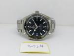
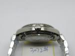
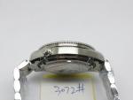
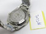
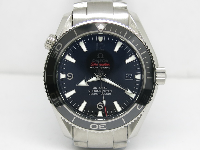
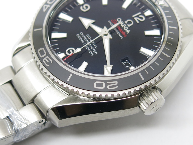
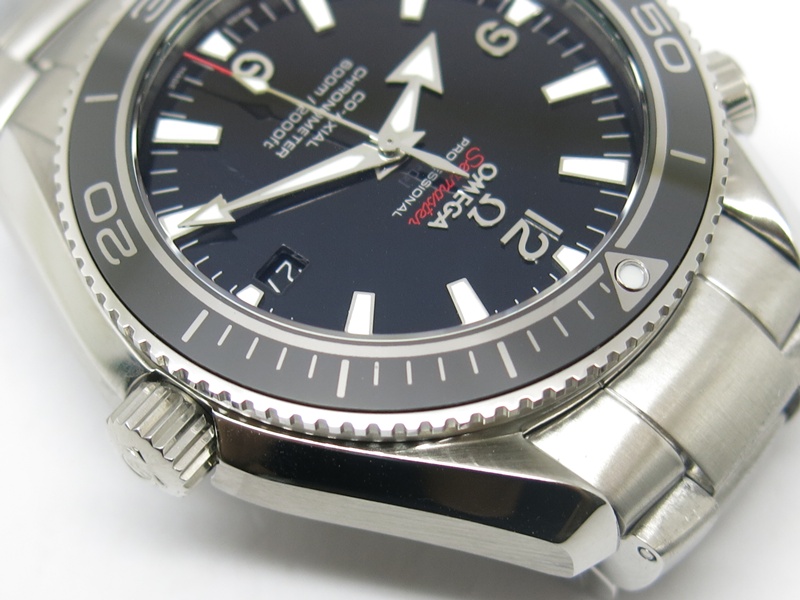
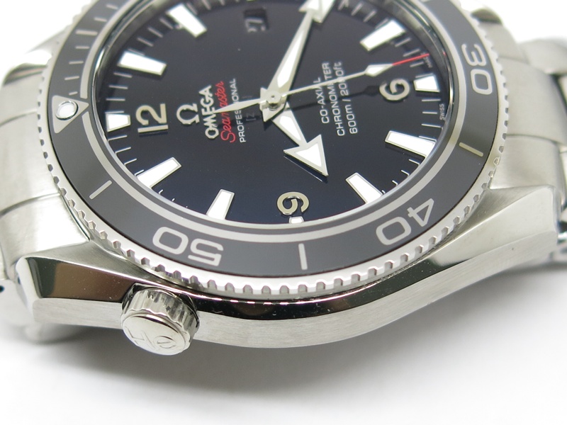
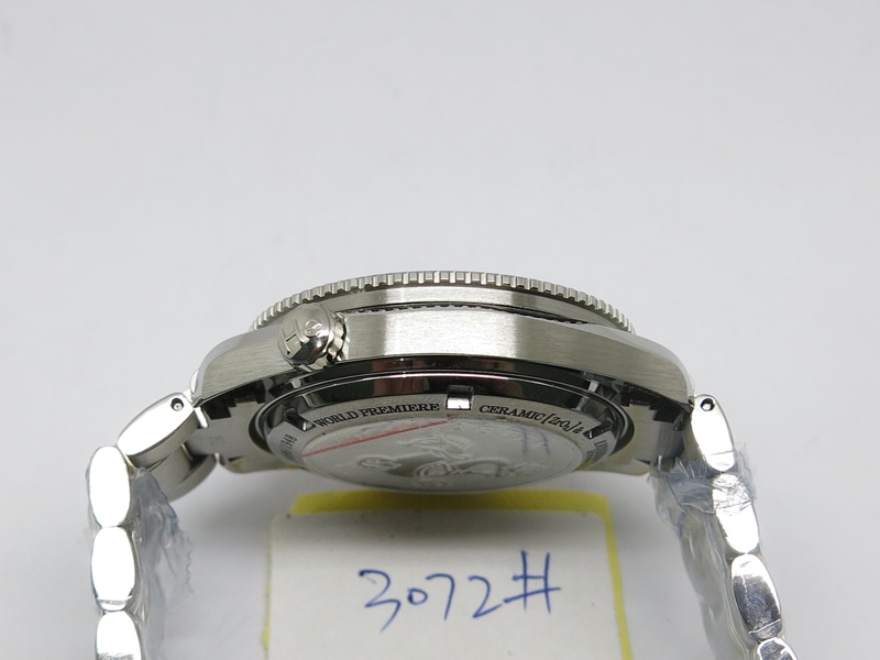
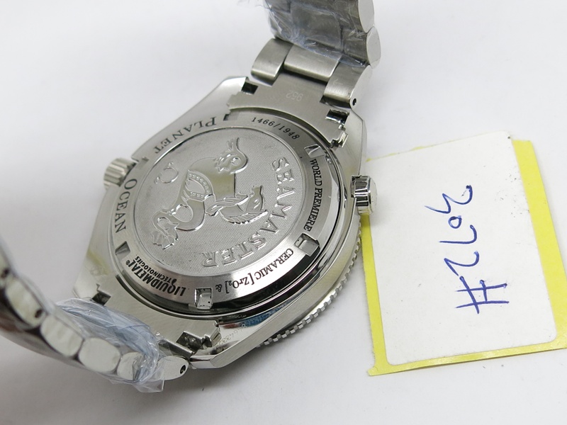
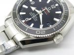
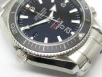
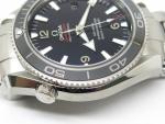
Agreed, I know it's a rep and thus should expect sub-gen quality, but in my opinion, the top of the 1 is slightly slanted away from the 2 (macro-zoomed to ascertain), and lume on the 3 looks blurry. Also when I try to look as close as possible, despite the shadowing, pearl is closer to the right. To bring maximum nitpicky, the seamaster logo is closer to the "omega" than "professional" (noted by distance from top of S on Seamaster to bottom of O on Omega). However, all being said, that date window is as perfect as can be, and I think this rep is really nice, just thought I'd bring my 2 cents in for any other active forum members who are keen on this watch! My TD is Ryan from Intime, and he's awesome, a real top bloke all round. edit add* Asked QC for more pictures to focus on the lume on 3 and pearl. Fingers crossed, and I'll keep you all updated!
-
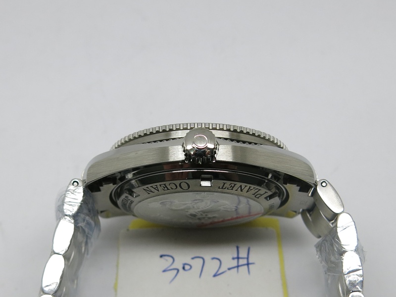
The watch looks so good!! Still, I don't want to jump the gun - the 3 marker shows some blurring which could be reflection or lume spill? Crown seems to stick out slightly alignment of the pearl is slightly right shifted if I zoom in. All of this is probably nitpicking, but I some objective feedback would be great.