geo1nah2a Posted June 10, 2008 Report Share Posted June 10, 2008 I just received the Corum Admiral's Cup Competition 48 in Titanium with rose gold bezel, hands, numerals, and crown. I will not do a full review, since the plain Titanium is for a while out. Yes, the size is big++, but it wears smaller than the mm's indicate. +It is in titanium, and therefore it doesn't feel heavy on the wrist. Yes, the buckle is huge, and the strap is huge, probably to be worn on top of a raincoat on a yacht. Having seen k222's AR on a plain ACC black ti, it really puts the factory double AR to shame...Ar plays a big role, especially with such a big sapphire. i think it will pay a visit to k222 labs Things that I love compared to the plain Ti version: Well, the rose gold. It has a nice contrast, both in sparkle and in color versus the titanium. The numerals are not printed/painted with lume on the dial. They are metalic ones, filled with lume, adding a dimension to the dial. BTW the color of the gold crown doesn't match 100% with the rest of the details. Not a huge difference, and even knowing what to look for it will be hard to spot, but since I did notice it, I have the obligation to report it Here are some photos of the watch. I will probably revisit this thread adding some more pictures and comments, but for the time being, enjoy: Close up of dial/running seconds One of the best dials I have seen, and this goes to the original design. Minute numerals and simple hands. One of the fastest dials, that still feels fresh and colorful. The colors are hard to portrait faithfully.. I will try to do some middle of the day shots. For the time being here are two more pictures All in all, AFAIAC this is a super rep. For various reasons (size and brand) it didn't catch the public's attention as much as other 'superreps' out there. No prob for me: I don't mind getting it for a better price.. Quote Link to comment Share on other sites More sharing options...
dadog13 Posted June 10, 2008 Report Share Posted June 10, 2008 this is wonderful rep...I had it in my hands but decided not to buy it since I am waiting the factories to release the one in RG and with the brown face (hopefully)...if they don't do it, I'll have to get one of these...have already the all ti version with black dial and it is one of my fav reps! tnx for the pics, they look 100x times better than the stock photos of the various dealers... Quote Link to comment Share on other sites More sharing options...
geo1nah2a Posted June 11, 2008 Author Report Share Posted June 11, 2008 dadog13: thank You for the kind words on my pictures...I will try to do it more justice next time I get some leisure time that will have coincide with some good light. In the mean time, I wish they will make the RG& brown dial. More choices is always good. I still would prefer the Ti-RG, exactly because the RG is contrasted in such a nice way by the titanium. Plus the two tone does promote the shape of the case: the bezel is more prominent and the case looks flatter. Since You have the full Ti, You can see the difference in the way they blend together. I would probably go for the 44mmChrono in the above mentioned colors: all in all, 48mm in full RG is an overkill for me Still, if it is released, it might be the first full gold watch I would buy Quote Link to comment Share on other sites More sharing options...
assasi9 Posted June 11, 2008 Report Share Posted June 11, 2008 wow, those numerals make all the difference in the world. awesome piece.do you mind me asking where/who you got it from? Quote Link to comment Share on other sites More sharing options...
geo1nah2a Posted June 11, 2008 Author Report Share Posted June 11, 2008 Currently there is only one version of this specific watch. I got mine from Andrew. Great communication. I agree that the numerals take the dial to a new level. I haven't manage to capture one more feature in my photos: there are some angles that their metallic border fires up with light and they become so sharp and 3D, almost floating above the dial. Quote Link to comment Share on other sites More sharing options...
italiano17771 Posted June 11, 2008 Report Share Posted June 11, 2008 not a big fan of gold watches, but this one looks great....and your pics are amazing!! thanks for sharing! Quote Link to comment Share on other sites More sharing options...
SubFrog Posted June 11, 2008 Report Share Posted June 11, 2008 WOW...those numbers...just WOW! Quote Link to comment Share on other sites More sharing options...
Samurai Posted June 11, 2008 Report Share Posted June 11, 2008 Lovely watch...got myself one a few days back....loving it. Brilliant pics geo....what setup do you have for taking the pics? Cheers Quote Link to comment Share on other sites More sharing options...
geo1nah2a Posted June 11, 2008 Author Report Share Posted June 11, 2008 Samurai: Thank You for your kind words. My setup: canon 400D, tripod, sigma 150f2.8 macro, adobe lightroom. Quote Link to comment Share on other sites More sharing options...
Samurai Posted June 11, 2008 Report Share Posted June 11, 2008 Thanks Geo....lovely shots. Have you done post photo editing/touchup as well....or are these kosher? Am planning to get a DSLR.....thinking of getting a Sony Alpha 350. Quote Link to comment Share on other sites More sharing options...
geo1nah2a Posted June 11, 2008 Author Report Share Posted June 11, 2008 OT: No photoshop on these. Only developing from RAW to jpg's with Lightroom. Most of my effort goes into getting the angle and light correct. The sony α350 is a nice choice, but anyhow, today's dslrs are very similar to each other. My choice of canon is because of all the glass I have accumulated over the years Quote Link to comment Share on other sites More sharing options...
Samurai Posted June 11, 2008 Report Share Posted June 11, 2008 Great...thanks for the input mate! Cheers Quote Link to comment Share on other sites More sharing options...
takashi Posted June 11, 2008 Report Share Posted June 11, 2008 This watch looks good Like it more than the pure Ti version. It's a shame that the size is simply too big for my skinny wrist. However, I agree, this is a super rep. The only glaring flaw on this piece is the datefont. Even with ETA datefont, it's still wrong. Quote Link to comment Share on other sites More sharing options...
Dario33 Posted June 11, 2008 Report Share Posted June 11, 2008 Glad to see some Corum lovers -- highly underrated reps (and gens) IMO. I have the black Ti 48mm and these pictures are swaying me to get the RG version as well -- though I may hold out to see if they release the tobacco dial version. Quote Link to comment Share on other sites More sharing options...
ATEspo Posted June 11, 2008 Report Share Posted June 11, 2008 How are the numerals on the Ti (non gold) version? This is one of my next watches to purchase, but I do not wear anything gold, so I am planning on a black dial Ti version. Quote Link to comment Share on other sites More sharing options...
geo1nah2a Posted June 11, 2008 Author Report Share Posted June 11, 2008 The numerals of the Ti are not metalic: they are level with the dial, painted on, and contain lume as well. It is a nice version, and the price is currently very attractive. Quote Link to comment Share on other sites More sharing options...
peto Posted June 11, 2008 Report Share Posted June 11, 2008 The numerals of the Ti are not metalic: they are level with the dial, painted on, and contain lume as well. It is a nice version, and the price is currently very attractive. hy all, are you sure that the original rose gold has this kind of numerals? i was looking for this watch in a several web pages like chrono 24 and it seems to have the same kind of numerals like the ti one at the same level with the dial. please would be great to see a proper comparation with the original dial because im really interested in this watch. cheers,peto Quote Link to comment Share on other sites More sharing options...
geo1nah2a Posted June 11, 2008 Author Report Share Posted June 11, 2008 Well, I found some pictures of the genuine..They are hard to find: I guess their owners are not that much in love with them after all. This is the best I could find.. http://us.st12.yimg.com/us.st.yimg.com/I/j...p_2003_63996493 this is not bad either.. they look like their sides are shining.. http://flickr.com/photos/26533454@N05/2569183343/sizes/l/ Have a look at www.corum.ch too There are some pictures that show a different version: the numerals are flat and the running seconds hand is red. Which is something that should indicate that these are photos from some prototype or early production versions. Remember the differences regarding the font used in the "Admirals Cup"? Quote Link to comment Share on other sites More sharing options...
peto Posted June 11, 2008 Report Share Posted June 11, 2008 Well, I found some pictures of the genuine..They are hard to find: I guess their owners are not that much in love with them after all. This is the best I could find.. http://us.st12.yimg.com/us.st.yimg.com/I/j...p_2003_63996493 this is not bad either.. they look like their sides are shining.. http://flickr.com/photos/26533454@N05/2569183343/sizes/l/ Have a look at www.corum.ch too There are some pictures that show a different version: the numerals are flat and the running seconds hand is red. Which is something that should indicate that these are photos from some prototype or early production versions. Remember the differences regarding the font used in the "Admirals Cup"? Hey thanks for your response this model is my prefered gen watch.and now can be possible with this quality rep... my last question is how does the strap fits the case?because i saw in a few webs of our dealres that this version does not fit properly i don Quote Link to comment Share on other sites More sharing options...
peto Posted June 11, 2008 Report Share Posted June 11, 2008 Hey thanks for your response this model is my prefered gen watch.and now can be possible with this quality rep... my last question is how does the strap fits the case?because i saw in a few webs of our dealres that this version does not fit properly i don Quote Link to comment Share on other sites More sharing options...
geo1nah2a Posted June 11, 2008 Author Report Share Posted June 11, 2008 You are welcome. I am sorry, but I don't have any more pictures currently. If I get some time tomorrow, I might go it one more round. The crown guards are made of a harder plastic (not the same as the strap), they feel of nice quality, and are pretty much in line with the case shape. No jiggle or free play either. The strap is nice too. It is finished to perfection, even from the inside-close to the lugs. It feels soft but firm. I actually feel it will take some abuse without giving up as fast as my HBB's . They tend to feel like holding someone from his pierced ears: not that safe grip for both parties. BTW the genuine HBB has the strap endings enclosed in metalic covers: that way the two screws are applying their grip on the whole width of the strap and not on two single points. There are some very nice pictures from TTK that show both the strap and crown guards.. He is banned from RWG, but if you frequent some of the other fora, you might stumble upon them. BTW: it IS a replica. If You get [censored] from minute details, I am sure You can find flows in all replicas. Enjoying them requires a bit of inner balance, and appreciating these watches for the representation of design and execution, more than their pretended value. Quote Link to comment Share on other sites More sharing options...
Dario33 Posted June 12, 2008 Report Share Posted June 12, 2008 Anyone know how thick the RG plating is on this? I have not seen anything published on dealers' sites -- I am always weary of RG wearing off. Quote Link to comment Share on other sites More sharing options...
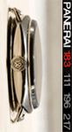
geo1nah2a Posted June 14, 2008 Author Report Share Posted June 14, 2008 I promised I would revisit this thread..Here you go A great bezel: there are 3 different finishes: mirror polished on the front, radial on the edge, and vertical on the sides.. The crown is great too: polished, except from the embossed Corum key that is mat. And look at the back.. The case/bezel layers look more pronounced than the plain Ti version.. Quote Link to comment Share on other sites More sharing options...
zenpang Posted June 14, 2008 Report Share Posted June 14, 2008 wow that is magnificent...if only they had this non-chrono in 44mm Quote Link to comment Share on other sites More sharing options...
ATEspo Posted June 15, 2008 Report Share Posted June 15, 2008 I am debating on the gold version or all Ti version...hard decision! Quote Link to comment Share on other sites More sharing options...
Recommended Posts
Join the conversation
You can post now and register later. If you have an account, sign in now to post with your account.