When you buy through links on our site, we may earn an affiliate commission.


theonewatches
-
Posts
42 -
Joined
-
Last visited
-
Days Won
6
Everything posted by theonewatches
-

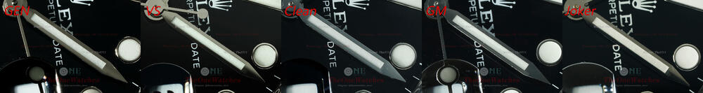
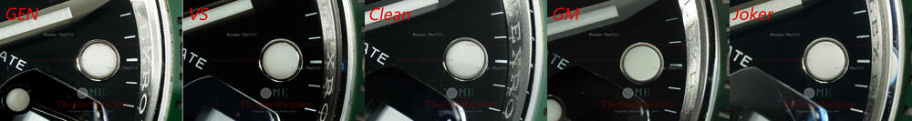
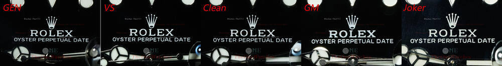
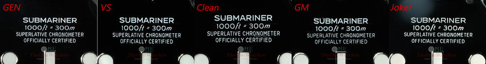
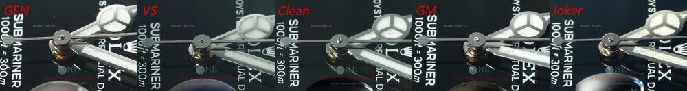
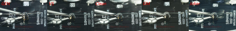
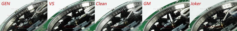
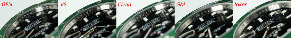
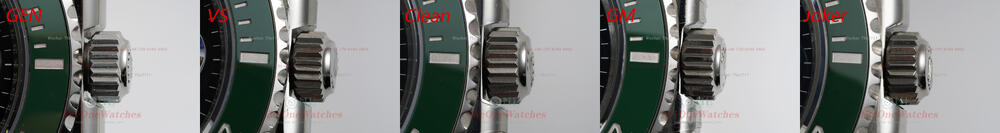
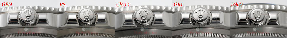
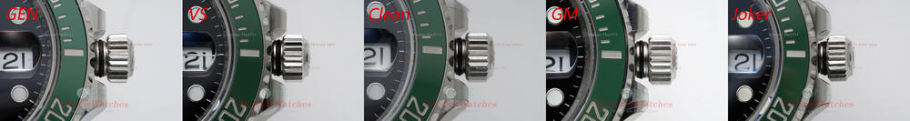
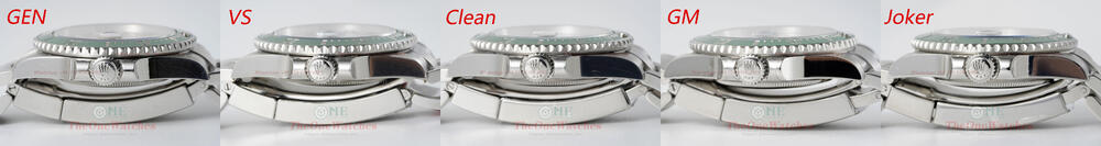
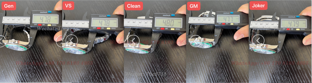
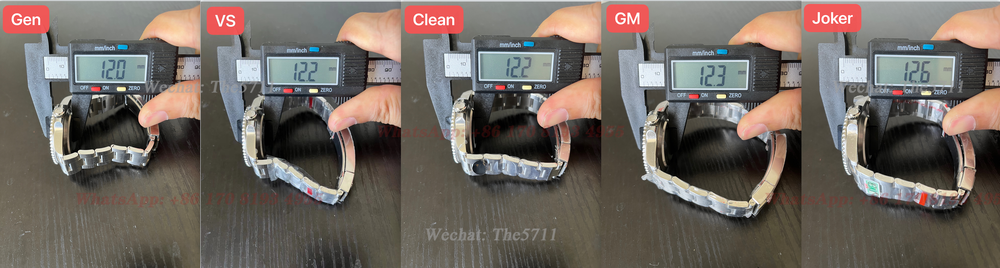
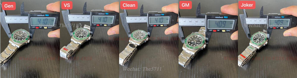
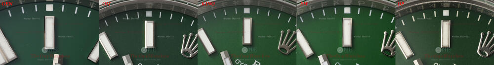
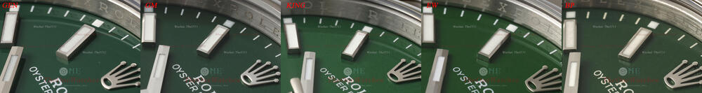
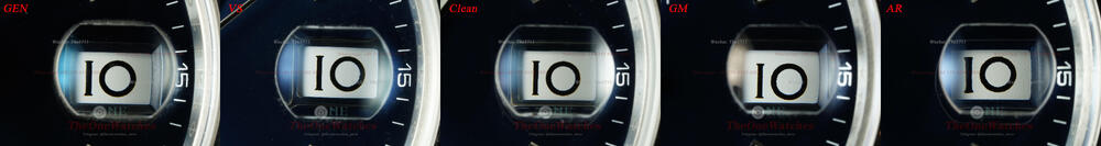
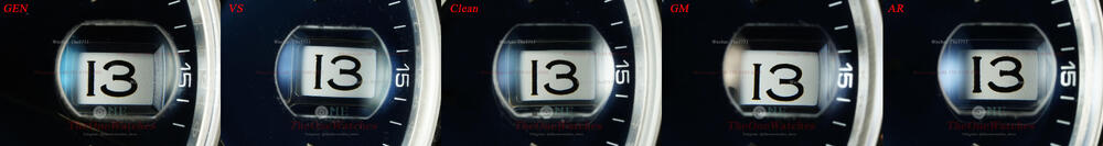
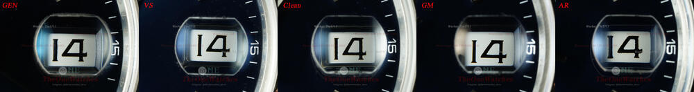
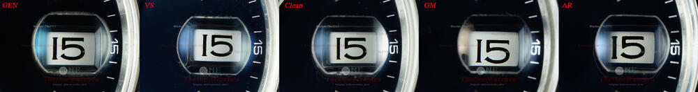
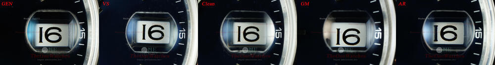
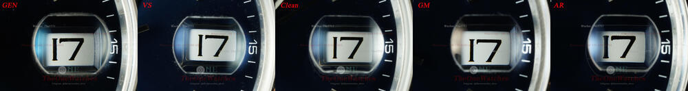
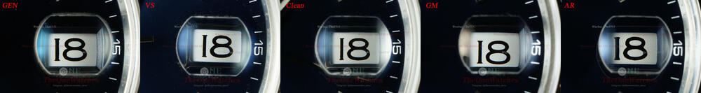
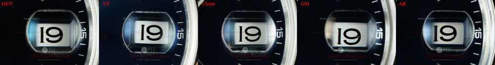
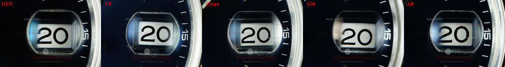
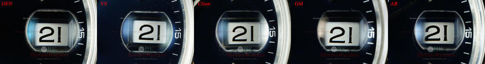
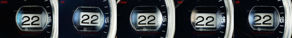
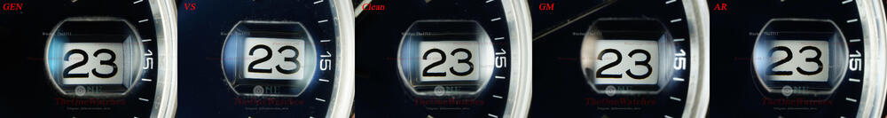
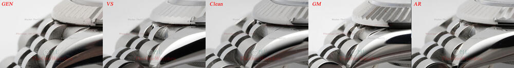
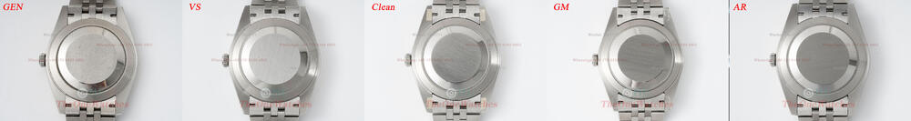
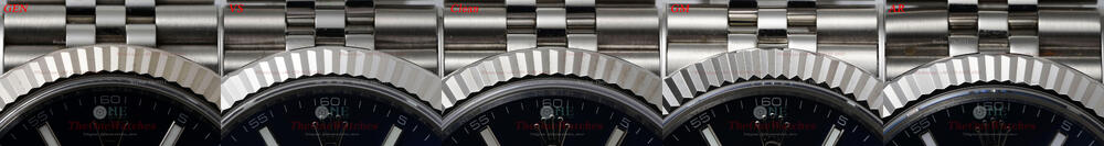
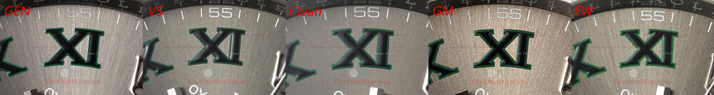
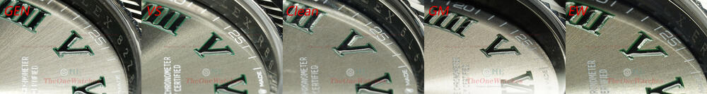
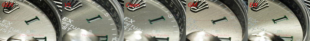
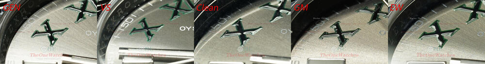
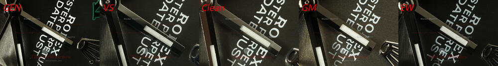
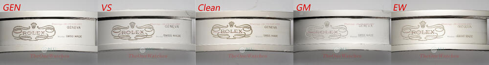
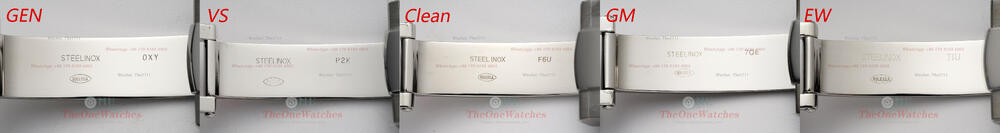
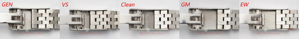
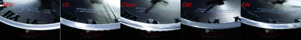
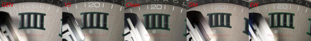
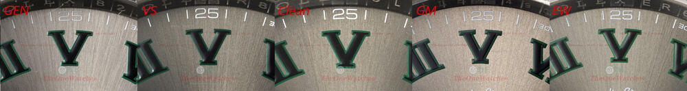
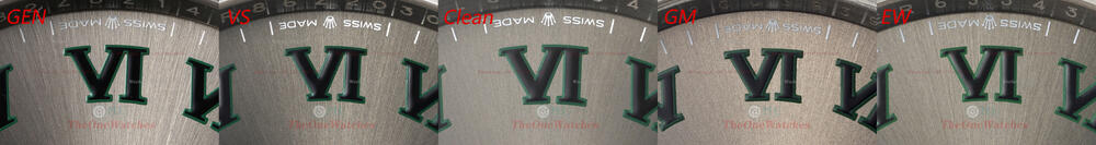
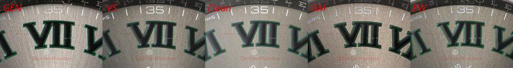
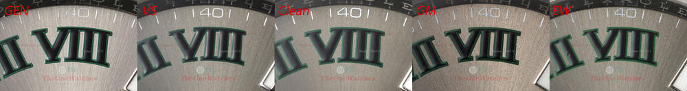
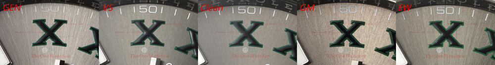
Full comparison of 126610LV GEN, VS, CLEAN, GM, JOKER
theonewatches posted a topic in The Rolex Area
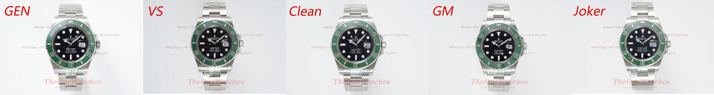
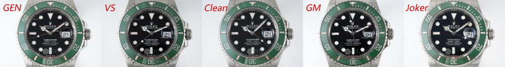
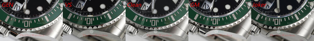
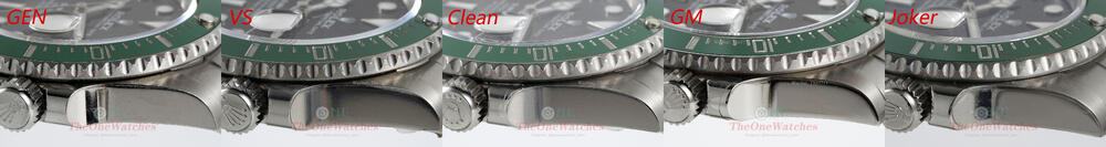
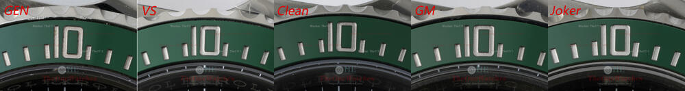
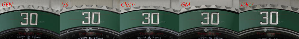
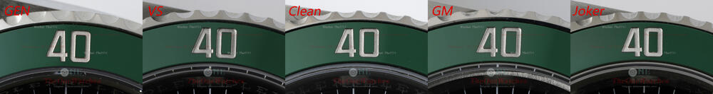
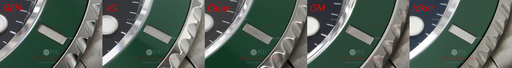
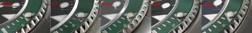
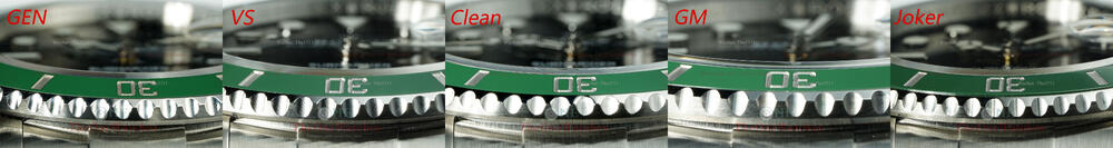
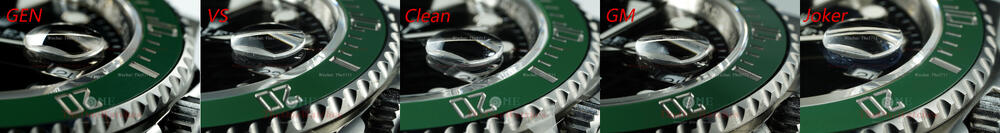
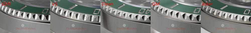
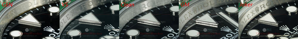
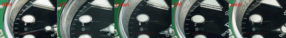
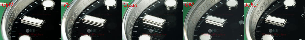
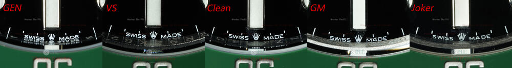
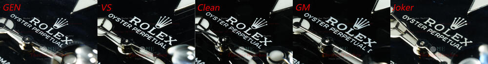
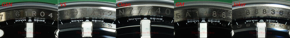
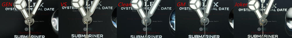
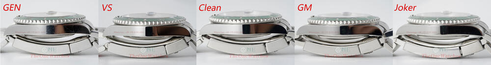
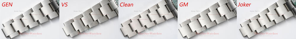
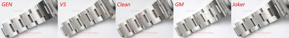
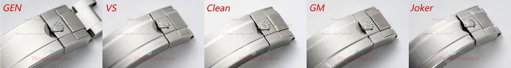
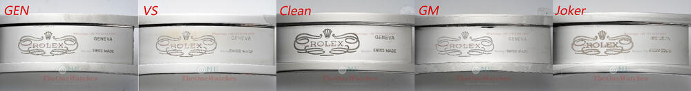
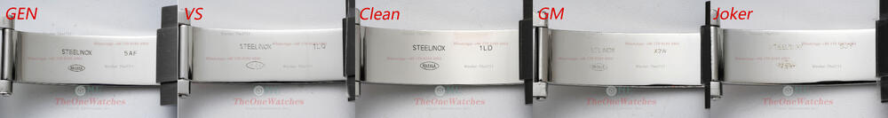
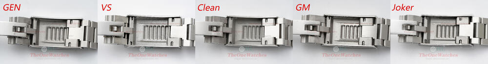
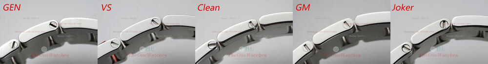
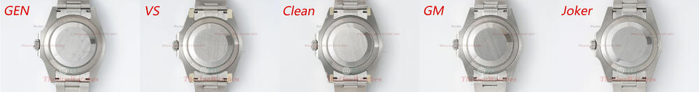
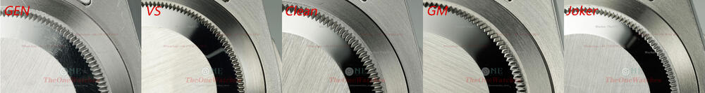
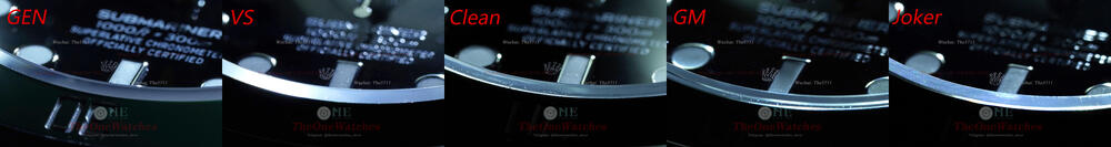
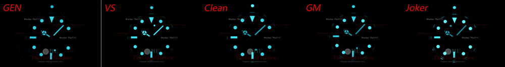
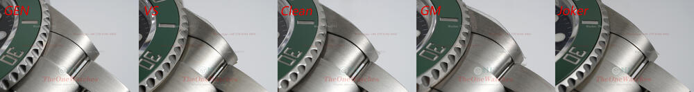
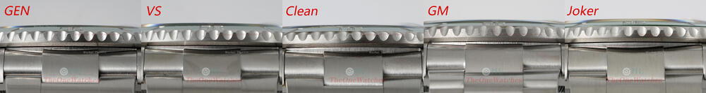
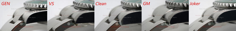
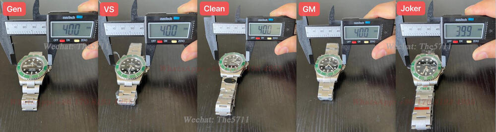
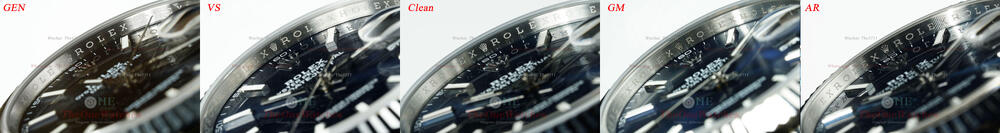
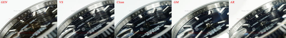
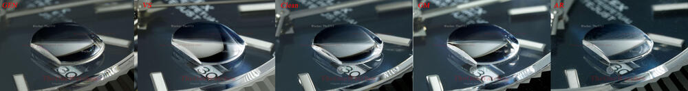
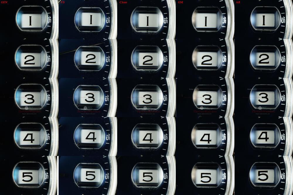
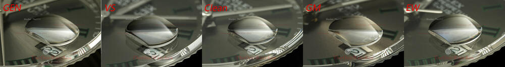
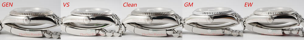
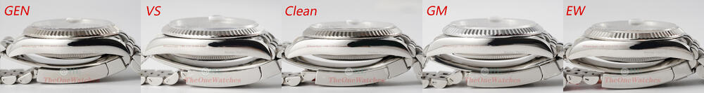
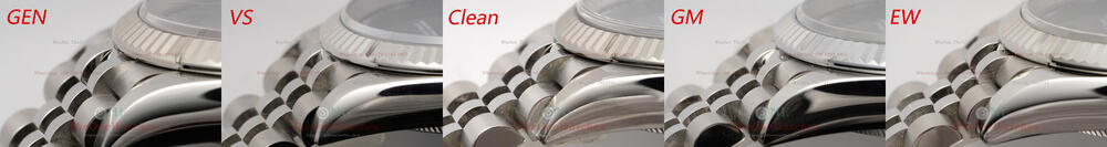
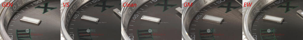
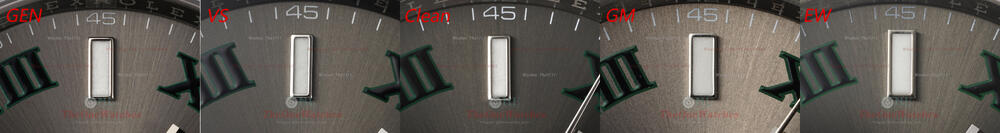
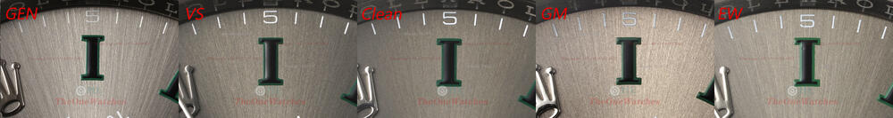
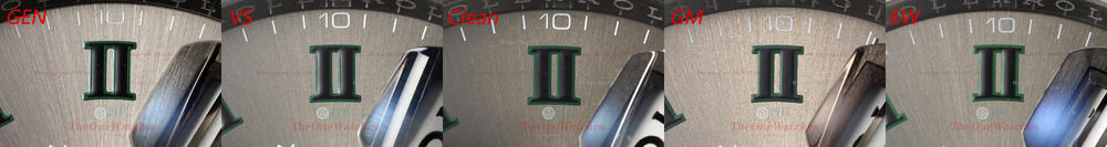
Hi everyone, I'm Steve, here I am again. This time I bring you a full comparison between the 126610LV GEN and several replicas! As far as style is concerned, the first generation of the submariner in the classic color scheme of black dial and green bezel is also my personal favorite! Without further crap, let's get to work! Bezel front view and side view There is no color difference with the black dial, but mainly depends on the color of the green bezel; VS and CELAN both use the clean bezel, which is claimed to be the closest to the gen, and through repeated observation and comparison in kind, the color is slightly darker than that of the GEN. Sapphire crystal side view It’s not very good to compare due to light about the comparison photos. In real life, VS and JOKER are better. (The side shape of the JOKER is closest to the GEN) Side view of the Pearl The color of the pearls all deviate from the gen, the GEN color is white with a touch of yellow! This is difficult for all factories to control, VS and GM go for white, CLEAN and JOKER go for yellow! In addition, clean’s sunken shape of the edge of the pearl is the closest to GEN. The Gen’s distance from the triangular edge of the pearl is small and all three edges are the same distance apart! All factories have at least one side that is significantly too large, obviously due to differences in the size of the cylindrical supports or deviations in the mounting position! In fact, this problem can be avoided in too much concern, and is difficult to detect with the naked eye. Bezel Marker Personally, I think the colors are pretty much the same from the factory, and the bar scales are pretty good on the inner edges of the cut corners! If you really want to differentiate, I'll leave it to you! Teeth side view The bezel shape of the VS factory is closest to the GEN, followed by the C factory, the GM oval shape is on the lean side. The JOKER's curved sharp corners are on the small side, and the overall brushed pattern is also the best restored by the VS! Dial marker side view In summary, there are no significant deviations in the shape and polish of the scales from any of the factories! There is no superiority or inferiority, which is the basic style expected of a major factory! Lume coating front view VS and Clean Factory are both quite grainy, GM and JOKER are almost smooth! Dial font view VS and C Factory continues to be better for the overall print control! Hand view VS and C Factory’s center shaft shape both have a skeletonised solid construction, although the top shape deviates. The GM and JOKER are somewhat worse, being completely closed. The edges of the hands are always in VS's favor, clean and almost burr-free, whereas all the other factories have burrs and rust! Rehaut view It goes without saying that it is obvious for the engraving on the GM and JOKER is blackened and the lettering is on the thin side Crown view The crown teeth are better rounded on VS and JOKER, CLEAN and GM are both a bit sharp Sel view We did a comparison video between the Panda Daytona 116500 and the black 116500 earlier and found that in fact the Rolex head and lugs aren't set in stone, it could have something to do with the length of wear, or it may related to the different years of production of the GEN! So I don't think this is a necessary option for your choice of comparison. The view also shows that the top of the GEN lugs does not actually sink, the VS, CLEAN and GM all sink more significantly, but the JOKER sinks the least and is closer to the GEN overall! Case side view Case black view Straps view VS and GM do a great job for the screws and slotted holes in the links of the strap, JOKER's are worse. Laser and lume view The messy arrangement of the GEN laser markers is always difficult to imitate and the VS has the most intense luminous effect. Movement view This time we took an open cap shot of the movement just to see the GEN 3235 in all details. The powerful 3235 movement is truly fascinating, with its sexy blue spring, like a beautiful woman's silky smoothness! Then the replica factories colors all look too dull, but of course we can't ask for too much, it's nice to see the overall construction in line with the GEN! The VS adopt the Danton 3235 movement, which also has the advantage of a power reserve measured at around 70 hours, which is still great! And after nearly two years of market validation, its stability is also very high! CLEAN, GM and JOKER all use the Shanghai 3235 movement, which has a measured power reserve of around 40 hours, and the feedback from the domestic market is that the return rate is high! Comparative chart of various data Note: All measurements are taken in a snug fit and may be inaccurate due to slight deviations in caliper position, all reps have protective film not removed, GEN intercepted a section of steel tape! Well, this is today's post, thank you guys for watching, if there are mistakes improper, please correct me, if there are any places I overlooked, you can put forward, I will try to add as comprehensive as possible for it, welcome to comment exchange! I will continue to bring you more detailed comparison between the replicas and GEN, but also in order to let the guys better choose their favorite style representative, the next style we will get out of Rolex, after all, Rolex style, I believe that many guys are already very clear! Note: (Some of the photos because of the light source problems lead to deviations from the real thing, details or text descriptions, comparison picture size is relatively large, you can download down to enlarge the comparison.) Plese contact us by the following contact info if you want to purchase anything. Website: https://www.theonewatches.ws Whatsapp:+ 86 17081934955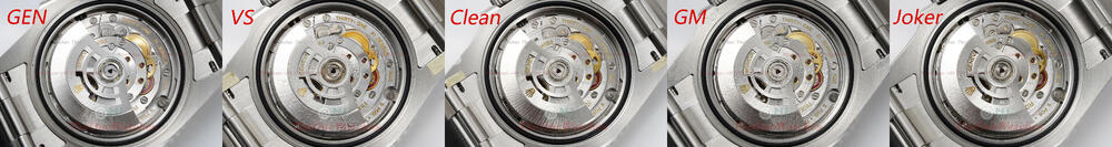


- 1 reply
-
- 1
-

-
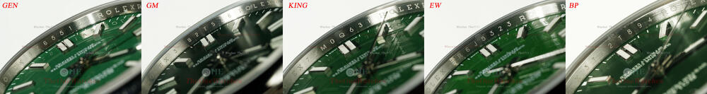
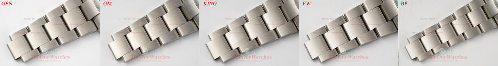
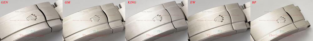
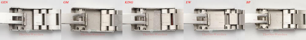
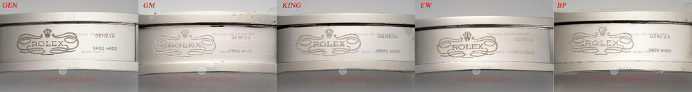
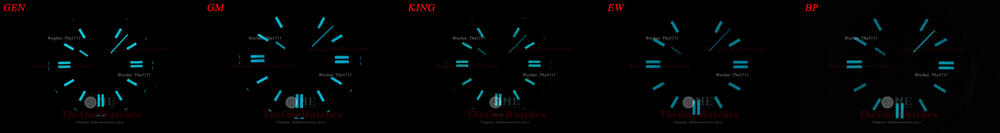
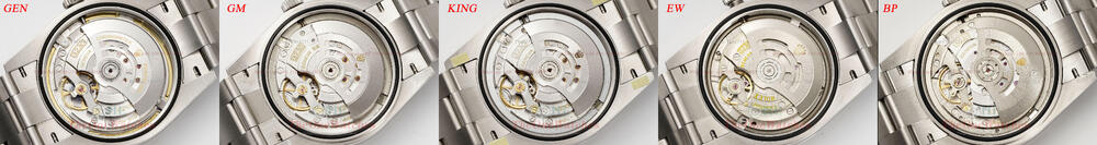
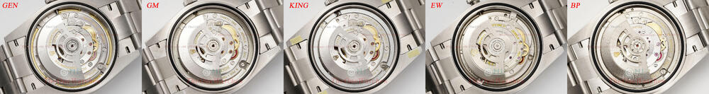
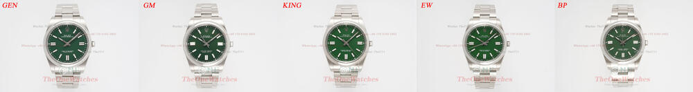
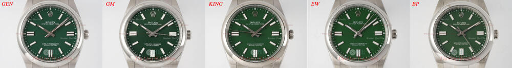
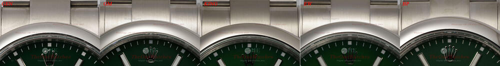
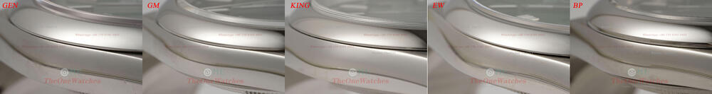
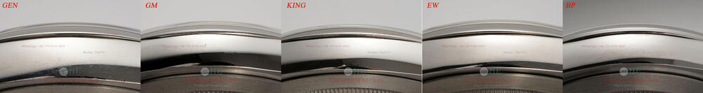
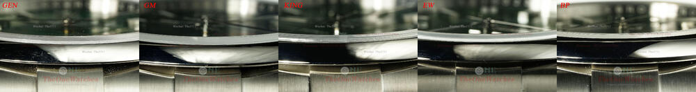
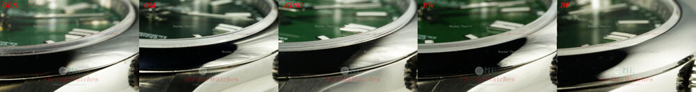
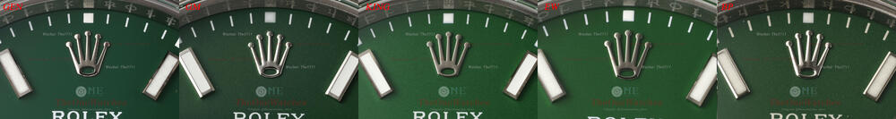
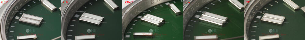
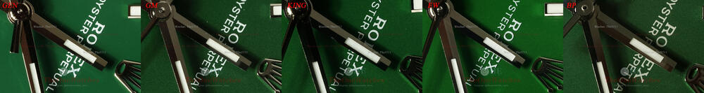
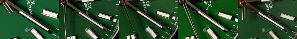
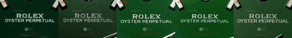
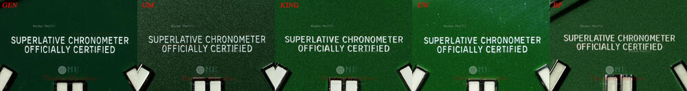
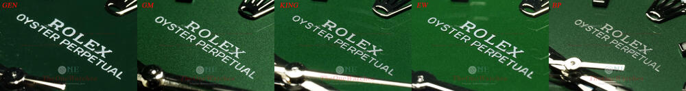
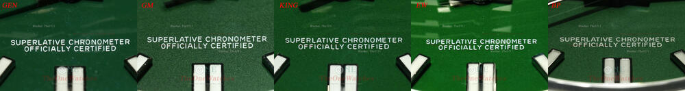
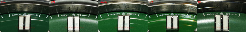
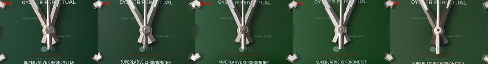
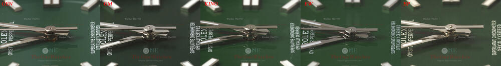
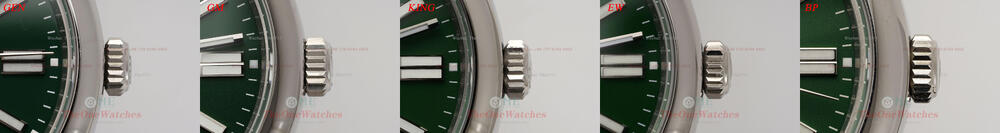
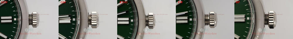
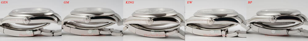
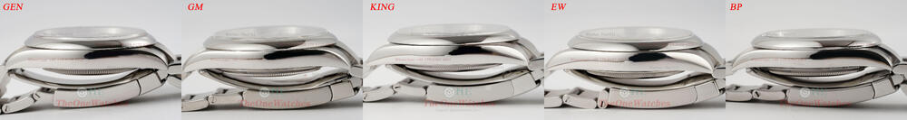
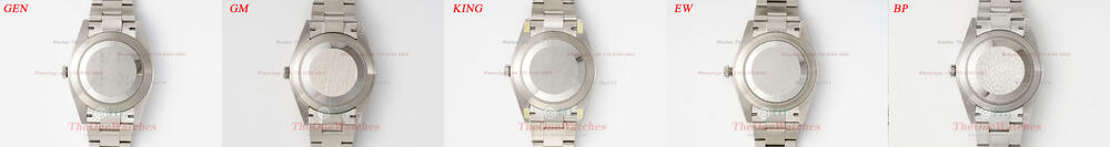
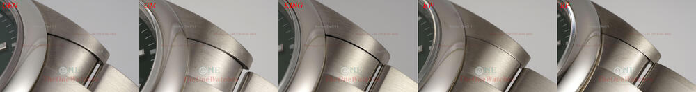
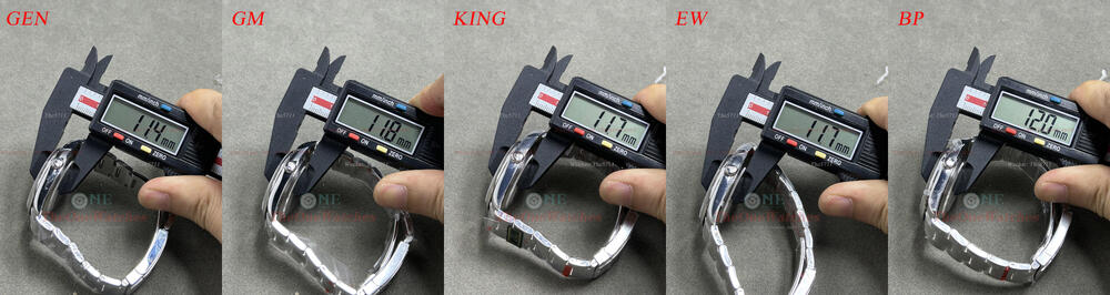
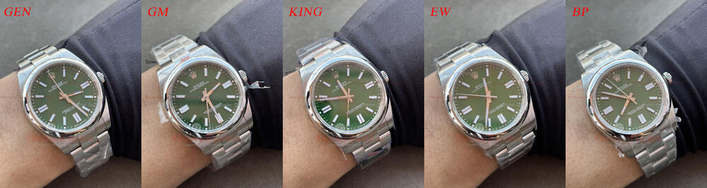
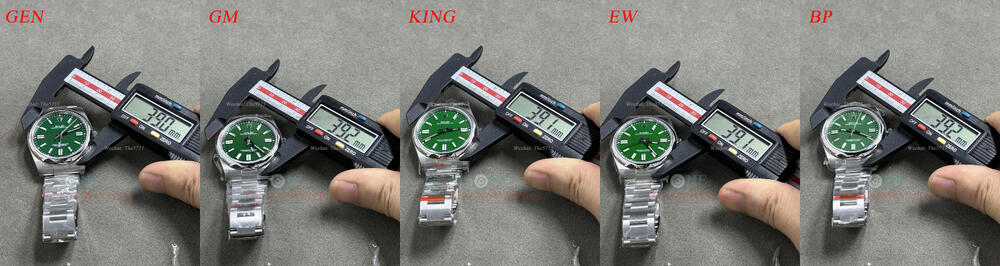
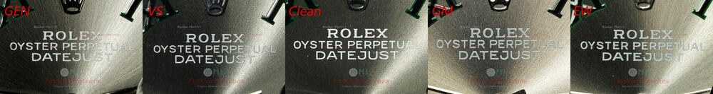
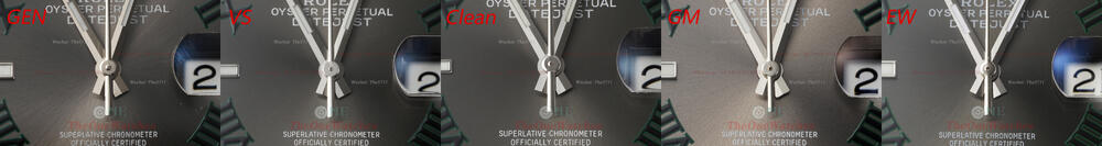
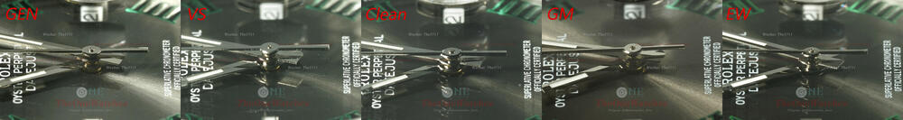
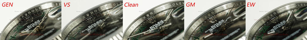
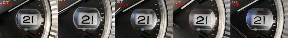
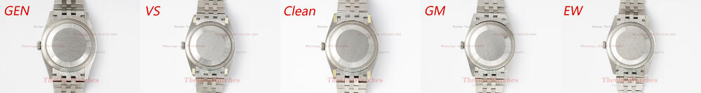
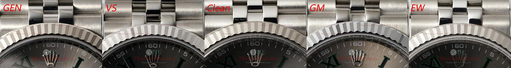
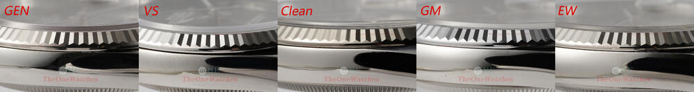
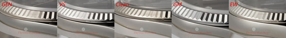
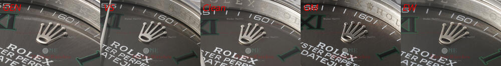
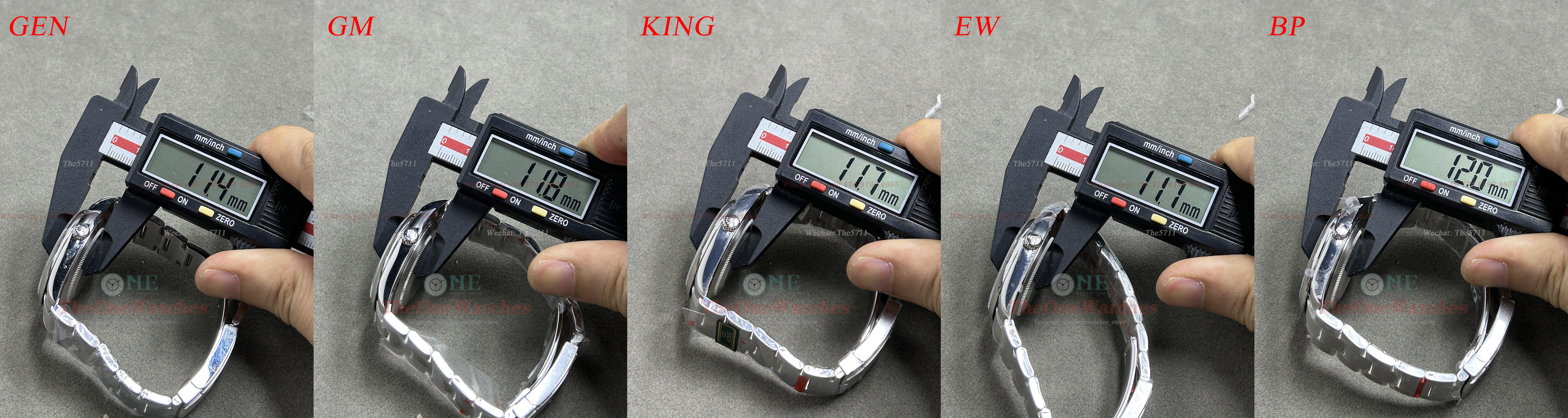
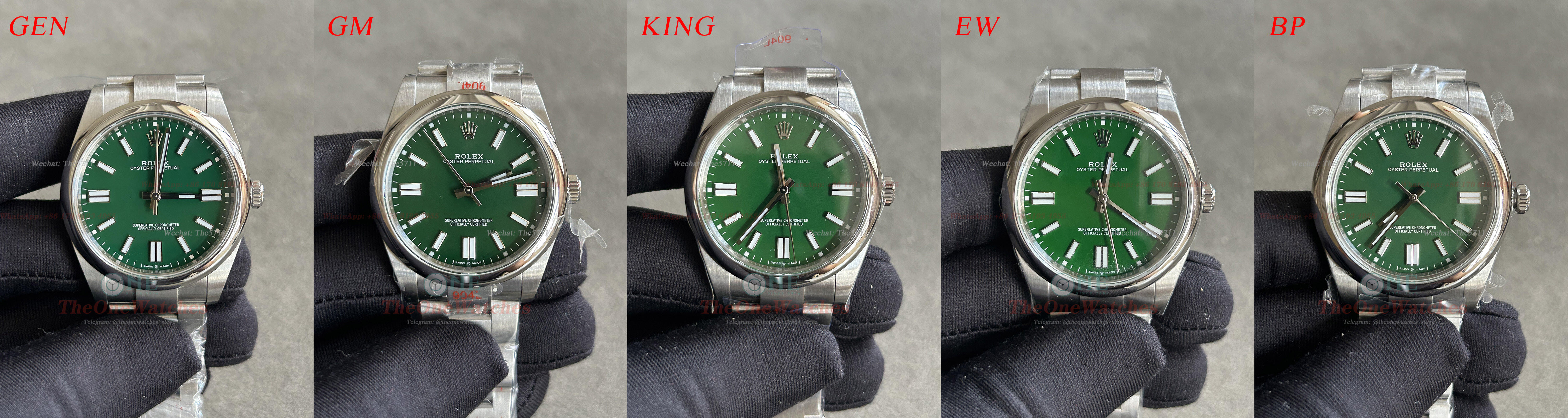
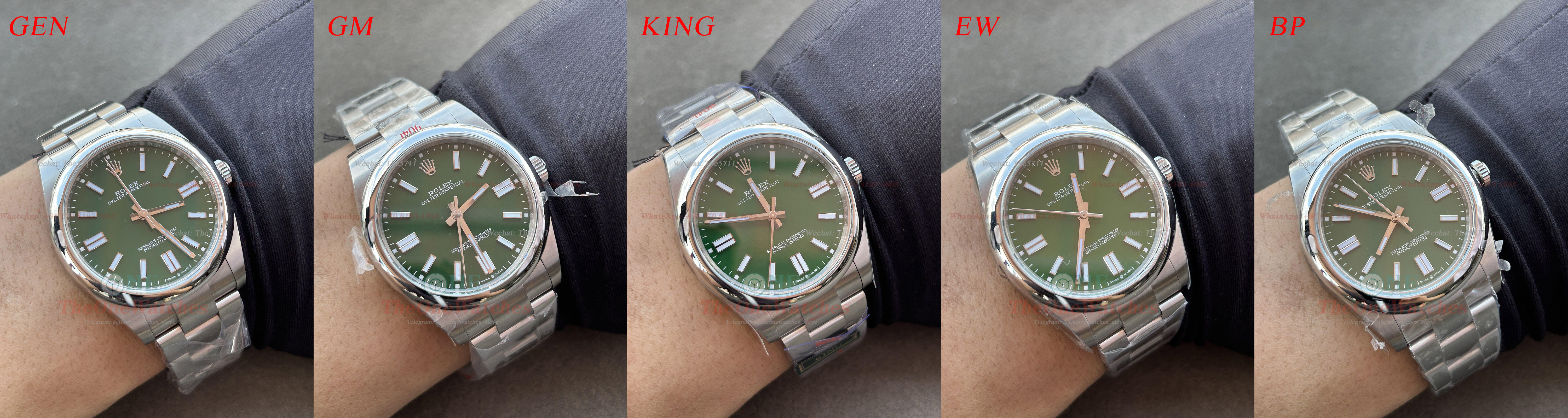
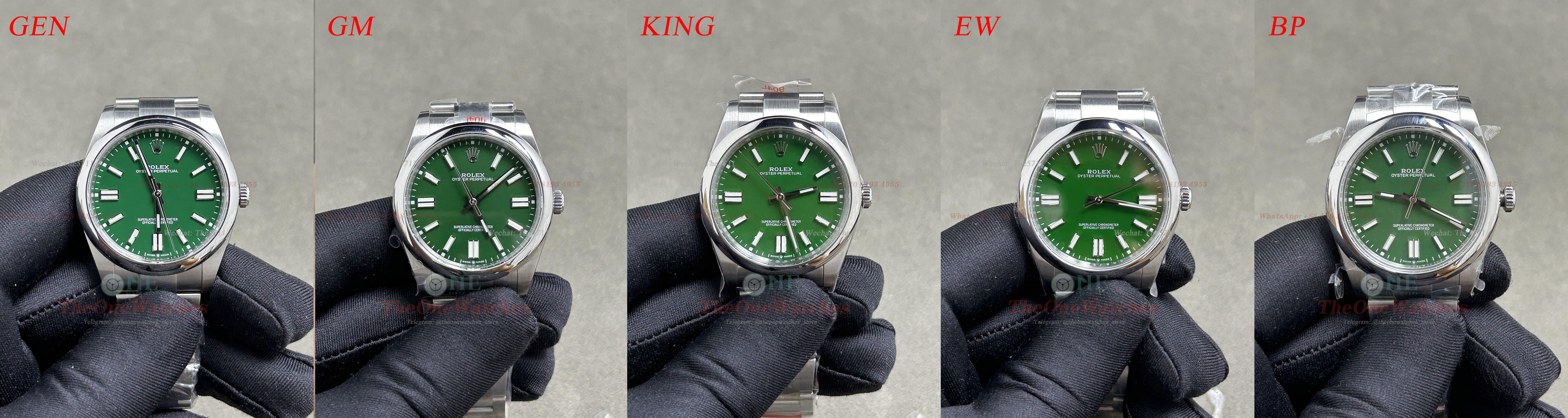
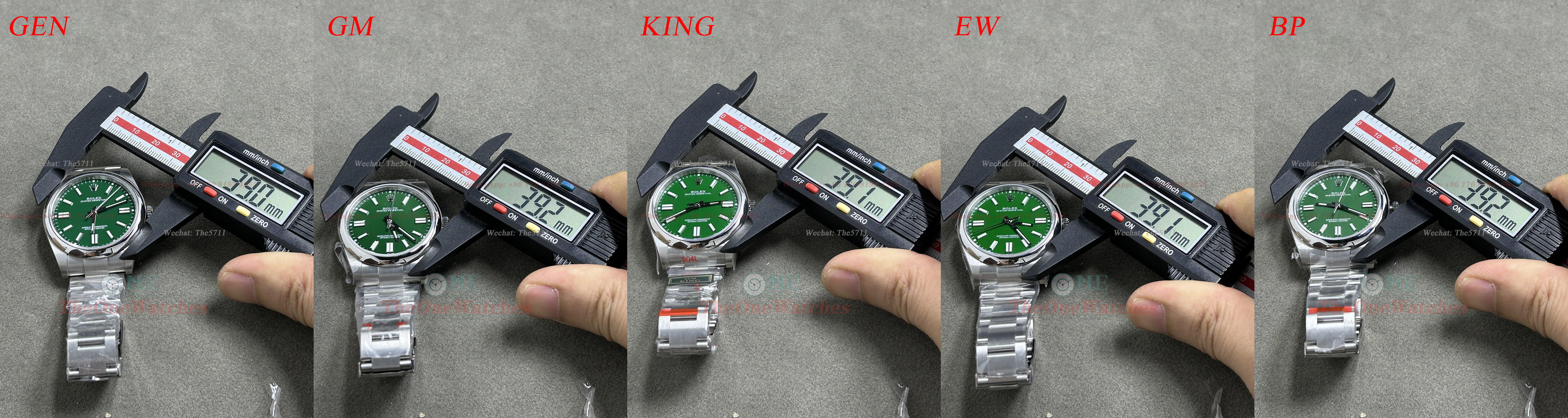
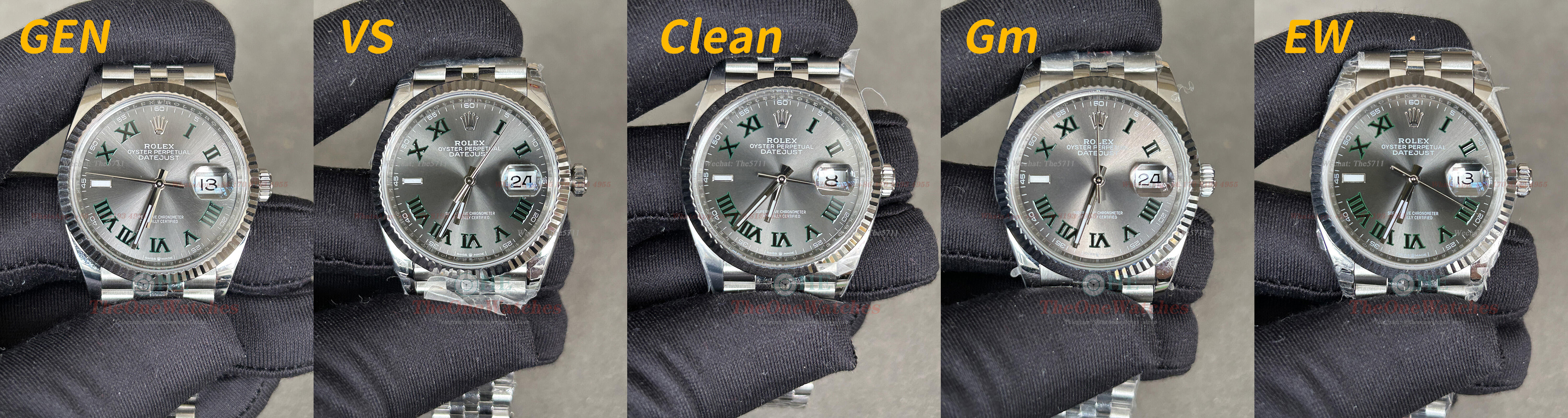
Hello everyone, this is Steve and I'm back. Today I’m going to bring you a comprehensive comparison of the entry-level model of the Rolex - Oyster Perpetual. In the beginning of this year, I had planned to do a comparison of the Oyster Perpetual. It is not as popular as other Rolex series, after all, it is the pioneer series of Rolex watches. If we don’t have comparison for this model, it’s a bit unreasonable. Haha. Without further ado, let's get started. Front Dial View Natual Light View Light View Color difference is unavoidable for these color dials, so we have to see which is the closest. Through the comparison view, we can clearly distinguish the color differences between the factories. The colors of KING and EW are brighter, and their color is very similar, it seems that they use the same dial. The color of GM is a little bit darker. The color difference of BP is actually not very big, but its color looks a bit faded and lacks gloss, which leads to its overall feeling by the dial color is not very comfortable. In general, I personally think that the color difference of GM is the smallest. Bezel View Except for BP, the bezel shape of all factories is consistent with GEN, and the side section of the BP bezel is too thick, which makes the bezel appear a bit too large from the front. Crystal Side View For the chamfering and height of the side of crysta, GM is the closest to GEN, followed by EW. The chamfering of KING is too much, resulting in obvious layers, while BP is slightly lower in height. Crown and Markers View GM’s crown logo has the smoothest edge chamfering treatment, and the overall shape among GM, KING and EW are very similar, no big different with GEN. While BP is slightly different, mainly because of its slope width is a bit narrower. Hands Luminous Fill View All factories have a certain luminous graininess, there is not obvious difference for this part. Dial Mimeograph Front View Relatively speaking, the regularity of BP fonts is slightly worse, and the mimeograph thickness and three-dimensional effect of other factories are similar. Let's take a look at the opening of crown at 6 o'clock. Except for EW, the other three factories have relatively large deviations. Of course, this might caused by batch issue of the factories. In addition, let’s talk about the dial. From the high-definition pictures, we can see that all factories’ dial is actually a grainy dial but not a glossy dial like GEN. It is just invisible to the naked eye and non closeup photos. King and EW are slightly better, the graininess is not particularly noticeable. Hands and Middle Axis Dial Compared with GEN, the leaking cylindrical part of the middle axis is different from each factory. Relatively speaking, GM and EW are closer to GEN. The flaw of BP is the most obvious, the hollow part in the middle is too large, and the processing is relatively rough, with obvious welding marks. Rehaut Side View In terms of the overall lettering shape and clarity, there is no obvious difference between the factories. If you have to score high and low, I personally think that KING is slightly better. Zoom in on the picture to see that the edges of KING’s font are more regular, and the shading is more clearer. Crown Side View There is nothing to say about the crown as there is no problem with the appearance and size. It feels a bit scratchy when you tough the crown of King, mainly because the teeth are not chamfered. Case Side View According to the past habits, usually, we don’t comment on the case, but I noticed it this time, so mentioned here. It is not difficult to find through the pictures. Compared with GEN, the curvature of the lug end of GM and BP seems to be more downward. I found that it is indeed the case by comparing with real watches.So KING and EW are naturally the winners in terms of case shape. Caseback View No more comments for the caseback, You friends can compare it in accordance with the photo. Steve is still in a hurry to write the next comparison, haha. Endlink Side View In terms of endlink, it is very difficult for factories to be completely consistent with GEN. In my opinion, as long as the lugs are not completely flush, it is within the acceptable range. Obviously, EW and BP are not good. GM is the best in this part and it is the closest to GEN, followed by KING. Bracelet Details View For the engraving inside the buckle, factories are different. EW’s overall engraving lines looks more comfortable. GM and KING lack clarity, and a few small engraving dots below the ''ROKEXSA'' font of BP is missing. Laser Mark and Lume View Although the laser marks appear slightly different in the picture, there is no difference in reality. KING's luminous color is different, it is more green than GEN, and the other three factories are consistent with GEN. Movement View GM and KING use the VR3230 movement, while EW and BP are A3230 movement which is modified and based on the 2824 movement. After all, their prices are cheaper. Compared with other factories, EW and BP have always take the cheap route, so it is justifiable to adopt the cheaper movement for these two factories. Data Comparison View Note: All measurements are in a clamped state, and there may be tolerance due to slight deviations in the position of the caliper. Well, this is today’s post, thank you guys for watching, if there are any mistakes, please correct me. If there is anything else I overlooked, you can put it up, and I will try my best to do it complementary and comprehensive, welcome to comment and exchange! I will continue to bring you more detailed comparisons between replicas and GEN, which is for you guys to better choose your favorite replicas. (Note: Some photos deviate from the real object due to the angle of the light. The details are mainly written in text. The size of the comparison picture is relatively large. You can download it and enlarge it for comparison.) There is no perfect replica, only the one you prefer. Website: https://www.theonewatches.ws WhatsApp: + 86-17081934955 Wechat: The5711


-
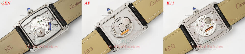
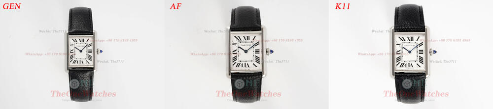
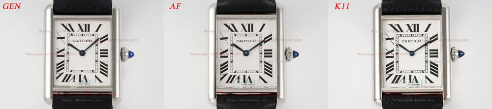
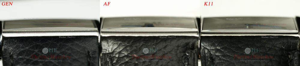
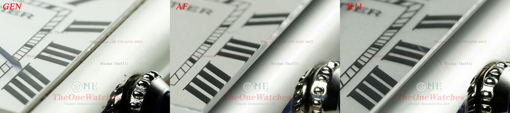
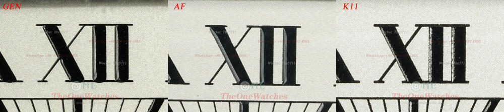
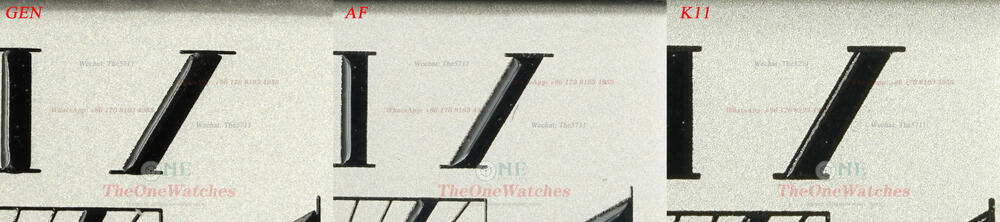
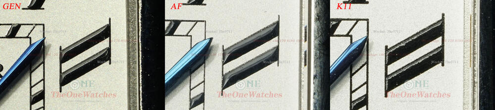
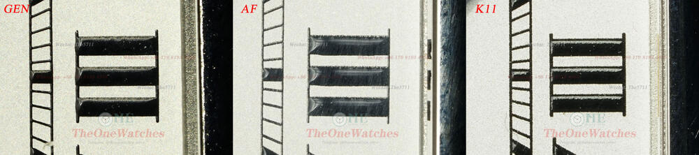
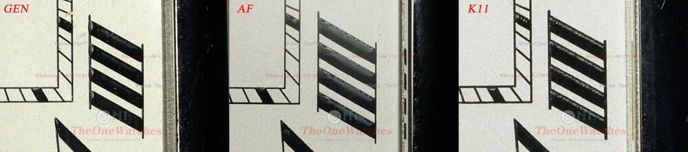
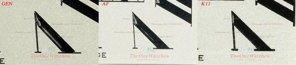
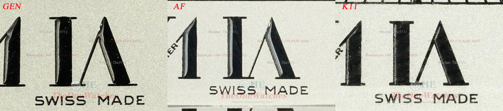
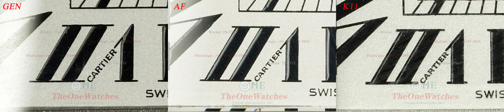
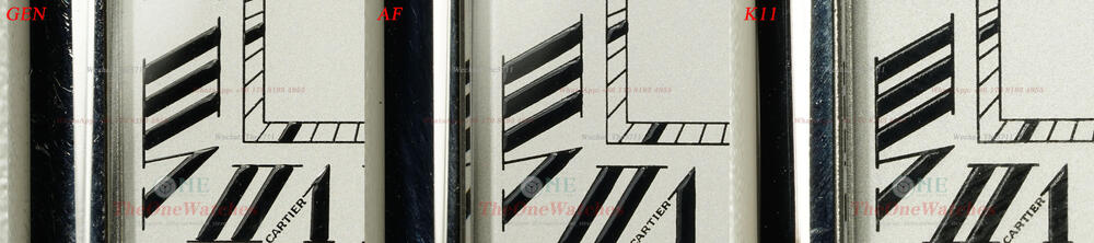
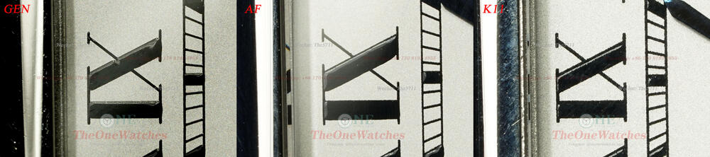
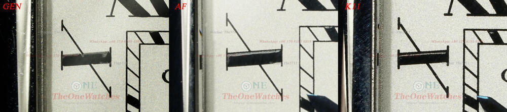
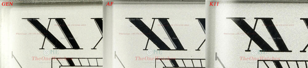
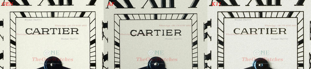
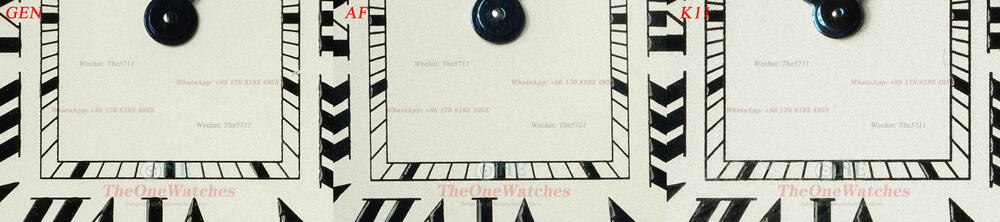
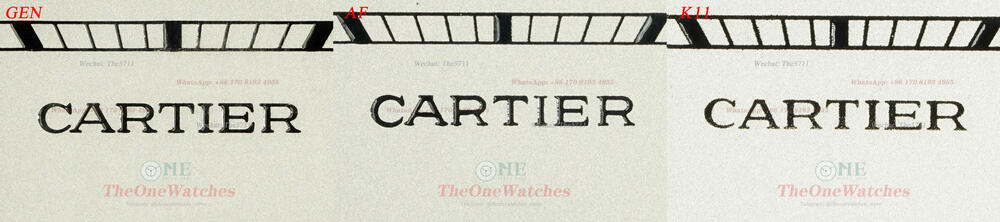
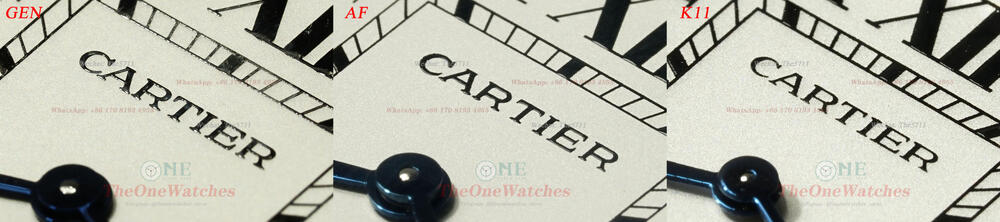
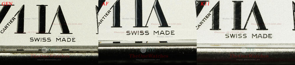
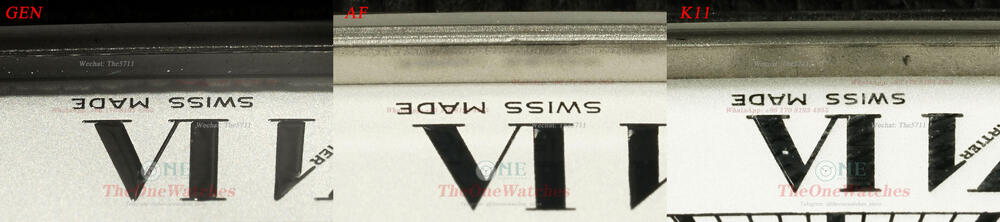
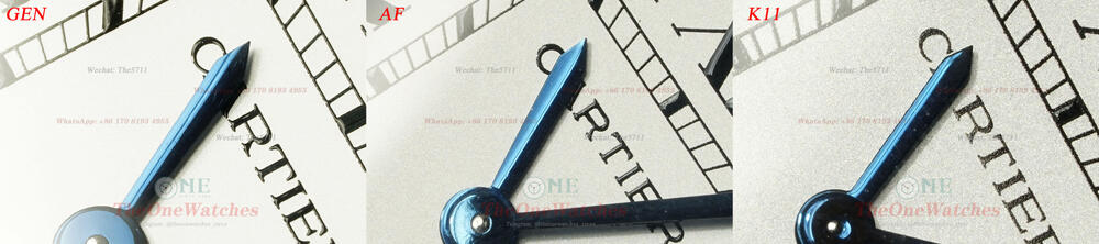
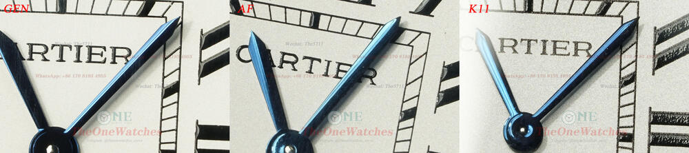
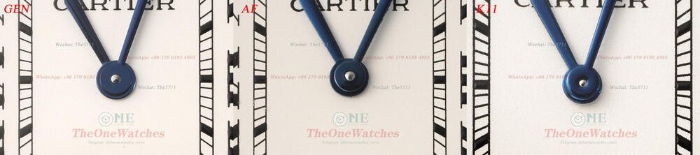
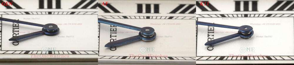
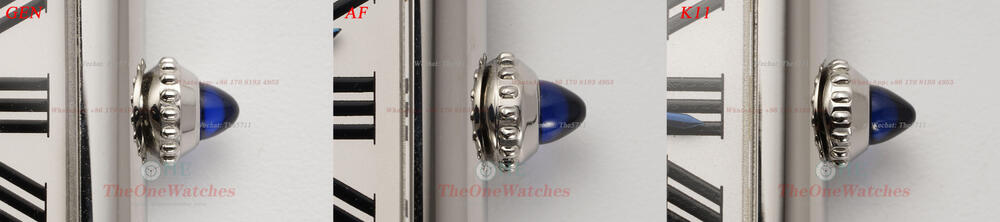
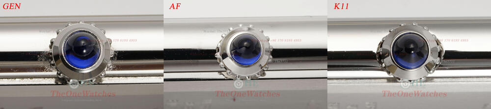
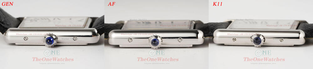
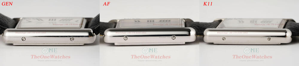
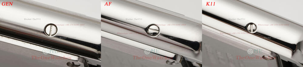
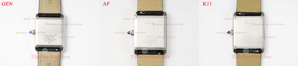
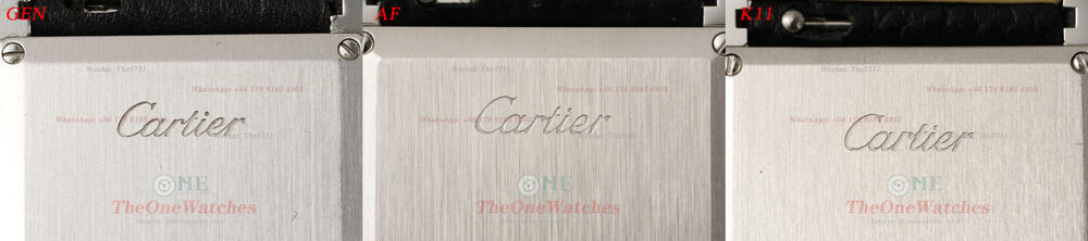
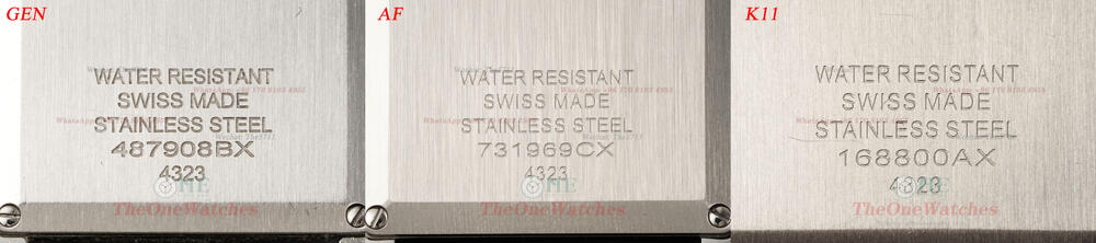
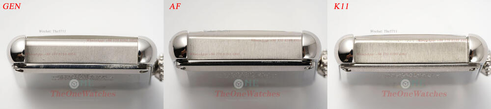
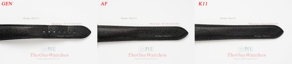
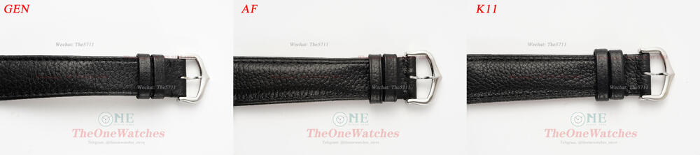
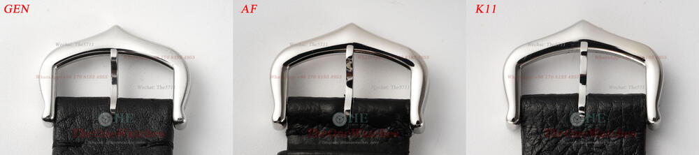
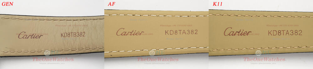
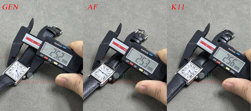
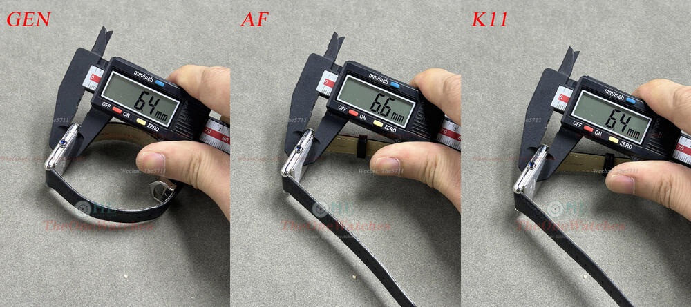
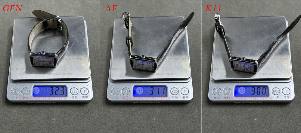
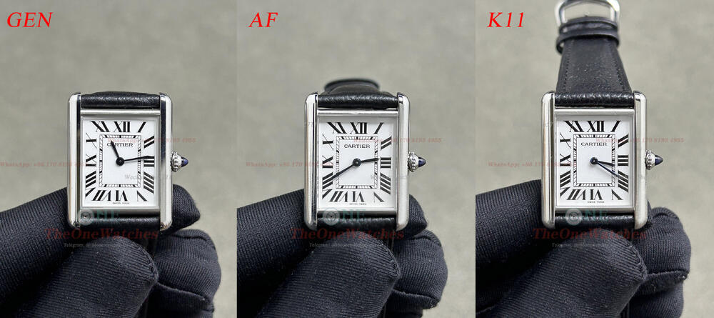
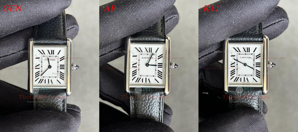
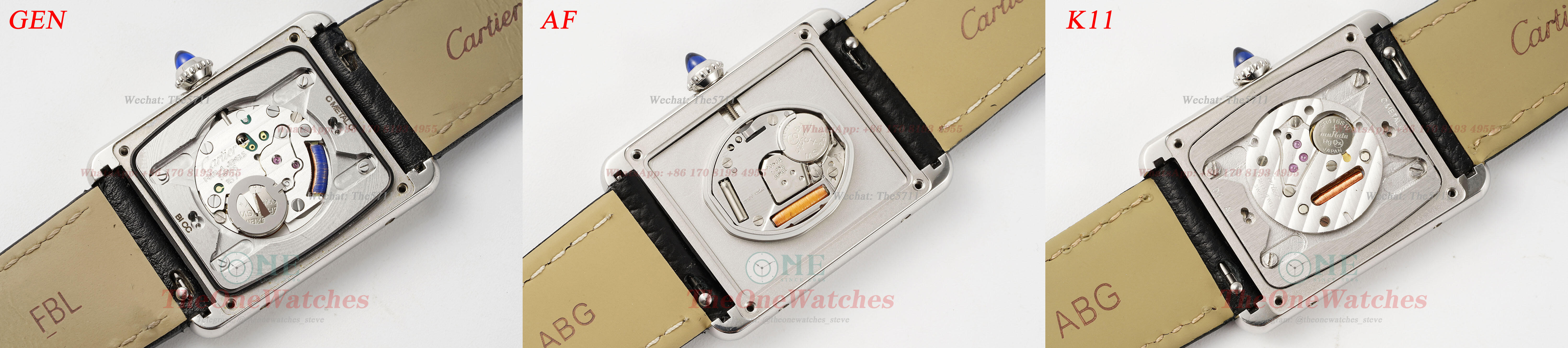
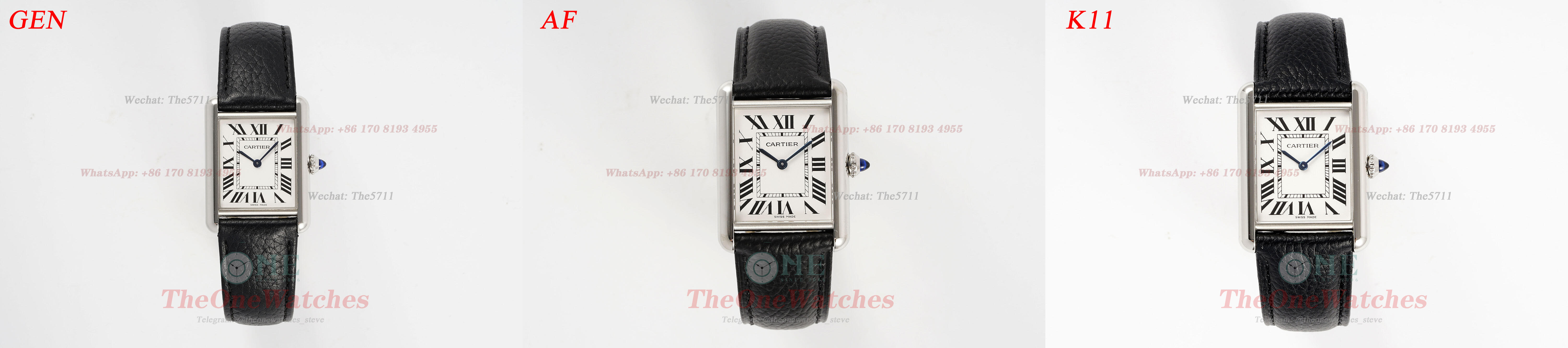
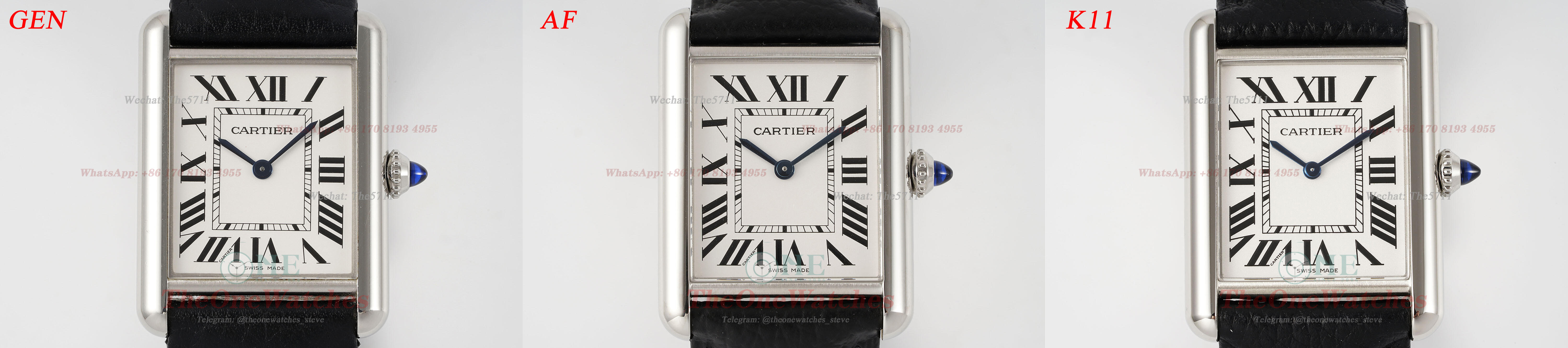
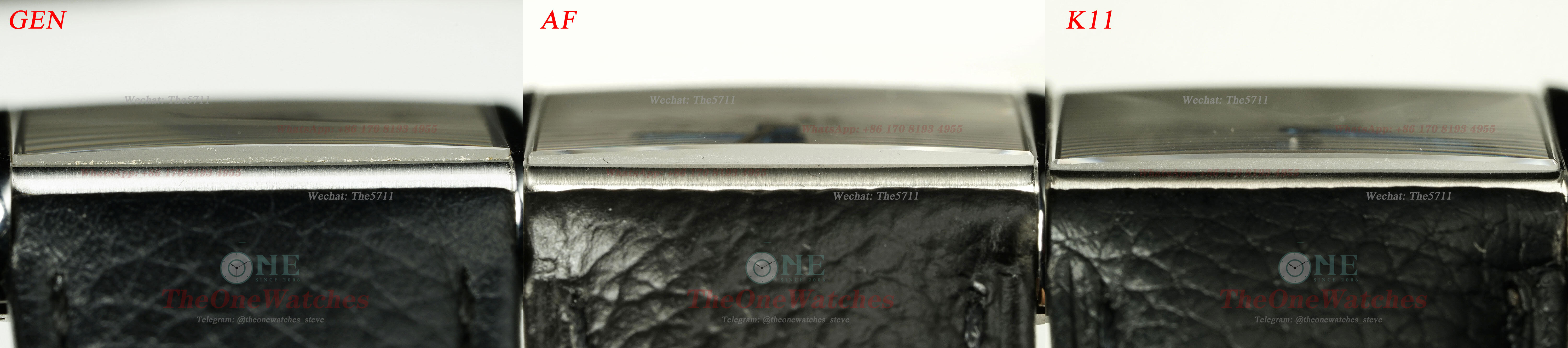
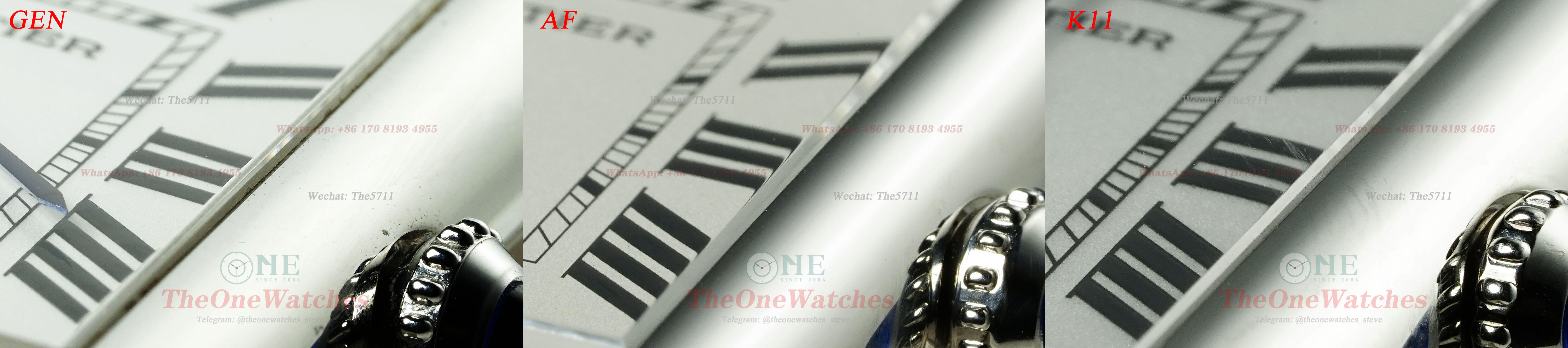
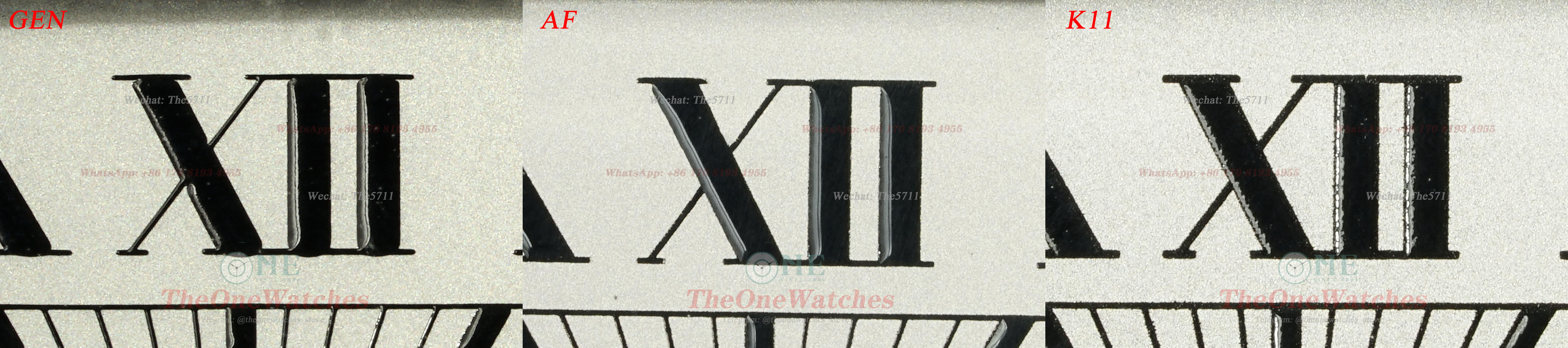
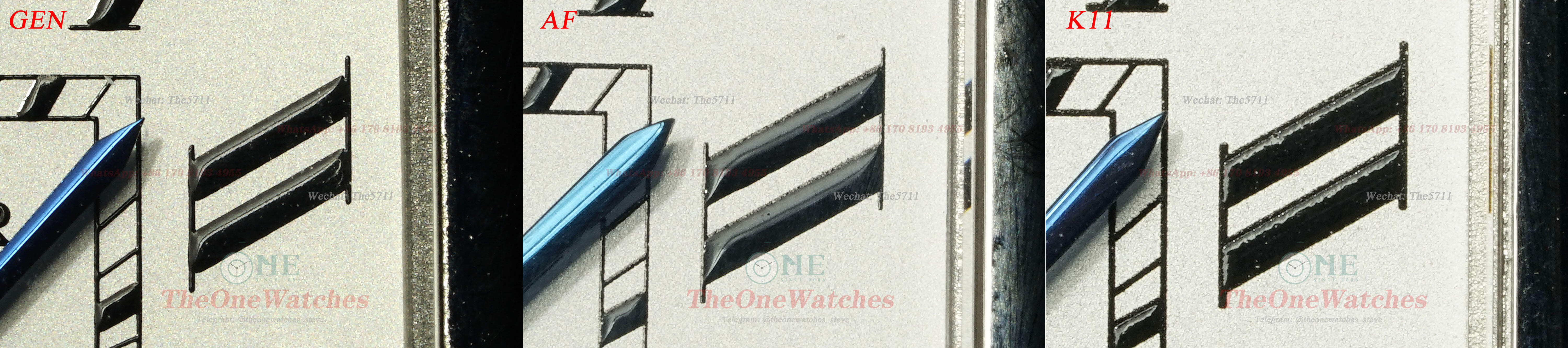
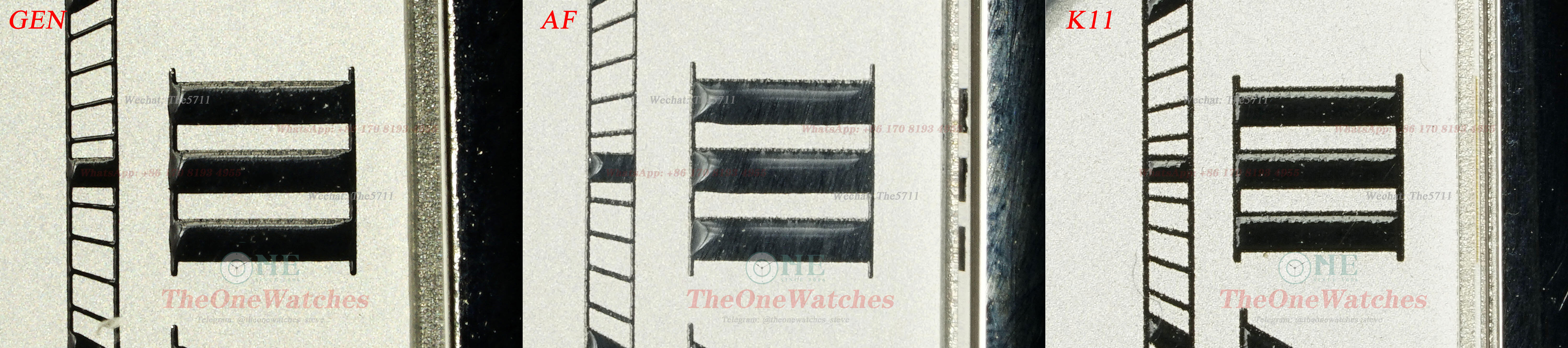
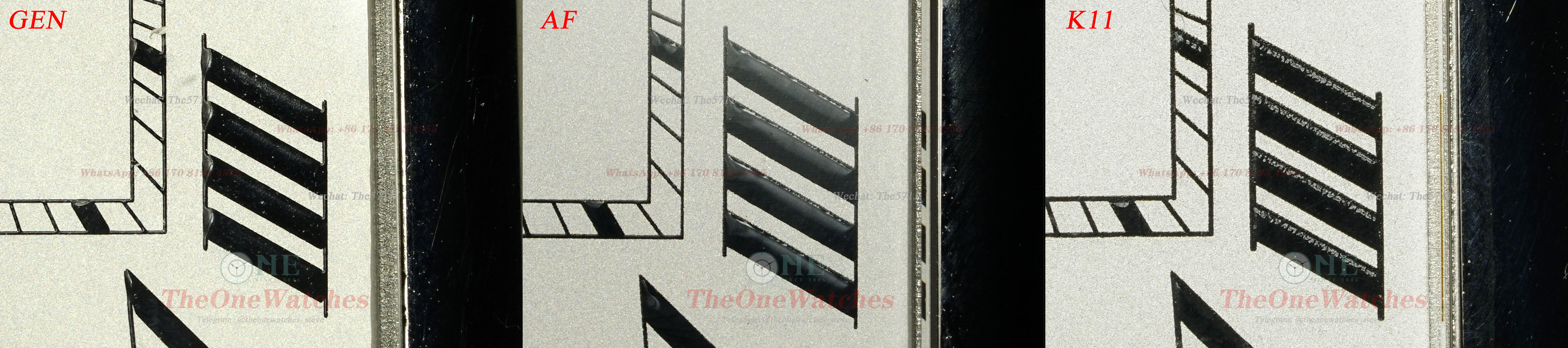
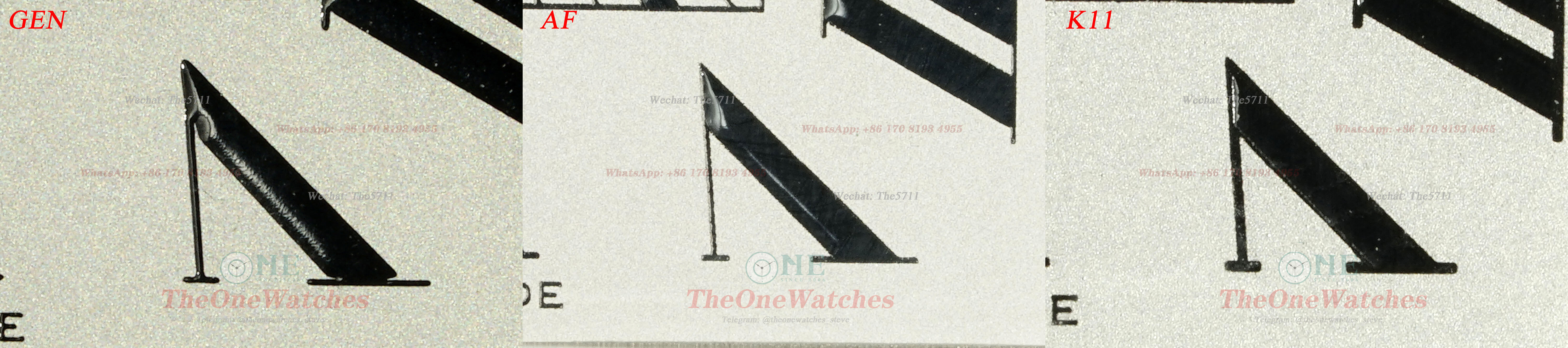
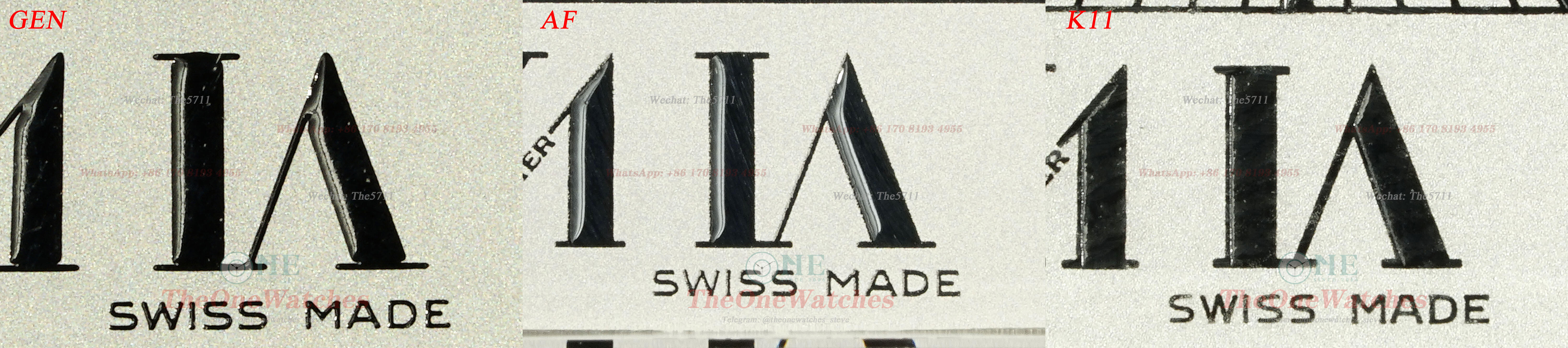
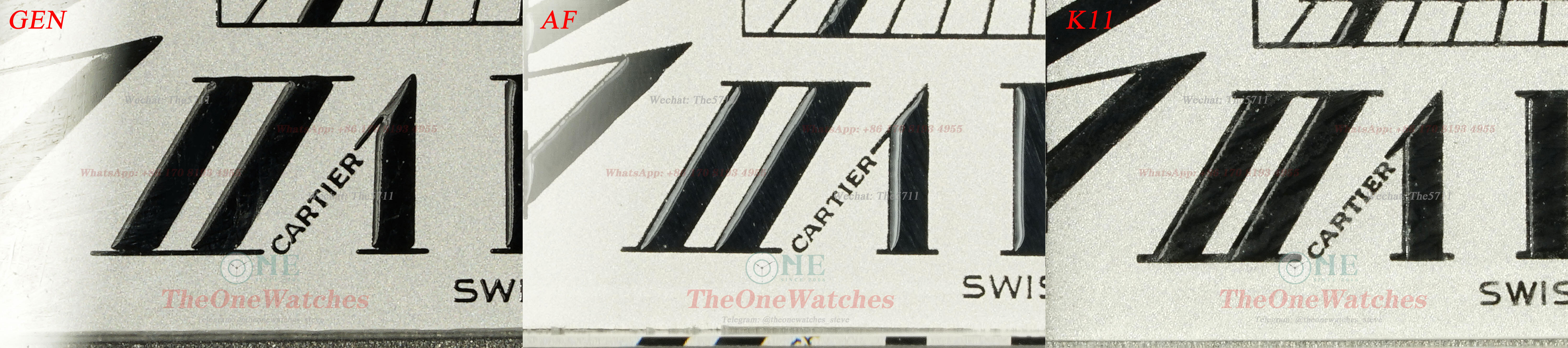
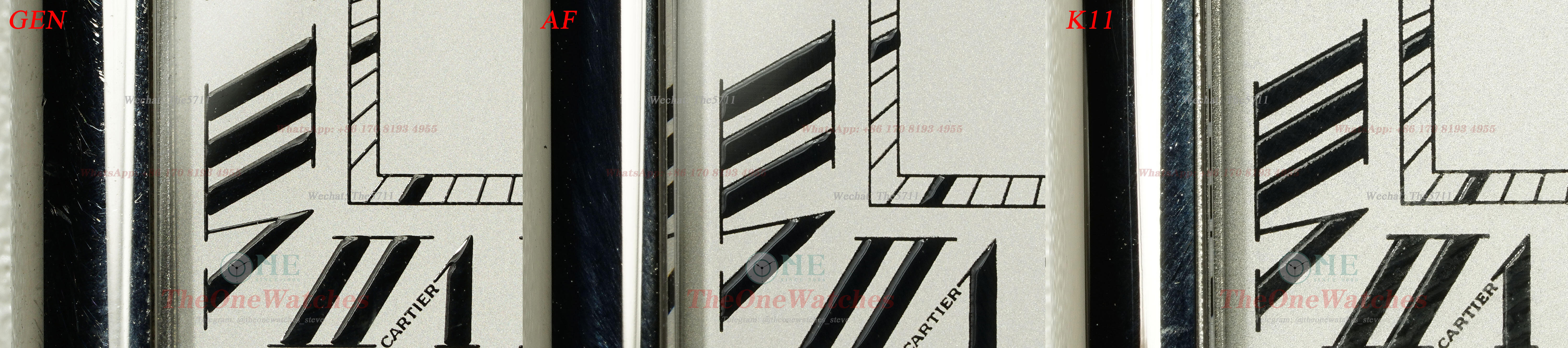
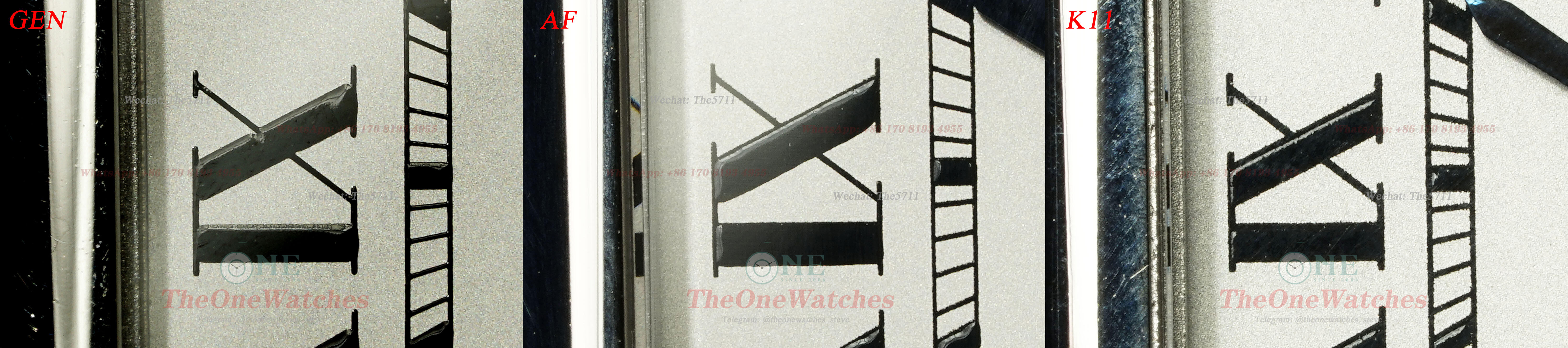
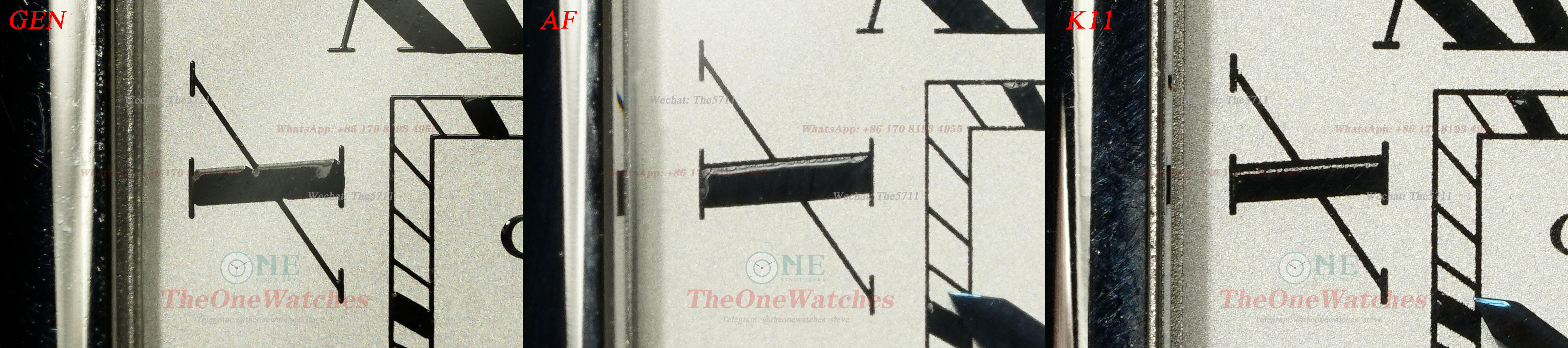
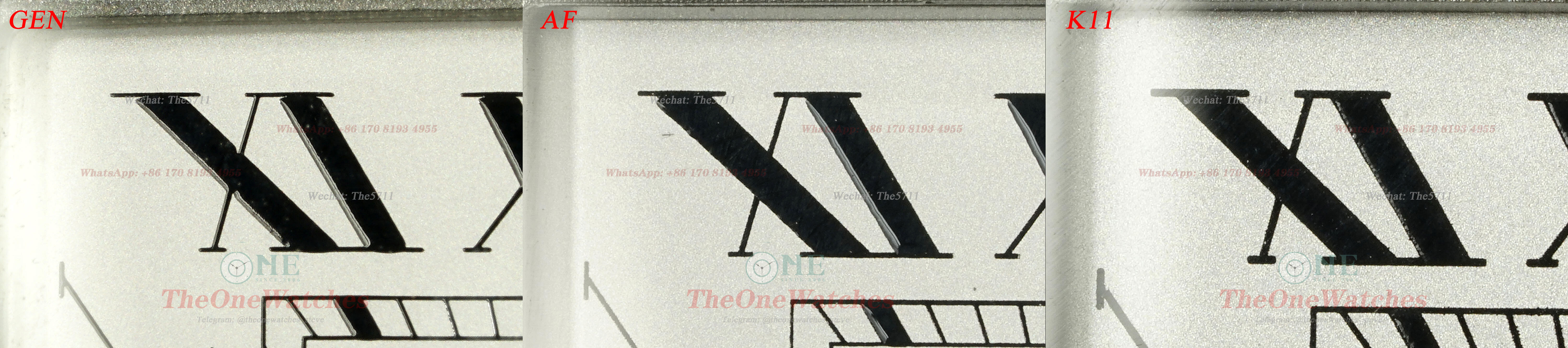
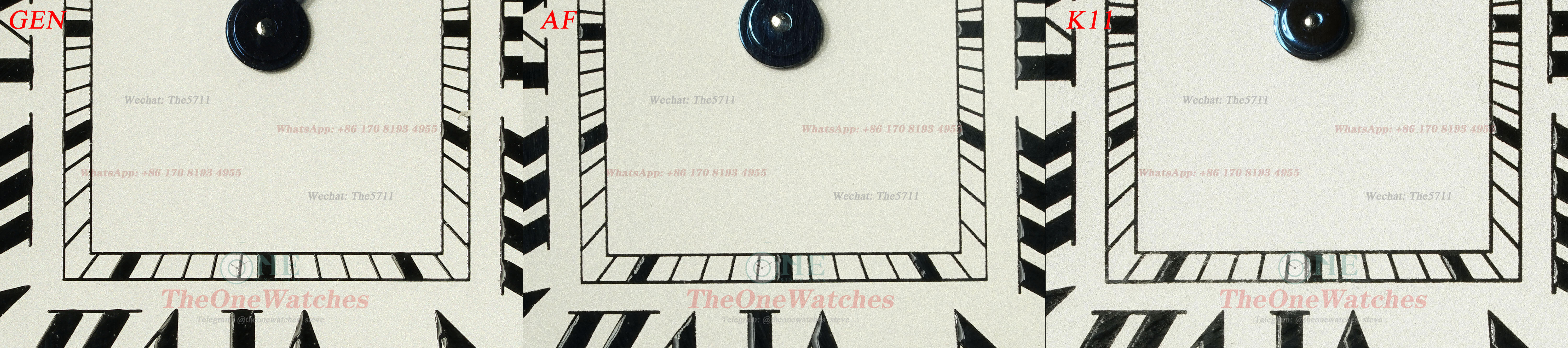
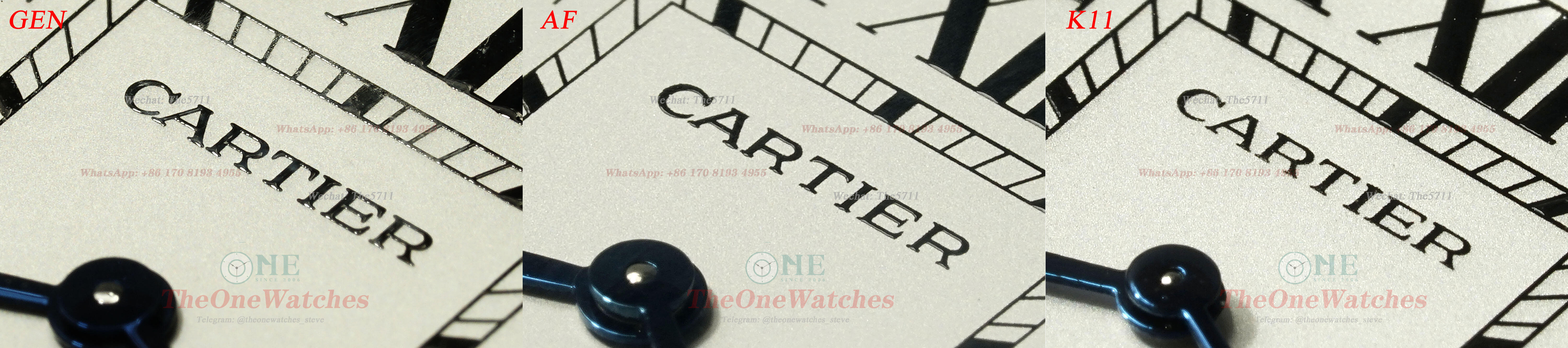
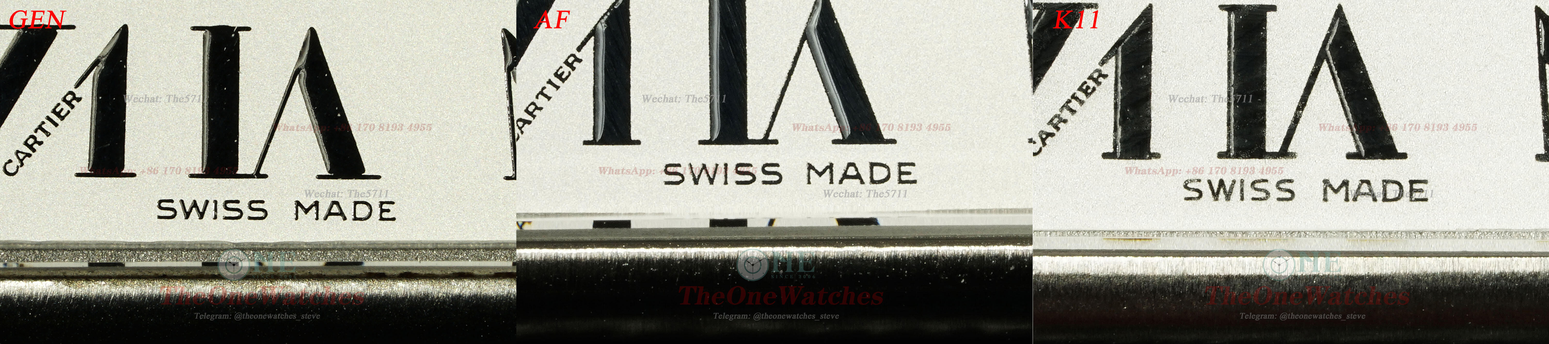
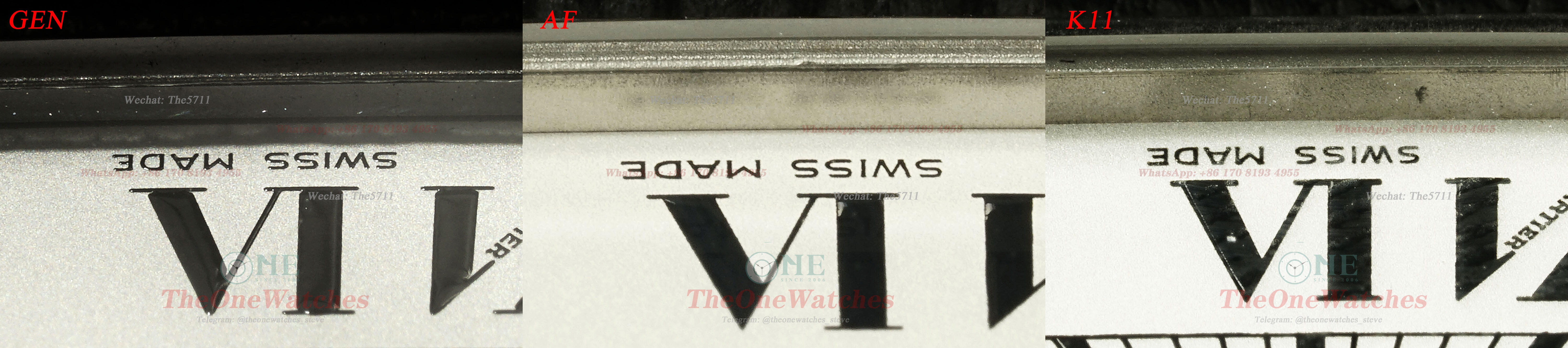
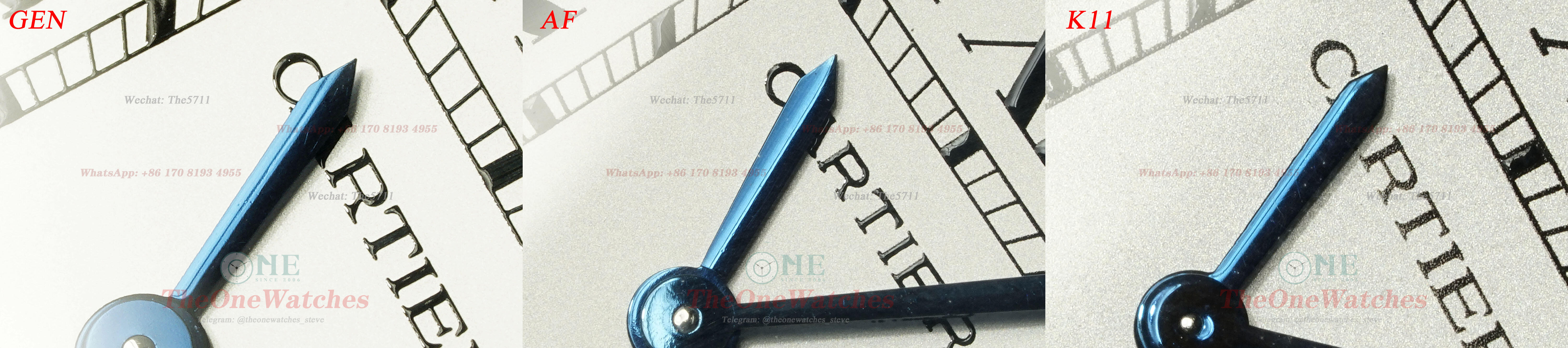
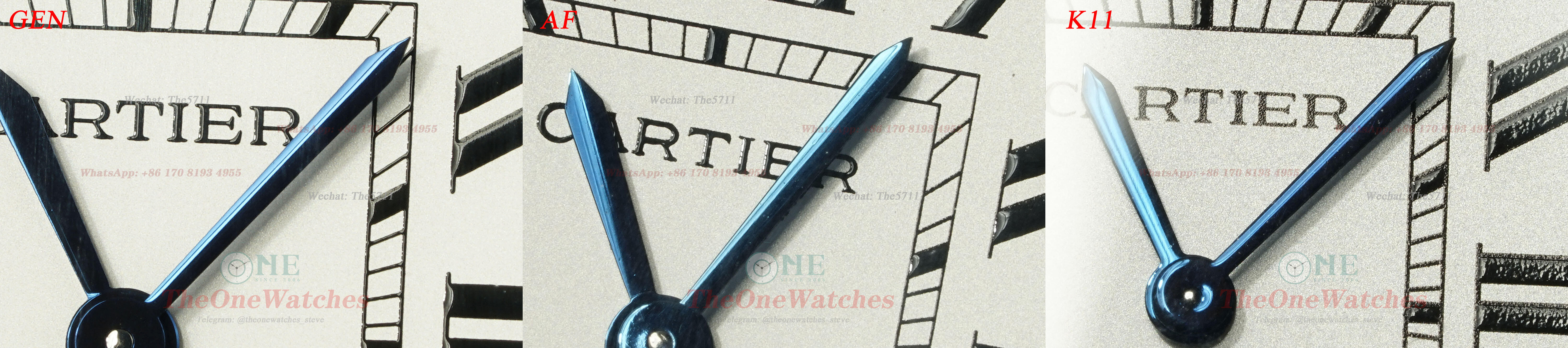
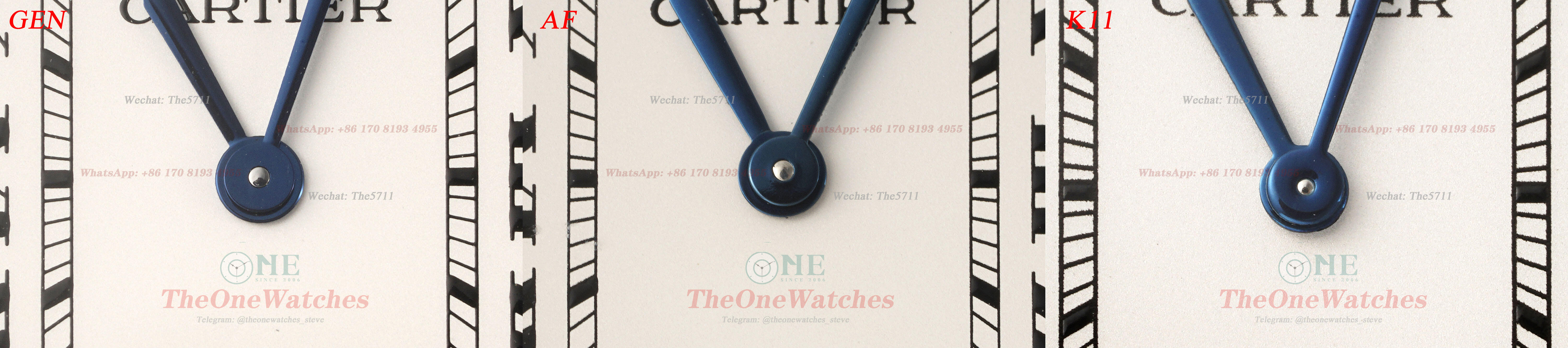
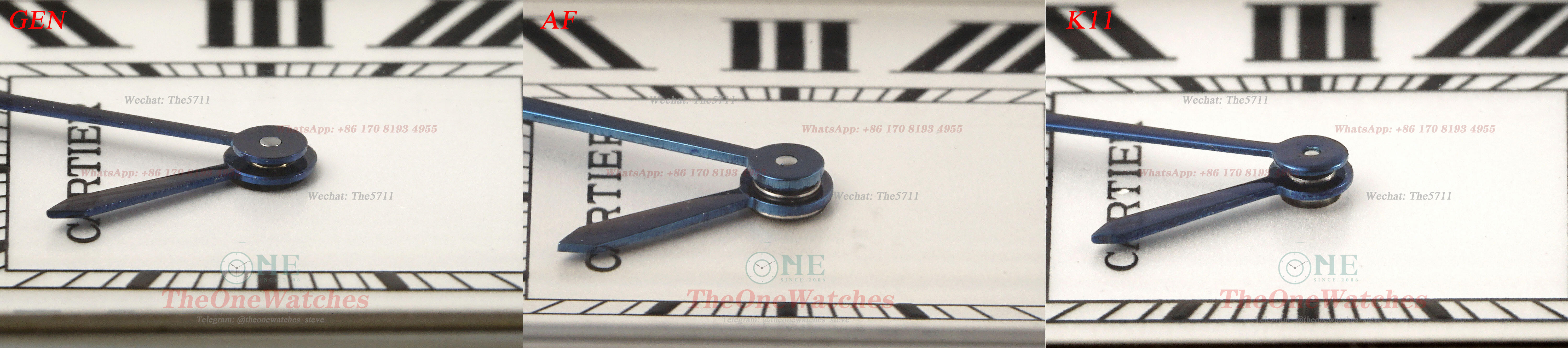
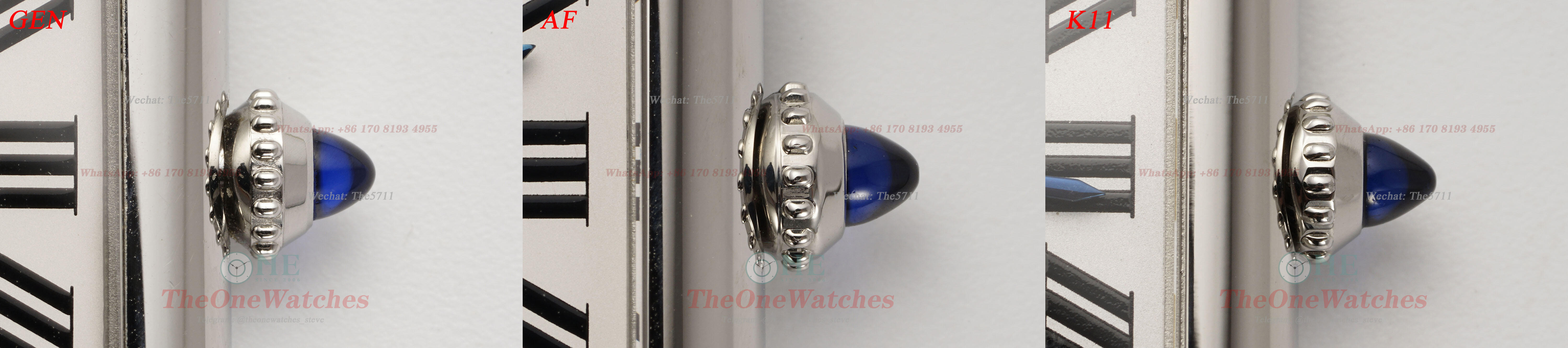
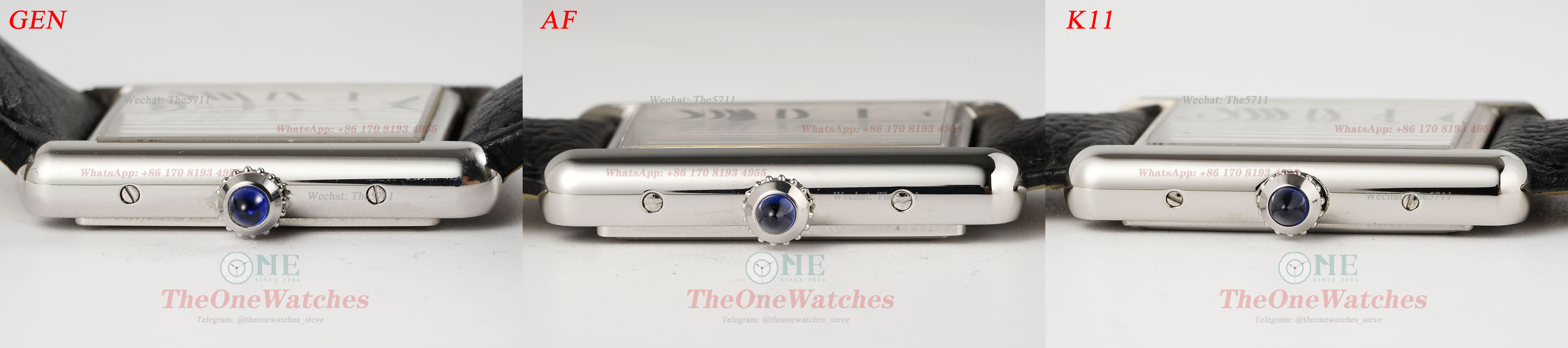
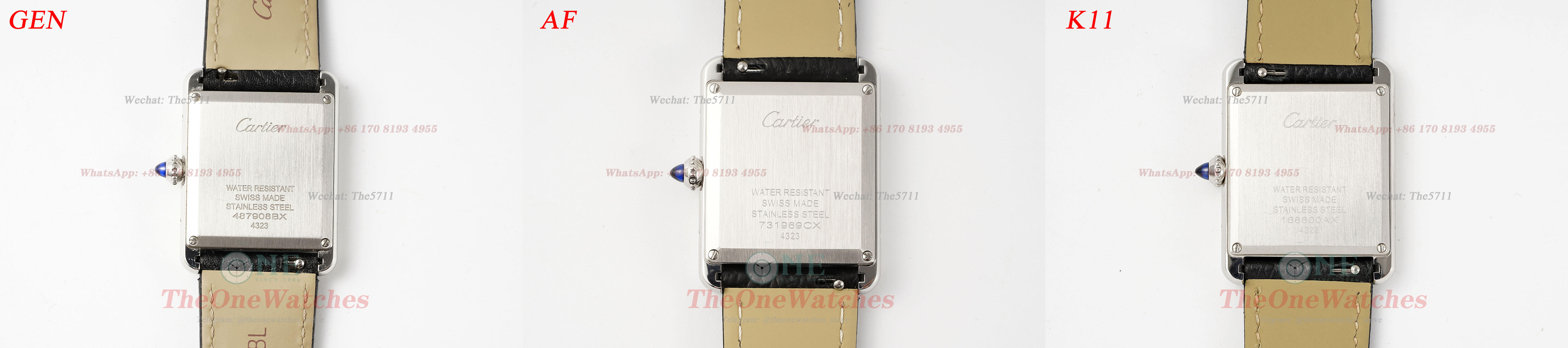
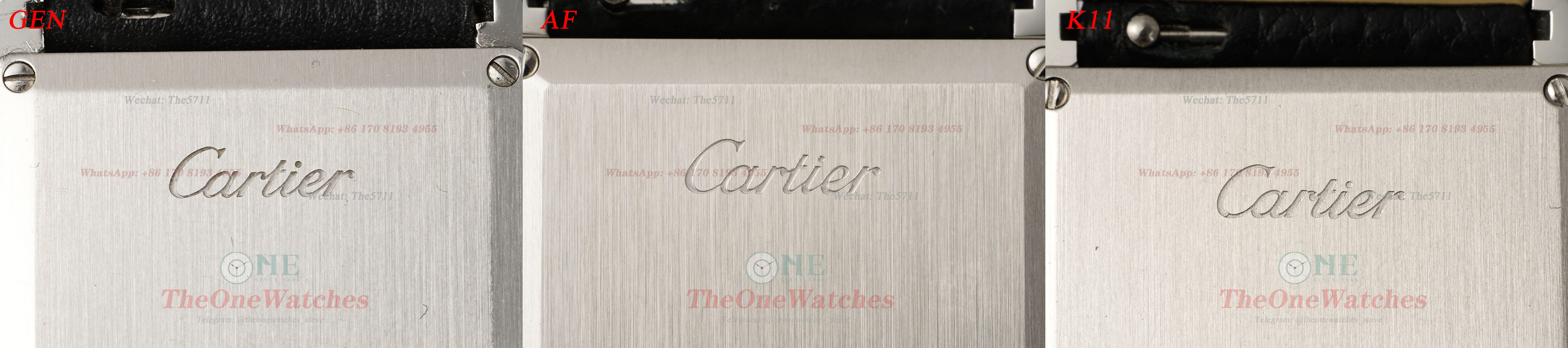
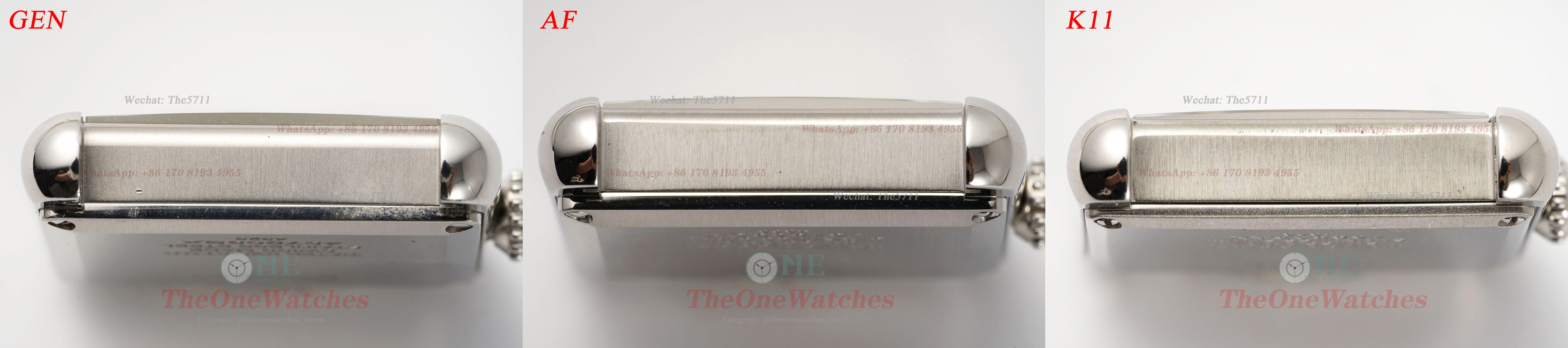
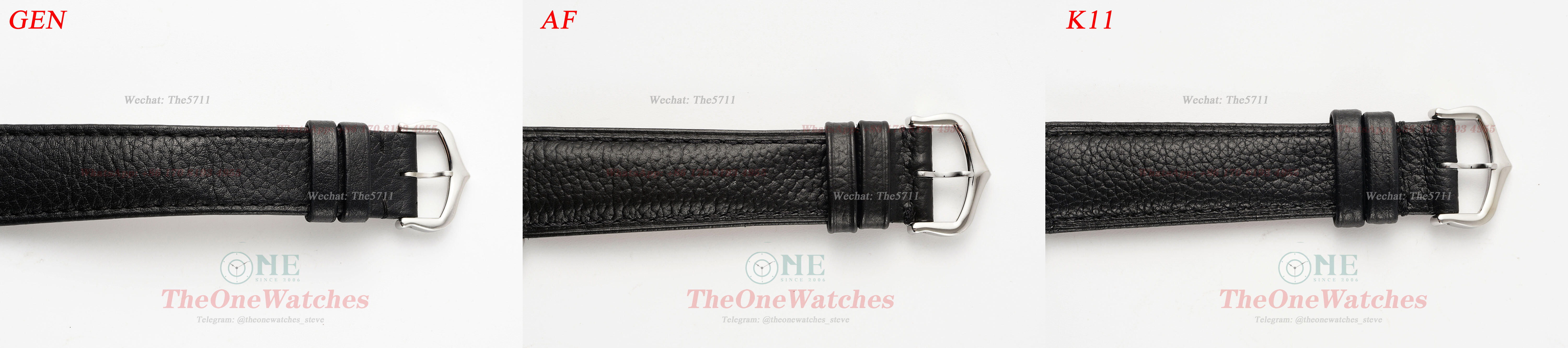
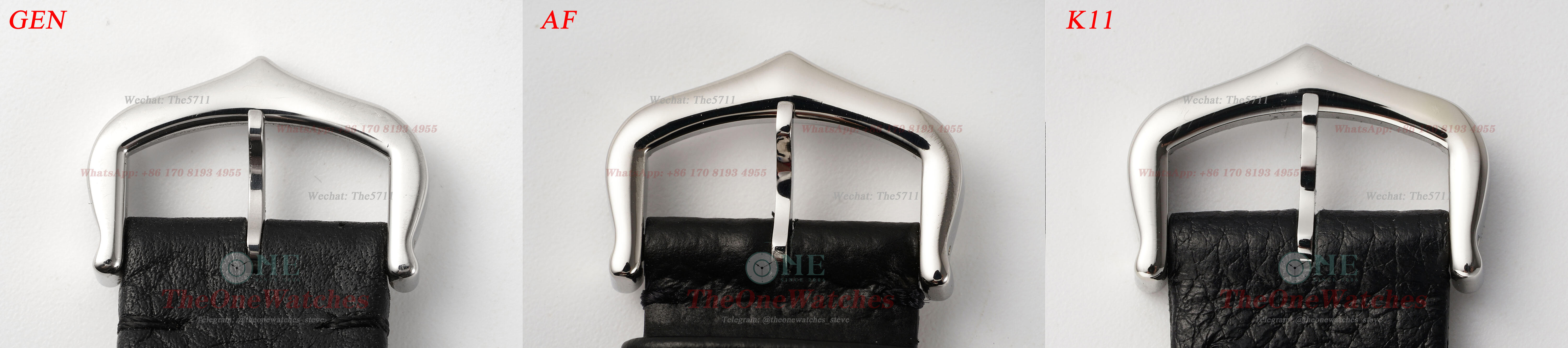
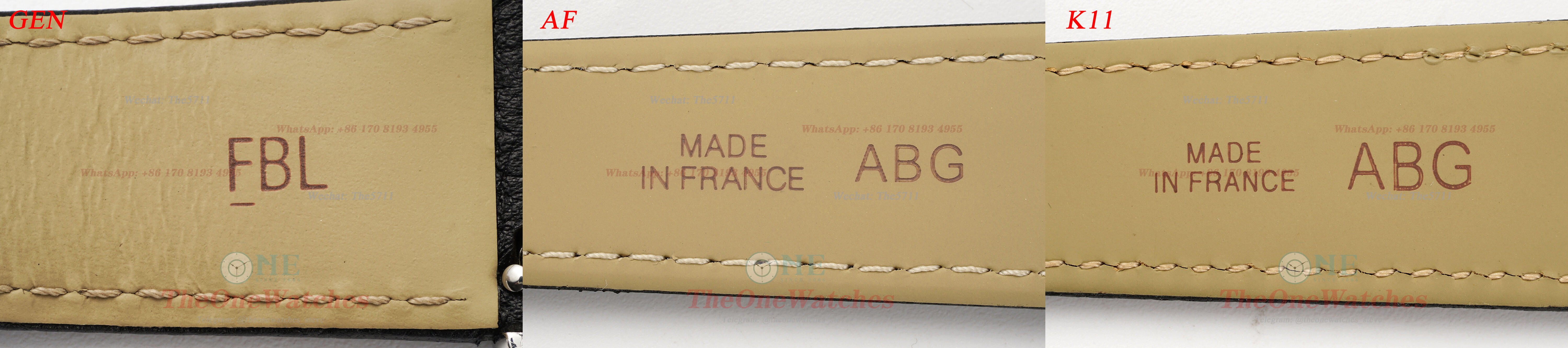
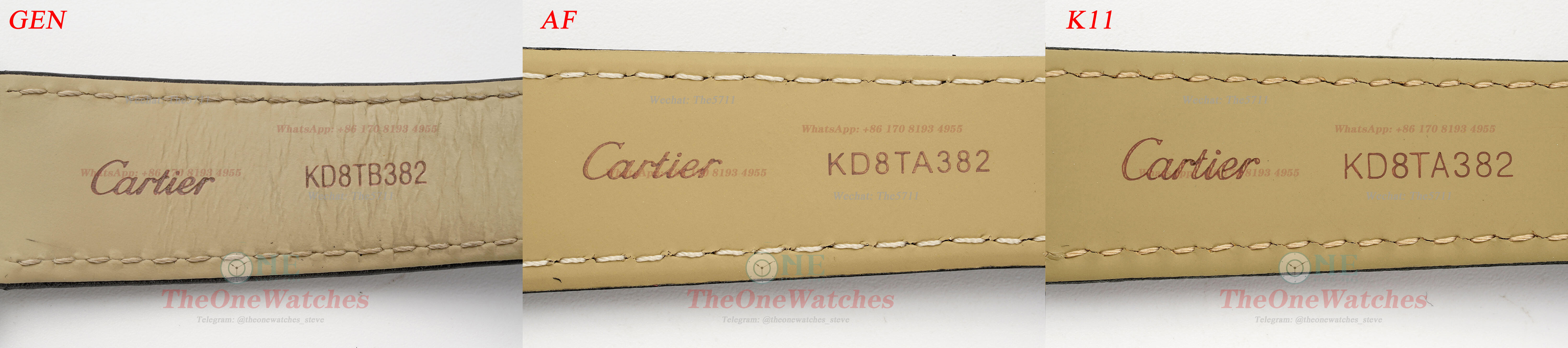
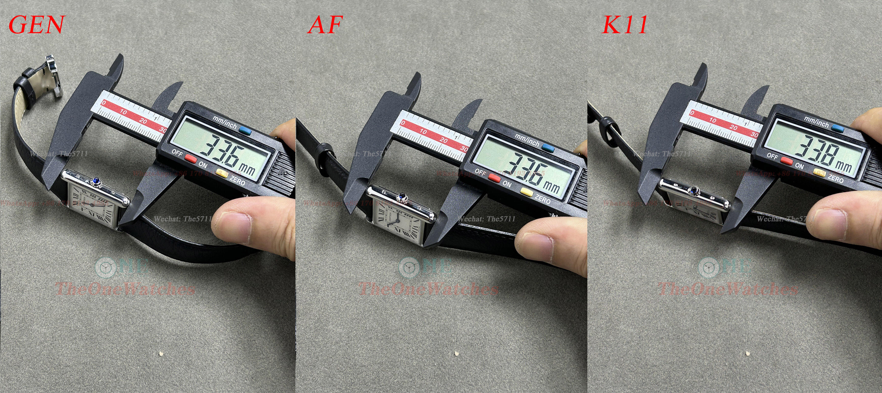
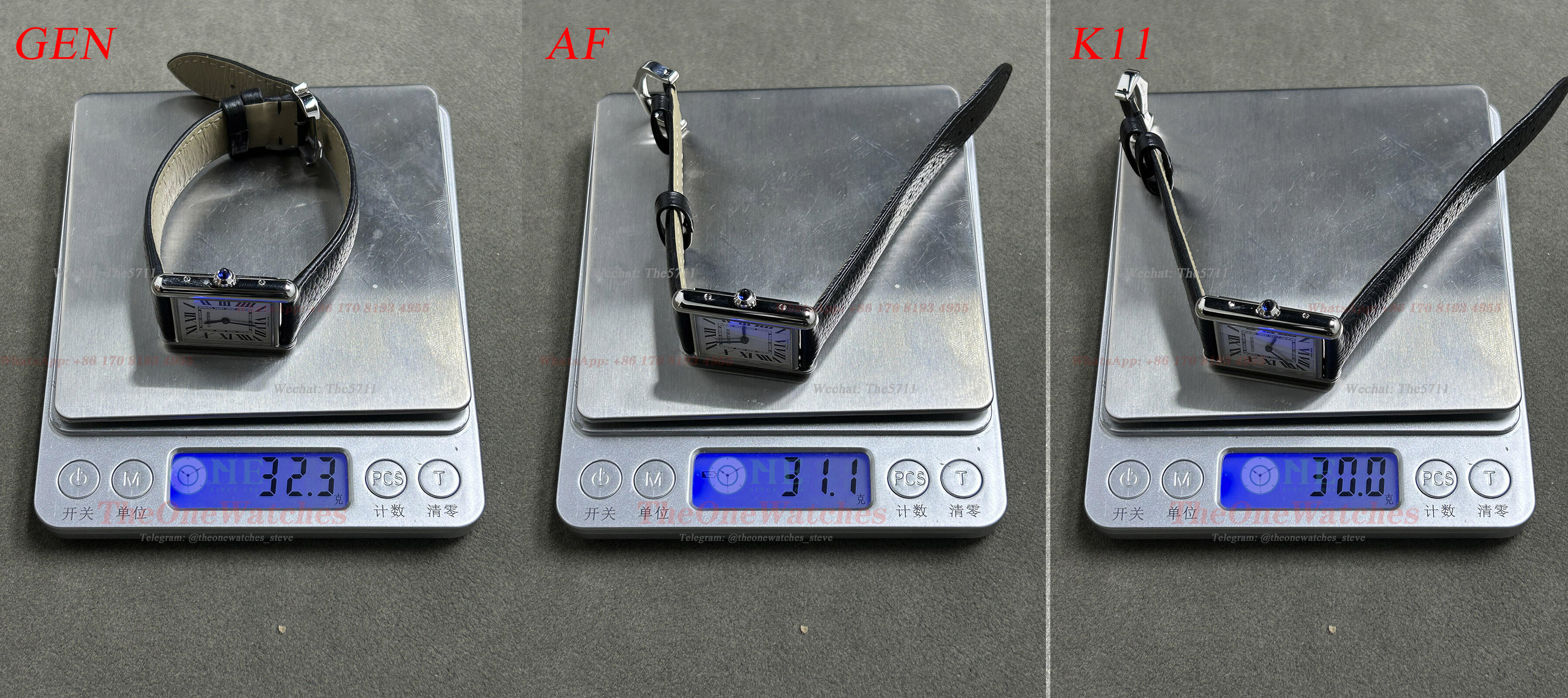
Hello, guys. I'm Steve and I'm back. We've been working on male models comparisons for a while now, until recently I realized that we hadn't done any female comparisons, so here it is. Although there are only two factories producing tanks, AF and K11, and most friends are familiar with the best options for this model, I think it's important to bring this comparison, after all, it is one of the few popular models for women. So without further ado, let's take a look at the current tank models available from the factory and see what they are really like. Dial front view View of the dial in natural light Under lighting View In fact, in terms of appearance alone, both factories have done such an excellent job that they have reached the point where it is hard to tell the real thing from the fake. At least when I compared the three watches side-by-side with their straps removed (I mixed up the three watches), I couldn't quickly tell which one was the GEN by the colour of the dial and the overall appearance, and that was my honest opinion. So which factory do you think is better? Side view of the Crystal The mirror edges of the GEN are chamfered, the horizontal side is very well finished by both factories, very close to the GEN, but the vertical side is a little different. View of dail font stick In fact, there is no difference between the two factories when you simply look at them with the naked eye, and it is easy to see from the macro photos in high definition that the K11's scales are not full enough, and there is hardly any sense of dimensionality. In addition, the overall neatness and the placement of the strokes are relatively better in AF. View of minute scale In the printing process of the scale of the few minutes, AF is also better. The edge of the scale line of K11 is not regular, and the spill over is more worse. On the thicker minute scales such as 5 and 10, the K11 has an obvious stroke, the white lines are visible in the picture, and I think K11 has done this to compensate for the lack of dimensionality in the scale. View of dial oil font The oil font on the dial is still better done by AF, although it is less full than GEN, but at least it has a certain sense of dimensionality, while K11 has none at all, and the colour of the letters is uneven, but it is not obvious to the naked eye. View of hands The colour of the hands of both factories is very close to that of the GEN, but it is not always the same, as there is a colour difference. The blue colour of both factories is brighter than that of the GEN when viewed from a down light perspective. View of hands central It is easy to see from the pictures that the centre of the K11 is not the same height as the GEN, which is slightly higher than the minute hand, while the K11 sinks very significantly, although the AF is in line with the GEN. In addition to this, I also noticed a problem with the K11 by comparing it side by side, the rounded part of the hand is also slightly smaller compared to the GEN. As for the AF, it's also not that perfect, the hands seem slightly thicker when viewed from the side, and that's just from the similarity aspect, actually, a thicker pointer is not a bad thing, what do you think? Side view of the crown There is no significant difference in the shape of the crown between the two factories compared to the GEN But the main difference is the brightness of the blue spinel, which is lacking in both factories, Comparatively speaking, the AF is brighter than the K11. Side view of the case As for the shape of the sides of the case, both factories are very good, and as for the nuances of the case diameters, you can see the comparative view of the data at the end of this article. We can also see the screw holes on the side of the K11, which are a little smaller. The AF is the same as the GEN, and the screw slots are very flat and clean. View of back case In the first picture we can notice that the width of the beveled edge of the rear bottom cover of the K11 is noticeably narrower, the AF is slightly wider but at least it is within acceptable limits In terms of the depth of the engraving, there is not much difference between the two factories. Detail of the strap The genuine product has a calfskin leather strap (with quick release), which doesn't feel particularly good in the hand. Just to clarify, as we purchased a second-hand GEN, we are not sure if the strap is original. Both the AF and the K11 have synchronised GEN straps, but the AF strap is a little thicker than the K11. View of the movement The great thing about quartz models is that there is no worry about errors and there are virtually no after sales problems. So if it's a gift for your wife or a girlfriend, the quartz feminine model is definitely the first choice. The AF and the K11 are both Swiss quartz movements, with different models, but there is no real difference, as they are both electronic anyway. Although the movement is not visible in the case of the solid case back model, the K11 is to be commended for its internal slotted construction Which was made in parallel with the GEN, this is a very careful approach, while AF has omitted the reproduction of the internal structure, but this does not affect the overall similarity. Data comparison chart Well, today's post is here, thank you guys for watching. If there are any mistakes, please correct me. If there is anything else I overlooked, you can put it up, and I will try my best to complete it. Welcome to comment and exchange! I will continue to bring you more detailed comparisons between replica watches and GEN’s. And it is also for you to choose the favorite models conveniently. Illustration: Some photos deviate from the real object due to the light source. For details, please refer to the content. The size of the comparison picture is relatively large, you can download it and enlarge it for comparison. There is no perfect replica, only the one you prefer. Website: https://www.theonewatches.ws WhatsApp: + 86-17081934955 Wechat: The5711


-
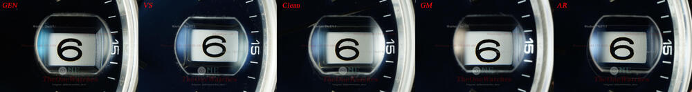
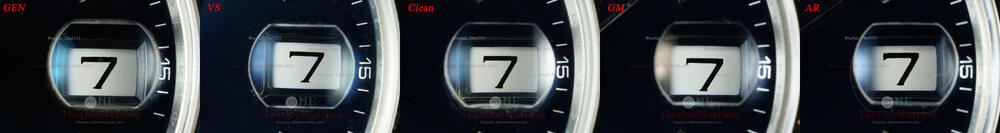
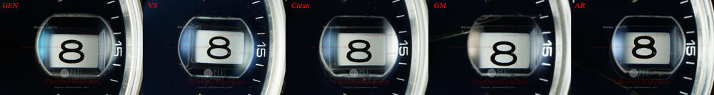
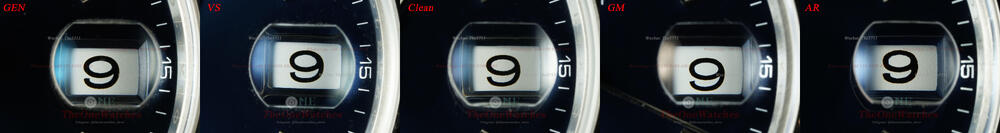
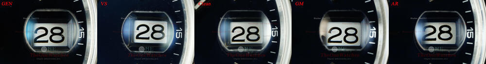
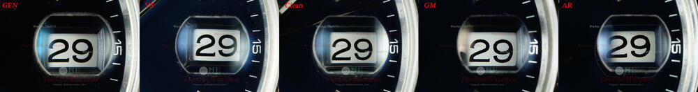
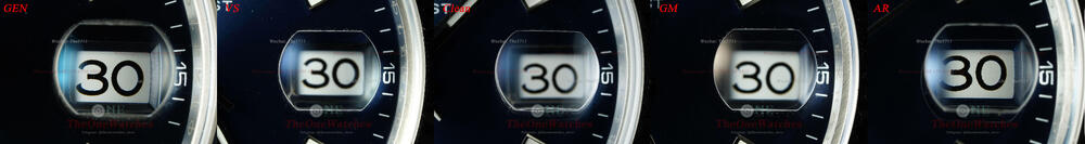
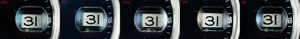
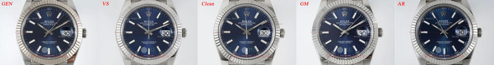
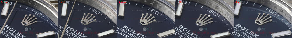
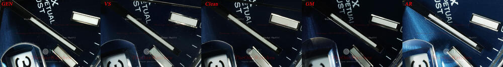
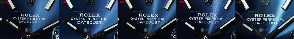
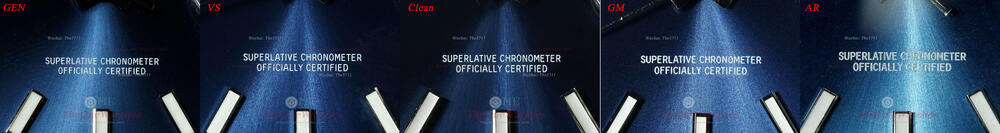
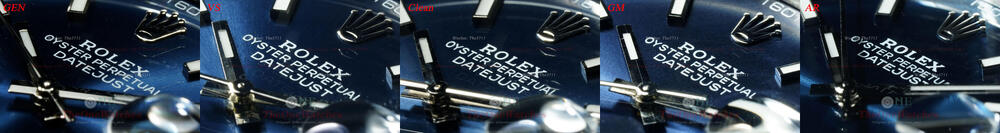
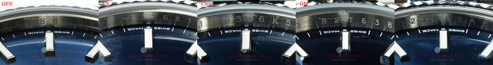
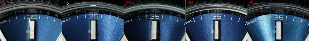
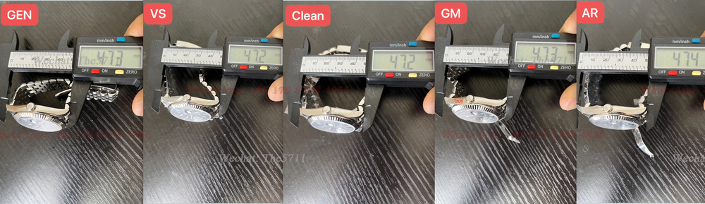
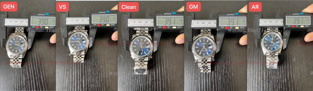
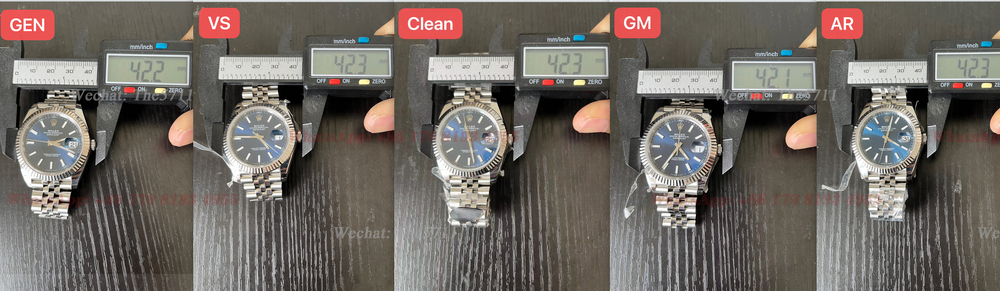
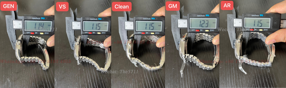
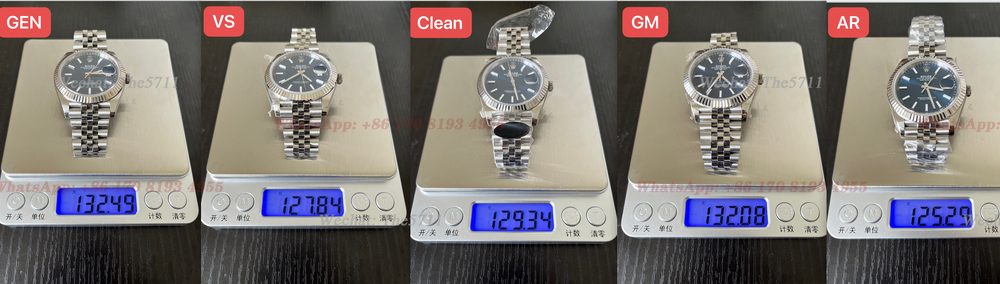
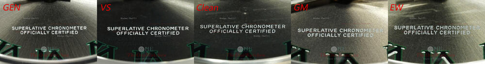
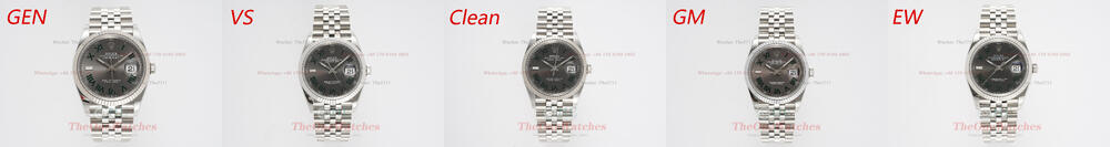
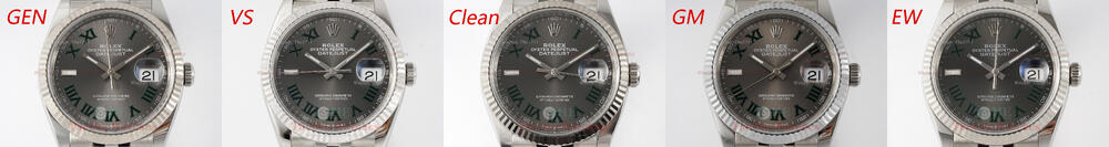
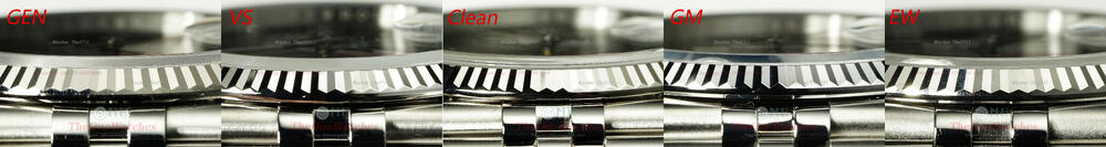
Hello everyone, this is Steve. Today we bring you a full comparison of the GEN Blue datejust 126334 with several major manufacturers! Let's get right to it! Front view There is unavoidable about the color difference in the blue dial, the GEN is a dark blue, the AR factory deviates the most and looks similar to a faded color! AR sunburst on the dial is too strong, VS is the closest to GEN, followed by CLEAN, GM is too indistinct! Bezel view VS, CLEAN and AR are all very good in the teeth shape, GM is on the long side and the angle of the triangle on the inner edge is obviously too small! Also the triangle of the AR is too smooth. Markers view The overall shape of the VS is closer to the GEN, VS is better filled, the downside is the lack of rounding of the sharp edges, the other three are still mainly due to the lack of filling of the inner edges, resulting in significant gaps. Clean's chamfering of the scales is still excellent. Crown side view It’s not very good to compare because the angle of the picture will deviate. But after I repeatedly observed the physical comparison, the four factories are actually similar, all still good, or maybe my eyes are not very good! I'll have to see what you guys have to say! Lume filling view All three are very good, except for the GM, which is too smooth, and the AR is the grainiest, for the C, which is the closest in color and texture to the GEN! Engraving font view The VS and Clean are very flat, the GM and AR font have uneven edges, especially the AR! As we can see, GEN's type is very glossy, something that all the factories lack! We noticed through the macro lens that GEN's ink printing is much fuller, but if you look at it from the naked eye, other factories do a good job, except AR, which can be noticeably different Hand view The shape of the central axis of the hands, VS factory and C factory have done skeletonized solid structure, but C factory's central sleeve position, flatness is very poor, GM and AR's sleeve position is completely closed, and is very different from GEN. From the side view, the whole arrangement of VS and GM is very close to GEN, AR appears too dense. Crystal Giant Side View The overall translucency of all the factories is fine, and the cross-sectional chamfers of the windows are best polished by the AR factory! 1-31 calendar display view There's nothing much to say about this! You can compare for yourself if you want to. Rehaut view The GM factory engraving has some darkening and looks a bit like rust; for the AR factory, the engraving looks a bit too light in person, both VS and Clean are still quite good Case side view All the factories are fine in terms of case type, and there are no significant differences! Sel view First, we can check the location of arrow pointed, the layered VS on the side of the bezel is the closest to the GEN, which is commendable, followed by the AR, which is less pronounced in the C factory, and the GM, which is almost flat. Then where the lugs meet the headstock, VS and GEN are the same, GM is not too bad, VS and AR are almost flat. Strap view The VS and CLEAN both use AR steel straps, but the GM steel strap does feel a little different than the AR! The engraving is still a far cry from the GEN. Case back view The same old problem as in the C factory, a ring around the bottom of the teeth, spillover from the brushed lines, unevenness! Lume view The stripes on the bezel are very strong for VS, weaker for C, and almost non-existent for GM and AR. Laser view GEN's irregularly arranged crown pattern is always a problem for factories! And we don’t need to be too concerned! Comparative chart of various data Note: All measurements are taken in a calibrated state and may be inaccurate due to slight deviations in caliper position All the replicas haven't take off the plastic protector. the VS and GM have removed the steel strap protector as you can see, the GM is closest in weight to the GEN ! Well, that's it for today's post, thanks for watching, if there are any mistakes, please correct me, welcome to comment and exchange! We will bring you more detailed comparisons between the replicas and GEN later, also to let you better choose your favorite style replicas, you can leave a comment on what style you are more interested in! Description: (Some of the photos have deviated from the real thing because of the light source, the details are still based on the text, the size of the comparison pictures are relatively large, you can download them and enlarge them for comparison.) There is no perfect replica, only the one you prefer. Website: https://www.theonewatches.ws WhatsApp: + 86-17081934955 Wechat: The5711


-
Due to the impact of the raid, vs factory is currently slow to ship, need to pre-order, please contact our whatsapp or email to confirm the inventory
-
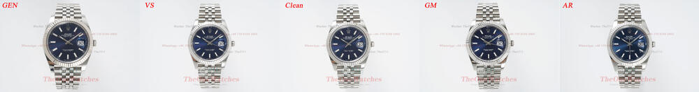
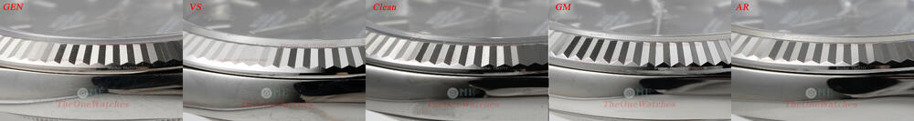
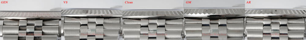
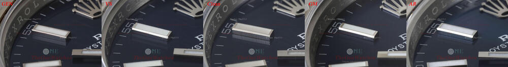
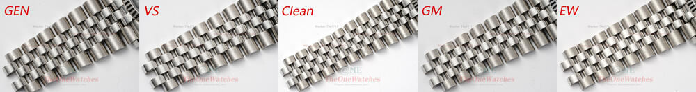
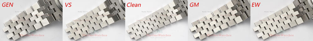
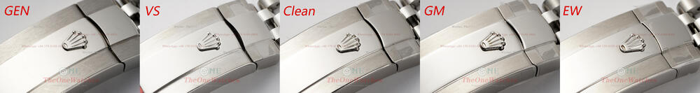
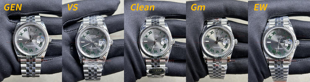
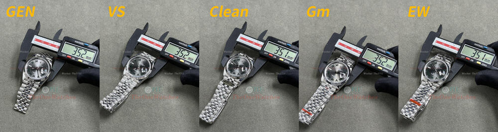
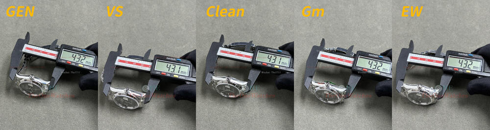
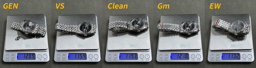
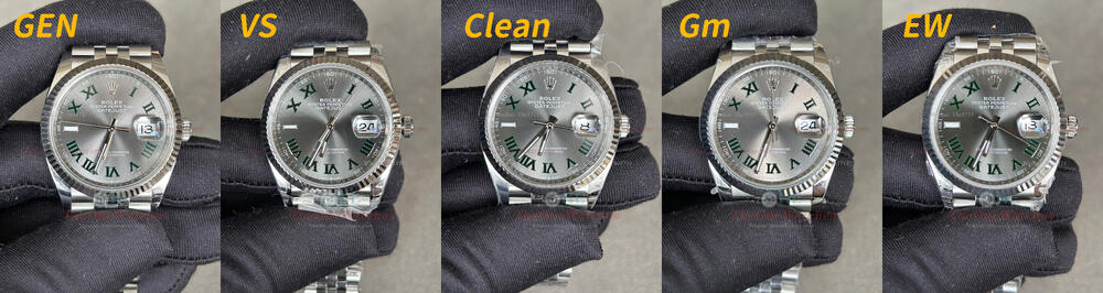
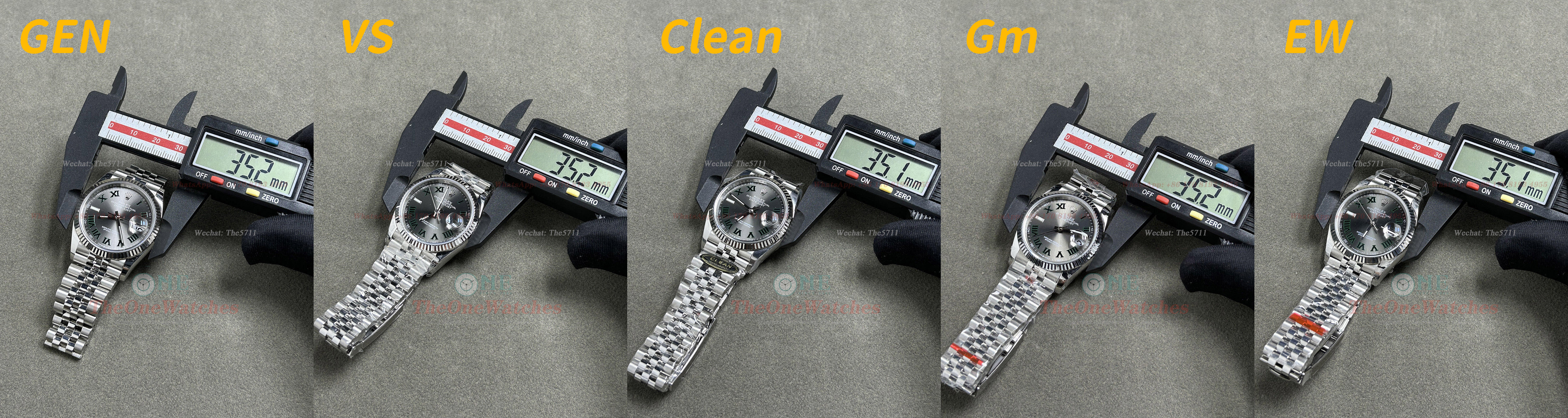
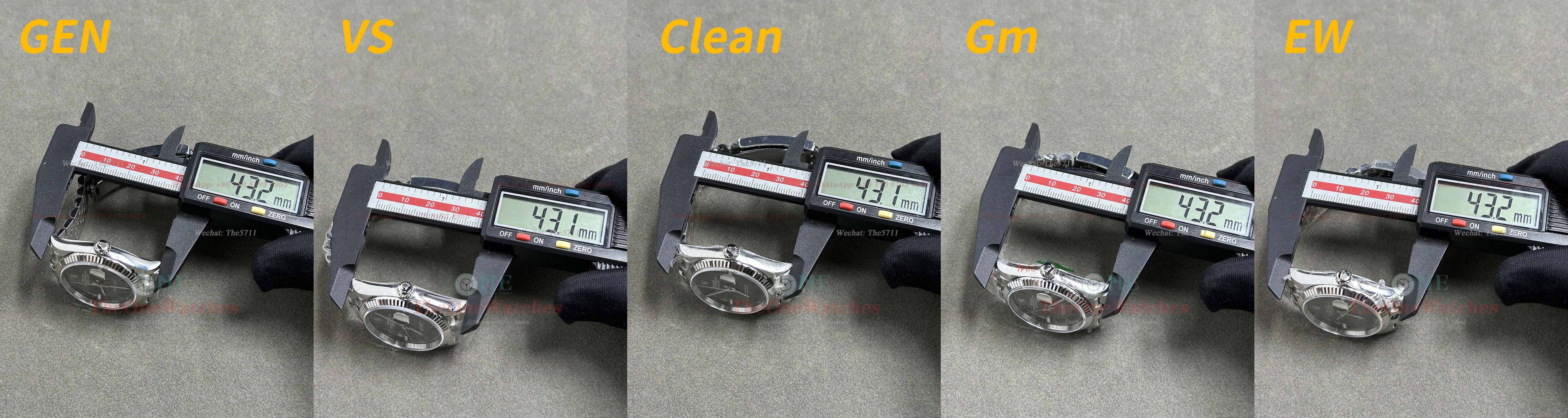
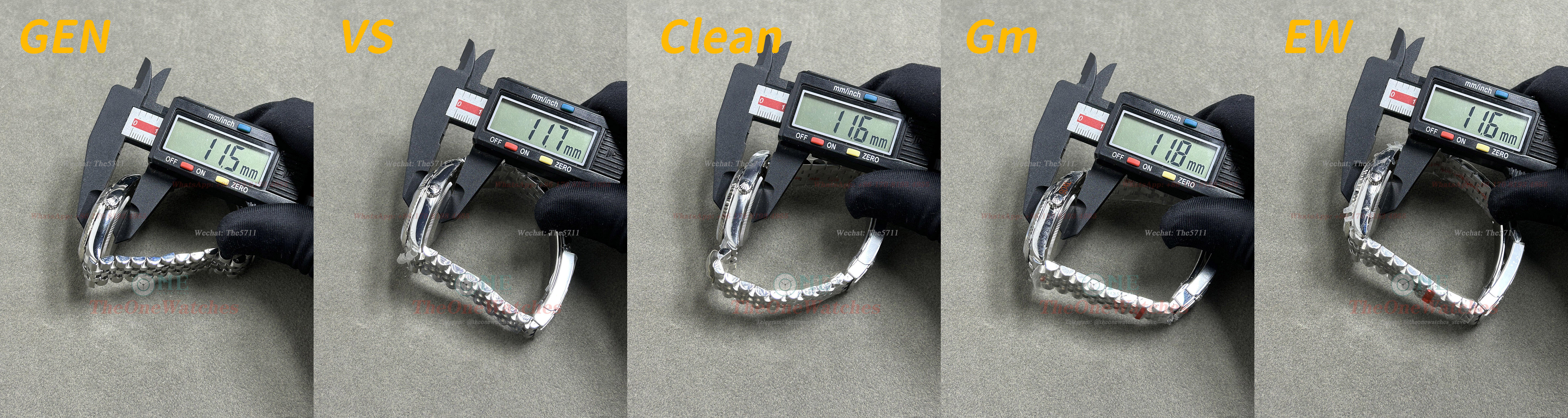
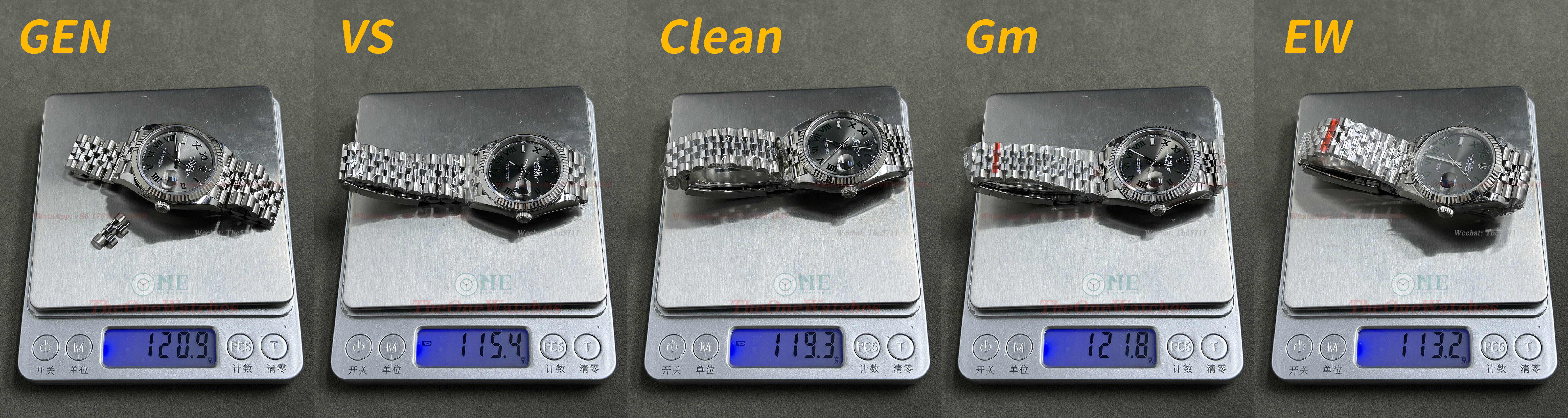
Hello everyone, this is Steve and I'm back. The 36mm datejust series was always competed by the old factories GM and EW before, Since the second half of last year, as the two top factories VS and Clean joined the 36mm datejust camp, you guys has more choice in this series. Many friends left a message "I want to see the comparison of 36mm datejust", so the time is coming, let's take a look at the standards of VS and Clean as latecomers, will GM and EW be able to keep the position of the datejust 36mm series? Without further ado, let's get started. Front Dial View Natual Light View Light View In terms of dial color, compared with GEN, VS, CLEAN, and EW have better control, and the color is only slightly darker, while GM has the largest color deviation with obvious brown tone. In addition, the sunburst of GEN is very obvious, while VS and CLEAN is slightly lack of sunburst, and the sunburst of GM and EW is more obvious. Crystal Side View In terms of the edge chamfering of the crystal, the chamfering thickness of GM is the closest to GEN, while Clean and EW are slightly thicker. VS did not process this step. Bezel Side View There is no obvious difference in the surface shape of the fluted bezel between factories by the naked eyes. However, they differ in color. The GEN has a platinum bezel, so it has a distinct yellow hue. The Clean and EW are plated with platinum, which also has a yellow tint. VS and GM ignored this step, so it is silvery white. Crown and 9 o’clock Stick View Factories are almost the same in Crown’s shape, and the edge chamfering is more obvious of Clean. For the stick at 9 o’clock, VS and Clean have obvious flaws, as everyone commented on the “mini version of the 9 o’clock stick”, this stick of the two factories are obviously longer and narrower. In terms of shape and size, GM and EW are obviously closer to GEN. The slight disadvantage is that there is no edge chamfered treatment of EW, while GM is only chamfered the front of stick, but not chamfered the side. Mimeograph Markers Front View The black part of the mimeograph stick, factories has a good three-dimensional effect. In the green outline part, the colors of VS and CLEAN are closest to GEN, GM is darker, and EW is too bright. The difference is not obvious by naked eyes in reality. When you zoom in the picture, you can see that there are more or less flaws in the replica, which cannot compare with the smoothness of GEN. Hands Front View The luminous hands of the factories also have a certain graininess. For the sides of the hands, GEN is very clean, but the factories have some burrs. Painting Font View Considering factors such as font shape, fullness, and regularity, we can see that the mimeographs made by the four factories performed very well. Middle Axis View For middle axis, Clean is the most similar shape with GEN, if the solid axis of Clean is raised a little more, it can be said to be almost exactly the same with GEN. In contrast, the other three factories are slightly different. The treatment of VSF is very neat, while there are obvious weld marks on the middle axis of GM and EW. Rehaut Side View Although the factories are different in engraving of rehaut, it is difficult to see the difference by naked eyes. The serial number of GM appears to be slightly thinner. Calender Window View For calender window, there are blue light coating of the three factories except for the GM. In terms of shape, there is no big difference of the four factories. Case Side View For the shape of the case side, you guys could compare them directly if interested in. SEL View We can see from the first picture, for the truncation surface layers of bezel edge, VS is the closest to GEN (GEN has three layers) While the other three factories only have the same side layers as GEN, and did not show the bottom layering. In terms of the junction of the strap and the lugs, all factories are basically consistent with the GEN factory in the height of protrusion. Caseback View Bracelet Details View In general, Clean and VS do better in the engraving inside the buckle. They perform well, both in terms of shape and depth. GM and EW is slightly insufficient in this part. Laser Mark and Lume View For laser marker, although the shape of EW is not exactly same as GEN, it is the closest to GEN, especially the whole shape looks like a messy arrangement. We can zoom in the luminous picture and check the luminous effect carefully. The graininess of replicas is very clear. Data Comparison View (Note: All measurements are in a clamped state, and there may be tolerance due to slight deviations in the position of the caliper. All protective films on steel strap of replicas are not torn off.) Well, this is today’s post, thank you guys for watching, if there are any mistakes, please correct me. If there is anything else I overlooked, you can put it up, and I will try my best to do it complementary and comprehensive, welcome to comment and exchange! I will continue to bring you more detailed comparisons between replicas and GEN, which is for you guys to better choose your favorite replicas. (Note: Some photos deviate from the real object due to the angle of the light. The details are mainly written in text. The size of the comparison picture is relatively large. You can download it and enlarge it for comparison.) There is no perfect replica, only the one you prefer. Website: https://www.theonewatches.ws WhatsApp: + 86-17081934955 Wechat: The5711


-
In actual VS factory return repair rate is much lower, comprehensive consideration more recommended VS factory
-
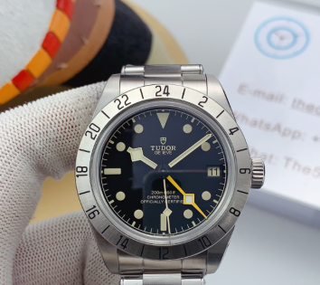
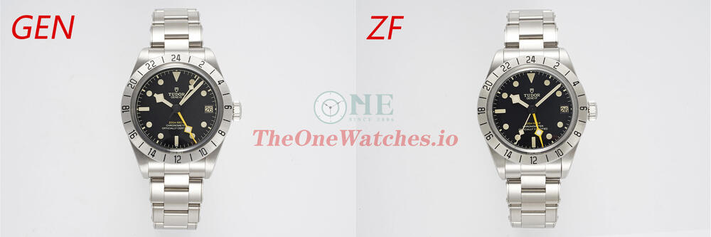
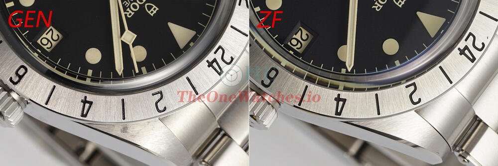
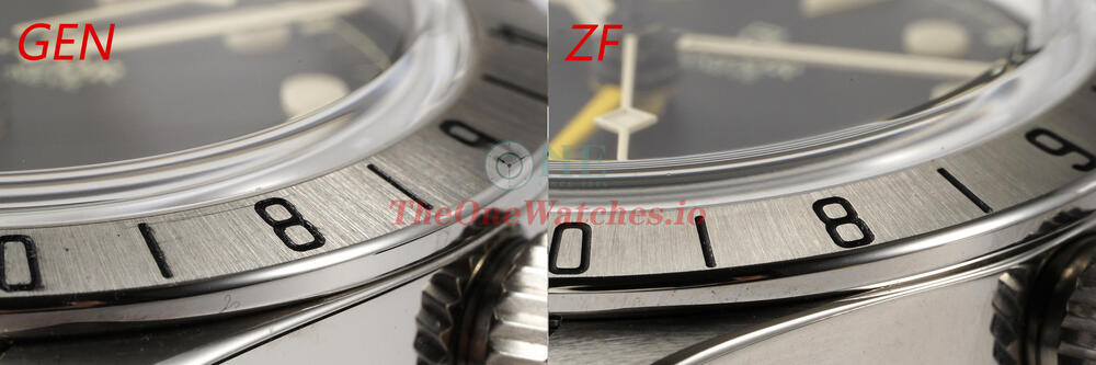
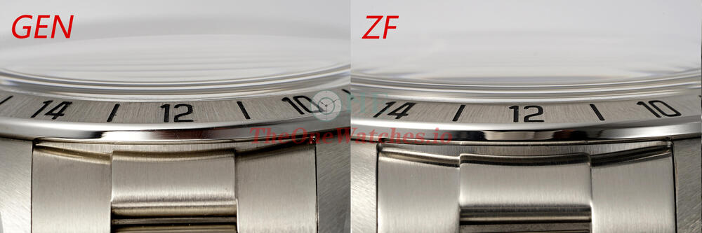
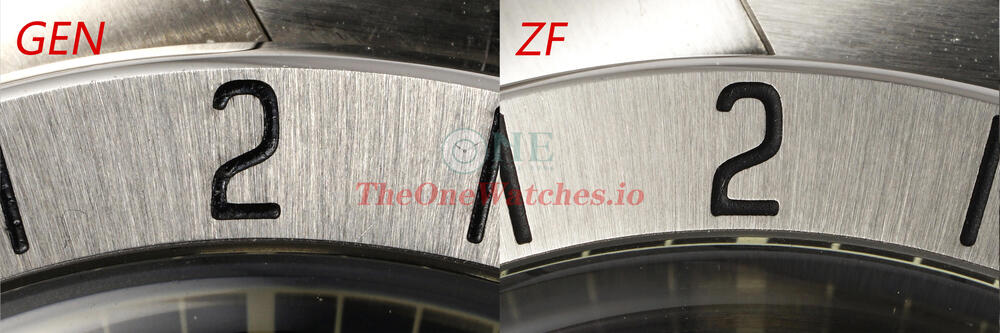
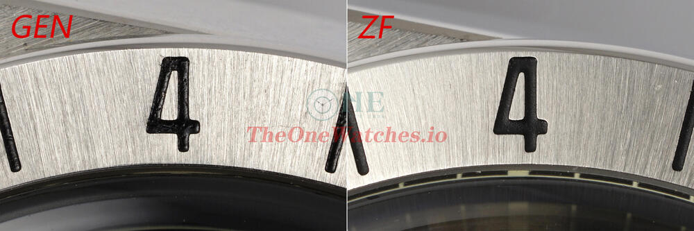
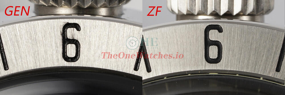
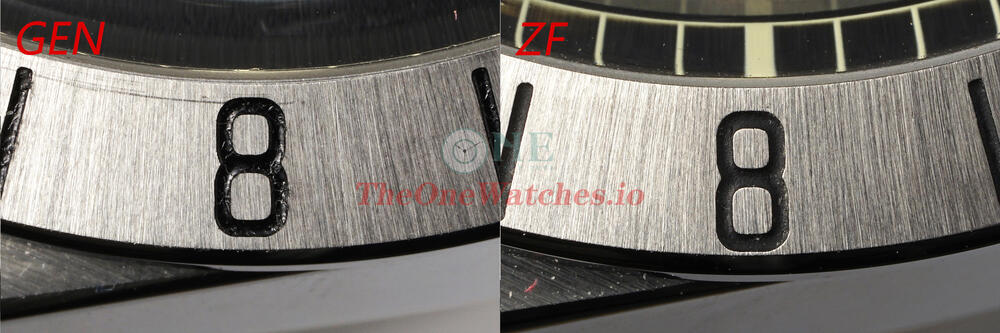
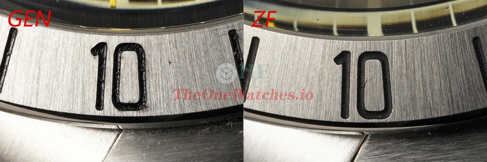
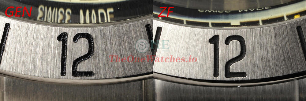
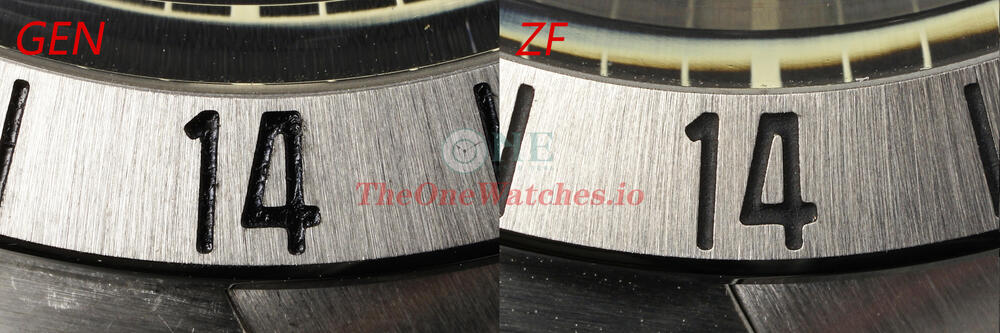
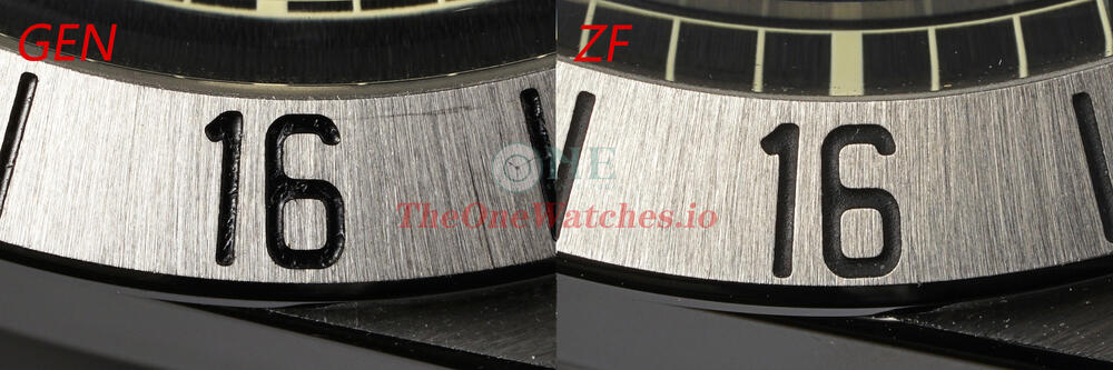
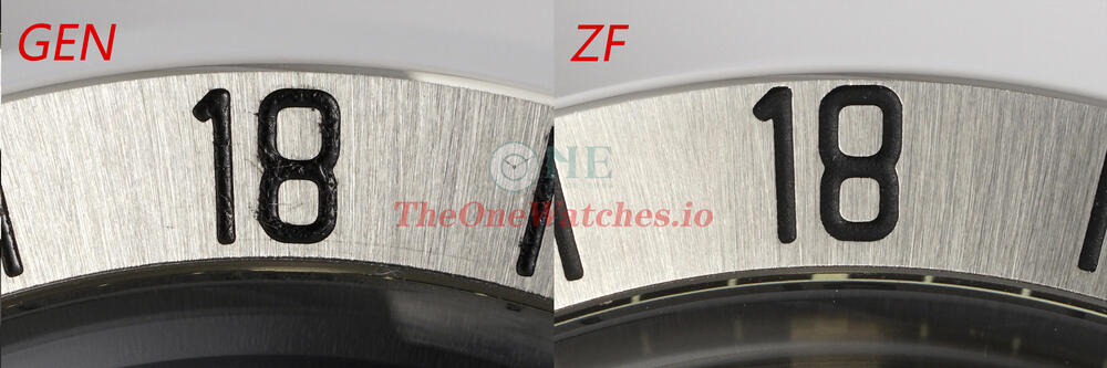
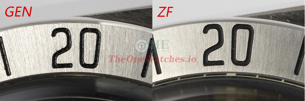
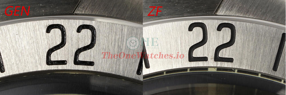
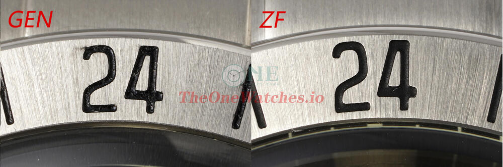
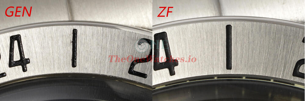
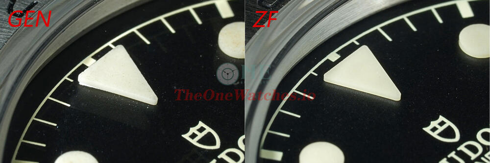
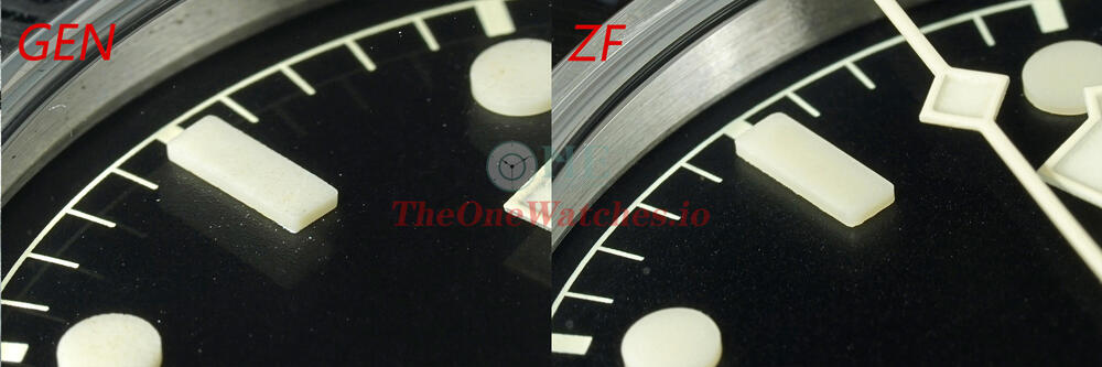
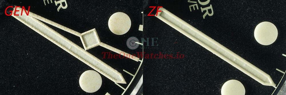
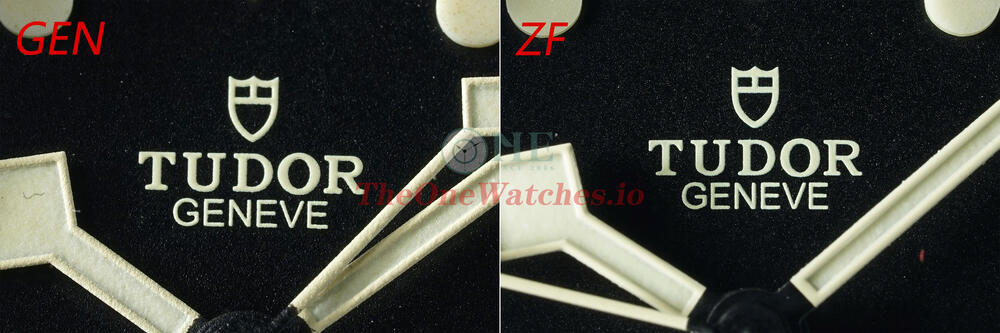
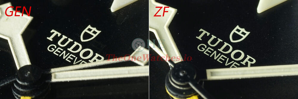
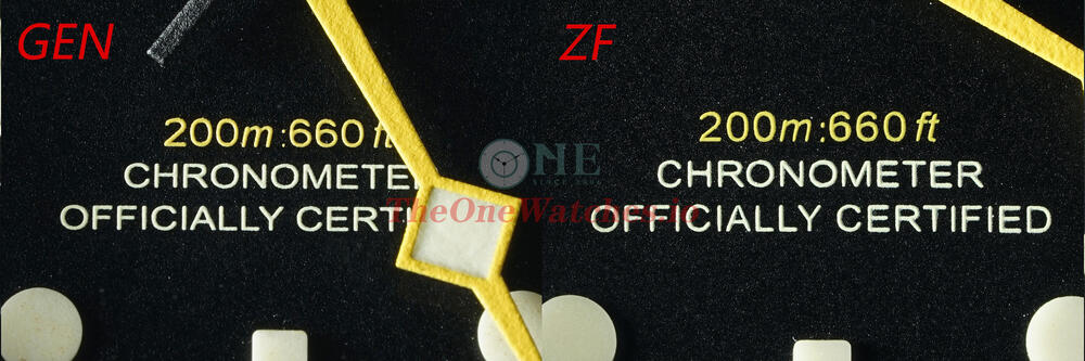
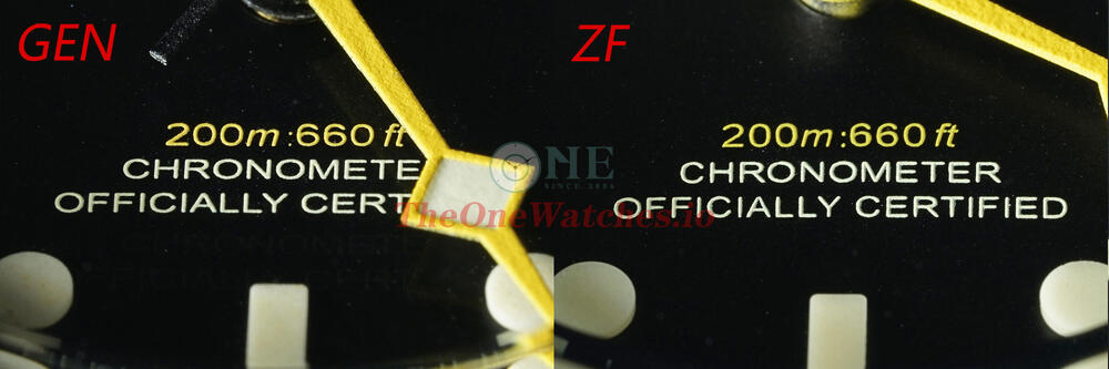
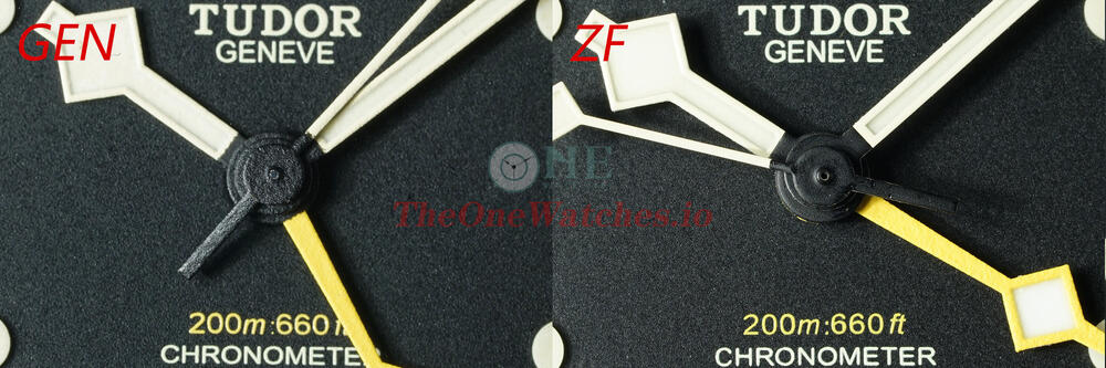
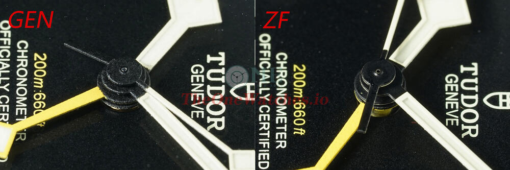
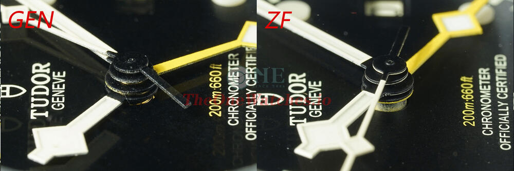
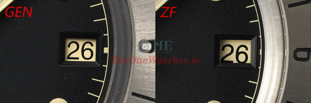
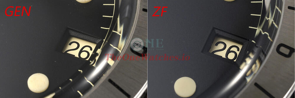
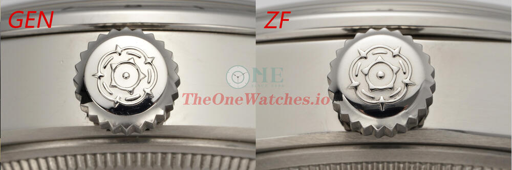
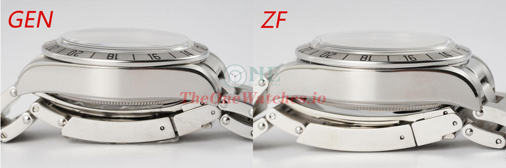
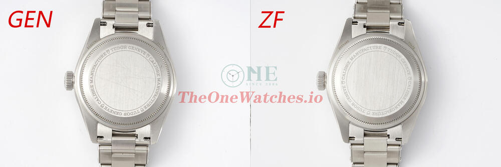
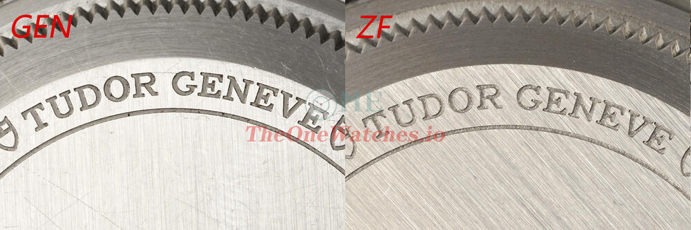
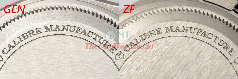
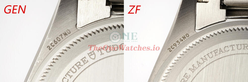
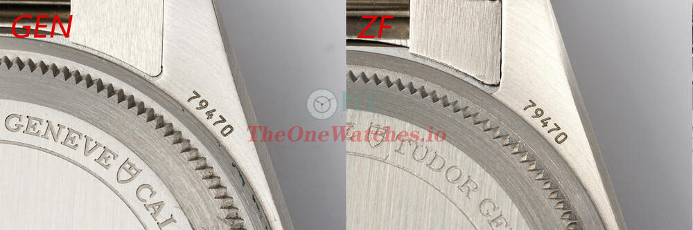
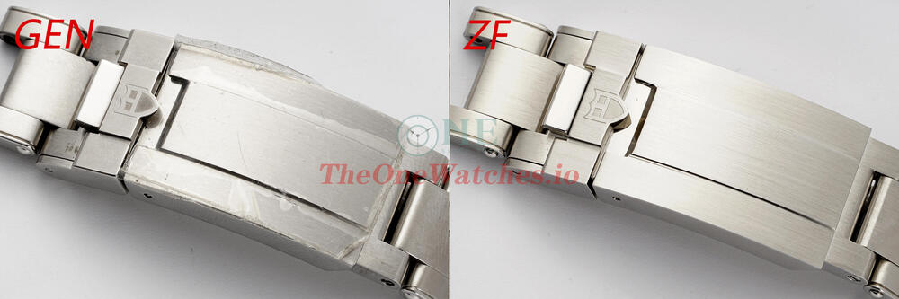
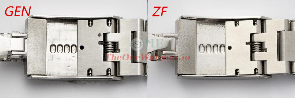
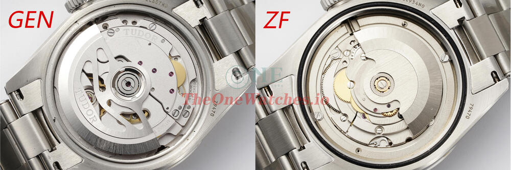
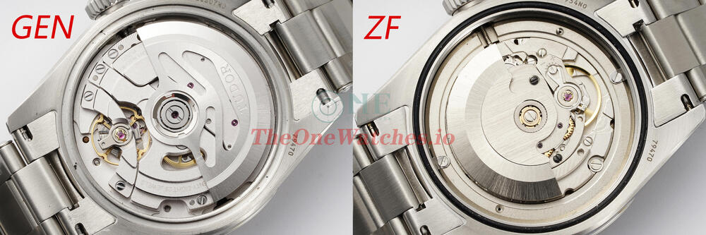
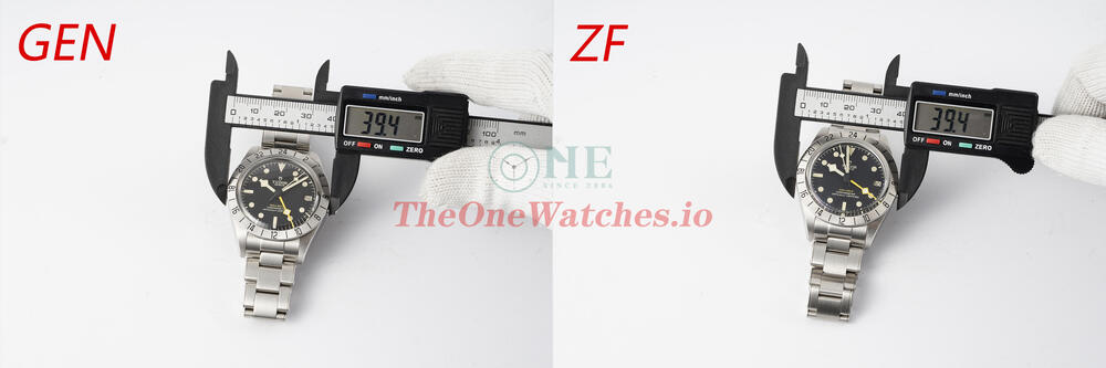
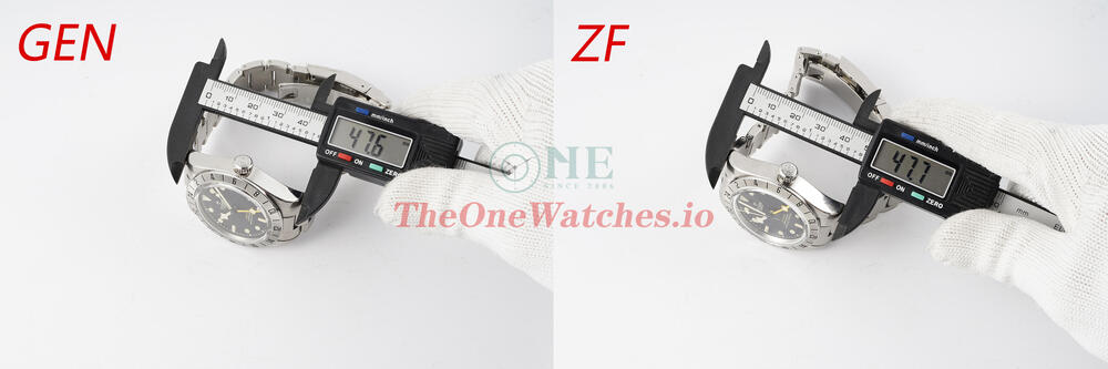
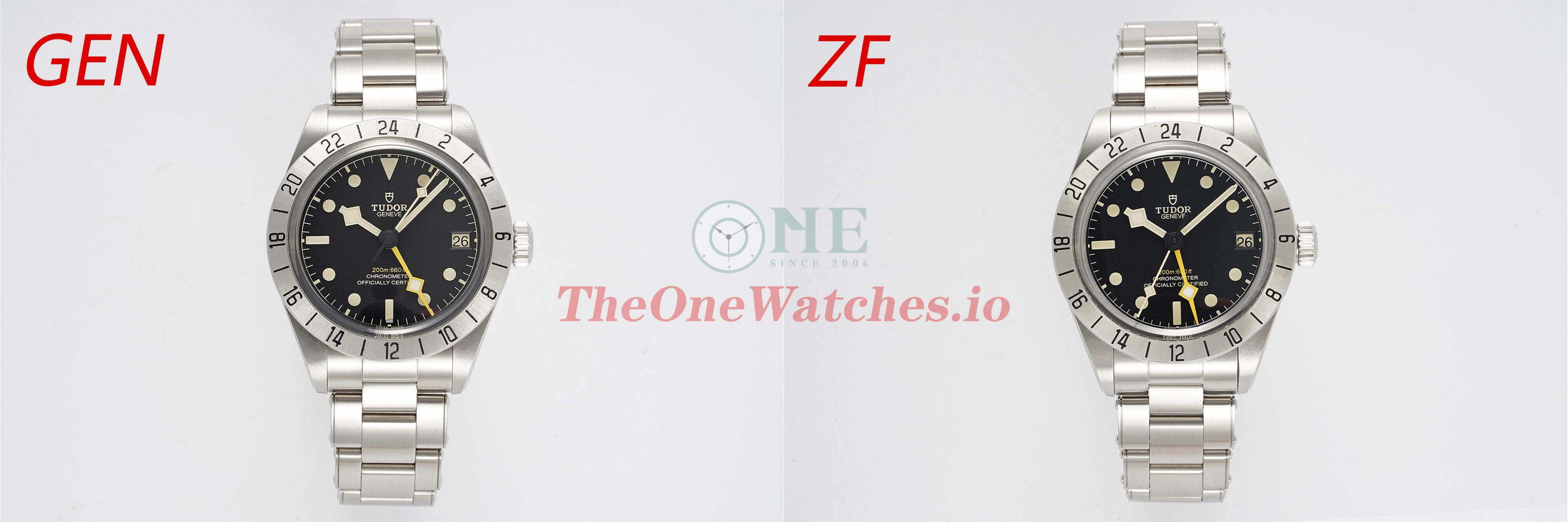
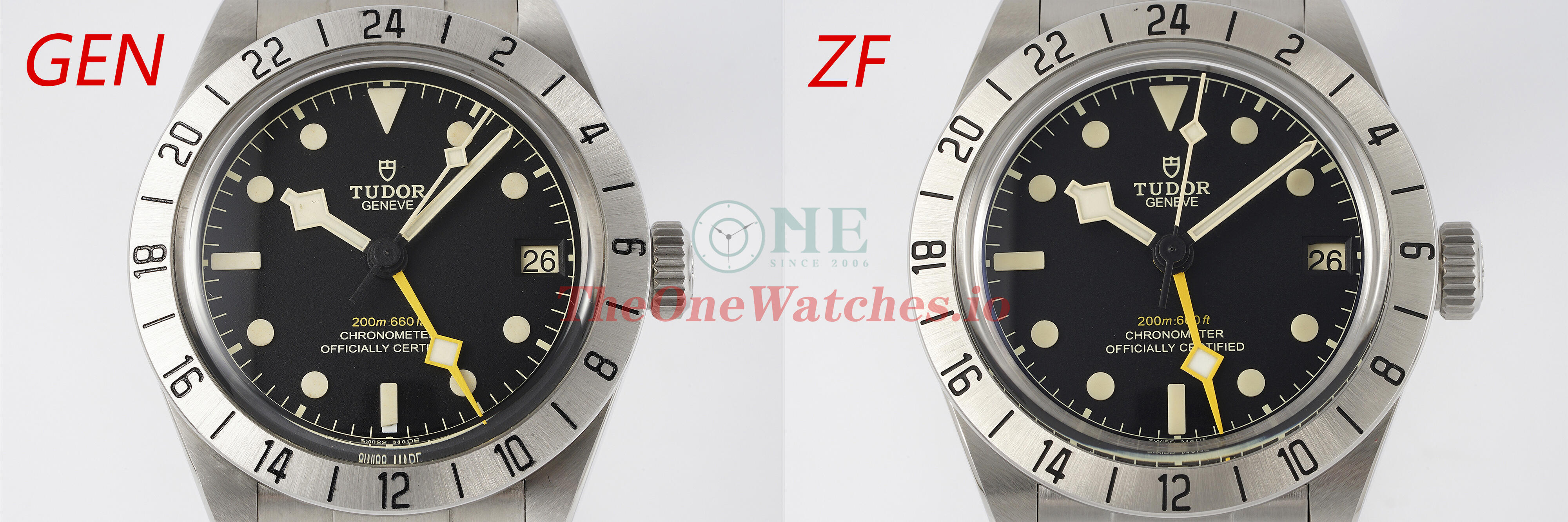
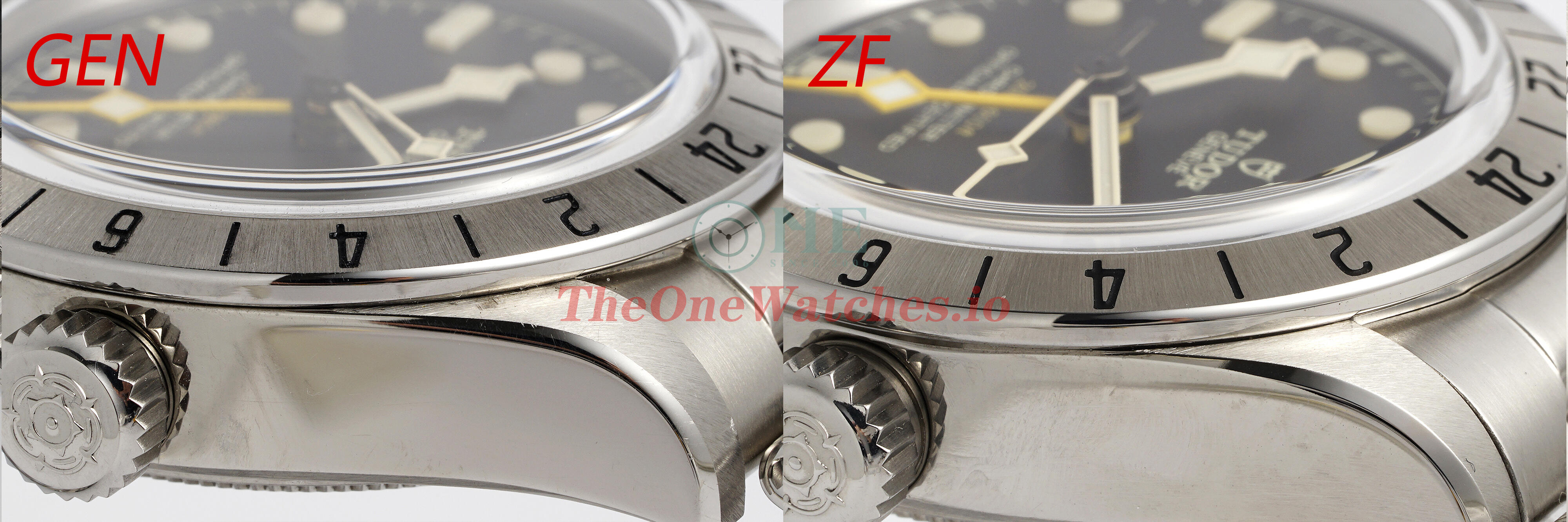
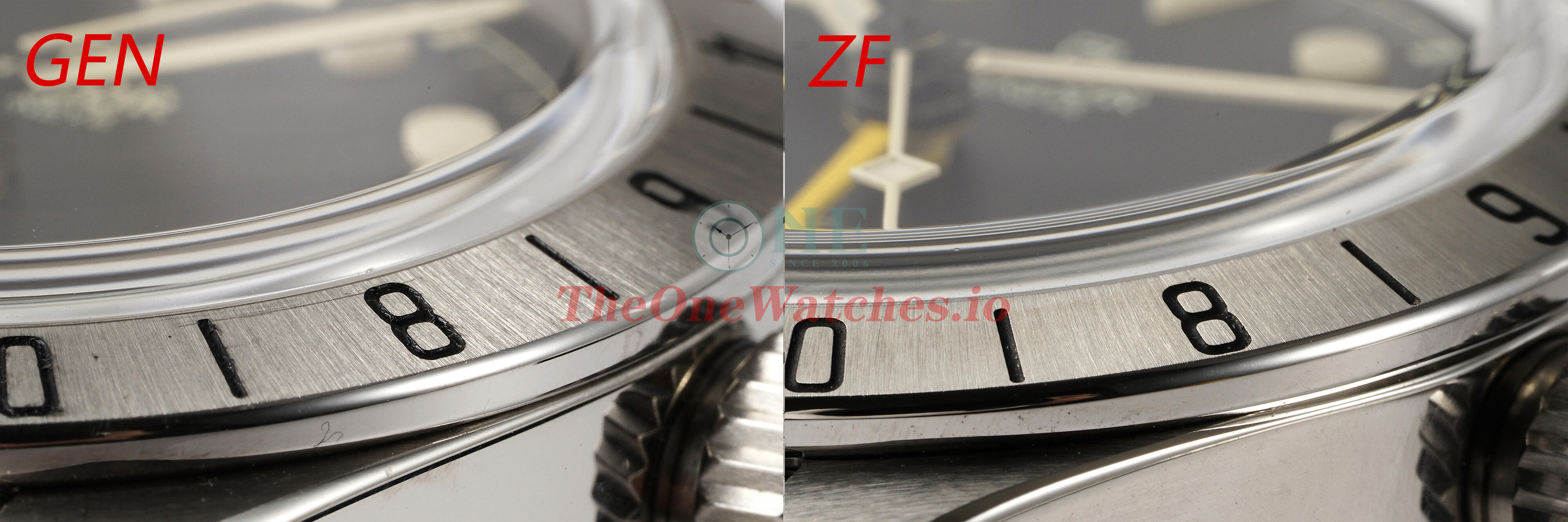
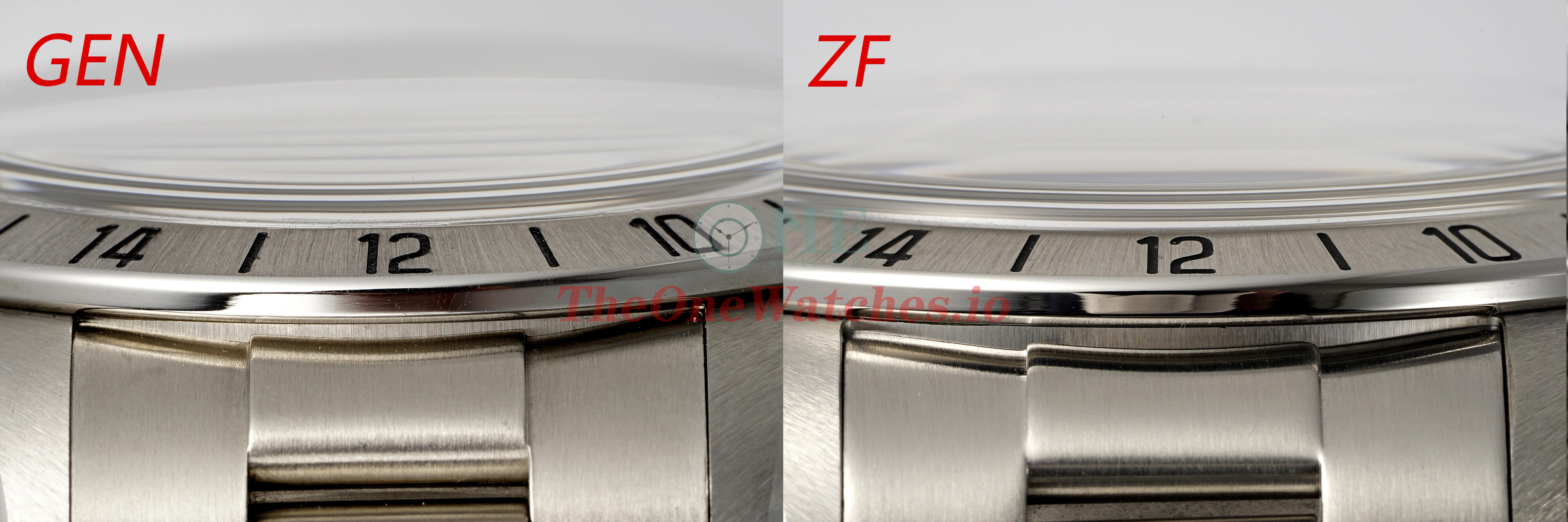
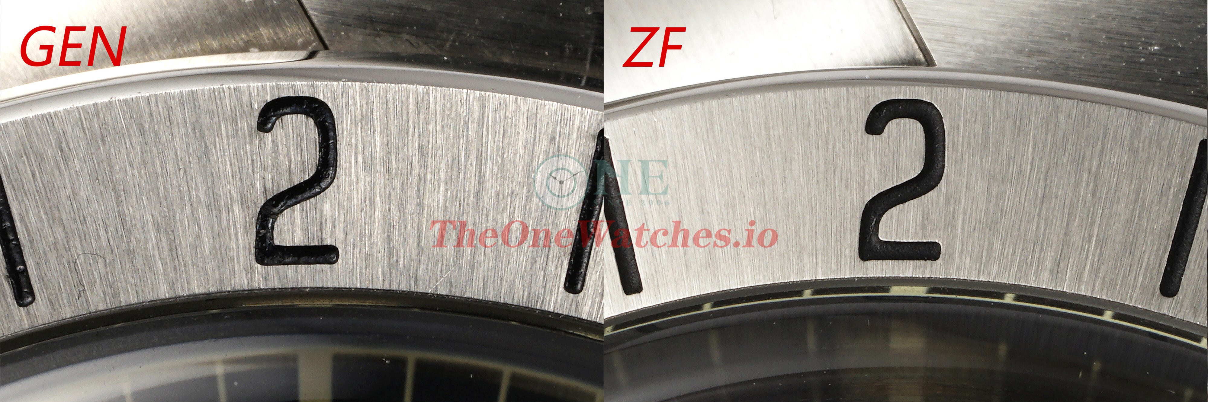
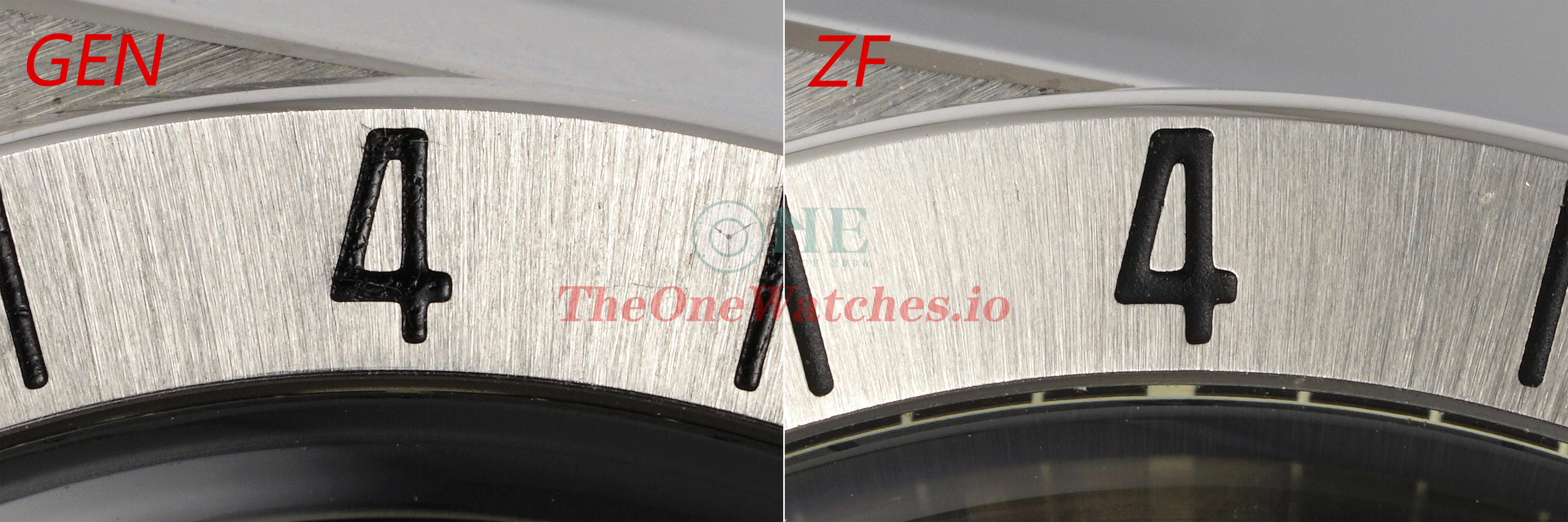
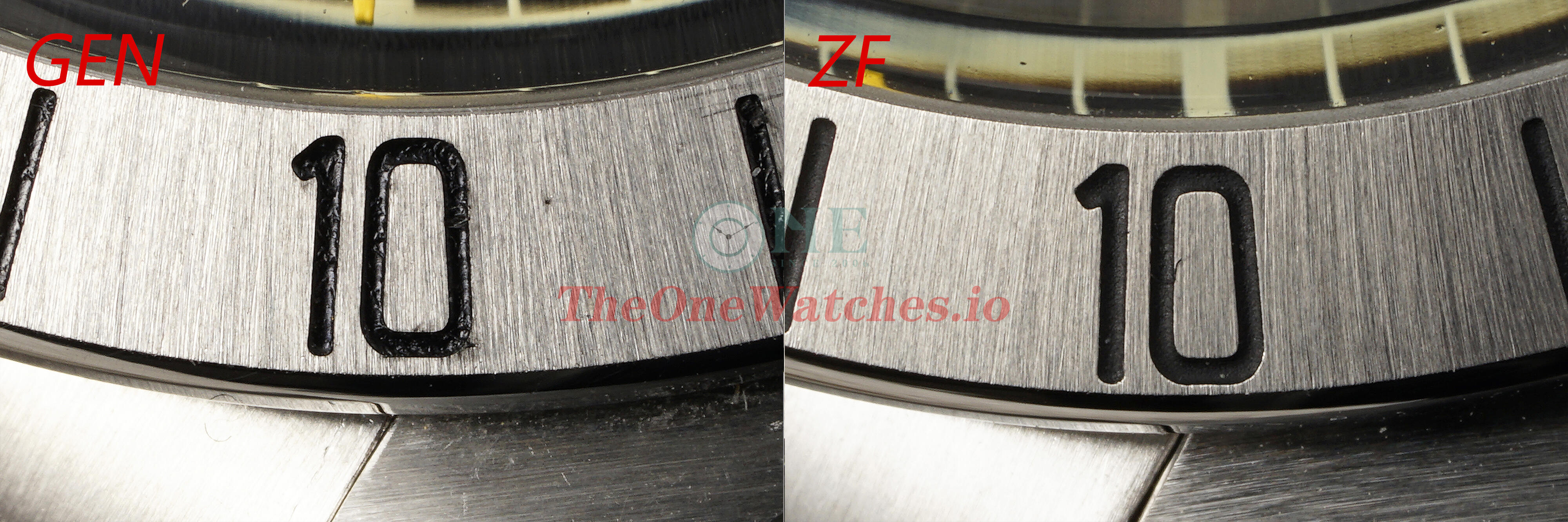
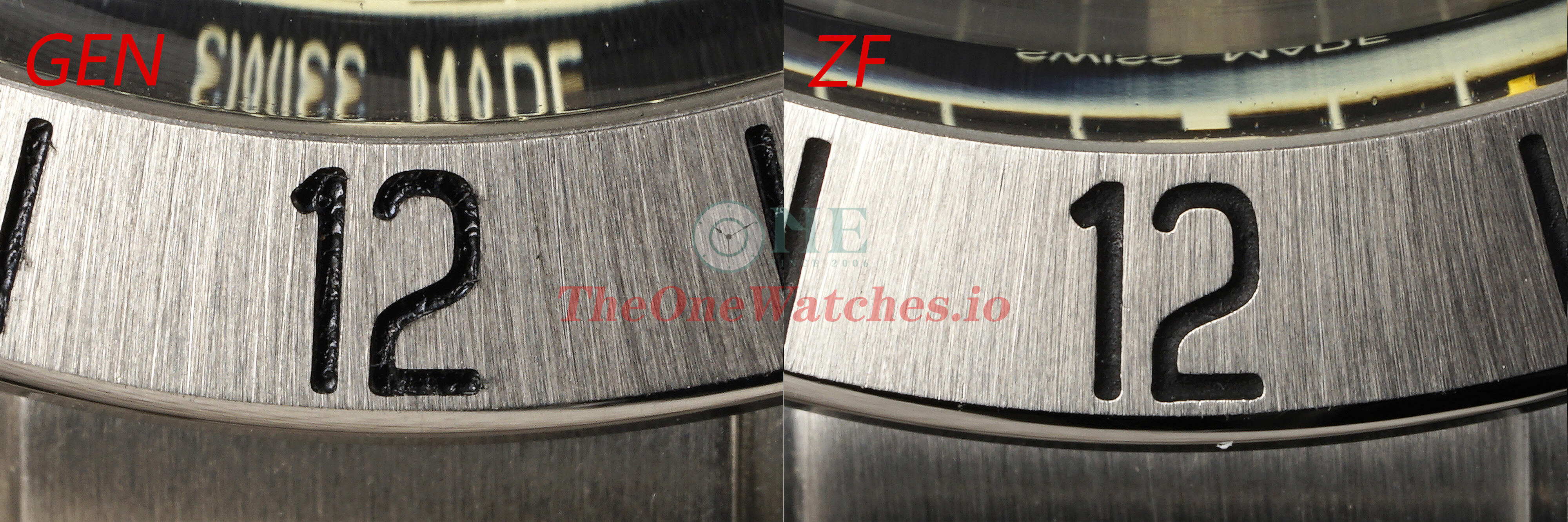
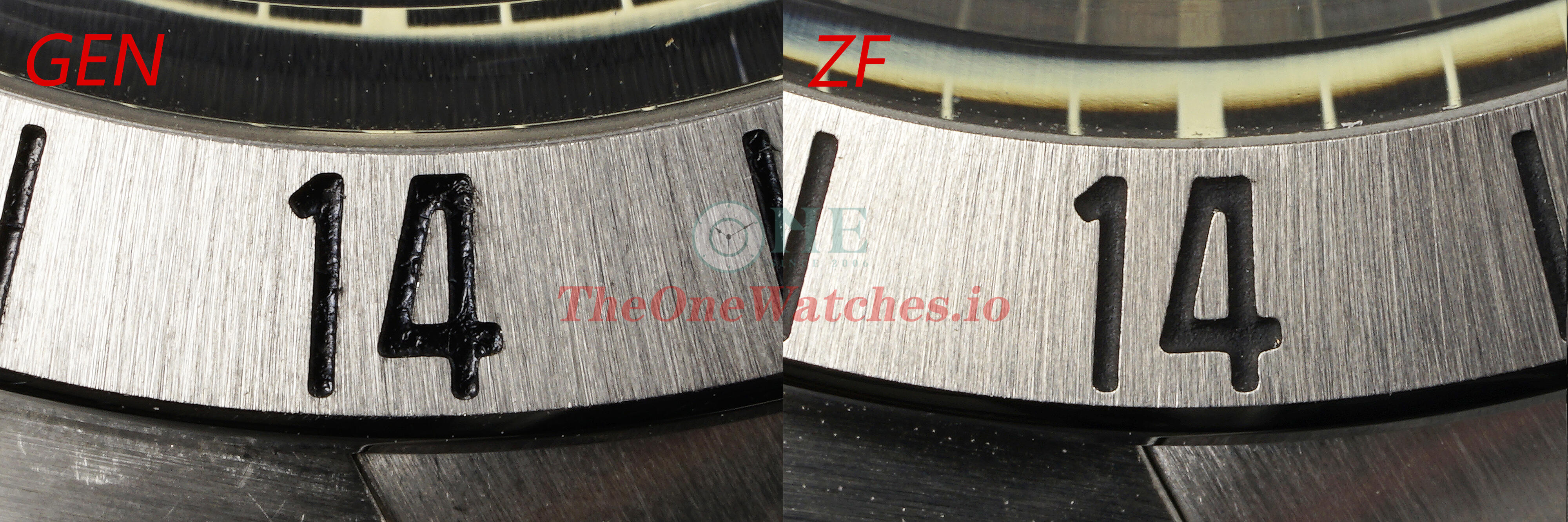
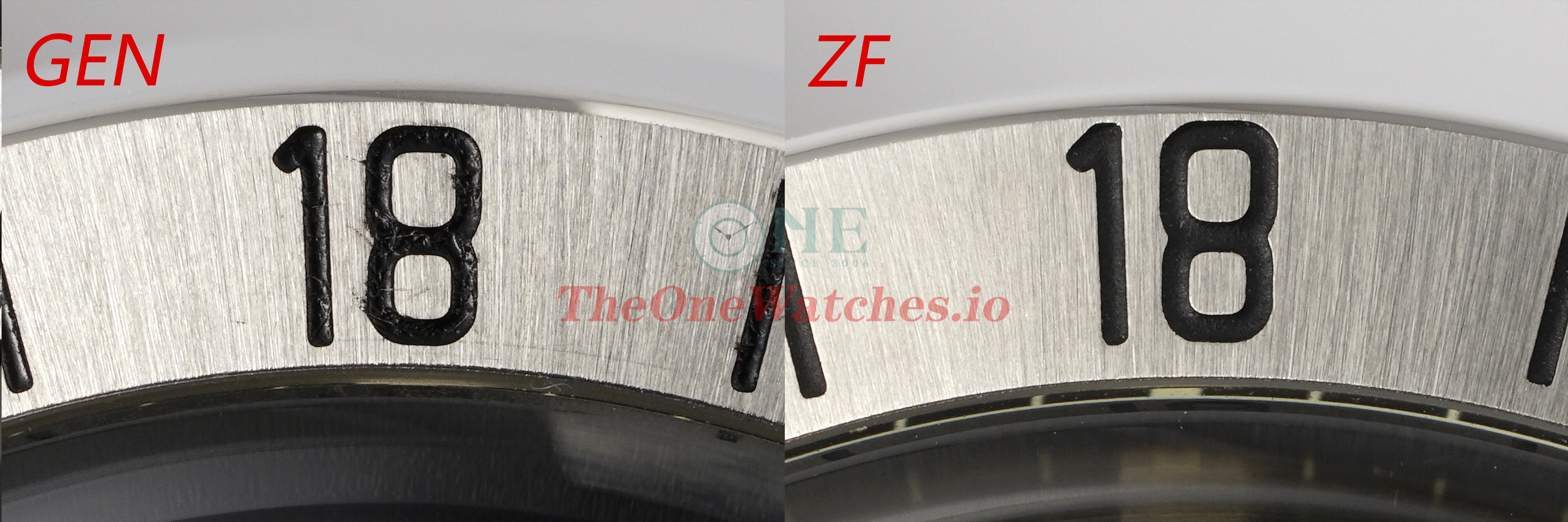
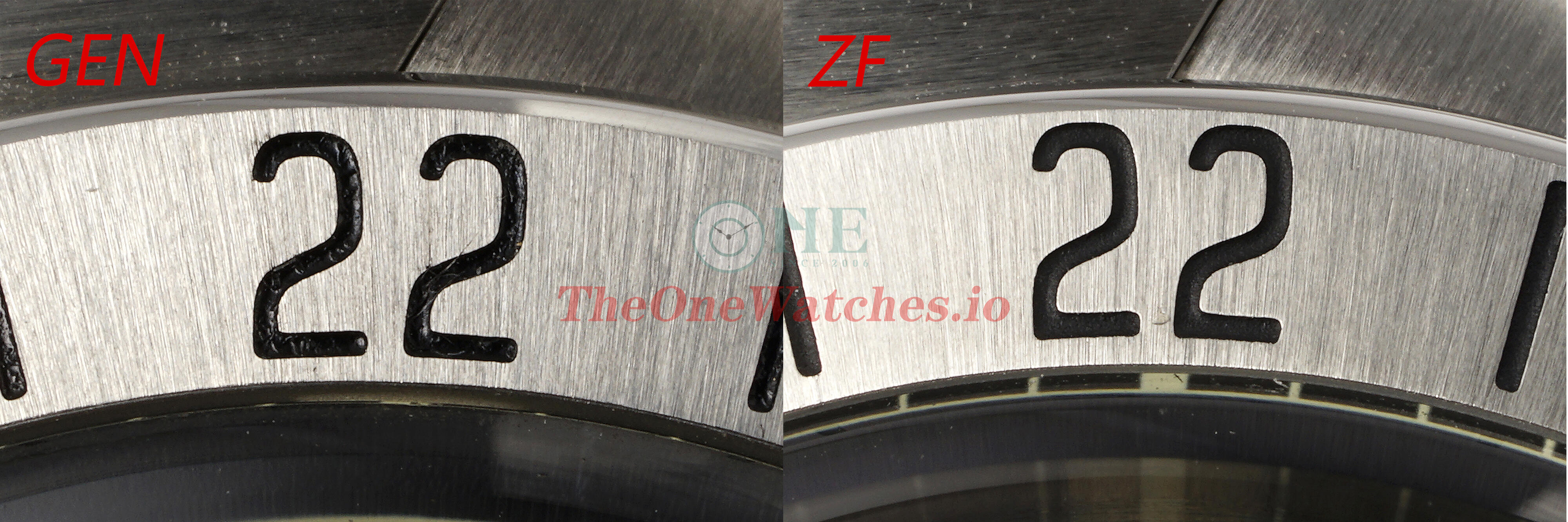
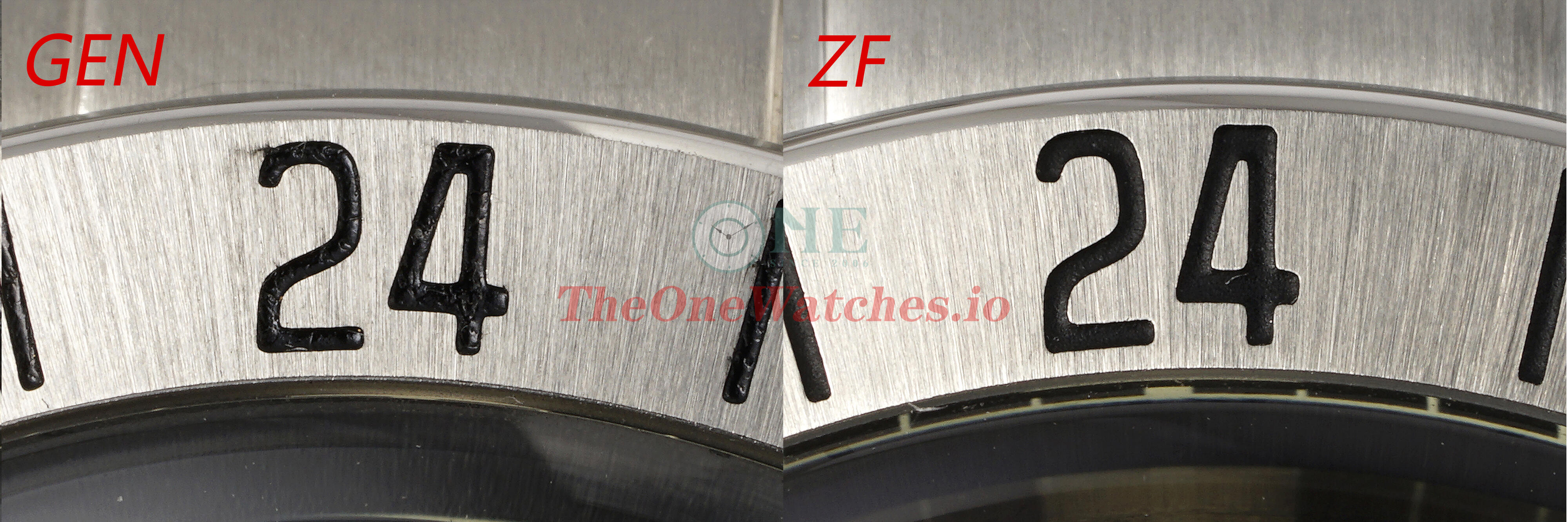
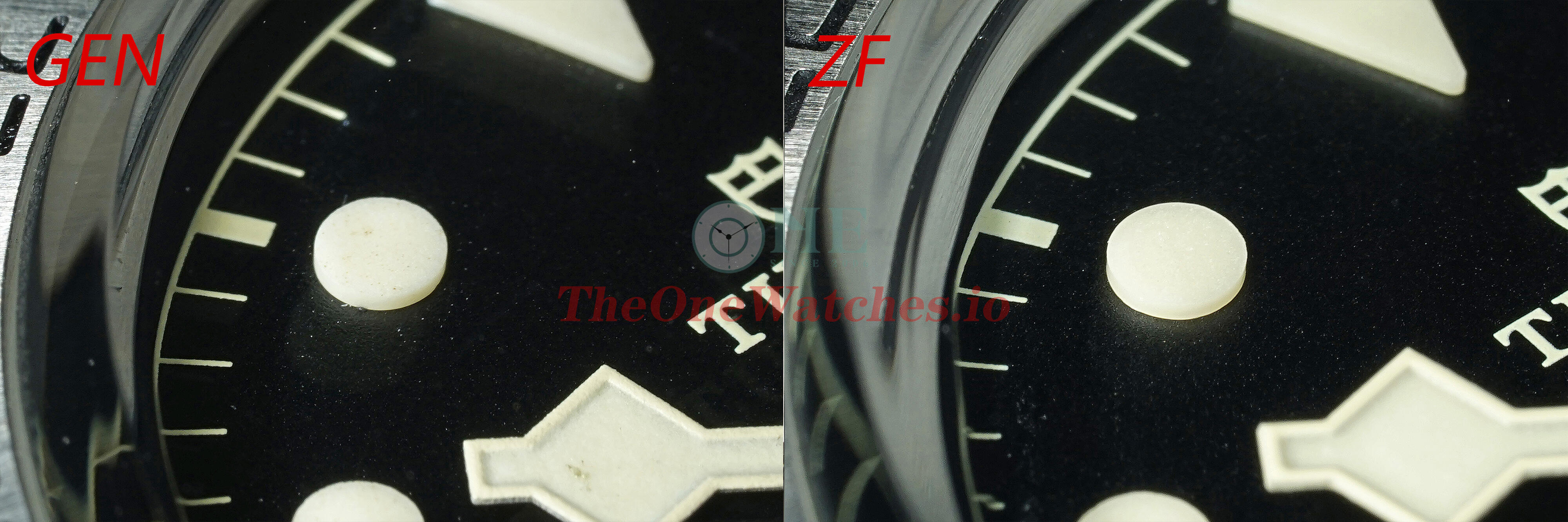
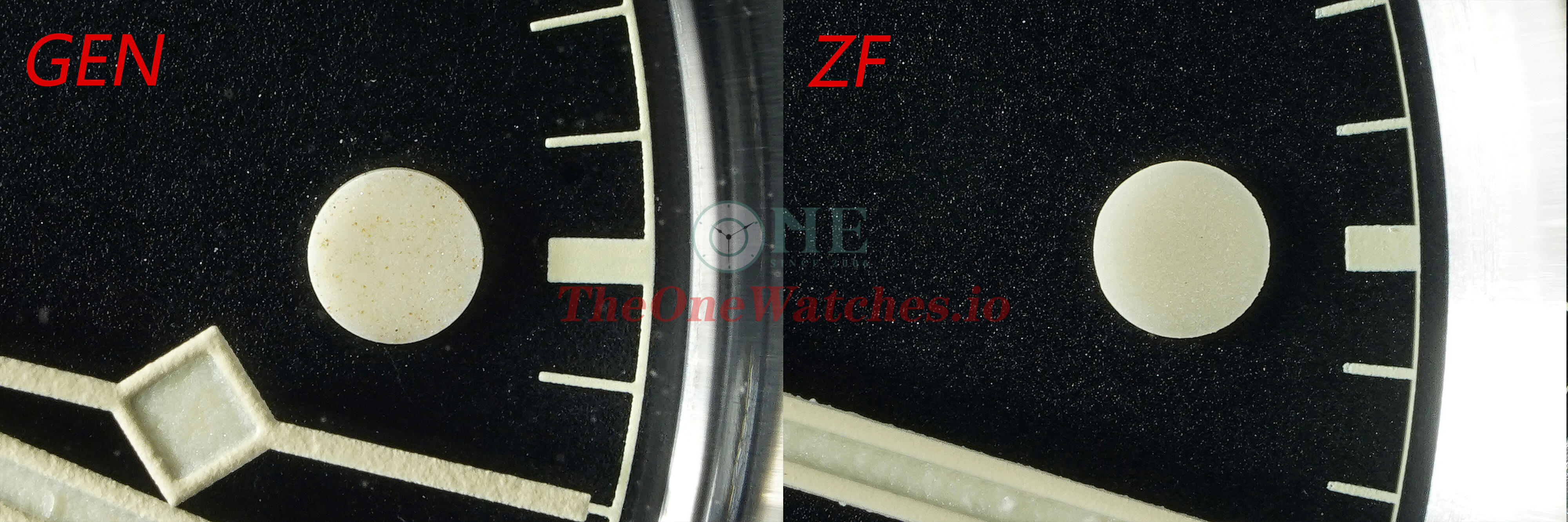
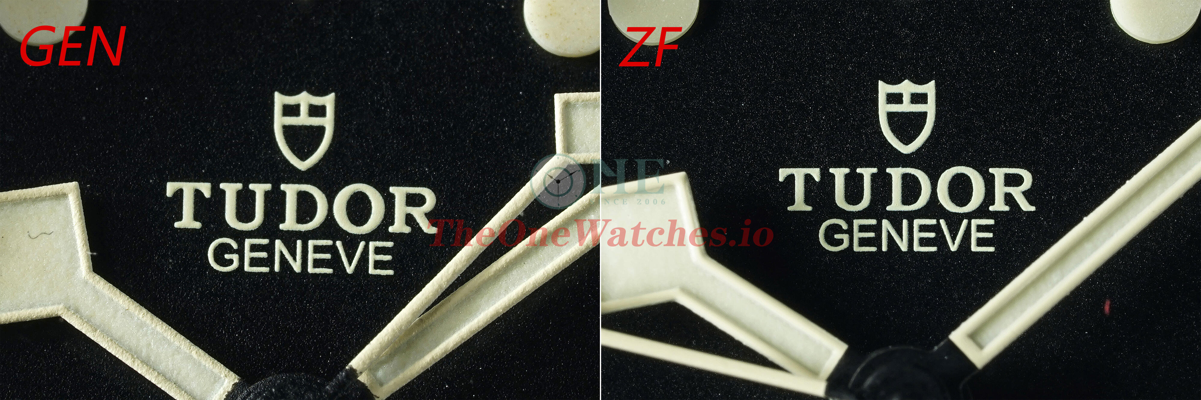
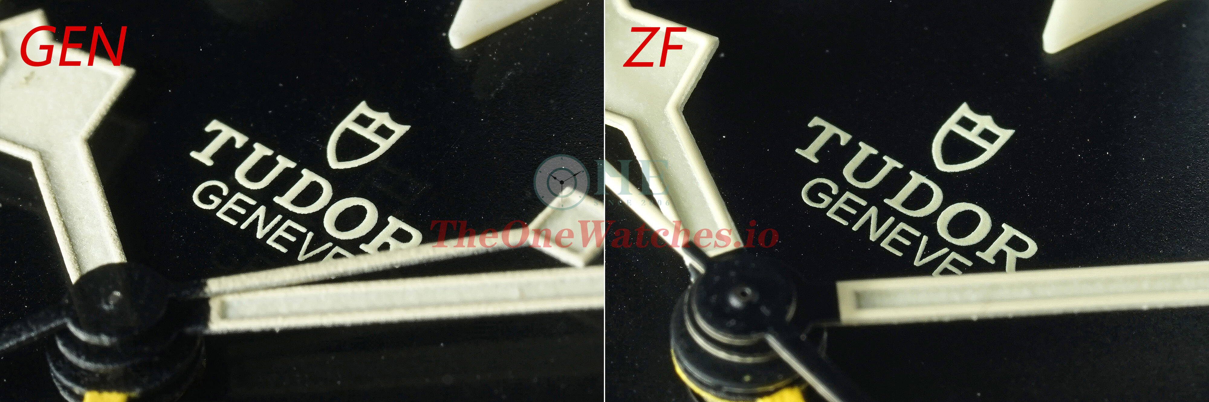
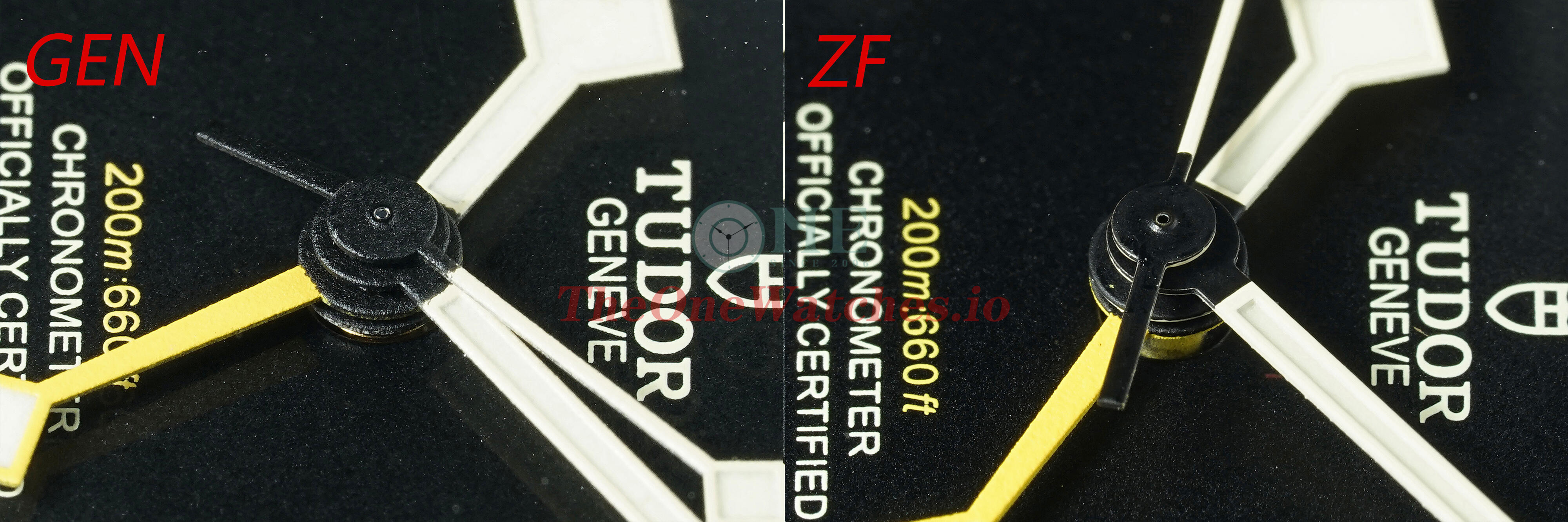
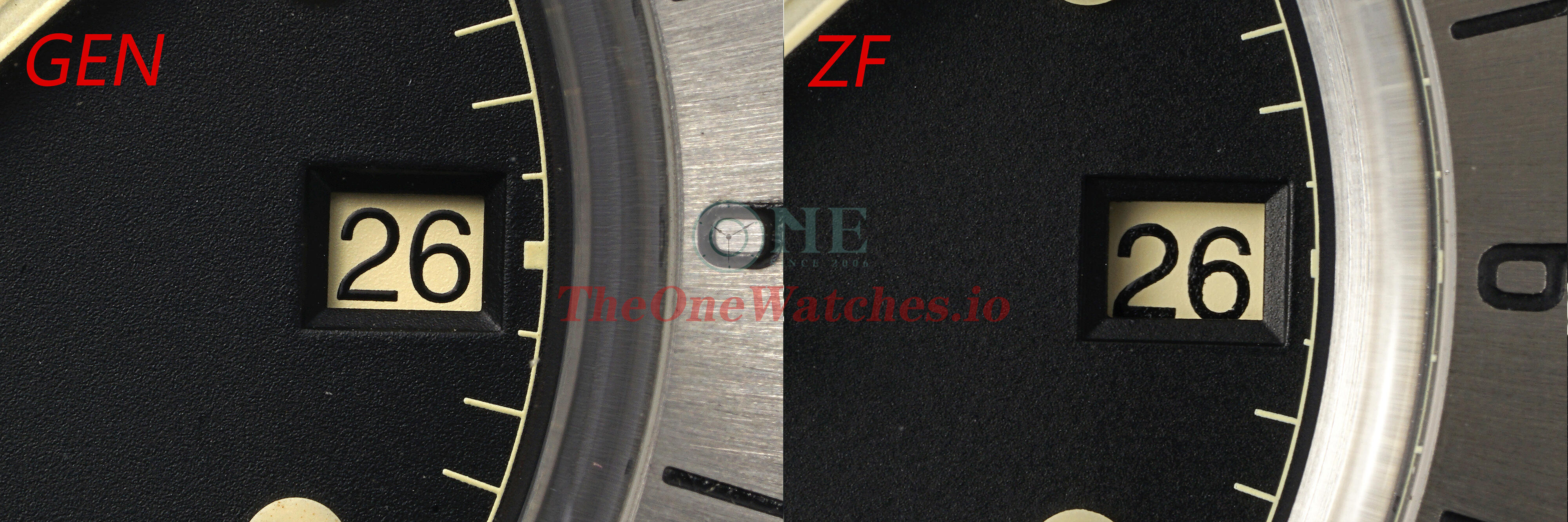
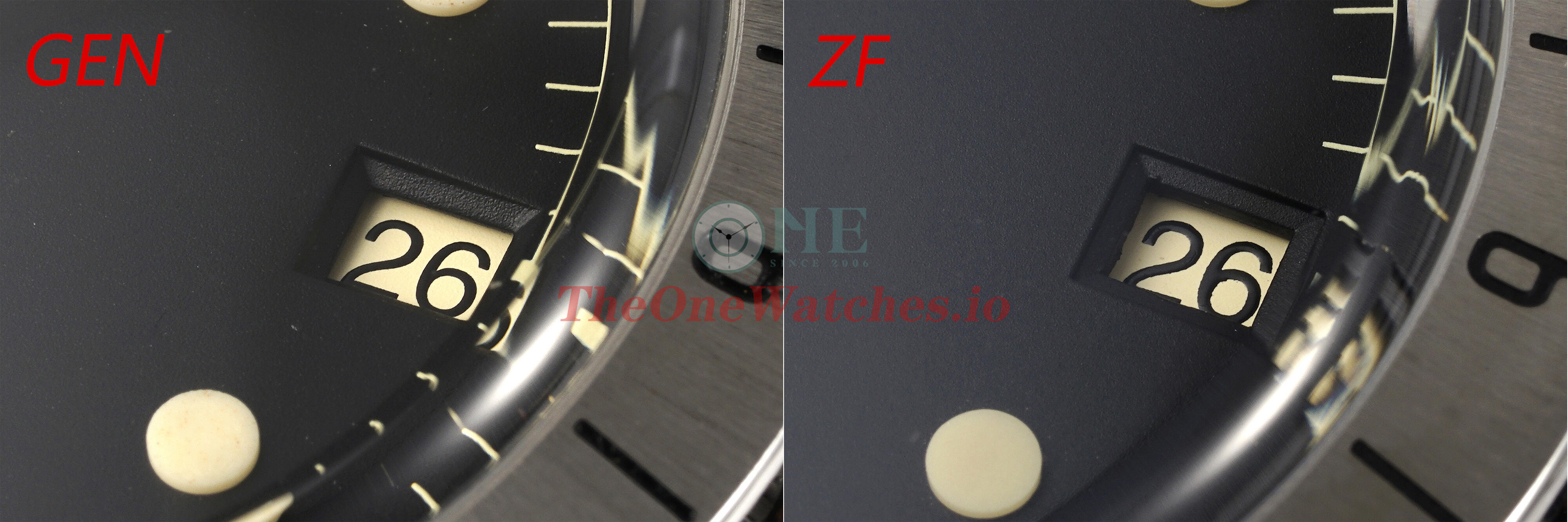
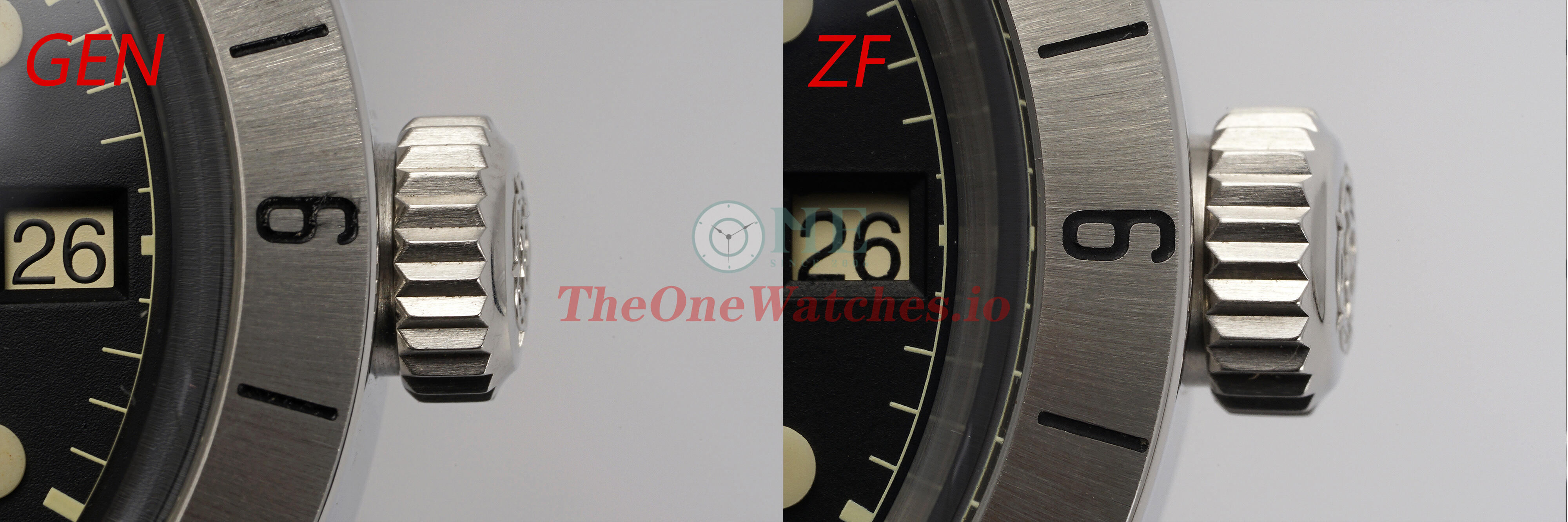
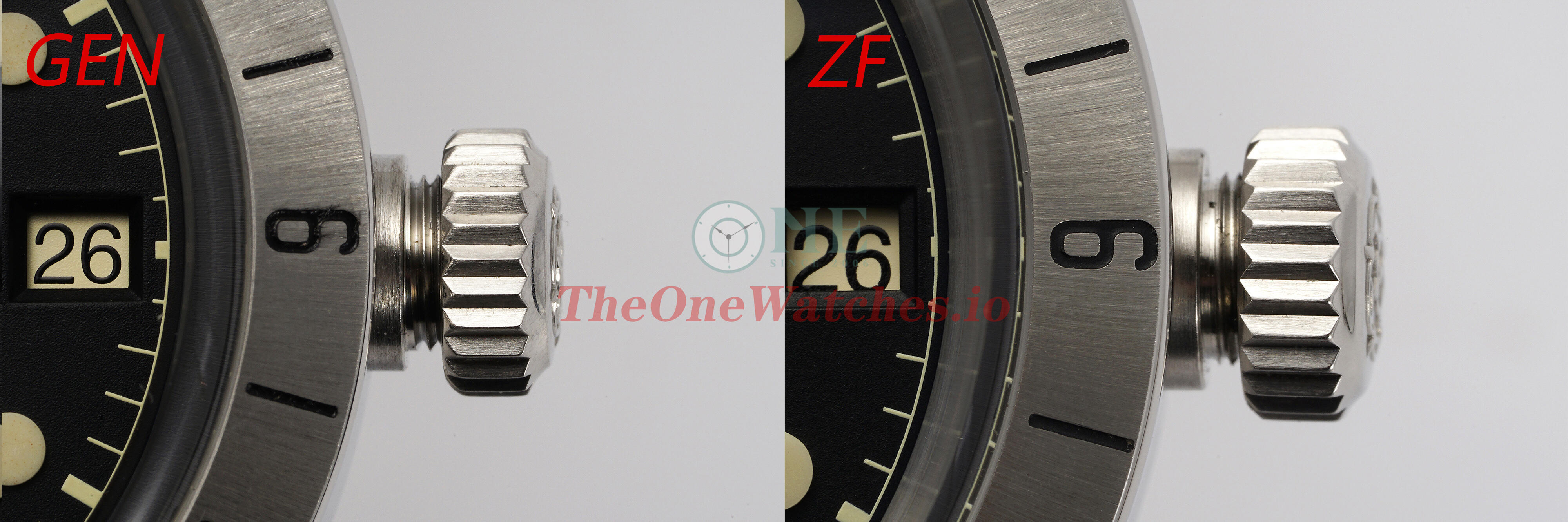
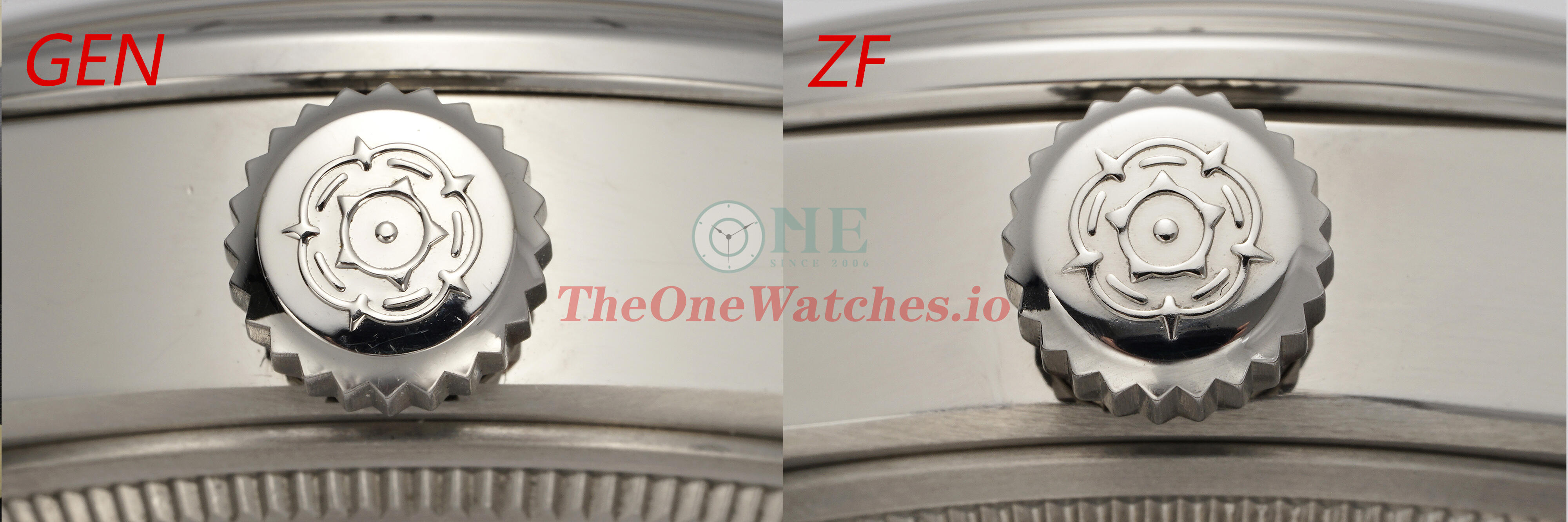
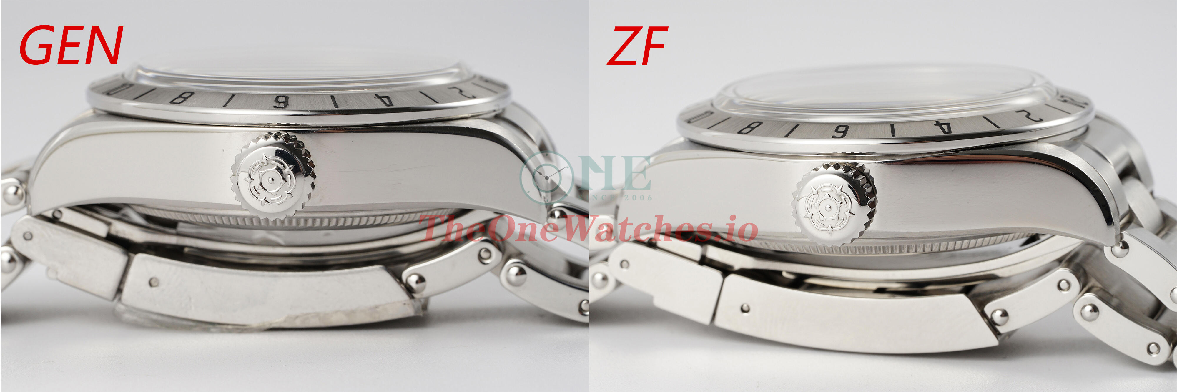
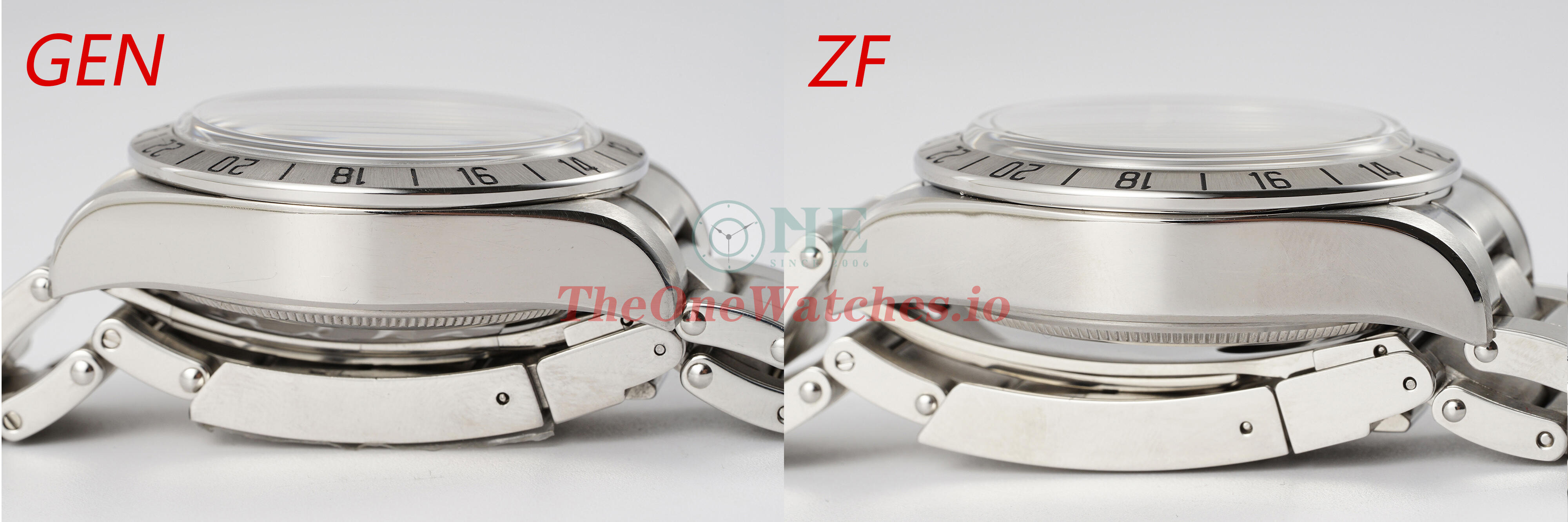
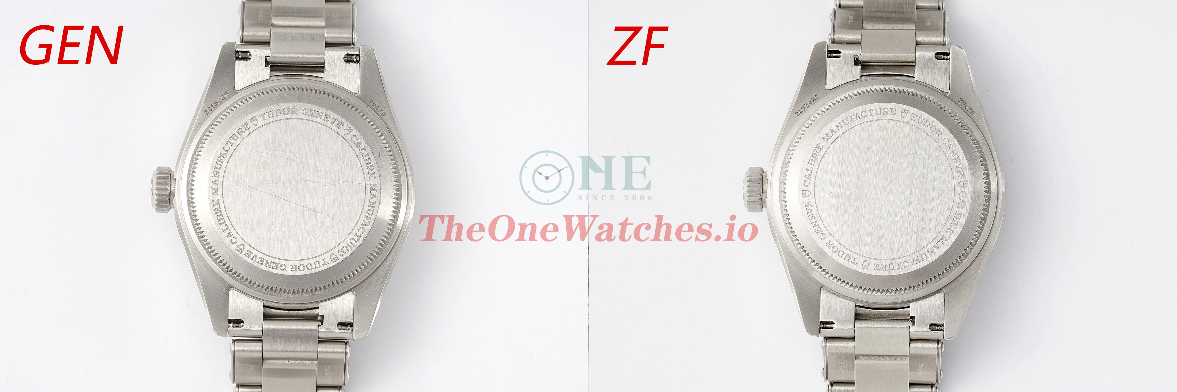
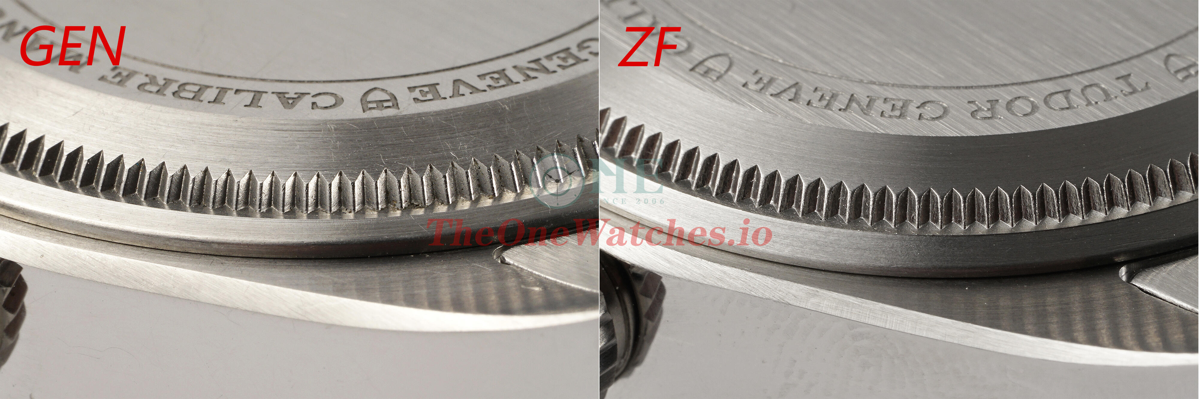
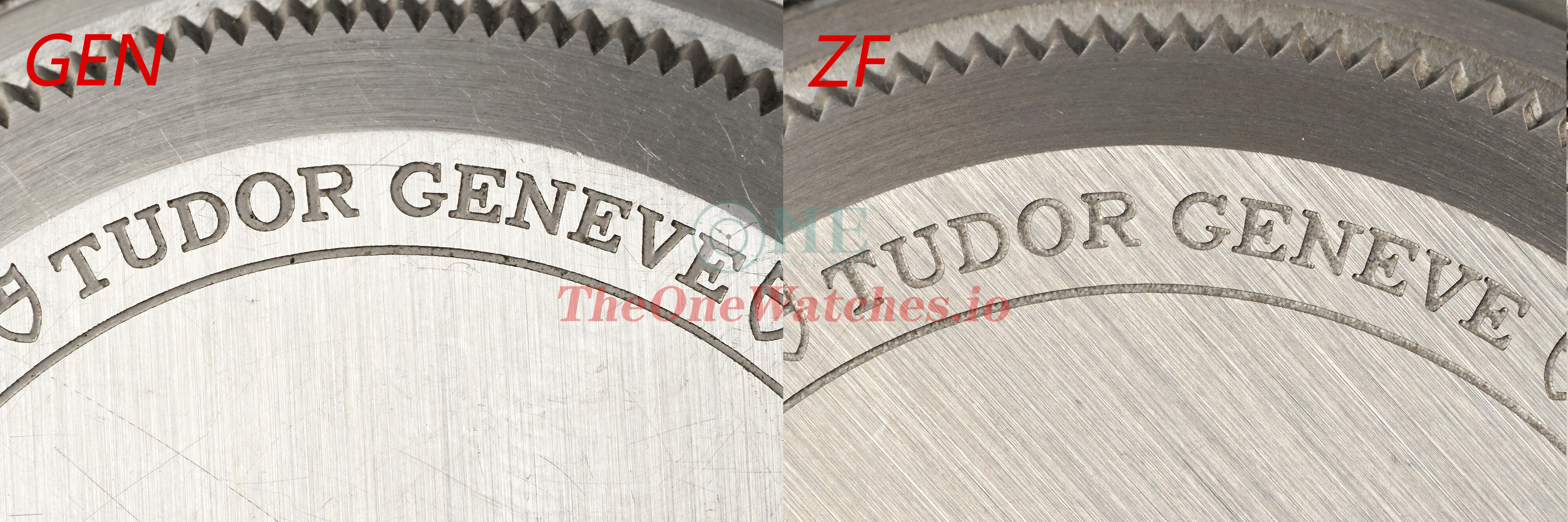
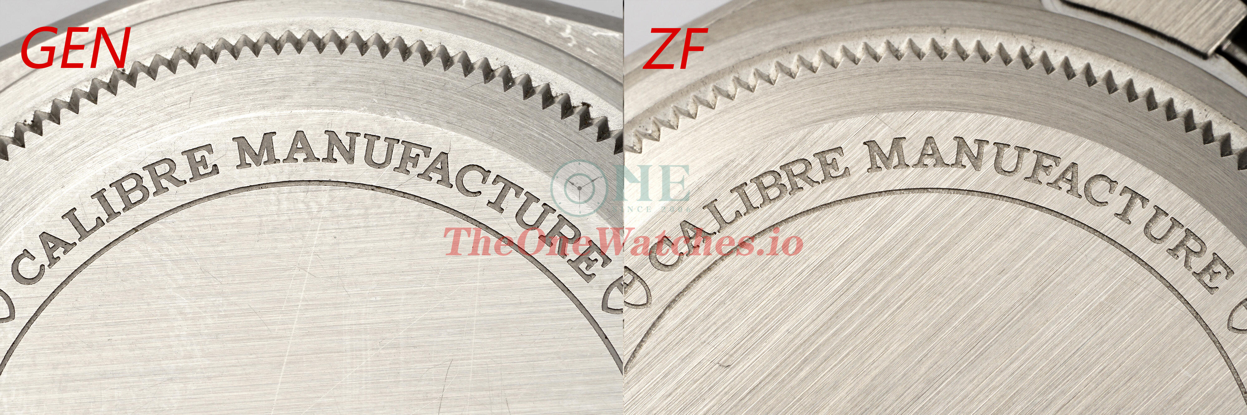
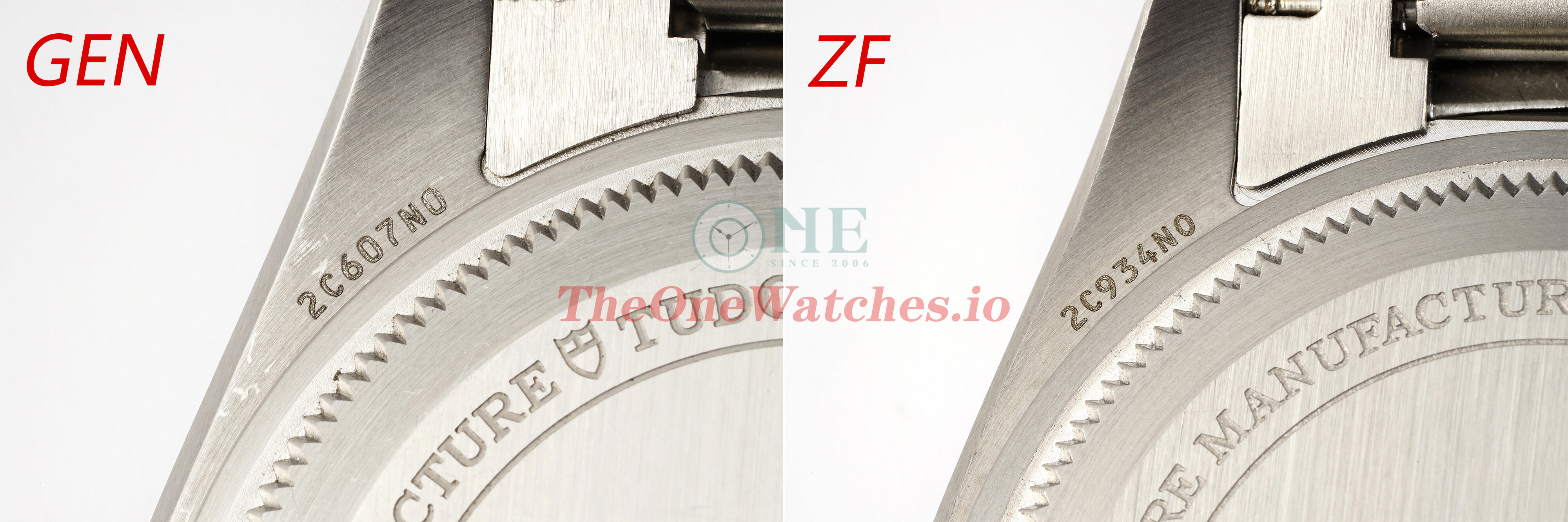
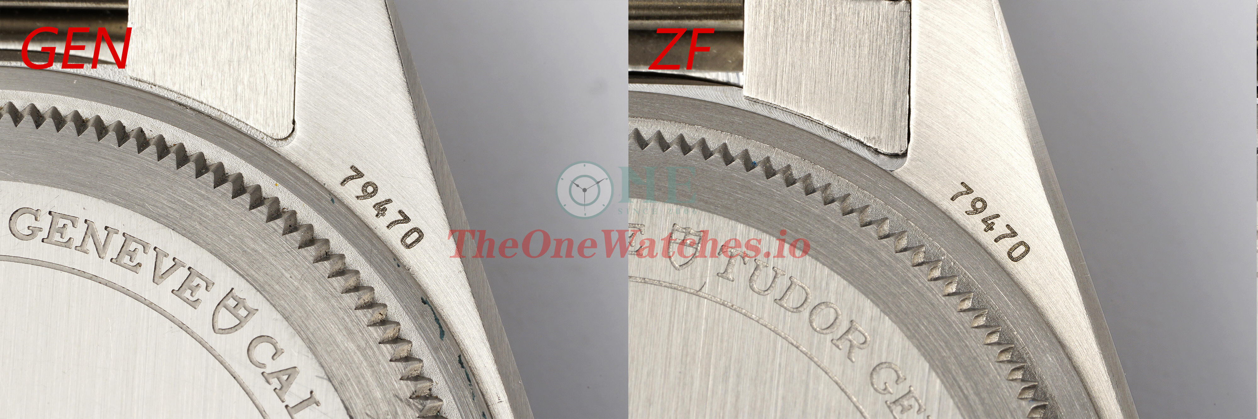
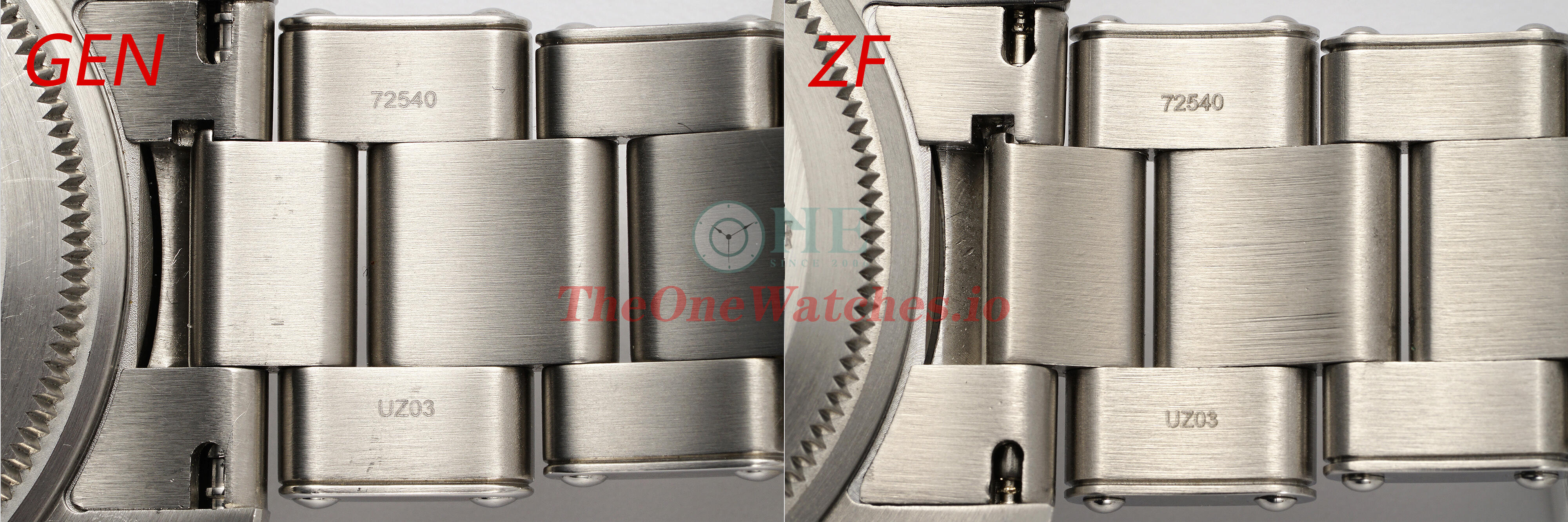
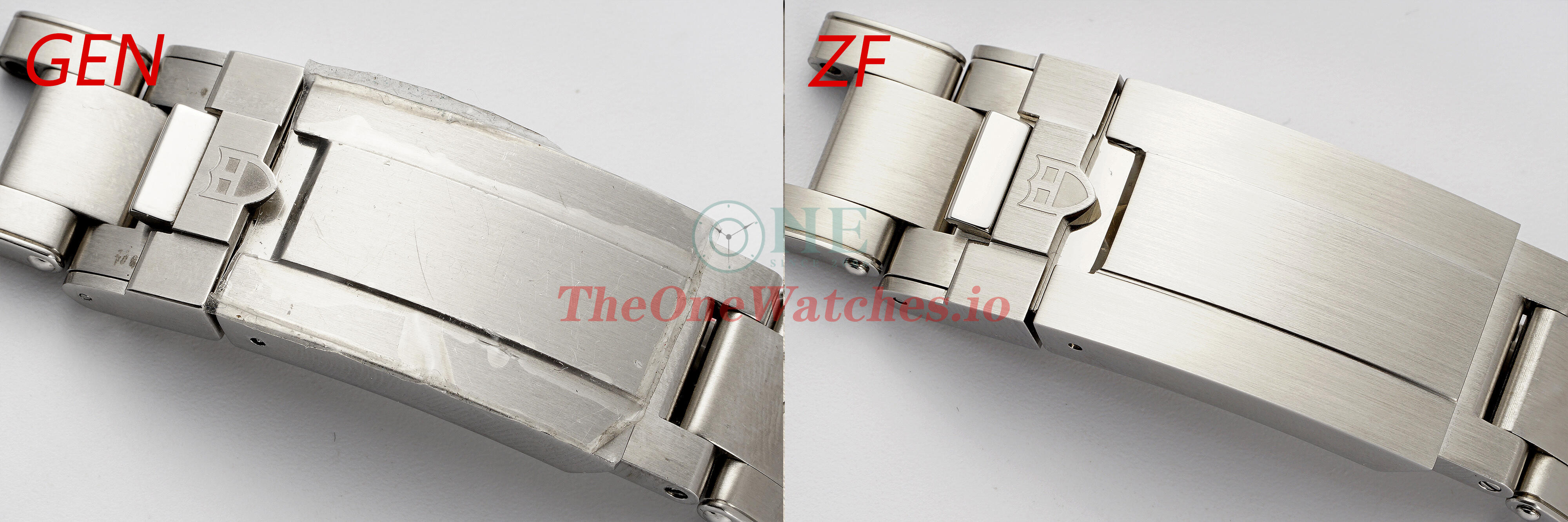
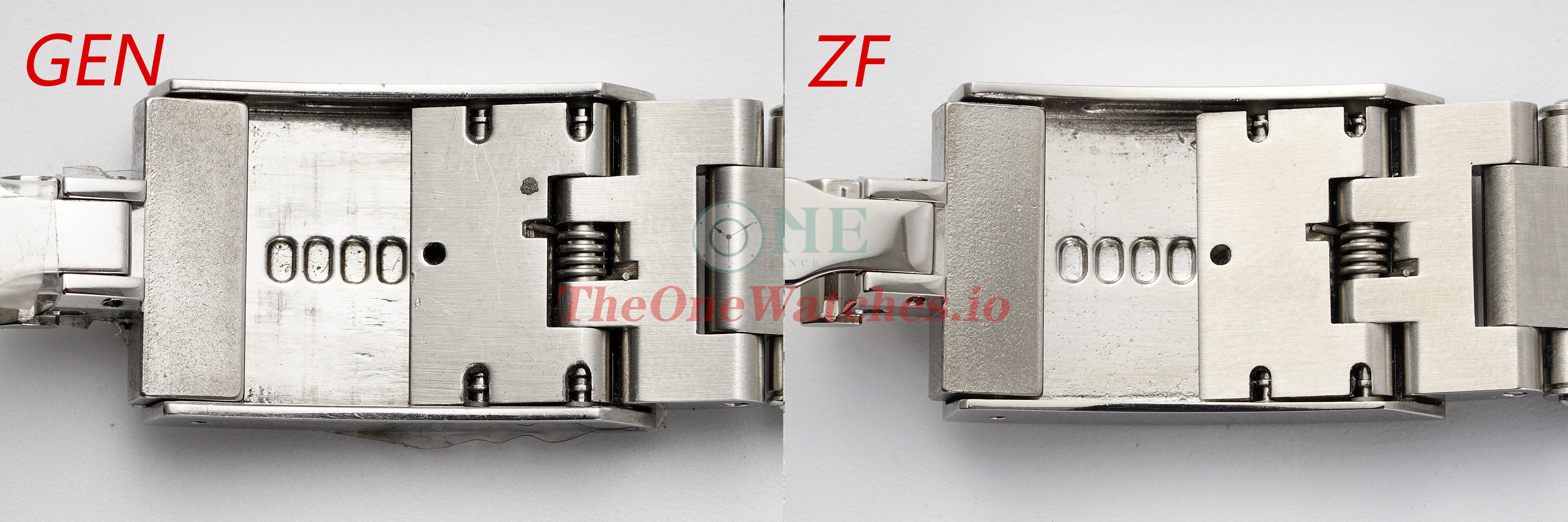
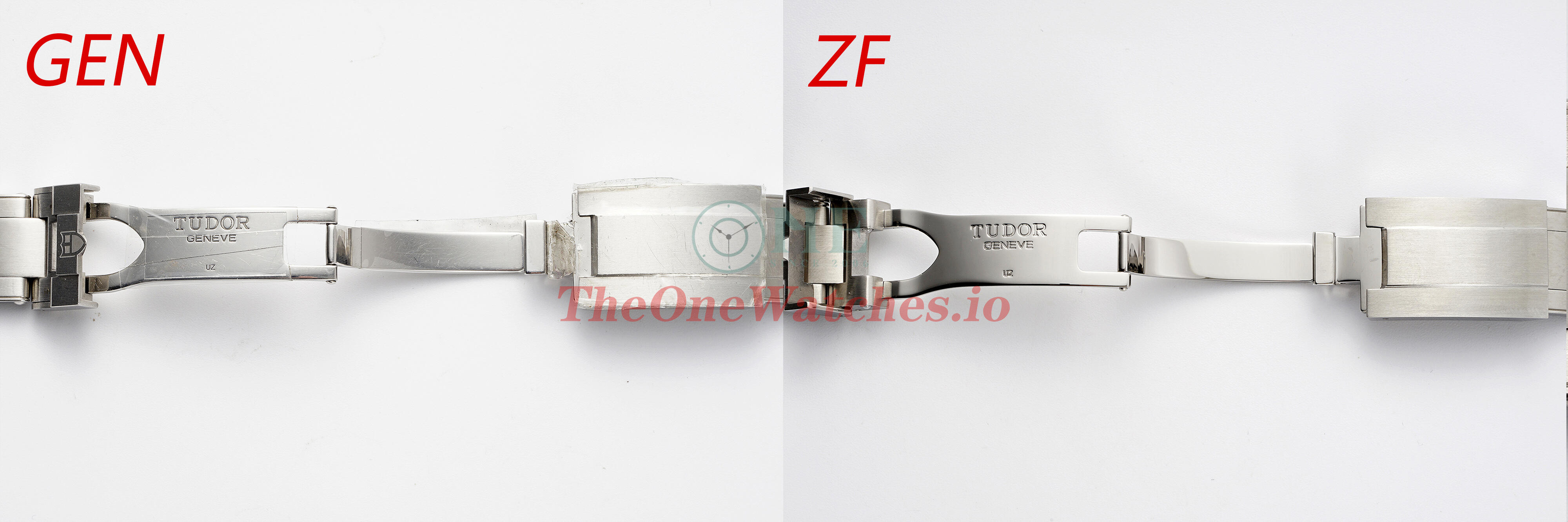
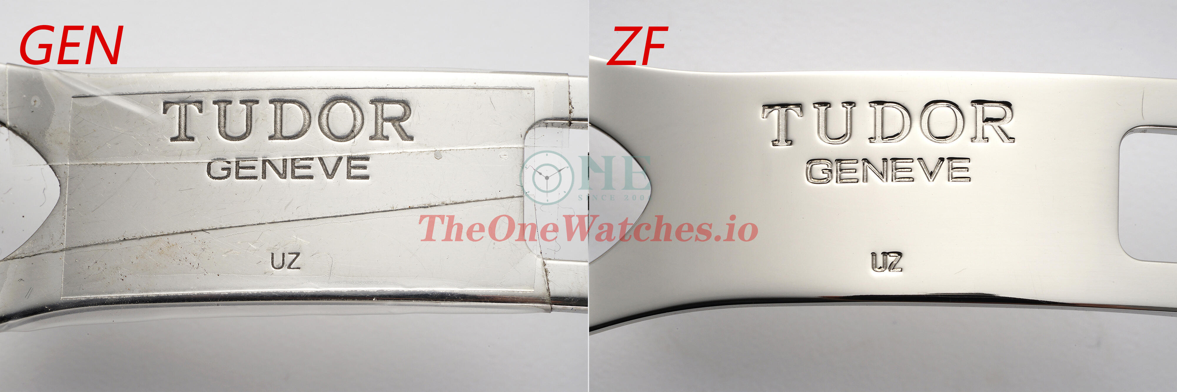
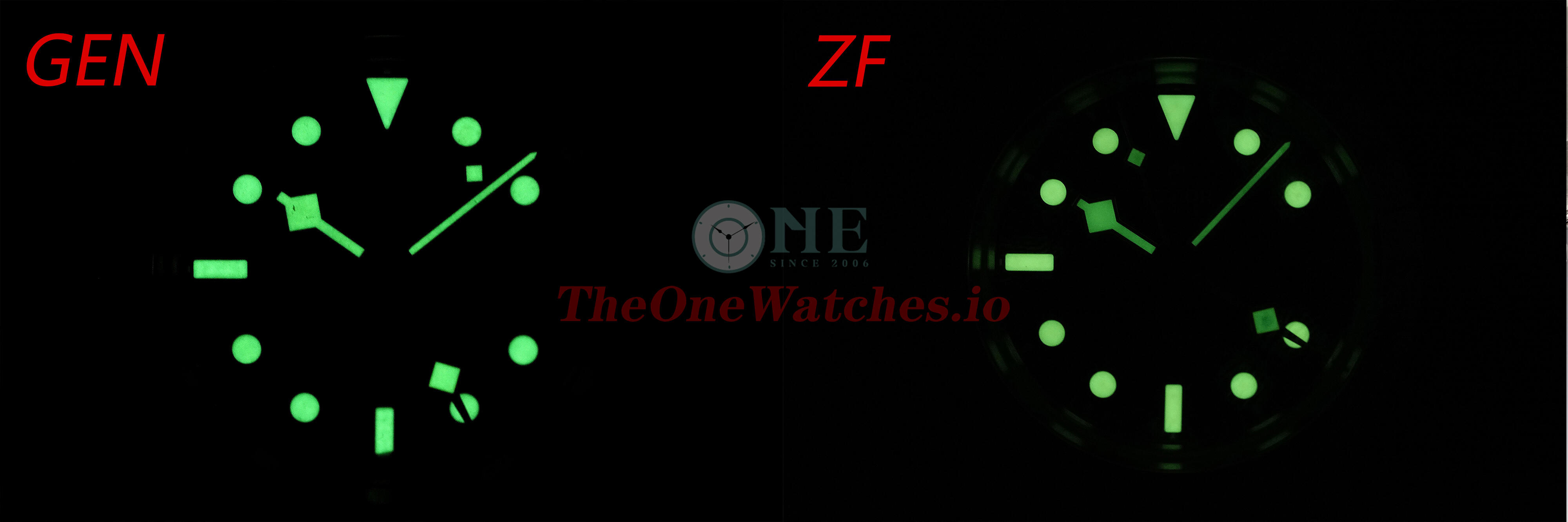
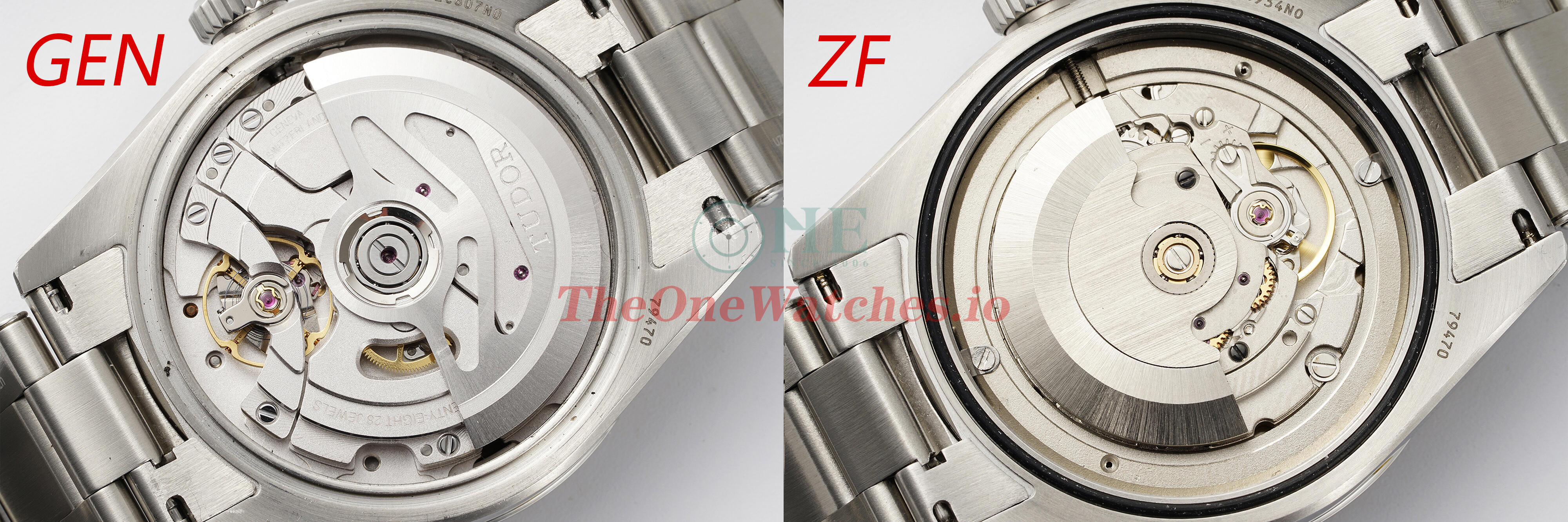
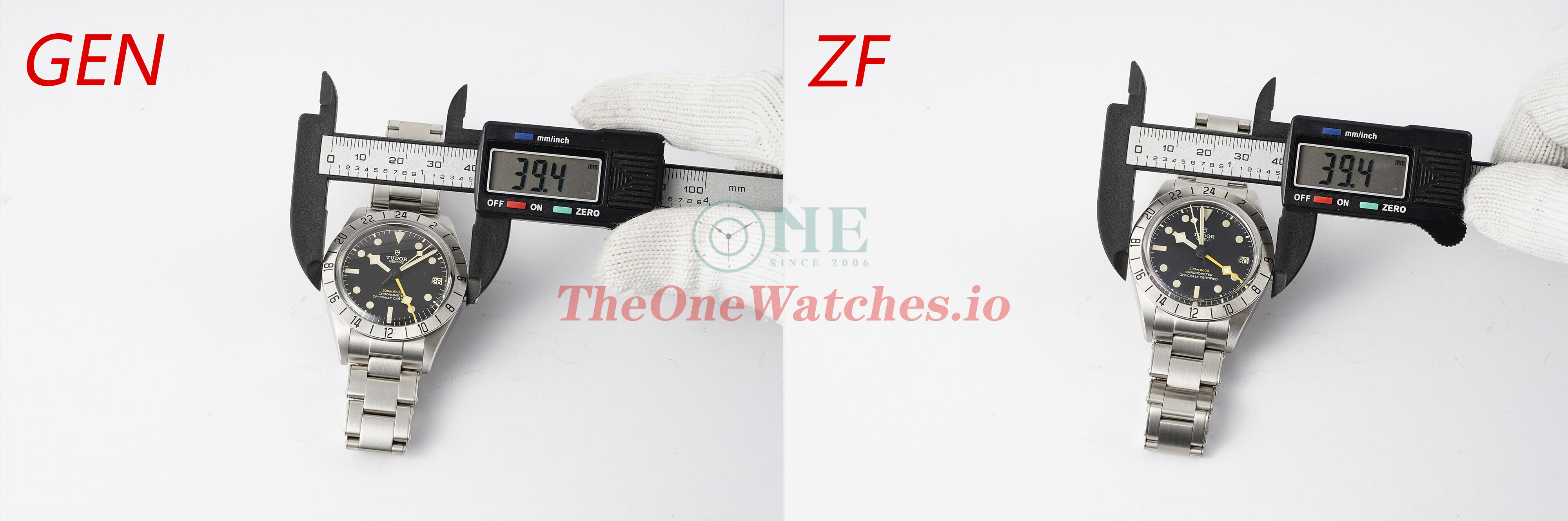
Hello, I'm Steve, I'm back, I've done a lot of GEN and replica Rolex models comparisons, it's time to check Rolex's little brother Tudor, LOL! ZF recently just released a new Black Bay GMT M79470, so let's take a look and see what ZF has done with this new product, by the way, you can also get a closer look at the authentic Tudor workmanship details, after all, it is Rolex's little brother, I think it should not be bad. Enough crap now, and if I don't start again you'll think I'm an old lady, haha. Front view of the dial In terms of color, there is no second pure black in the world, so there is no need to worry about color difference on the black dial. As we can see, there is a small crack on 6 marker in the gen since it has been scratched when ZF replicas the model for the marker. But this is enough to see that the ZF factory is doing a true 1 to 1 replica, even a small accessory need to be disassembled to replicate, so as to do the closest. Bezel side view Gen bezel is made of frosted steel, the surface frosting treatment of ZF bezel is still very good, very delicate, the edge of the transition to the side of the rounded smooth processing is also very good. Crystal side view The chamfered level of the crystal side and the GEN are also very similar, and the height remains the same. Bezel numeral view The shape of the ZF inked numerals is well controlled and consistent with the GEN, but the slightest shortcoming is that some of the numerals are a little off the outer edge, but the good thing is that it is hard to notice with the naked eye. In addition, because the GEN is worn and used, the inked numbers on the bezel are stained with oil and dust, so it looks shinier and the surface of the numbers look untidy, while the ZF looks more comfortable. Side view of the markers The ZF maker is made of Super-Luminova luminescent coating to make a whole stick marker, and there is no difference between the shape and size of the GEN scale. In addition, you can see that the triangular scale and the bar scale of GEN have a white edge at the bottom edge, which is not perfectly recovered by ZF factory after using GEN scale. Lume filled view The lume fill of the GEN hands is very granular, while the ZF lume fill is lacking and is slightly raised in places. The GEN markings are where the grain filling on the surface has been scratched out. It is very easy to damage such delicate accessories by using authentic 1 :1 replicas. You can zoom in on the second photo to see that the surface of the ZF circular marker has the same texture as the gen. It is very crystalline and View of the oil-printed font on the dial The font shape of ZF dial is also very good, and the color of the yellow font is almost colorless compared to GEN. Hands Central axle view Due to the different construction of the movement, the center pin of the ZF hand is slightly higher than gen.and the hand stack is incorrect (ICHS) But on the other hand the black sandblasting is very neatly finished. the sandblasted parts of the gen are already leaking fluid. I don't think it was originally intended to be this condition. It should have been damaged in the process of previous replication. After all, it's a $4,500 Swiss watch, so there's no way such poor detailing could have occurred. Date wheel veiw The shape of the date wheel is very well made by ZF, with the same beveled slope as the gen. And the date wheel is also Full-bodied and three-dimensional. However, the seconds marker at 3 o'clock is a little short. In addition, you can obviously see that the ZF calendar digital position is a little down, this is just a little problem in the assembly of this calendar wheel we used for the shooting caused by, I also check our recent QC photos, to confirm that this is just an example, you do not need to care, as long as the QC check clearly on the line. Side view of the crown ZF has done a great job on the edges of the crown teeth, which are as rounded as the gen. And the engraving of classic Tudor plum logo is also stereoscopic clarity. Side view of the case There is nothing wrong with the ZF case shape either. And the curvature of the case and the lugs are also the same as the gen. Back case view The back case teeth are also very well finished by ZF. However, the length of the bevel on the side of the back case is slightly longer compared to the gen. The good thing is that the distance to the naked eye is actually quite noticeable. Engraved view of the case back and lugs The engraving on the case back is very close to the gen in terms of depth and coordination. The numbered engravings on the lugs are particularly good, as they are difficult to distinguish even when magnified to macro. Strap detail view The overall fit of the ZF strap is excellent, with relatively small gaps. The clasp polishing is also very well finished. The adjustment length is up to 8 mm and the feel of the adjustment is smooth, just like the gen quick-adjustment mechanism. Factory engraving on the inside claims to use the same stamping process as the gen. There are differences in the actual carving marks, but in terms of depth and shape, they are very well done. Lume view The lume color of ZF is the same as the gen and there is no difference. Movement view The movement of gen is Tudor's own MT5652, and the ZF applies the Asia 2836 movement. ZF one does not have a brass plate or engraving to imitate a gen movement. The balance wheel is also in the opposite position to that of the gen. But for models with a solid case back, this doesn't matter too much. After all, no one would be bored enough to open the back of your watch. What do you think about it? Comparative view of data Note: All watches are measured in a clamped state, and there may be errors due to the slight deviation of the position of the caliper. In addition, GEN intercepts the strap, and the factory has a steel strap protective film that has not been torn off. The ZF is identical to the gen, except for the weight, which is slightly lighter than gen. Well, that's it for today's post. On the whole, this new Tudor from ZF is a very well made and high quality replica watch. There are still a few things that are not perfect, but we can't ask for too much more than that. After all, this model is only made in the ZF factory at the moment. We don't have to be too hard on ourselves. When there is no choice, it is actually the best choice. On a side note, the market for this non-popular model is relatively small in itself. Regardless of how well it's actually being done, it is already giving us a few more options that a large factory is doing it. At least we won't be confined to a few popular models when it comes to choose replica watches. Finally, thanks to the guys for watching. Please correct me if there are any mistakes. If there is anything else that I have overlooked, please feel free to ask and I will add as much as I can to it. Illustration: Some photos deviate from the real object due to the light source. For details, please refer to the content. The size of the comparison picture is relatively large, you can download it and enlarge it for comparison. There is no perfect replica, only the one you prefer. Thanks. Steve.


-
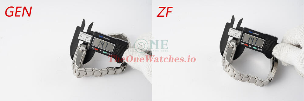
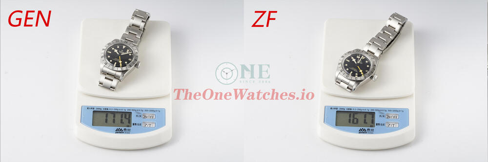
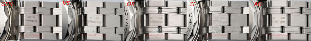
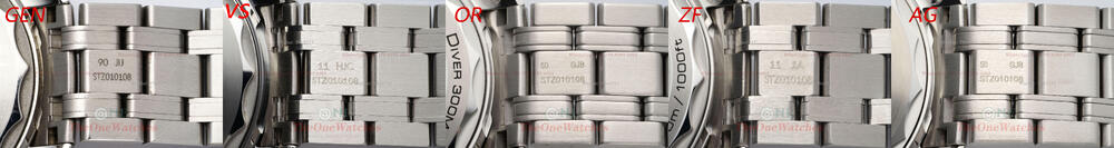
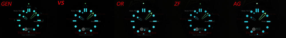
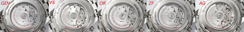
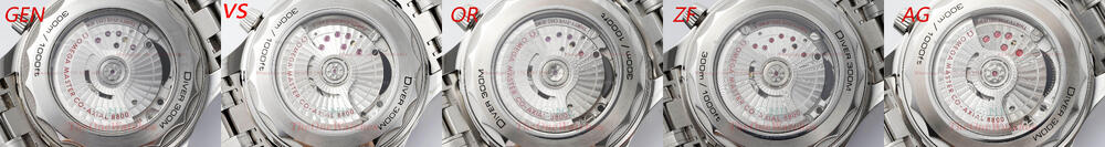
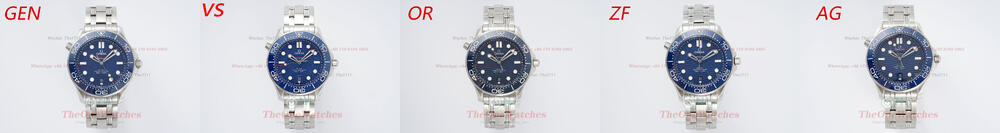
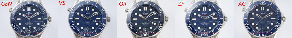
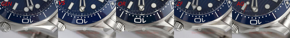
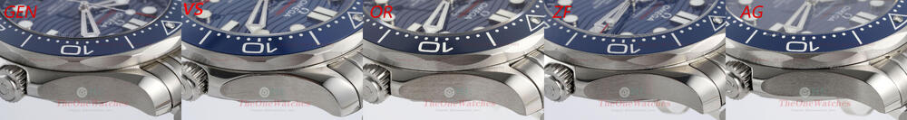
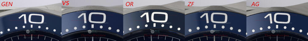
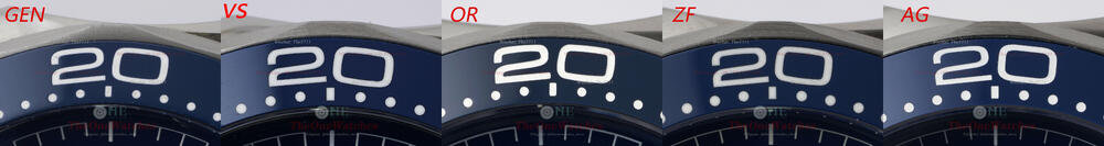
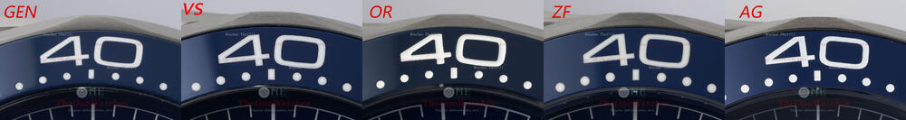
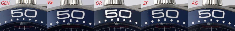
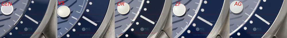
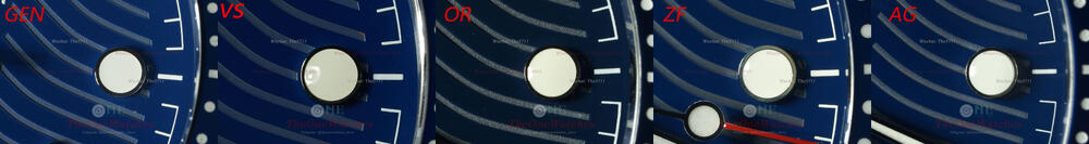
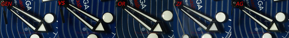
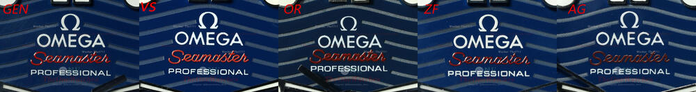
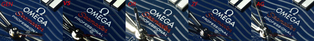
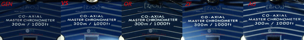
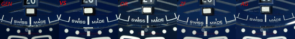
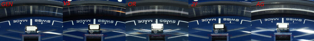
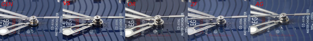
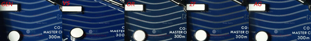
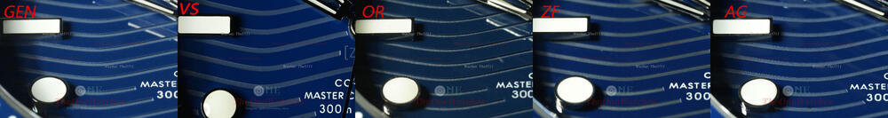
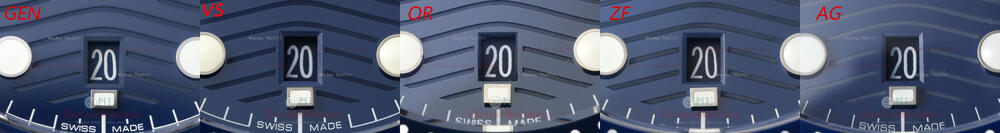
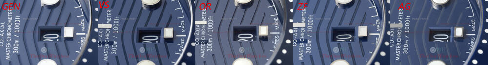
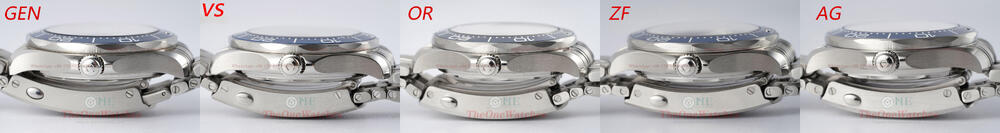
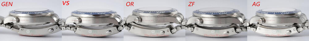
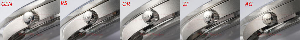
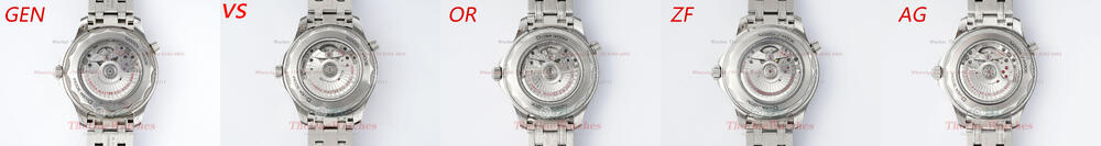
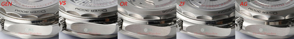
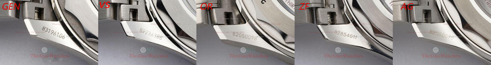
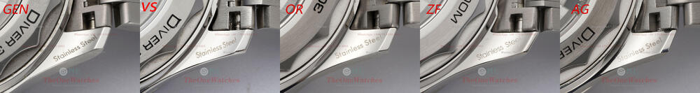
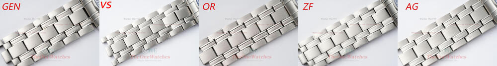
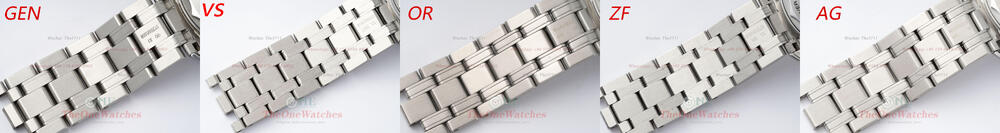
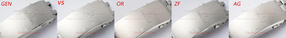
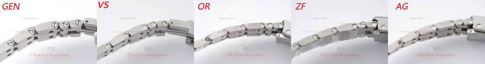
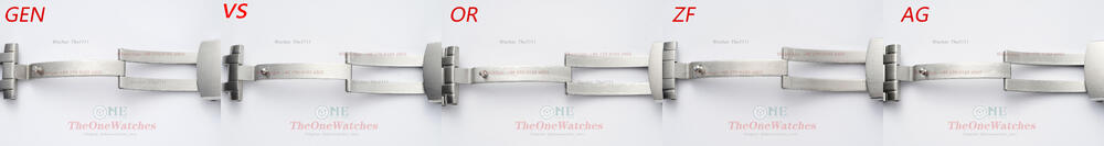
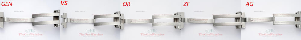
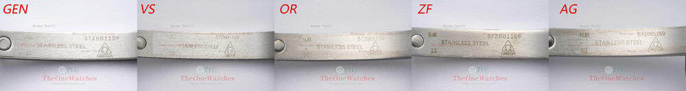
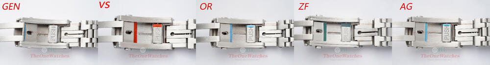
Hello friends, this is Steve. I’m come back. I have done a lot of comparison posts about the most popular Rolex models. We guess you guys may tired of reading it. For a change of pace this time, let's see how well the major factories have done with the Seamaster 300 Blue dial. Without further [censored], let's get straight to it! Dial Front View In terms of color, VS and ZF are the closest to GEN, AG is not bad, OR is the most obvious, too dark! Bezel view All factories’ bezels are well polished, and the shape and smoothness of the sides are about the same! OR's bezel is better polished. As far as the rotating feel is concerned, the VS’s is the most comfortable. Like the GEN, it is relatively loose to rotate. The sound is too loud is the only defect. OR, ZF, AG are all too tight to rotate! Detailed Engraving View The enamel engraving process used by GEN is almost flat and has no ranges visually! There is no problem with what the rep factories do! In terms of fonts, VS and ZF do better, OR is a bit thicker, and the flatness of AG edges is relatively poor! Night Pearl Triangle View The enamel engraving process used by GEN is almost flat and has no ranges visually! There is no problem with what the rep factories do! In terms of fonts, VS and ZF do better, OR is a bit thicker, and the flatness of AG edges is relatively poor! Glass view Overall, the crystal surface of ZF is better, and the secondary treatment of glass is done on the side. AG's glass surface is low. Markers view The overall polishing of the scale is not bad, but the GEN’s dot time scale is flat, and the factories’ seem to be too round! The double sticks at 12 o’clock are not very neatly arranged in all factories! Hand & Markers Luminous Filled View The luminous light of the hands are made grainy in all factories which are not much difference. Looking at the dot stick from this perspective, the factories’ are indeed too full, and the OR is obviously yellowish in color! Oil Font behind 12:00 Stick View VS is also not bad. The best thing ZF does is the shape and flatness of the font. The downside is that the red SEAMASTER is darker, and the color closest to GEN is the OR factory. Oil Font behind 6:00 Stick View On the whole, the OR factory is slightly worse. The letter A above the calendar window is the most obvious place. The skeleton part in the middle is made into a circle! Hand view The GEN middle axle is solid, but all the factories are skeleton. VS’s and ZF's external leakage cylinders are better in shape, protruding like GEN, and very flat! Panel Wave Notch View The depth of the notch is not bad in all factories. In terms of color, GEN is dark gray. Through physical observation, VS, ZF, AG are very close, and the graininess of the OR pattern is too strong! Date Window View The window shapes of VS, ZF, and AG have secondary processing of beveled edges, while OR does not. And only VS and ZF are correct for date fonts. GEN's font 20 is narrow at the top and wide at the bottom. The upper part of the number is leaning towards the middle, and the lower part is inclined towards the outer edge (the same is true for 10 and 30, and the date after many days is this shape. Case Side View There's nothing wrong with the shape of the case. The shape of the upper part of the letter E of GEN's exhaust valve is an arched curved corner, and the factories’ are a bit square! GEN's crown and exhaust valve are chamfered with circular arcs, which looks like a layered slide. All factories have noticed this detail, but VS and ZF are better at arc angle grinding. Caseback View GEN's rear bottom cover has a very fine chamfered edge, VS and ZF have noticed it and have chamfered it, while OR and AG feel almost no treatment. Engraved view of lugs The VS logo graphic is thinner. In terms of lettering, the factories all use different lettering processes, so there will be some gaps, but the overall shape can still be seen clearly. Strap Detail View Lume View GEN's sticks lume is more green, the factory's is more blue. The color is still different. Movement View All factory movements use Seagull 2824 to imitate the 8800 SMD movement. The structure of the four factories is slightly different. OR, ZF use fewer patches and more similar with GEN The most obvious place for VS is the lack of a screw on the balance wheel. In terms of polishing, OR and ZF are better, and in terms of gem color, OR is closer to GE Data Comparison Illustrate: All watches are in a clamped state, and there may be precision due to the slight deviation of the caliper position. GEN and factories have steel tape protective films. Well, today's post is here, thank you guys for watching. If there are any mistakes, please correct me. If there is anything else I overlooked, you can put it up, and I will try my best to do it. Complementary and comprehensive, welcome to comment and exchange! (Illustrate: Some photos deviate from the real object due to the problem of the light source. The details are mainly written in text. The size of the comparison picture is relatively large. You can download it and enlarge it for comparison.) There is no perfect replica, only the one you prefer. Website: https://www.theonewatches.ws WhatsApp: + 86-17081934955 Wechat: The5711


-
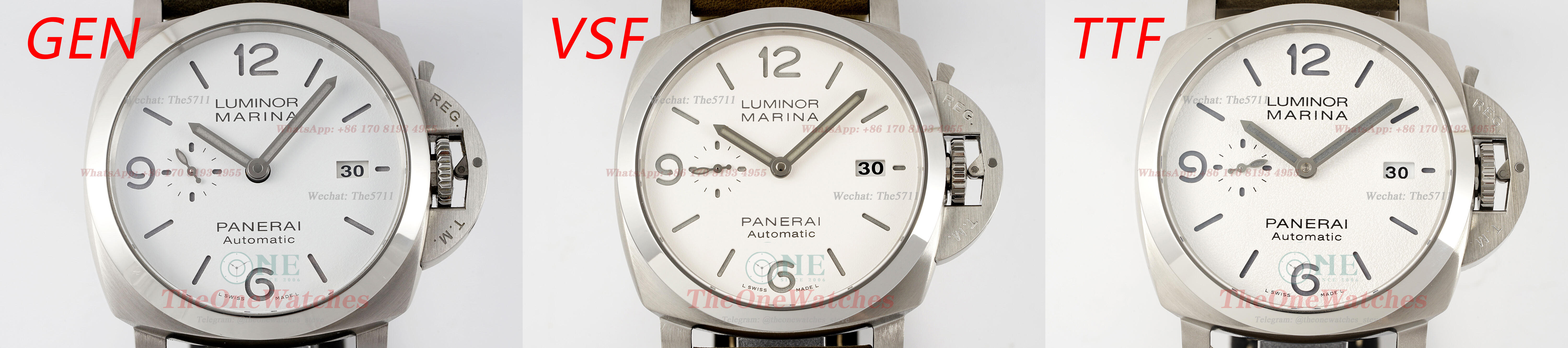
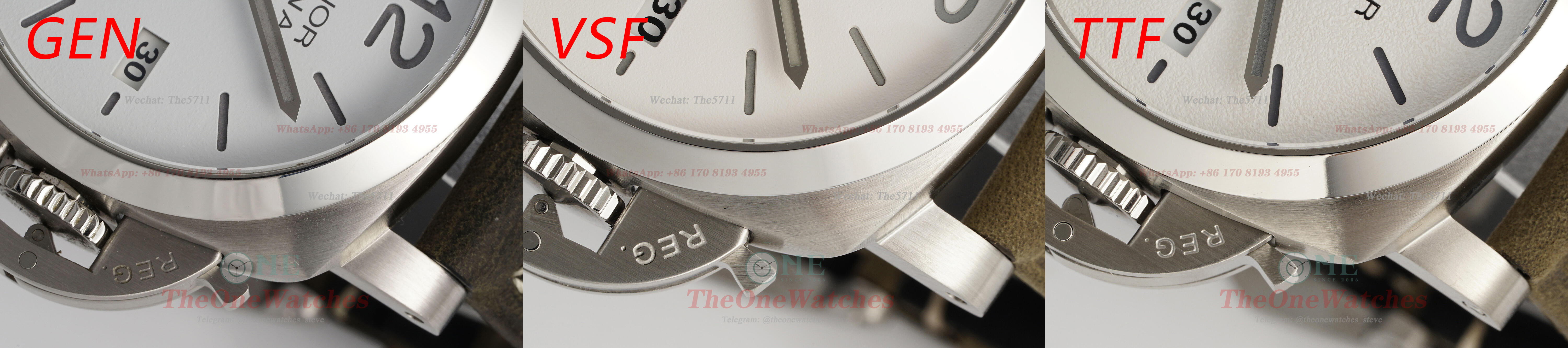
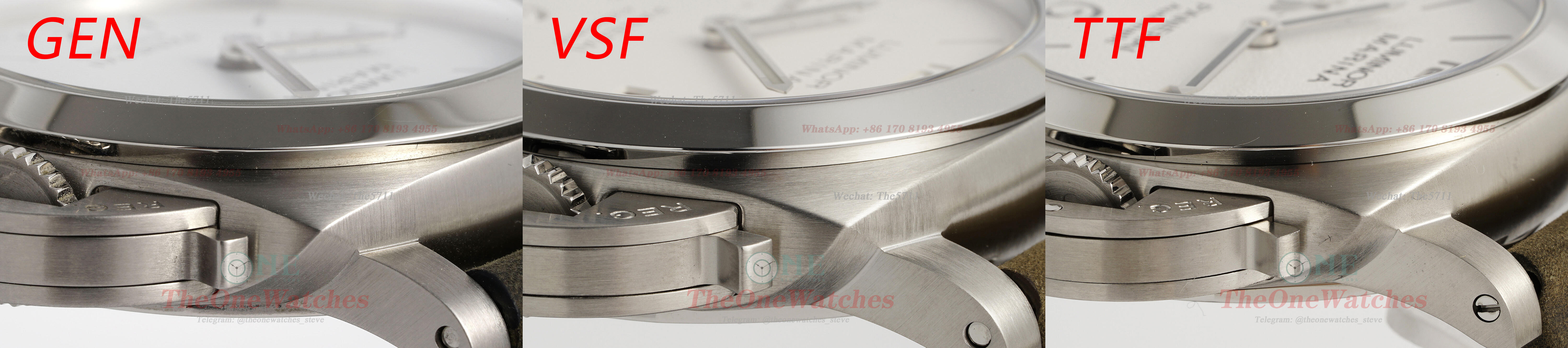
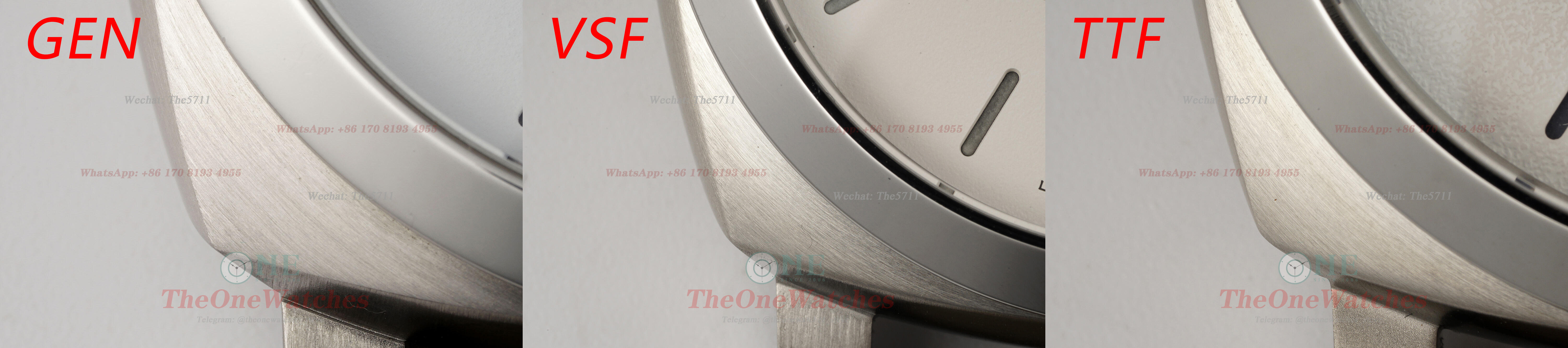
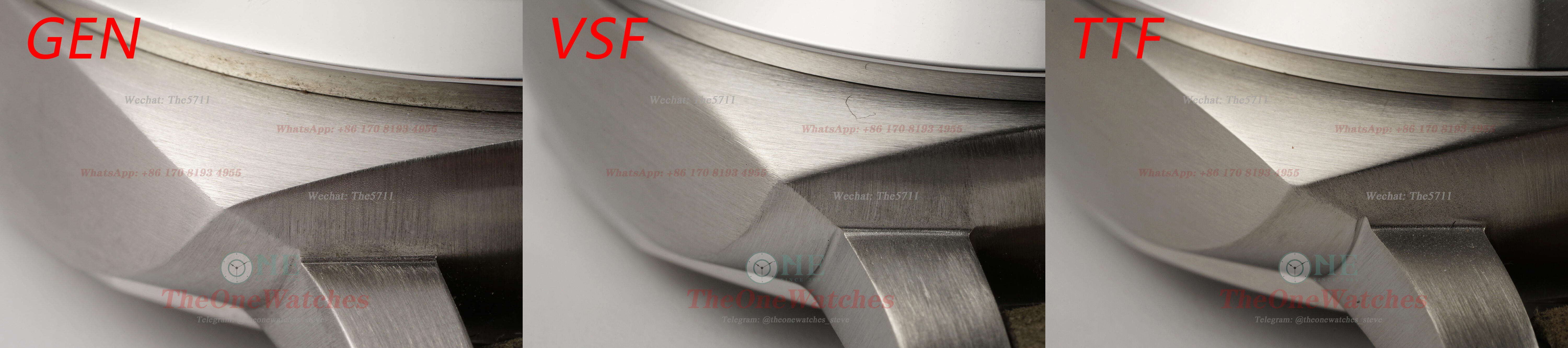
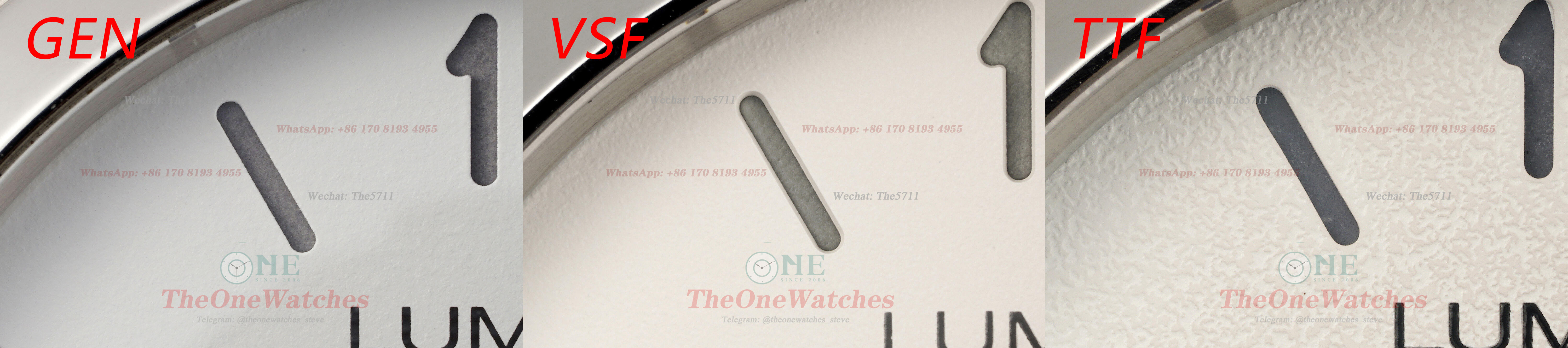
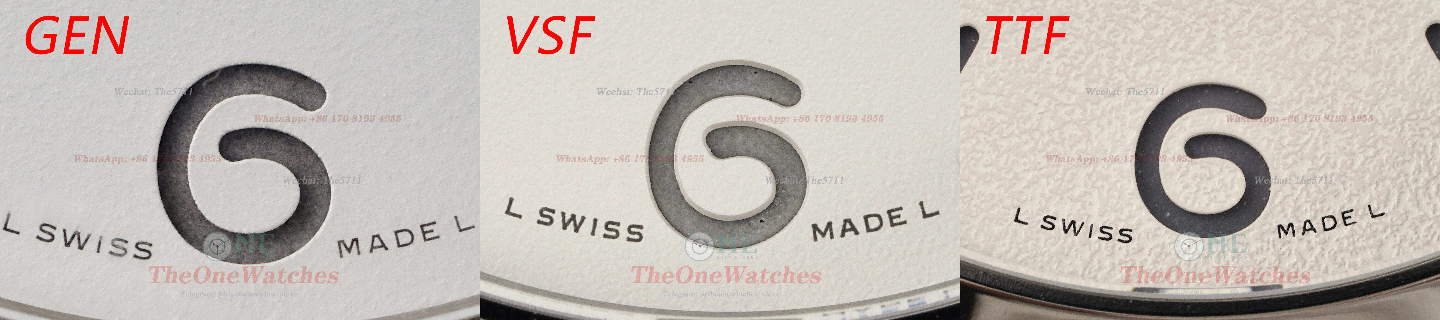
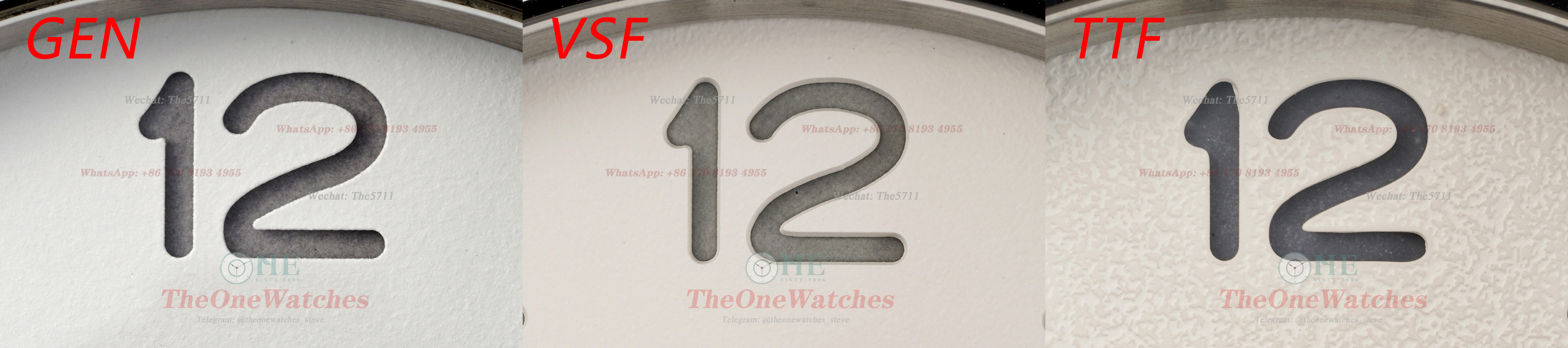
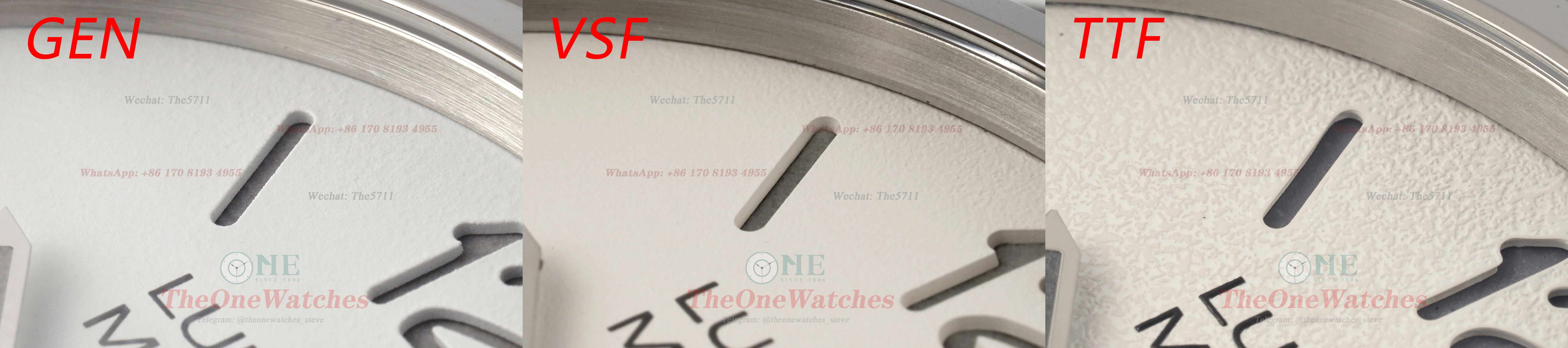
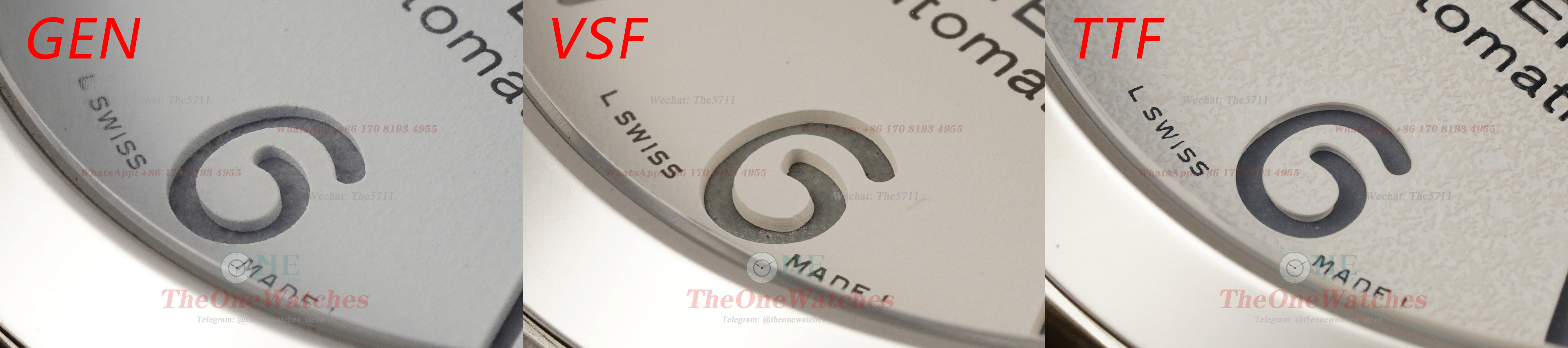
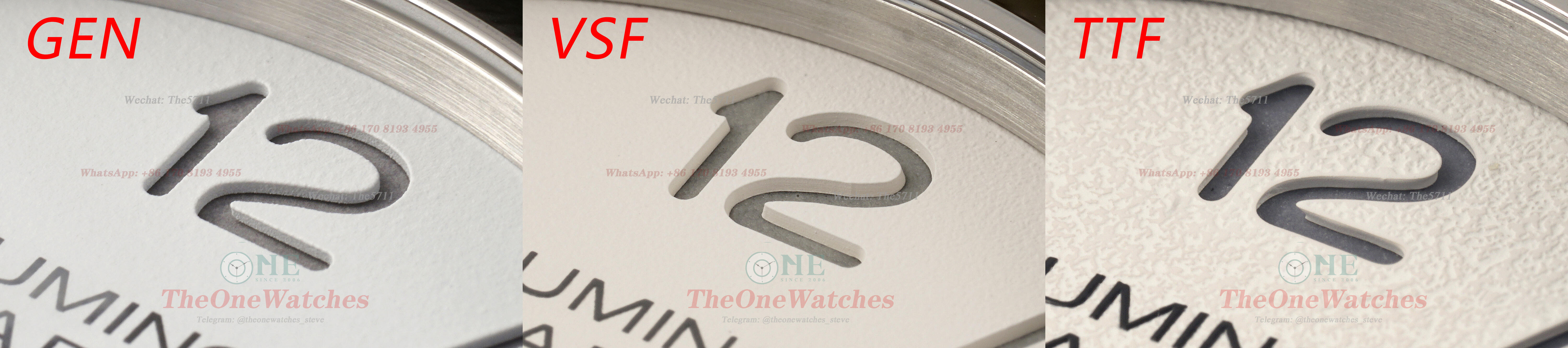
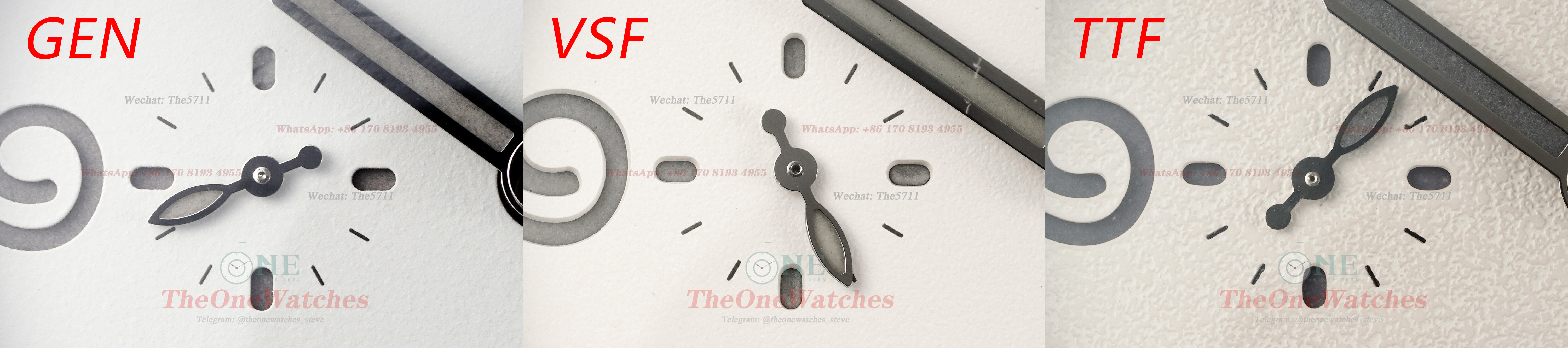
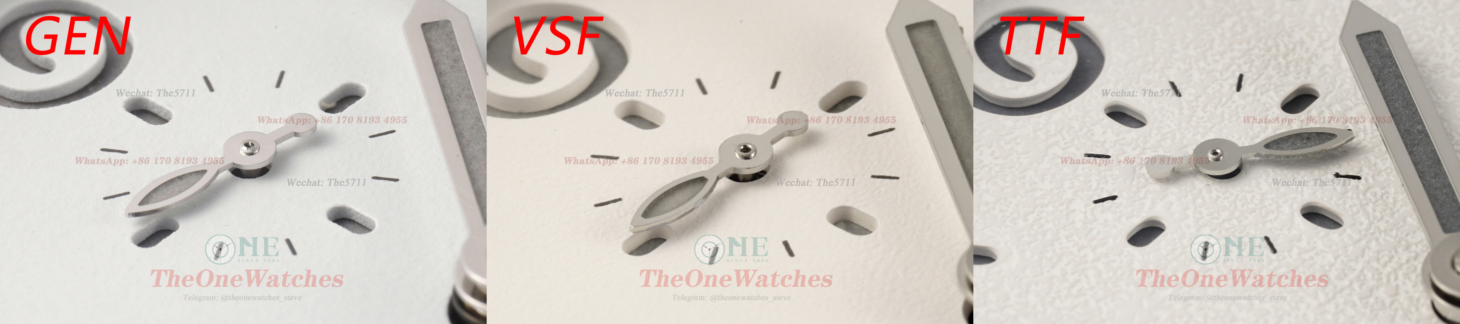
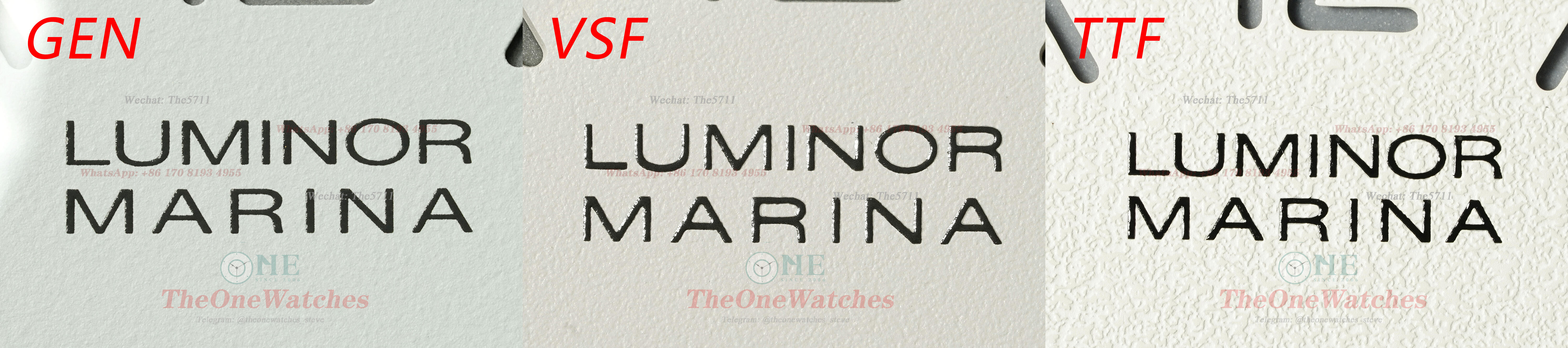
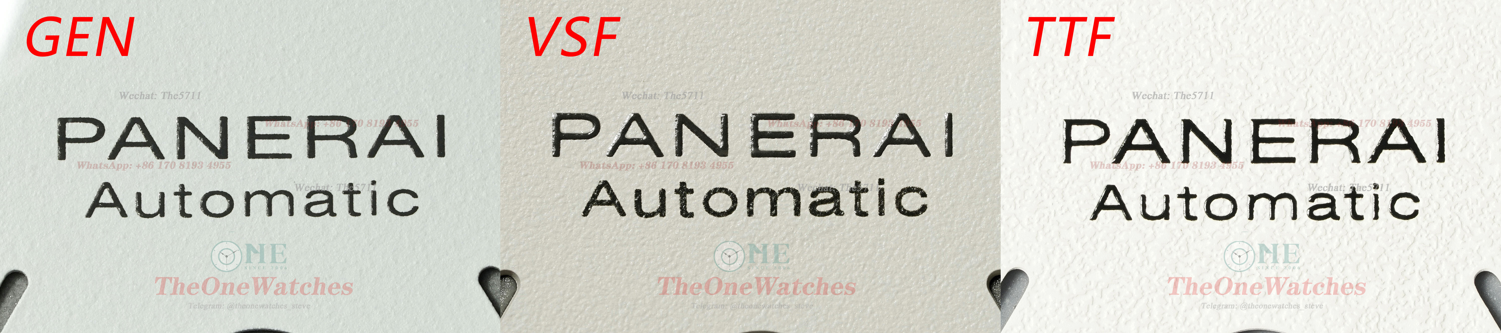
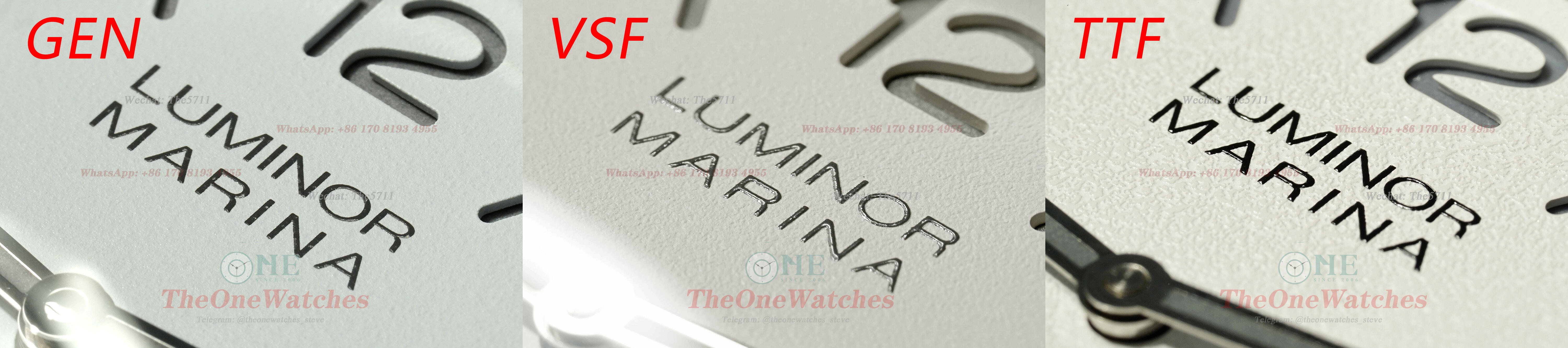
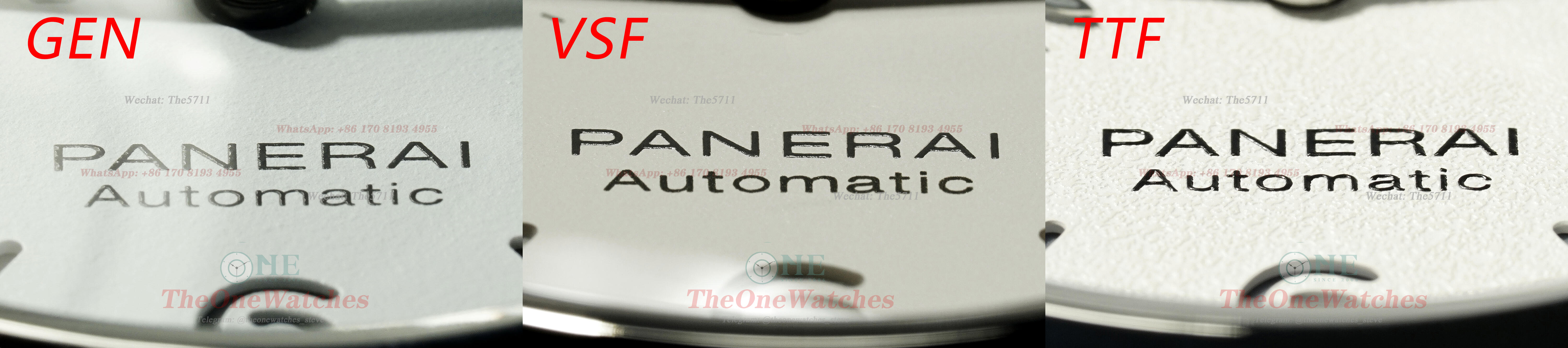
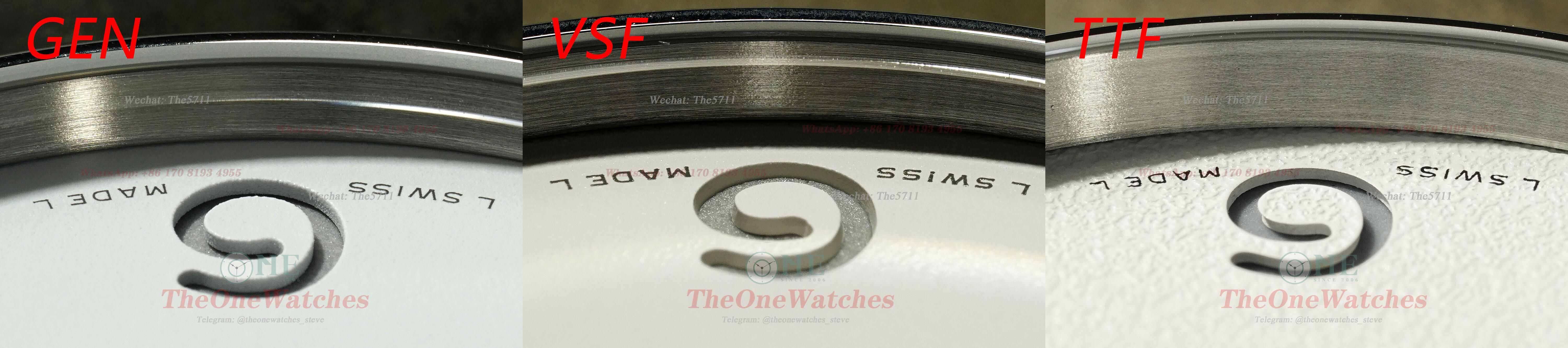
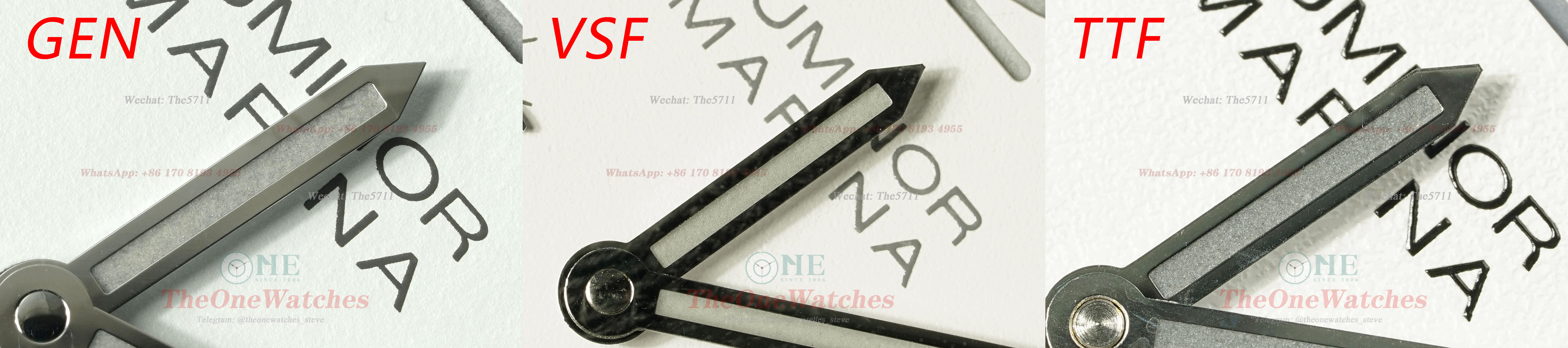
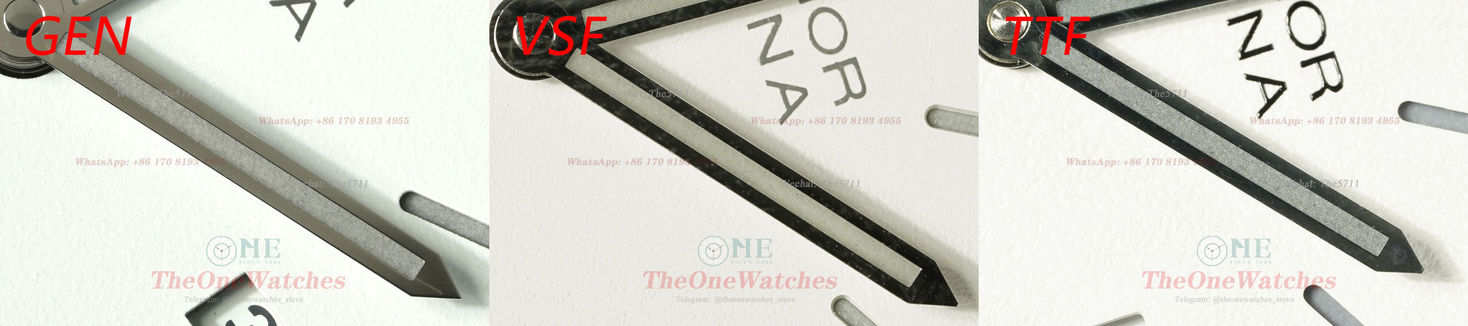
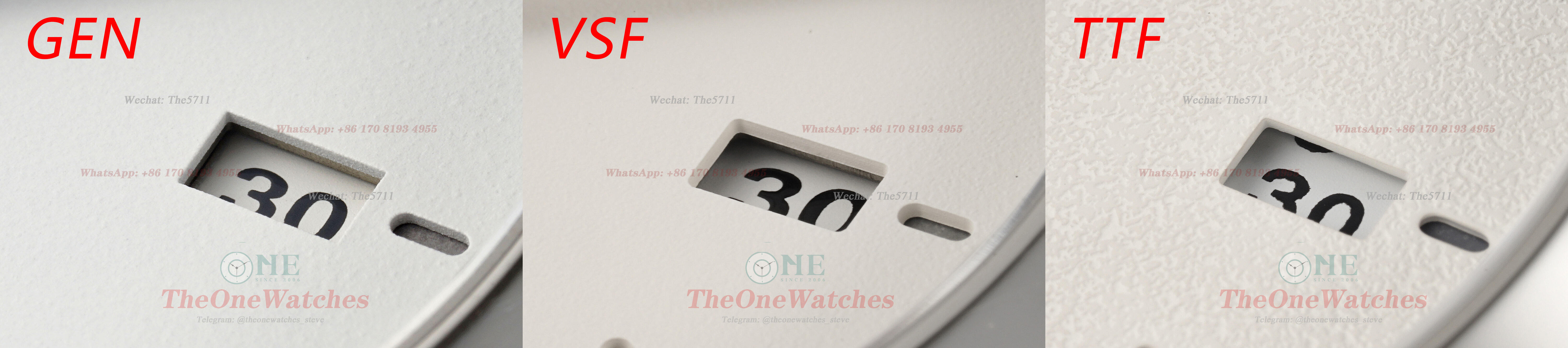
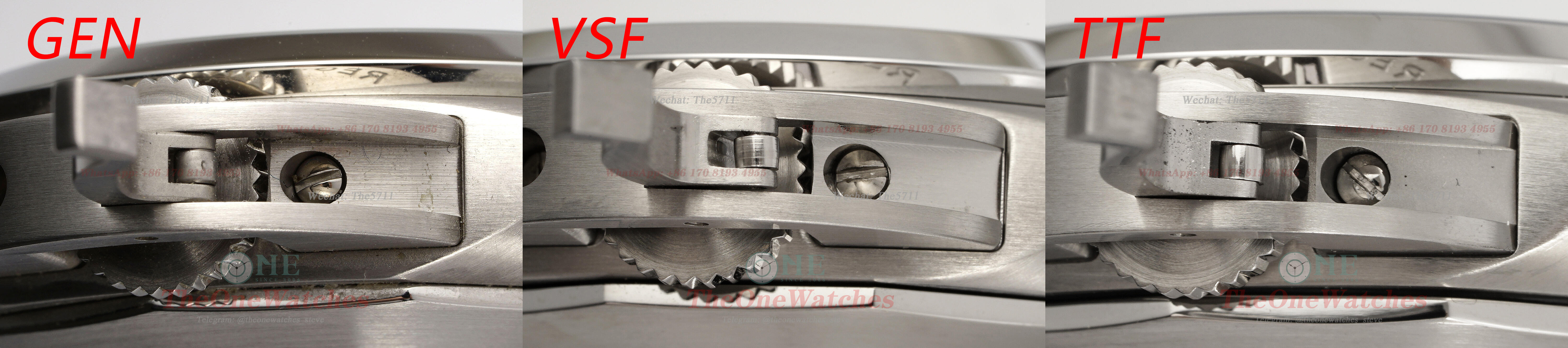
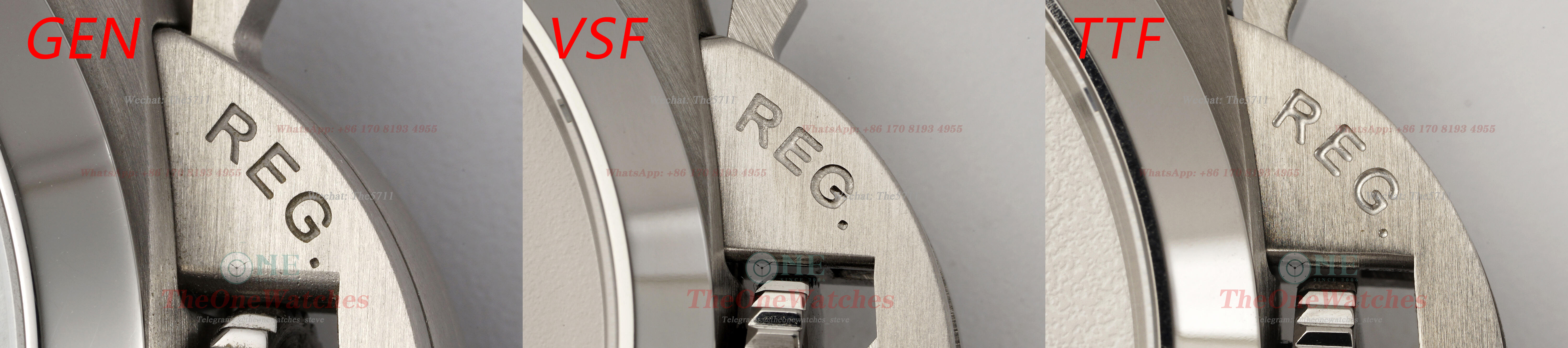
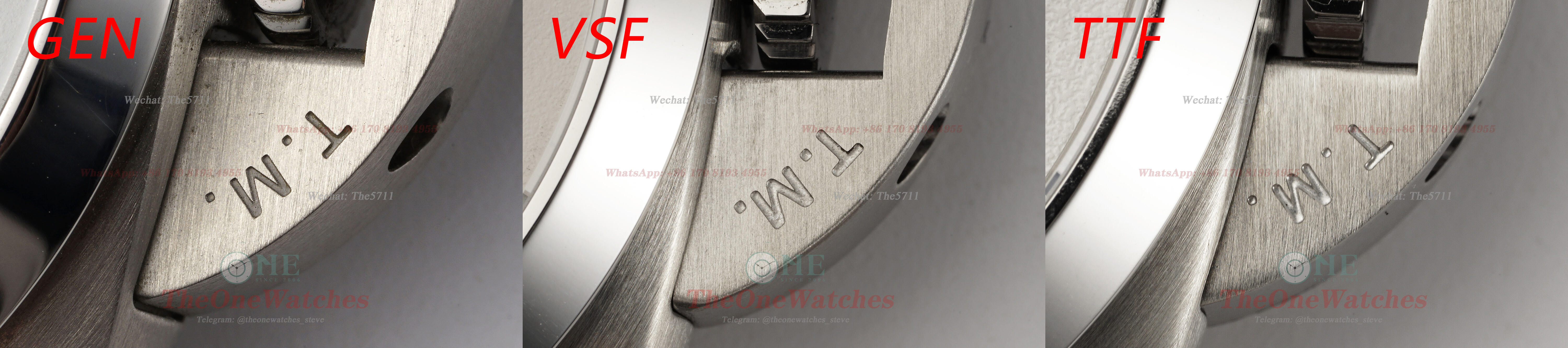
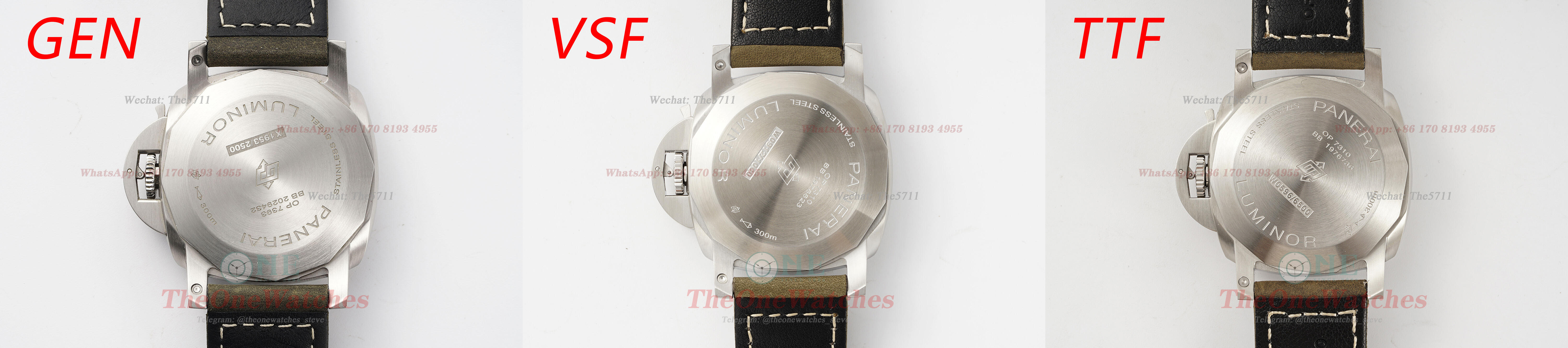
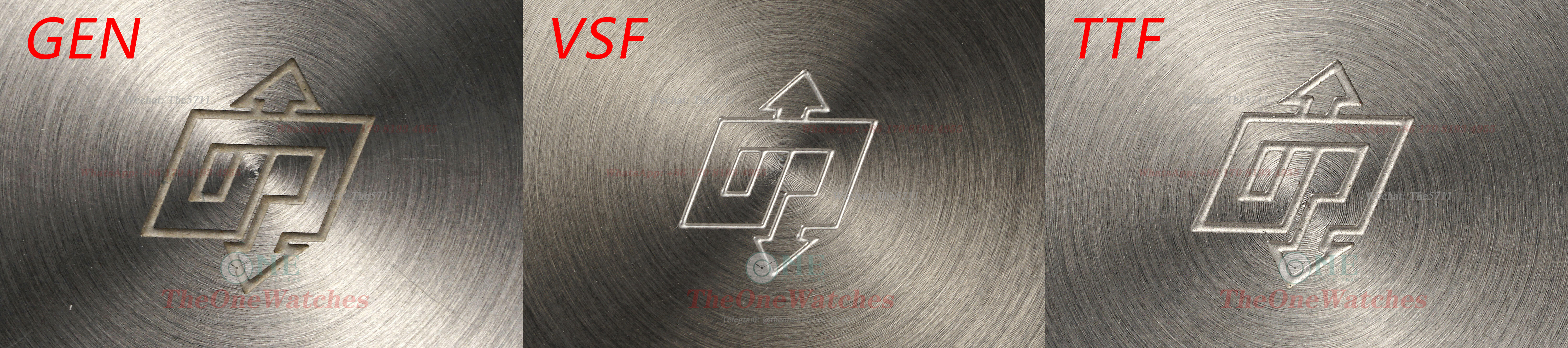
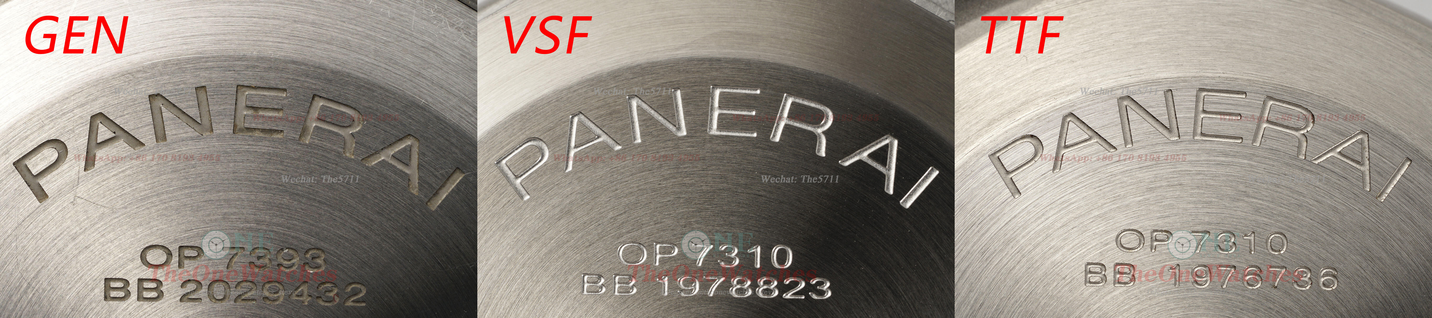
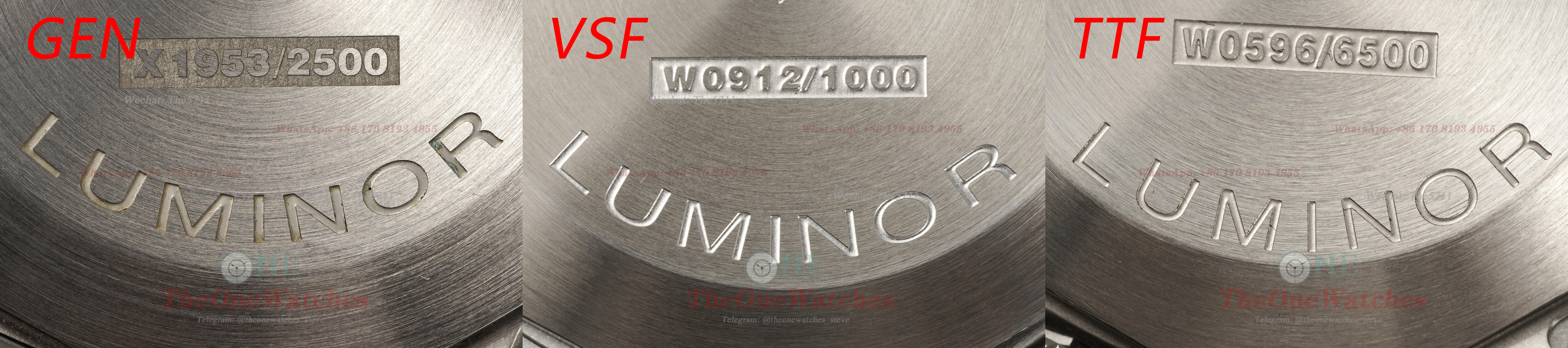
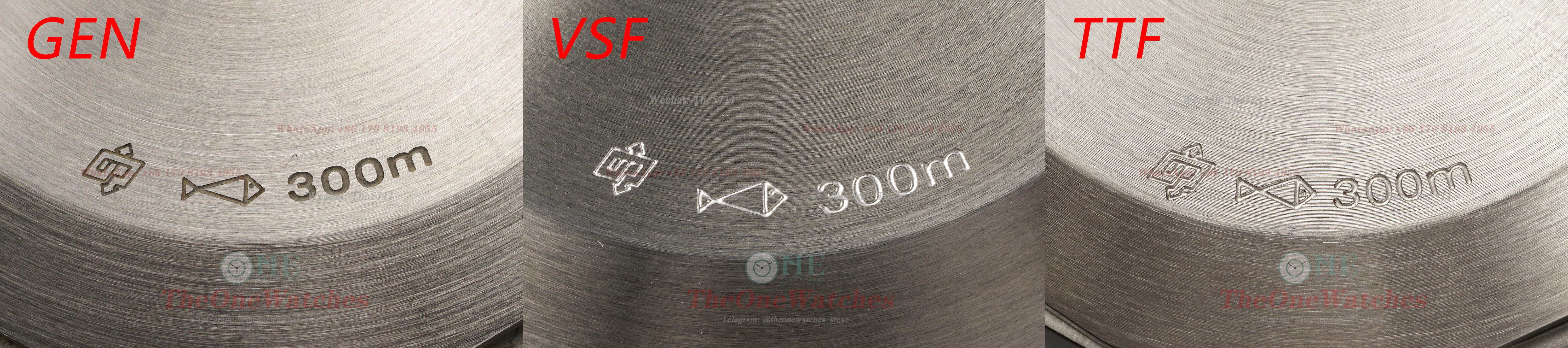
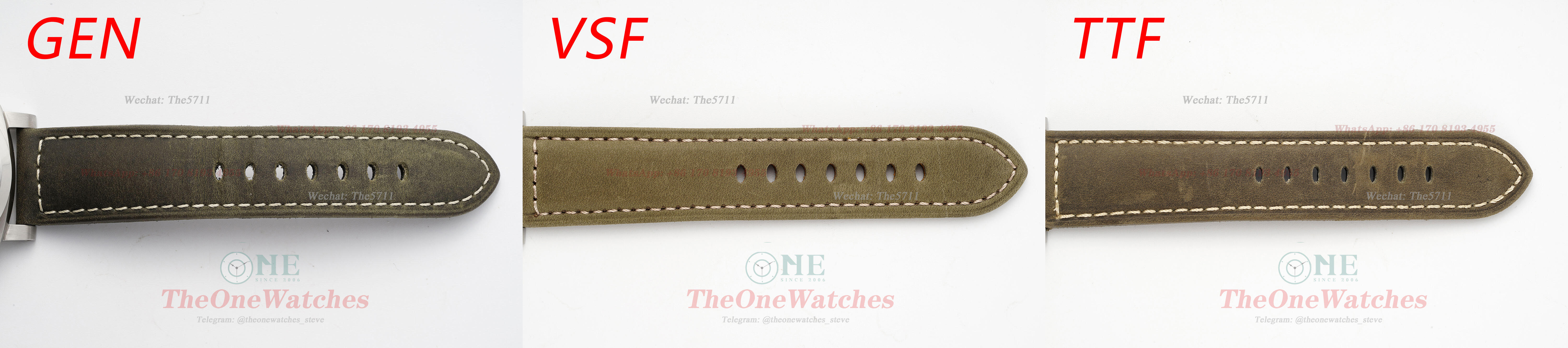
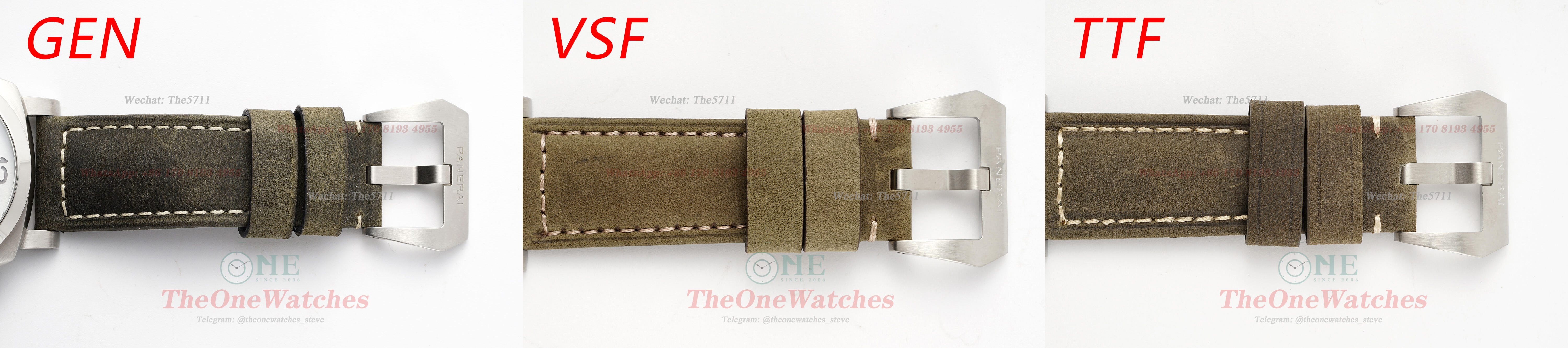
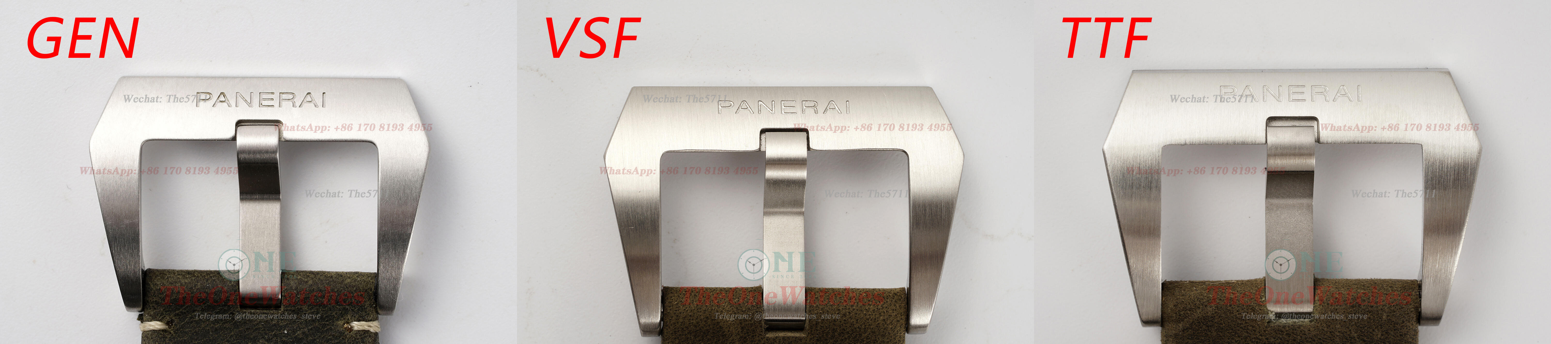
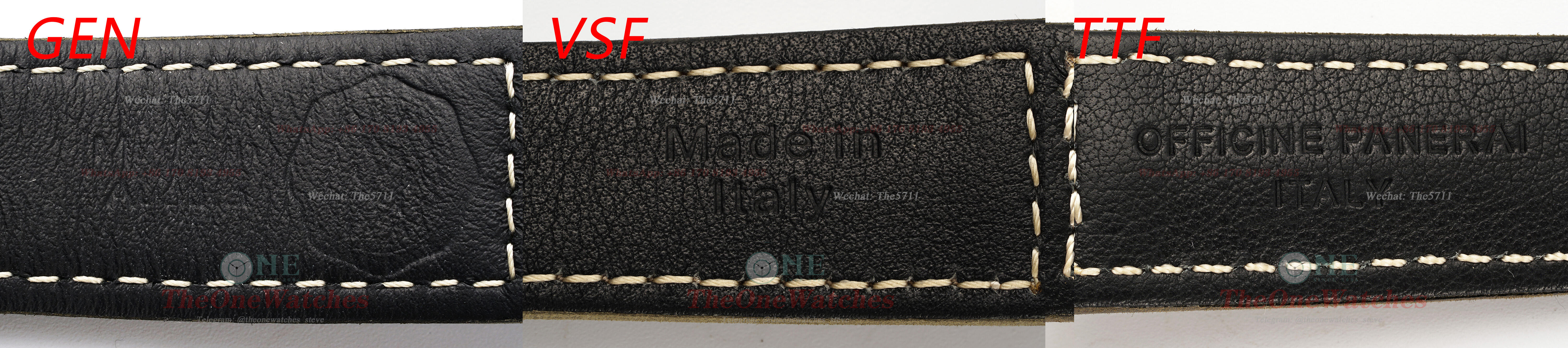
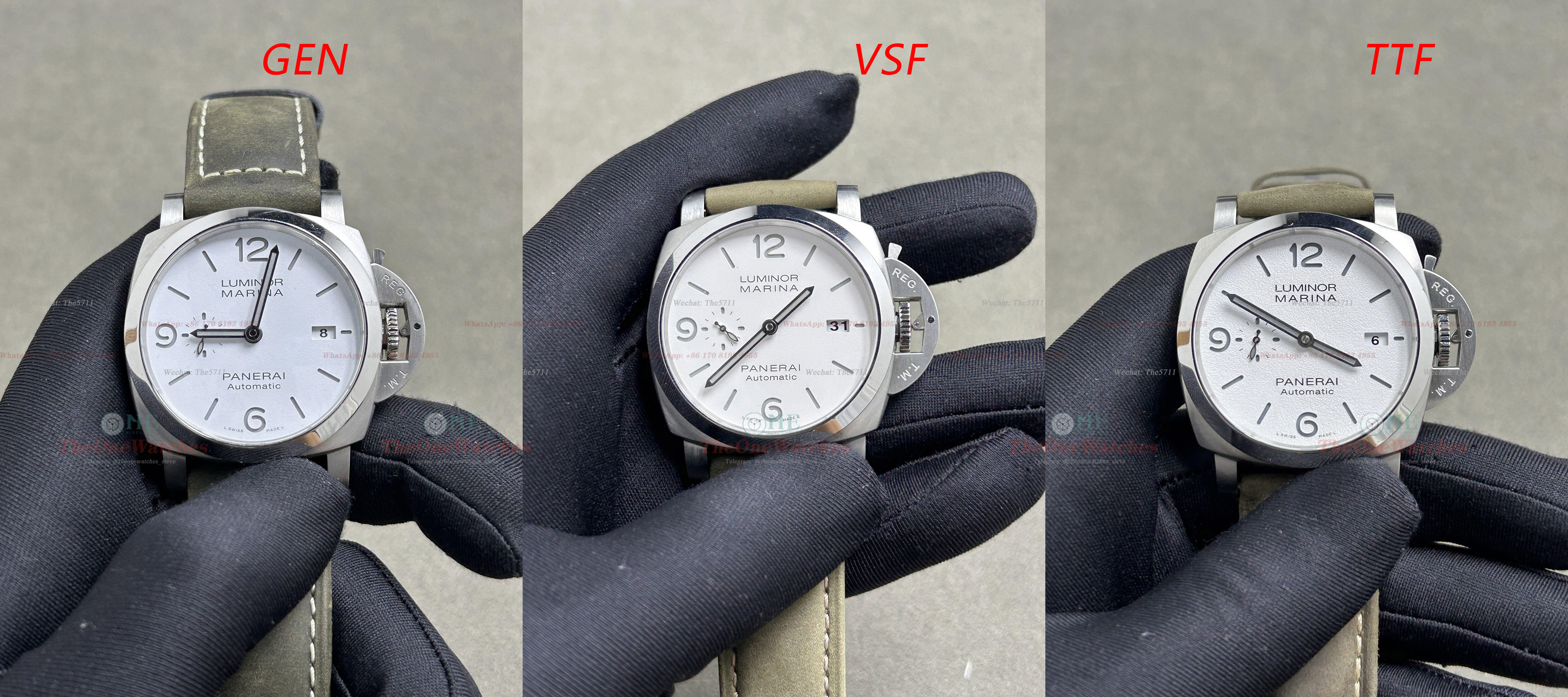
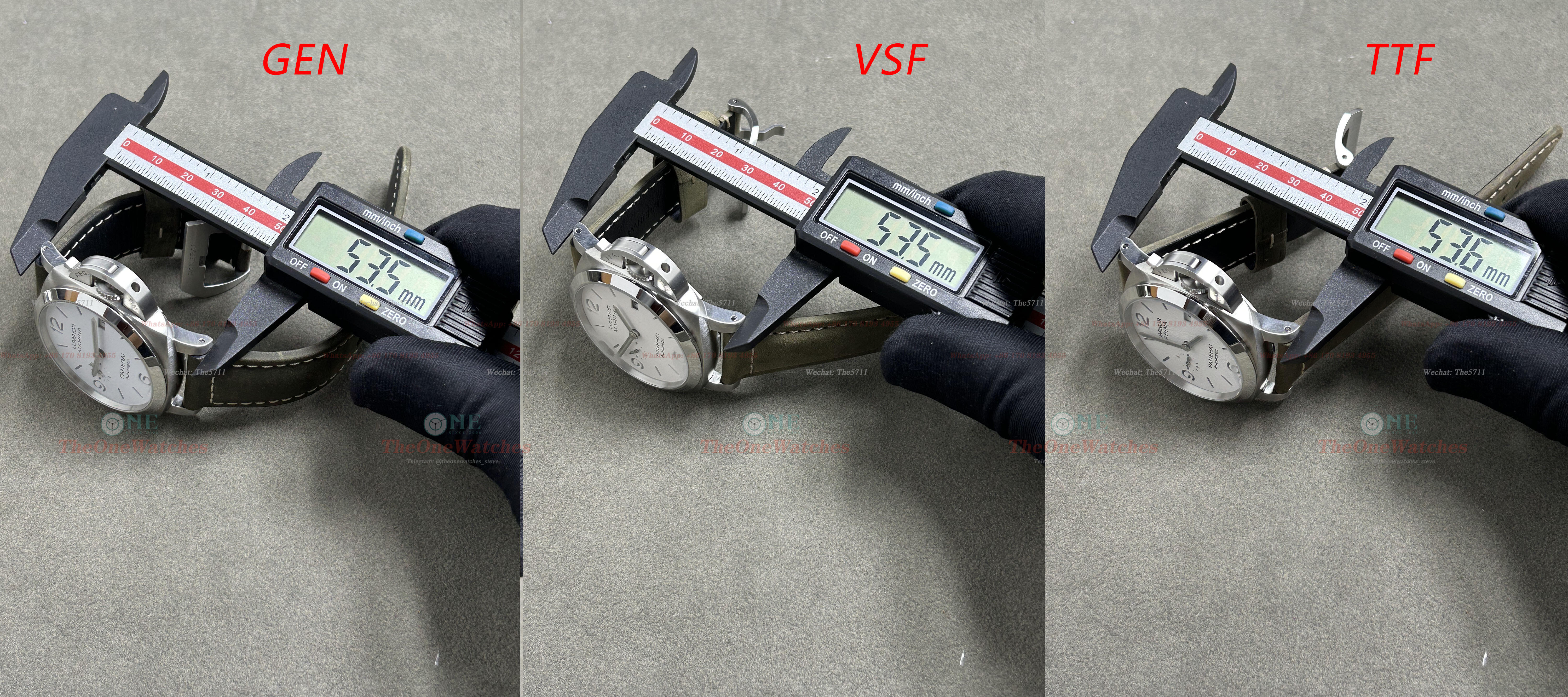
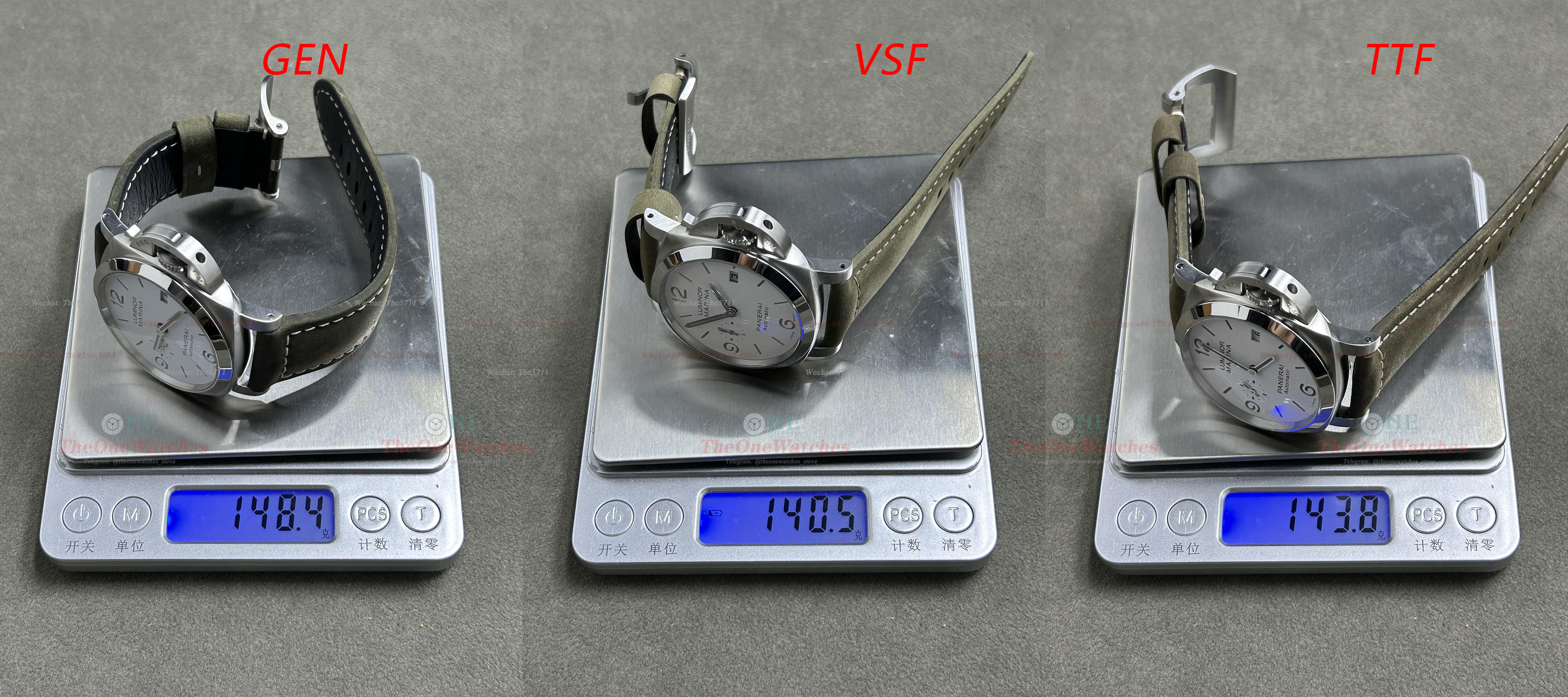
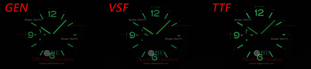
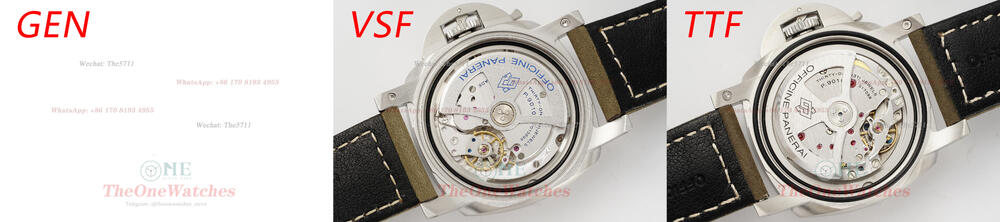
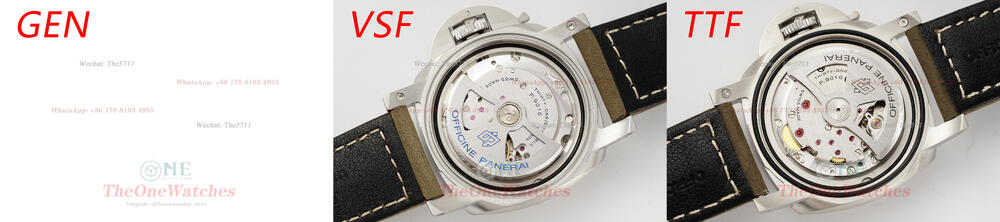
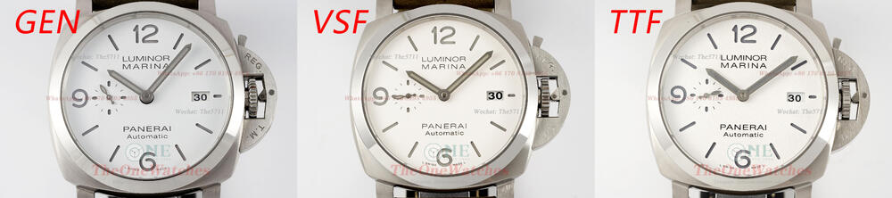
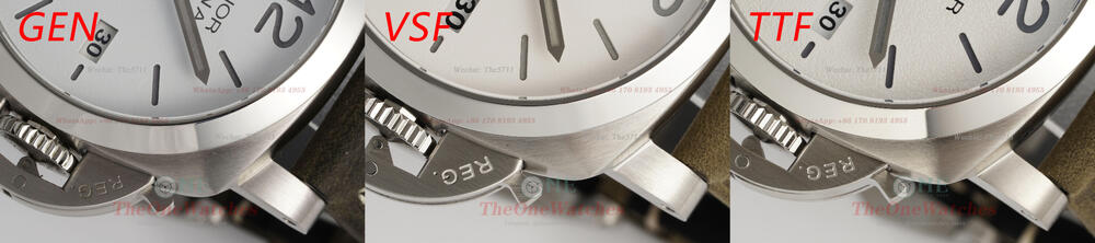
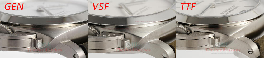
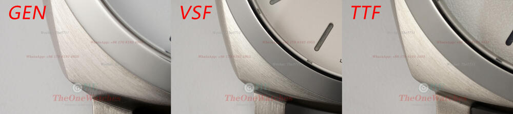
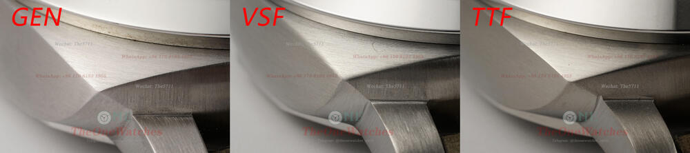
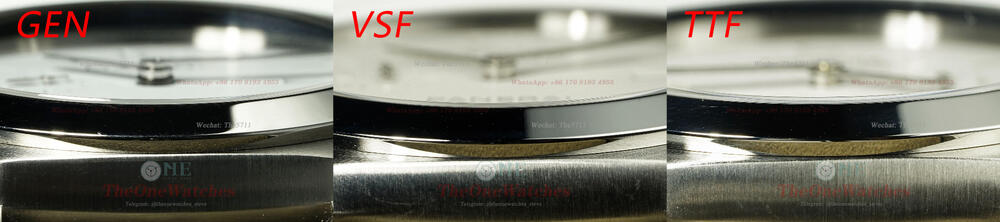
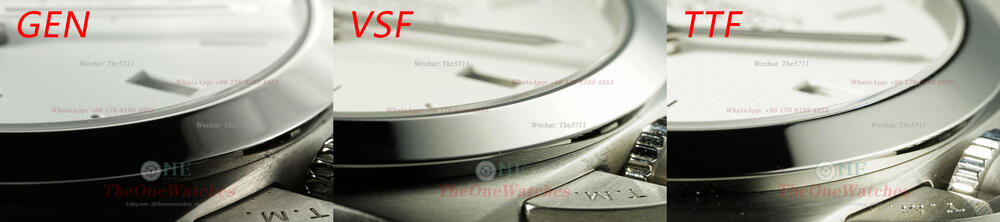
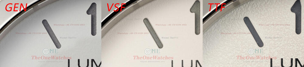
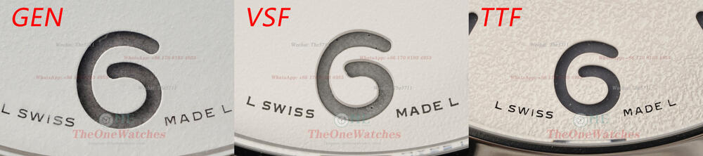
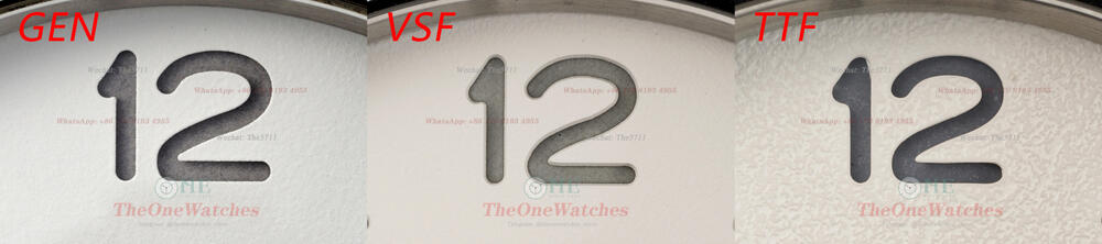
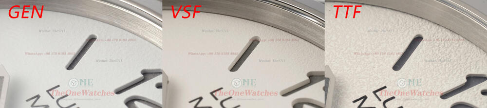
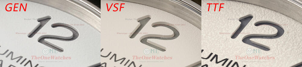
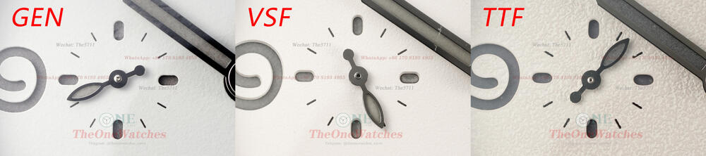
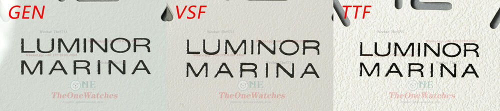
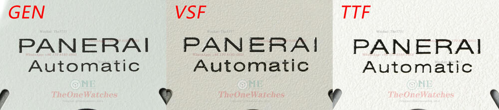
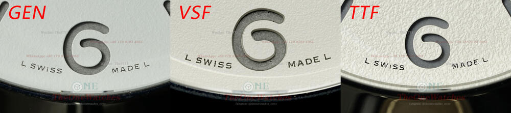
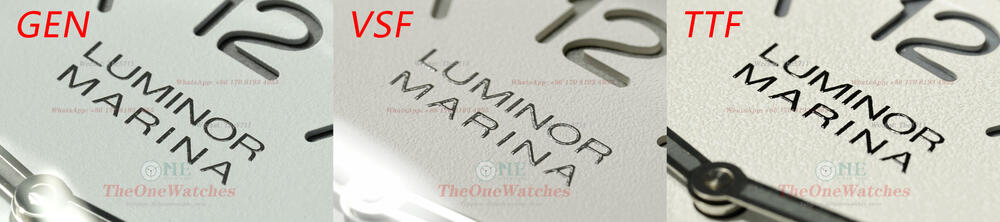
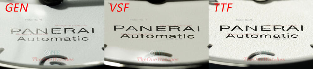
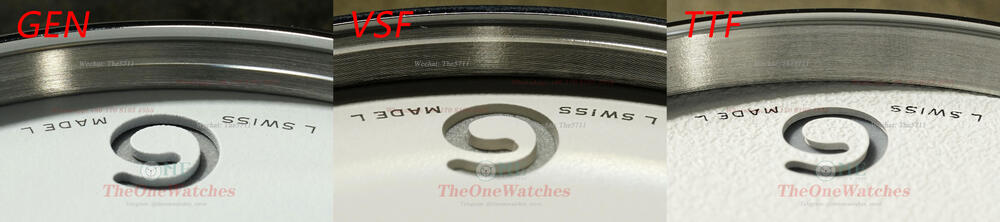
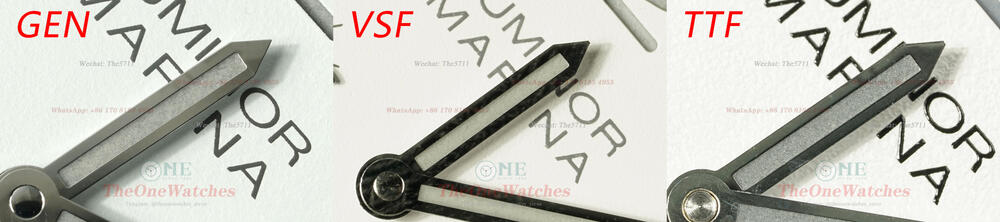
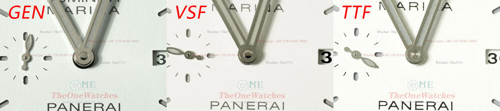
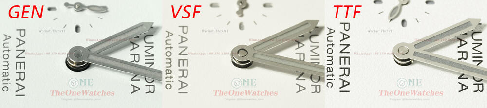
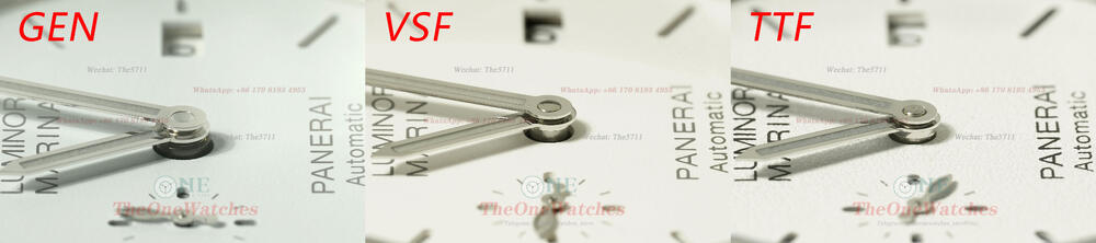
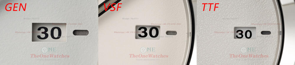
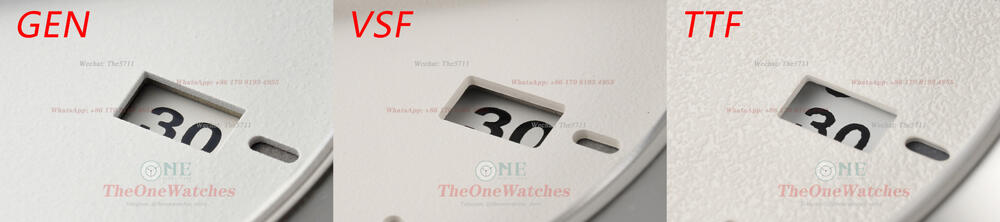
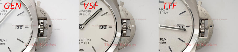
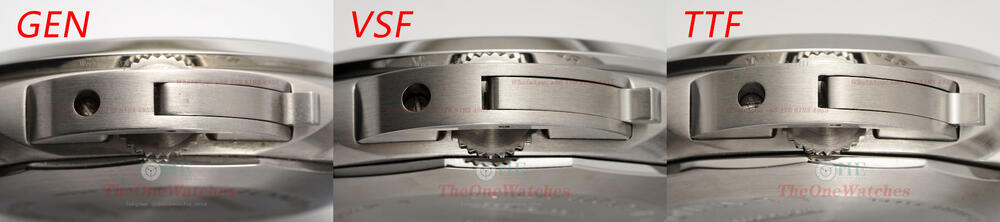
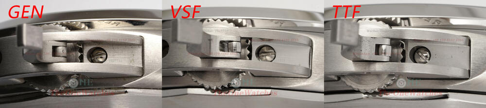
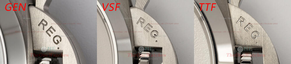
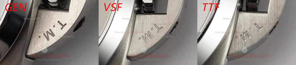
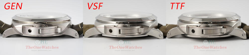
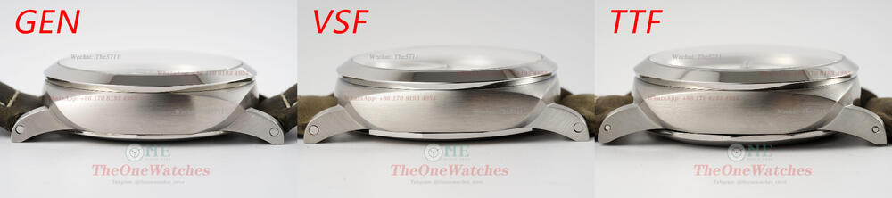
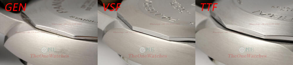
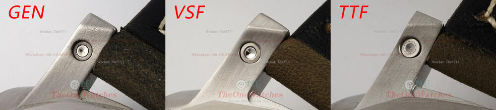
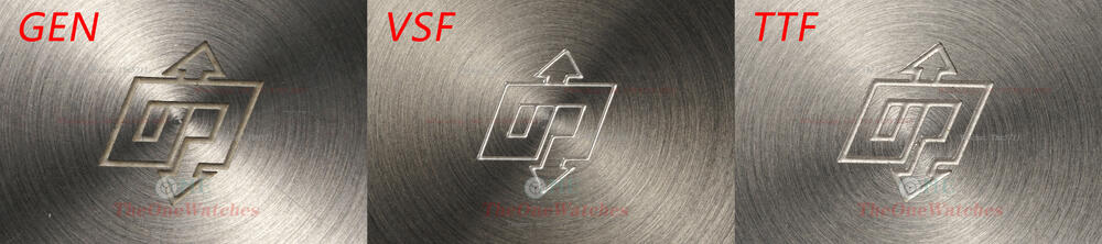
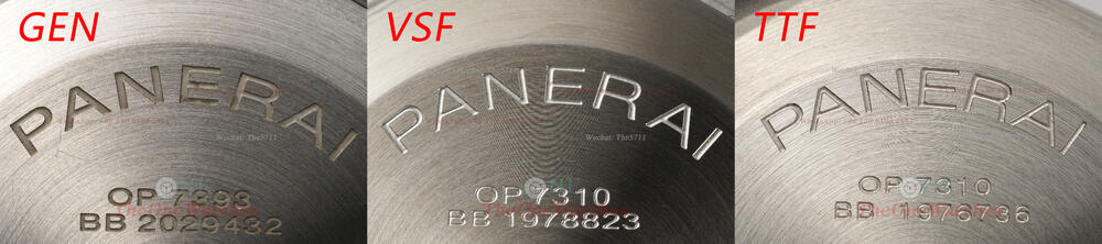
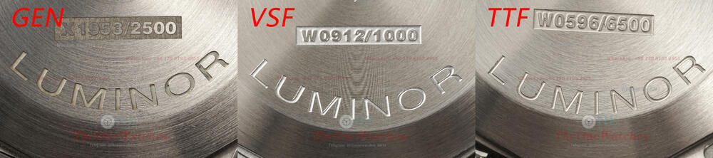
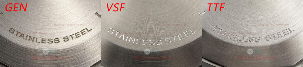
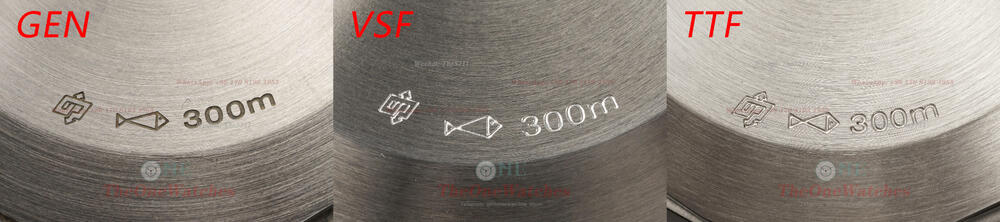
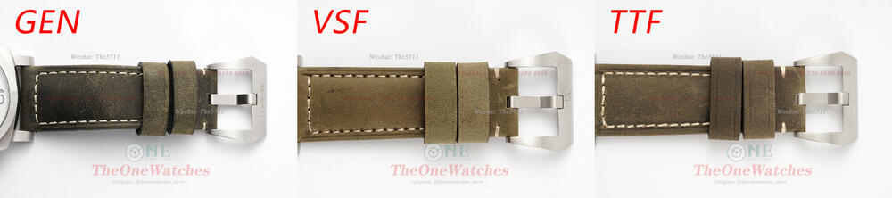
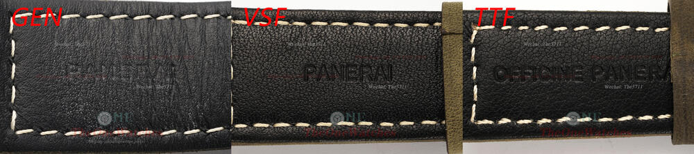
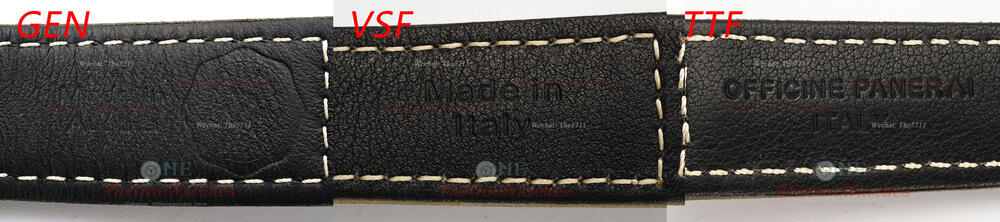
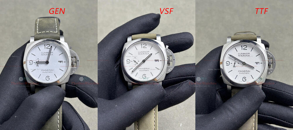
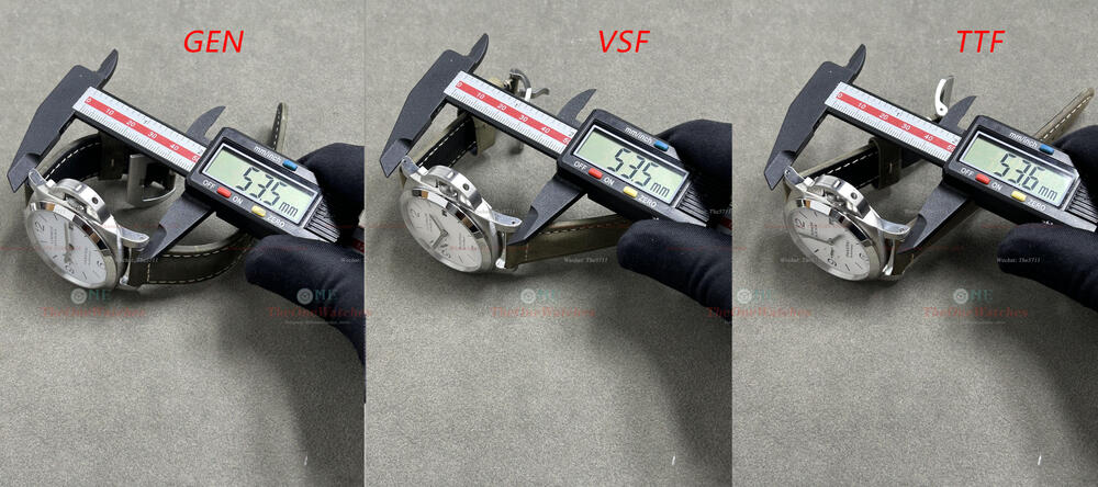
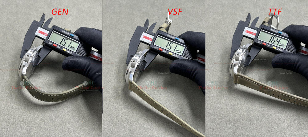
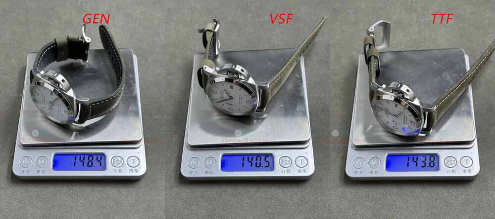
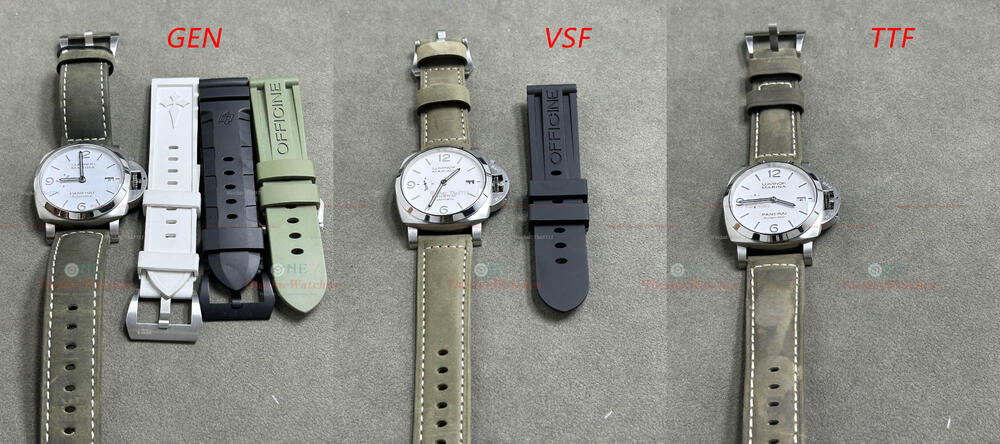
Hello everyone, this is Steve, I'm back. We have done a lot of comparison posts since last year, most of them are about Rolex models. This time, we finally came to my favorite tough guy style brand - Panerai. There are many models of Panerai, so I had to choose PAM1314 as the protagonist of this comparison according to my personal preference. Although it is also a large-sized watch with a diameter of 44 mm, I think the overall feeling of wearing 1314 is not particularly rough. The white dial adds a touch of softness to it, making it both tough-guy and elegant. To use a Chinese idiom to describe it, it can be described as "hardness and softness". Well, it seems to be a bit off topic, let’s cut the crap and get started! Flat View By the way, there is a black rubber strap gave away with the watch from VSF, while TTF does not come with a extra rubber strap. Front View Photos under lights We could see clearly that the dial color of GEN is pure white, while VSF is slightly yellowish milky white, and the graininess of TTF dial is too obvious, which can be clearly distinguished by naked eyes. Therefore, relatively speaking, VSF is better, although there is a certain color difference, it is within the acceptable range. Bezel View For the overall bezel shape and edge chamfered treatment, both VSF and TTF factories have handled them very well, basically no difference from GEN. View of the corner position of the case In terms of the polishing of brushed lines of the case, both factories’ performance are still very good, their polishing is very delicate. In addition, we can notice that the section edge of the GEN case is not very smooth (the side lines looks a bit sharp), TTF is the same, fortunately, it does not scratch your hands when you touch. Instead, VSF polished very smooth in this part. Crystal Side View From the side level of crystal, TTF and GEN are the same. VSF is slightly different, mainly in the narrower thickness of the upper chamfered edge. Dial Stick and Digitals View As a classic feature design of Panerai, the skeleton dial scale does look very individual.For the number’s shape, there is no big problem of VSF and TTF. If you zoom in on the picture, there are slight flaws on the edges in some position, but the edges of GEN are not very smooth as well. In addition, there is a small issue with VSF, the side section can be clearly seen when looking at the numbers from the front, but it is not noticeable under naked eye observation. For the color of luminous fill, both factories are different with GEN, The grey of VSF is lighter, while the grey of TTF is darker. Subdial View The second hand of GEN uses a solid central axle, while VSF and TTF are skeleton. In addition, we can notice that at the tip of the second hand, both factories are flat, which is called scissors hand in our country. Relatively speaking, in terms of the stick treatment of the small second dial, the flatness of VSF is better. Mimeograph Font View In general, the mimeograph fonts on the dial of both factories are handled well, there is no obvious difference between good and bad in this part. Hands Luminous Fill View For the luminous color of the hands, there are differences between the two factories and GEN. VSF is a bit yellowish, while TTF is a bit gray. The graininess presented by hands is still very obvious. In addition, we can notice that the hour and minute hands of both factories are also scissor needles (that is, the tip is flat) Hands Middle Axle View Unlike Rolex models, Panerai's middle axle is closed. For the top of the middle axle, VSF and GEN are consistent, while TTF has flaws. The surface of TTF is completely different from GEN, it has a spiral pattern, this part should be improved, because under the naked eye, the surface texture is very clear. Calendar Window View For the treatment of the four corners of the window, the factories have adopted obvious rounded corners, while GEN is almost at right angles. Although there are differences between factories and GEN, in my opinion, this is not a big problem. What do you think? In addition, by observing the actual calendar font, we can find that the font of VSF is slightly larger than GEN, while TTF is closer to GEN in size. However, VSF's font regularity is better, while the edge overflow of TTF factory's font is very serious. Crown and Crown Guard View For the overall shape and internal structure of the crown guard, the factories are basically consistent with GEN. However, we can observe the connection between the end of the crown guard and the case in the last two pictures, and find that GEN has adopted a horizontal corner treatment. VSF also takes this part into consideration, but the horizontal distance is a bit longer. TTF ignores the treatment of this part. Case Side View The side shape of the cases from both factories are excellent, and the surface brushed lines is also in consistent with GEN, very delicate. However, for the lugs, TTF is a bit different from GEN. Let’s look at the side of the crown first. The lugs of TTF are notched, while GEN are smooth. On the other side, the lug holes of TTF are obviously smaller. Case Back View For the gap between the case back and case, TTF is a bit bigger, VSF is better, at least it doesn’t looks so obvious, even for physical observation, it is same like the photo. The screws on the lugs of TTF are also different from GEN, there are clear lines on the surface. Engraving of Case Back View For the overall shape and depth of the engraving, the treatment of both factories is quite good, just different from the GEN in color. Strap Details View The strap color of GEN is a darker brown, while VSF and TTF are lighter. In terms of feel, the two factories are similar, but the strap of TTF is thicker. On the printing of the shorter section of the strap, VSF and GEN are consistent, while TTF has the extra word ‘officine’. On the other side, GEN is an embossed pattern, but the two factories are not synchronize this part , and they are still embossed fonts. Luminous View Panerai's super luminous light is really good, and the luminous color of the two factories is the same as GEN. Movement View Since we didn't open the caseback of GEN, there is no pictures of the movement. Here we will simply talk about the movements of the two factories. As we all know, VSF was able to quickly seize this market when they launched the Panerai model because of the advantages of its movement. VSF uses a P9000 custom-made movement (modified on the Asian 7750 movement), this movement realizes the quick-adjustment function of the hour hand in the first notch, which is consistent with GEN. The whole series of VS Panerai uses the P9000 movement, the P9001 and P9010 movements are all uses the P9000 movement as basic and changing the engraving. TTF also uses the 7750 movement, but there is no change in the function. The first notch is quick-adjust the calendar directly, which is different from GEN. Data Comparison View Note: All measurements are in a clamped state, and there may be tolerance due to slight deviations in the position of the caliper. Well, this is today’s post, thank you guys for browsing, if there are any mistakes, please correct me. If there is anything else I overlooked, you can put it up, and I will try my best to do it complementary and comprehensive, welcome to comment and exchange! I will continue to bring you more detailed comparisons between replicas and GEN, which is also to help you guys to better choose your favorite replica models. Note: Some photos deviate from the real object due to the angle of the light. The details are mainly written in text. The size of the comparison picture is relatively large. You can download it and enlarge it for comparison. There is no perfect replica, only the one you prefer. Website: https://theonewatches.cc WhatsApp: + 86-17081934955 Wechat: The5711
.thumb.jpg.ad7c6f6d1096058deae7617168056b83.jpg)


-
- 2
-
-

-
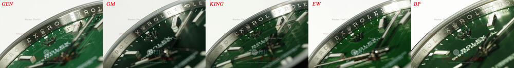
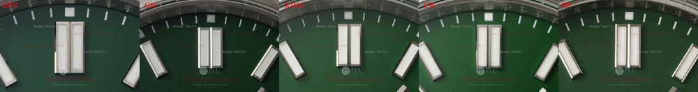
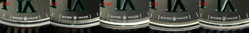
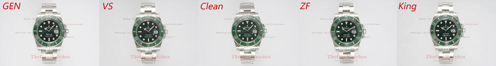
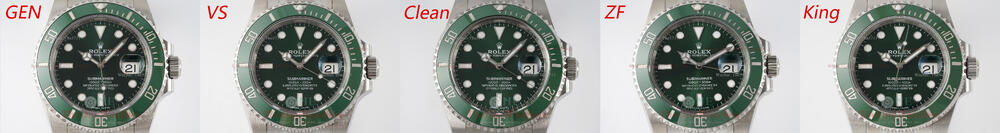
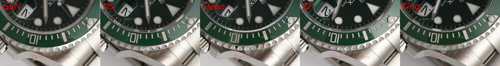
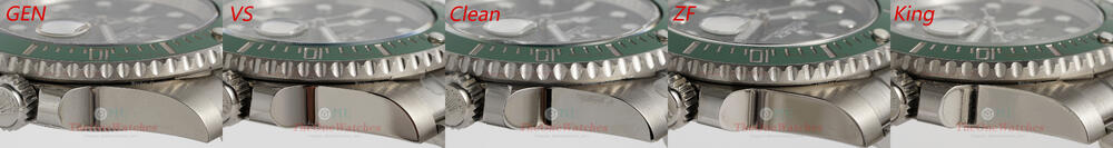
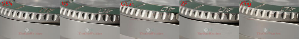
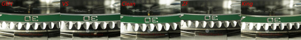
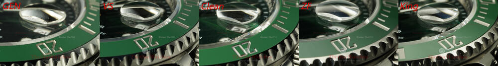
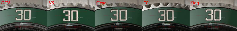
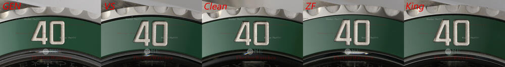
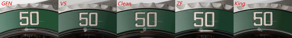
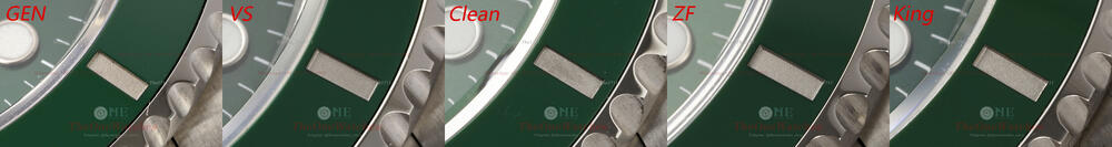
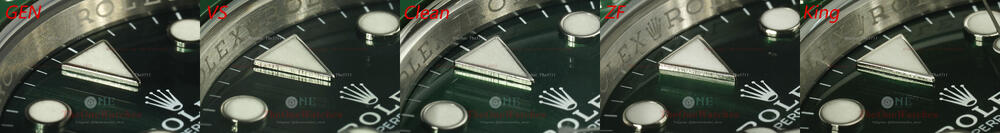
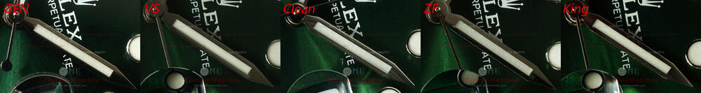
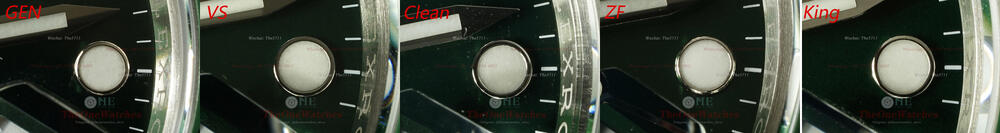
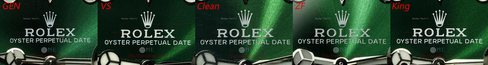
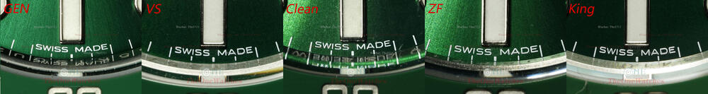
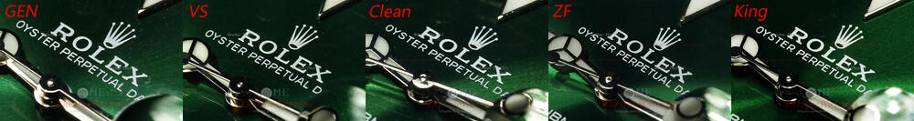
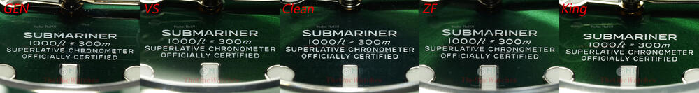
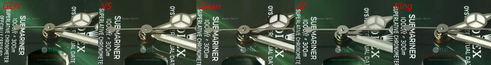
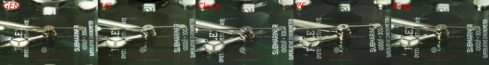
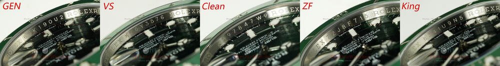
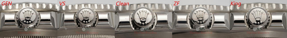
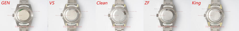
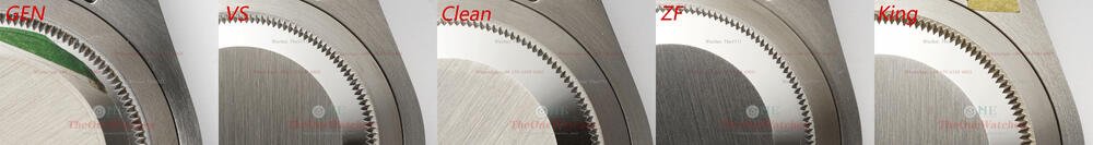
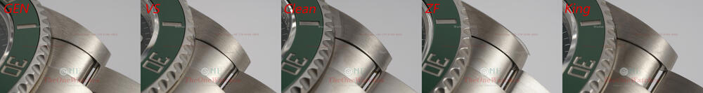
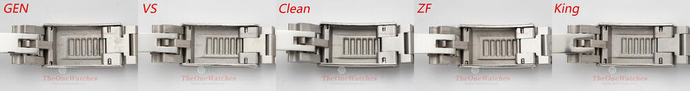
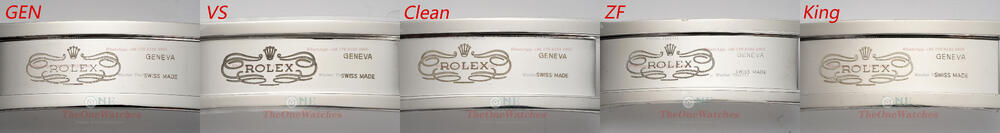
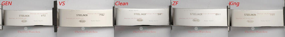
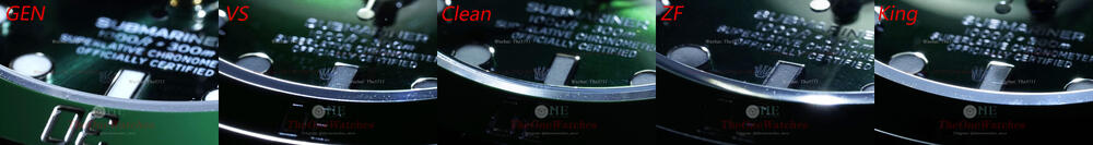
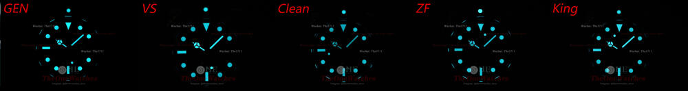
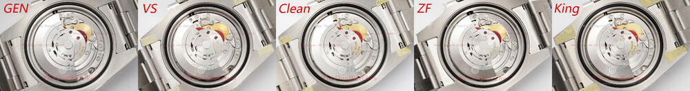
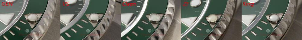
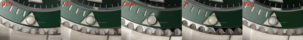
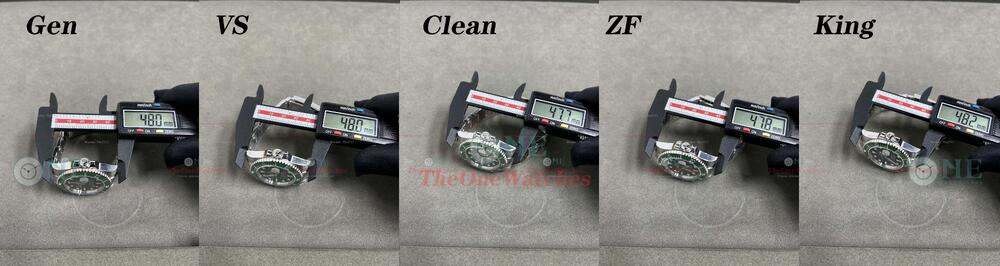
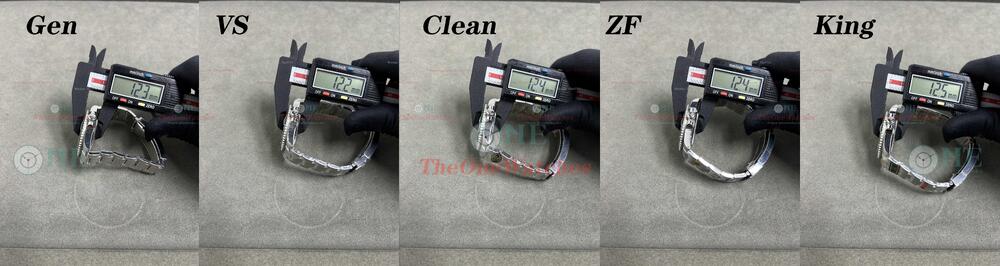
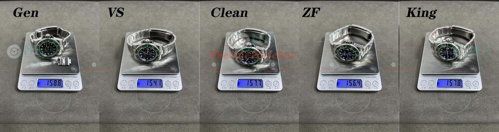
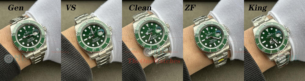
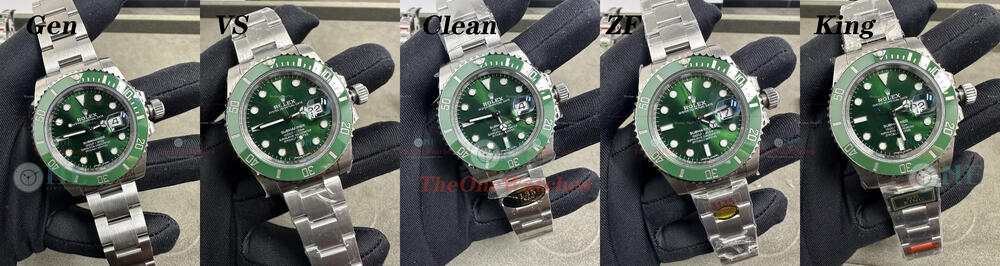
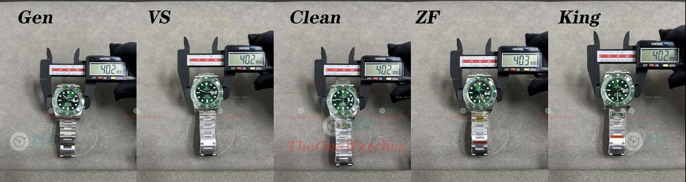
Hello, guys. I'm Steve and I'm back. We've already done two comparisons of the Submariner series, 126610LV and 116613LB, so let's get back to the classics. As the ace of the Submariner range, the 116610LV needs no introduction to its popularity, so let's get started. Dial front view View of the dial in natural light View of the dial under lighting 116610LV has a famous name in our country, that is “green water ghost” (hulk), so the dial color has naturally become the focus, the gen color is dark green, after repeated observation and comparison of the real objects,VS and KING's color is the closest to GEN, especially KING's black and green gradient effect is the most similar to GEN, Clean is also good, but the radial pattern is a bit stronger. The biggest color difference is ZF factory, too bright. But it is difficult to notice the difference without comparing them side by side. Which factory do you think has the better color? Side view of bezel The VS factory uses the V4 of the clean bezel. The color and brightness of the clean bezel are very good, and there is almost no color difference compared to the GEN, while the bezel of ZF and KING are also actually very good, and there is no difference between the color and the clean bezel. After checking with the factory, ZF factory claims to be using the clean V1 bezel and KING claims to be using the clean V4 bezel as well. Side view of the teeth insert The shape of the KING's teeth is distinctly different from the GEN's, and the brushed finish on the side of the ZF is too obvious, which has led to a more pronounced depth. Side view of the glass VS and KING do not have chamfered mirror edges, and although clean and ZF do, they do not have the same shape as GEN. View of the bezel digital As explained earlier, all four factories use the Clean bezel, and the clean bezel is worthy of being the best submariner green bezel available today, with a platinum filling that is very close to the GEN color and a very regular and fine filling. This is why all the major factories have adopted the clean fitting, which shows that it has been fully accepted by the market, including the factories. Pearl View There are slight differences between the factories and GEN colors, VS and KING are slightly whitish, while CLEAN is a little darker, ZF is too yellow and the edges are raised too high. Markers side view In addition to the ZF factory,other three factories have done chamfering, especially the ZF dot scale is obviously different with the GEN , you can see the side has a prominent section. Luminous Filled View The luminescent filling of the hands and indexes, which have a certain granularity, are not so different from each other in this respect, it is hard to say which one is better or not, as long as they are not smoothly finished. Oil font View The control of the oil font in all four factories is very good, but if you zoom in on the picture, the ZF is not good enough in some places. Hands View Clean center sleeve is very well made, very close to the GEN in cross-sectional shape and height, the VS and KING are different in shape but still very well made, the ZF has obvious burn marks. Rehaut side view The engraving of the rehaut varies from factory to factory, In comparison, Clean looks clearer overall. Calendar window side view The edges of the window are chamfered by VS, clean and ZF, but not as much as by GEN, and not by KIGN. Crown side view There are no obvious differences in the position of the crown, but a friend recently asked me about the crown logo not facing upwards when the crown is tightened, so here's an explanation: For comparison purposes, all the watches were photographed with the crown unscrewed, and the crown orientation was random when tightened, as is the case with the genuine one. Case side view Caseblack view In comparison, the edges of the teeth on the ZF base are not very well finished and are not very flat in places. The genuine product seems a bit dirty due to its age. SEL side view The position of the endlink is slightly different between the factories, but I think VS is closer to it than GEN. Bracelet details view The engraving on the inside of the clasp varies from factory to factory, so you can compare for yourself. There is definitely a clear difference between the macro photos and the GEN, but to the naked eye it is not really possible to tell who is better. Movement view All three factories use the VS3135 movement, except for ZF, which uses the VR3135 movement. Clean and KING movements do not have movement code numbers engraved on the mainplate, while VS and ZF do have the movement code engraved, but the VS is yellow. Laser Marker and Luminous View The factories laser markers are all similar in shape and the luminous colours are all the same as the GEN. Data comparison chart Note: All watches are measured in a clamped state, and there may be errors due to the slight deviation of the position of the caliper. In addition, GEN intercepts the strap, and the factory has a steel strap protective film that has not been torn off. Well, today's post is here, thank you guys for watching. If there are any mistakes, please correct me. If there is anything else I overlooked, you can put it up, and I will try my best to complete it. Welcome to comment and exchange! I will continue to bring you more detailed comparisons between replica watches and GEN’s. And it is also for you to choose the favorite models conveniently. Illustration: Some photos deviate from the real object due to the light source. For details, please refer to the content. The size of the comparison picture is relatively large, you can download it and enlarge it for comparison. There is no perfect replica, only the one you prefer. Website: https://www.theonewatches.ws WhatsApp: + 86-17081934955 Wechat: The5711


.jpg.77833b8870901cf271b25598d0f8f36f.jpg)