

jitai
-
Posts
205 -
Joined
-
Last visited
Posts posted by jitai
-
-
Where can I purchase case back and movement, do you know anybody who sells such parts?
I think there is nothing you can do.
Firstly, the dial cannot be used with the A7750. Because the subdials spacing are out
Secondly, The inner case may not be able to house the thickness of A7750.
Thirdly, case diameter maybe different so even if you get the movt sits in but may not be able to close it with the new caseback.
My 2 cents. I think it will be safer to buy from members or dealers here.
-
I've been browsing here for a few days and have decided upon a Panerai. Thing is, I can't decide which one to get!
As the advice seems to go, I've pretty much chosen my dealer (PT - hope it's ok to say so), I am in the UK, so think this is good choice
The thing is, I can't decide which one to go for, there are so many to choose from!
At the moment I am thinking:
Luminor Marina H Series
Panerai Luminor Marina
Luminor Marina Militare Titanium
Luminor GMT Titanium
Are the first two the same?
Has anyone any advice regarding the reliability of these? or just general advice as to which the best might be? Or is it purely a matter of taste?
thanks!
Hi,
There are 2 types of dial for luminor marina models (with a running second at 9 o'clock). One has the sausage dial (PAM001A,B, PAM111E, F) and the other has a sandwiched dial (PAM111H).
Sausage dial has 2 types of caseback. Closed and see-thru type. A and B series for the closed caseback and E and F series for the see-thru caseback. For the see thru caseback, it is easily recognise as the word "Panerai" is engraved multiple times on the bridge on the movt.
Sandwiched dial on has see-thru type caseback but usually start from H series onwards. The bridge has a more simple and cleaner look.
Both are handwind movt watch.
For better accuracy, I will prefer sausage dial model with closed caseback. (Angus is selling the ultimate PAM111E series. you may like to check it out)
Hope this help
-
Thanks,
Is it unusual for this watch to have AR?
Not on this model as it actually comes with AR coating on the crystal.
The blue tint is quite close to the gen.
If you want to go for the best. Get yourself the version with dagger swan neck.

-
How does DSN's new pam232 dial look as far as the sandwitch look? I know that on some of his other sandwitch dials, "pam127 and 217" they dont quite look as deep as other rep sandwitch dials because the sandwitch is filled in with lume. Can you post a picture of the dial at an angle so the depth of the sandwitch dial can be seen? Thanks, Wan
By the way, i love how the watch turned out. This is the first one i have seen that looks like it should.
Hi wan and everyone in this thread,
Thanks for all your kind words.
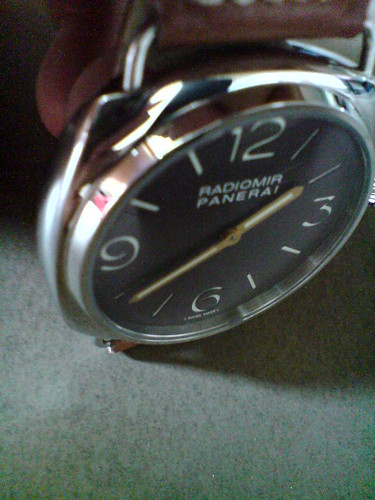
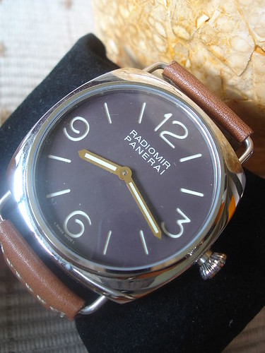
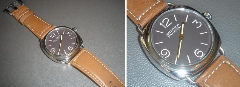
More pics for your viewing.
Very nice but looks too big for my wrist.
The gap thickness between the lume and the main dial are equally thick IMO. Therefore the depth looks correct.
-
Hi everyone,
Take a look at my franken 232 below
Rep
Comes with DSN's Latest and correct darker brown dial, correct length hands
Nice and sharp caseback with better and correct font size engraved.
DSN's C3 Lume
GEN 232 to compare
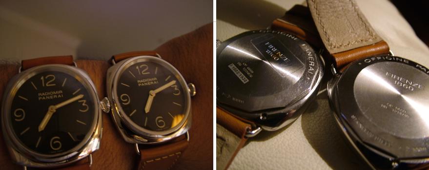
GEN 232 only produced in "I" series (1938pcs ). Panerai always make a prototype before official release for advertisement purpose. Usually these batch of PAMs will not have production number and they call them "shadow PAM". Above pics show an "I" series with shadow 232.
The ingredients and why?
Dial and hands
1. DSN's latest darker brown is correct like the gen.
2. DSN's correct min and hour hands length (Older DSN's PAM232 comes with shorter hands which are incorrect)
3. DSN's good C3 lume
1. Trusty's dial has the incorrect black dial
2. Trusty's PAM232 supelled hands are incorrect. They follow the hands used in PANERAI website catalog which was a prototype type.
3. Trusty's has almost zero lume.
Case
1. DSN's case has rounder edges
2. Trusty's case is better with sharper edges and look more "squarish"
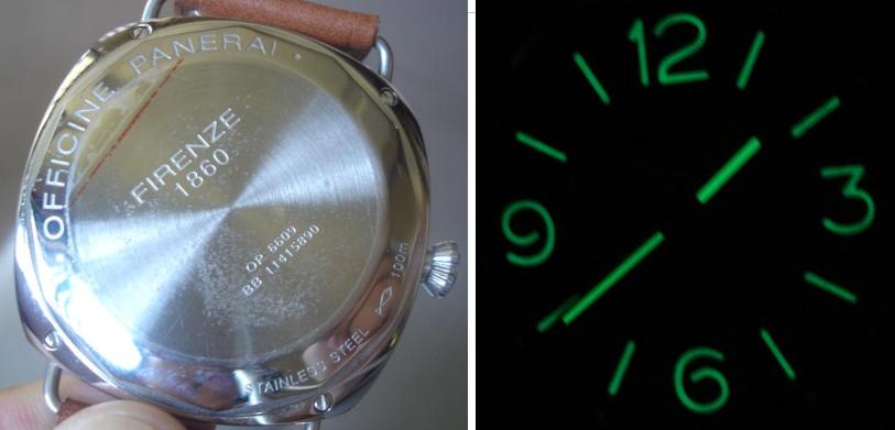
Caseback
1. DSN's caseback font used is a bit off. The engravement "Officine Panerai,SS,fish logo and 100m" are too near "Almost sitting directly to the inner circle.
2. The middle engravement "FIRENZE 1860" font is too big and the surace looks polished which is incorrect.
3. DSN's radiomir crown is a bit off to what I see. The crown edge looks rounded.
1. Trusty's caseback is nearer to the gen in term of the of better font used.The engravement for all the details are positioned like the gen.
2. The middle part is brushed like the gen with circular lines and the engraved font and size are accurate like the gen.
3. Trusty's 232 crown is a spot on with sharper crown edge.
Took me sometime to fix this one up. However, it don't really suit my style. May consider to let it go.
Thanks for viewing
-
Hi All,
Need some advice here.
1. I am wondering if davidsen's PAM caseback will fit on cartel's PAM watch case?
2. Will the cartel's crown and CG fit on davidsen's watch case?
3. Any own davidsen's single AR crystal. What is hue effect. Is it strong and obvious like double AR on SFSO?
4. Can davidsen's dial fit into cartel's watch case?
Thank you very much for your help.
-
 I'm Speechless.
The greatest Modded PAM rep collector.
Imagine the time, money, patience taken to have a collection this size...
Hat off to you. Fish.
You are the champ.

-
Hi,
My BB has a misaligned pearl. Anyone here can share how to remove the pearl tab cos I manage to find a better pearl tab to swap.
What tool should I prepare and is it easy to do?
Thanks
-
Hi Pix,
Congrats on your new BB and very nice marco shots.
Here's mine with brushed SS bracelet.
Andrew did a really good job in in his review. This is really one fine replica despite the flaws.
-
Hi,
Just thought of sharing my opinion. I think swapping the logo will be much easier and more accurate.
I got a dial (with the correct logo) from Silix before and compare it with the ulitmate version (with the crap logo) sold by Andrew or Jos.
After comparing it with the gen dial, except the crappy logo. The ultimate version dial is more accurate. The easiest way to see the different is the amount of lume filled in the hour markers and also the hour lume marker height at 6 o'clock. It should be taller like the gen. Although Silix's logo is correct, their dial is slightly smaller in diameter and the marker at 6 is smaller and shorter. The luming on the hour markers are flat (where it should have a bit "pop out" effect on the gen).
So, after much consideration. I went for swapping the logo over on Ulitmate dial.
Here's the effect. To me, except the pearl. It look much much closer to the gen now.
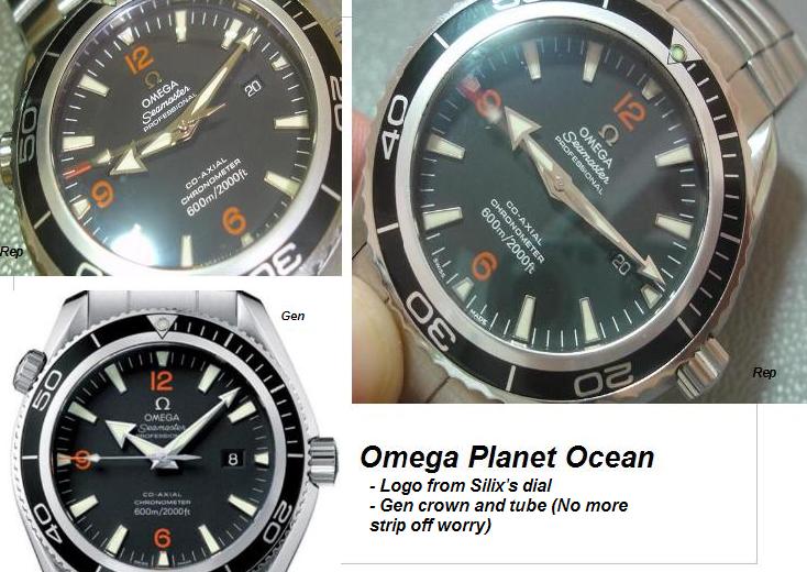
Hope my opinion is useful to you.
Franken PAM232 (47mm) radiomir
in The Panerai Area
Posted
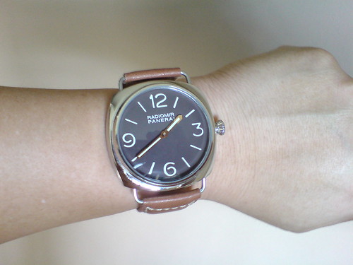
New look with dark brown croc strap
Wristshot again. (Hmmm.... Looks better on my wrist this time)