dennio3 Posted September 7, 2016 Report Share Posted September 7, 2016 Hi there, i am looking abou a very good refinished Paul Newman dial. I have find this one.... (see attachment pics), can i have opinions about, batch, texture, thikness..... Thanks a lot Quote Link to comment Share on other sites More sharing options...
newswire Posted September 7, 2016 Report Share Posted September 7, 2016 How deep is the sub dial "rings"?Sent from my iPhone using Tapatalk Quote Link to comment Share on other sites More sharing options...
freddy333 Posted September 7, 2016 Report Share Posted September 7, 2016 14 minutes ago, dennio3 said: Always compare to a gen (which can be found on any gen watch site or google) - Quote Link to comment Share on other sites More sharing options...
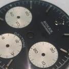
alligoat Posted September 7, 2016 Report Share Posted September 7, 2016 Other than the crown emblem at 12 o'clock looking kind of flat and possibly lopsided, I'd say it's a pretty good dial- lettering and numbers look good. Once it's under a crystal, it ought to do fine. Quote Link to comment Share on other sites More sharing options...
freddy333 Posted September 7, 2016 Report Share Posted September 7, 2016 16 minutes ago, alligoat said: Other than the crown emblem at 12 o'clock looking kind of flat and possibly lopsided, I'd say it's a pretty good dial- lettering and numbers look good. Once it's under a crystal, it ought to do fine. Alli, did you notice that the ROLEX COSMOGRAPH text is off-center (too far right) & the 90-degree 'step' between the dial face & subdials looks more like a ski slope? The dial has other issues that can be seen by comparing to gens. Quote Link to comment Share on other sites More sharing options...
alligoat Posted September 8, 2016 Report Share Posted September 8, 2016 Yep, now that I look at it- printed a picture of it and drew lines- the 'L' in Rolex is right of center, the twelve o'clock marker in the minute track is crooked, crown emblem is slightly cocked to the left and I do see the slope/rounding on the two subdials at 9 and 3- probably also on the subdial at 6, and there's that ring around the center hole. But alas, it's a rep dial and the big thing people need to do is decide if it fits their needs or if they are going to keep looking around. Price enters into the equation and also if they're putting a V72 in there, which is a costly proposition in and of itself, so it might be a good idea to find a little better dial. Quote Link to comment Share on other sites More sharing options...
dennio3 Posted September 8, 2016 Author Report Share Posted September 8, 2016 (edited) 1 hour ago, alligoat said: Yep, now that I look at it- printed a picture of it and drew lines- the 'L' in Rolex is right of center, the twelve o'clock marker in the minute track is crooked, crown emblem is slightly cocked to the left and I do see the slope/rounding on the two subdials at 9 and 3- probably also on the subdial at 6, and there's that ring around the center hole. But alas, it's a rep dial and the big thing people need to do is decide if it fits their needs or if they are going to keep looking around. Price enters into the equation and also if they're putting a V72 in there, which is a costly proposition in and of itself, so it might be a good idea to find a little better dial. ....sure... 19 hours ago, freddy333 said: Alli, did you notice that the ROLEX COSMOGRAPH text is off-center (too far right) & the 90-degree 'step' between the dial face & subdials looks more like a ski slope? The dial has other issues that can be seen by comparing to gens. Opps ..... I did not realize Edited September 8, 2016 by dennio3 Quote Link to comment Share on other sites More sharing options...
Recommended Posts
Join the conversation
You can post now and register later. If you have an account, sign in now to post with your account.