Grimlocktime Posted August 13, 2015 Report Posted August 13, 2015 I am in the middle of an epic Franken build for a fellow RWG member. A 203/A with a genuine dial and hand set, reshaped case custom coated by ROLLI's genuine Pre-V source. Along the way I'm taking lots of pictures and finding answers to plenty of questions I've had about the structure of Pre-V dials. One of those big question marks was the fact that we know the genuine dials indices are lacquer filled, but I have not found any images to demonstrate it. Furthermore my friend Rolli, has been questioned about this feature on his amazing Pre-V dials... I'm here to answer that question with some photographic evidence...Much like Rollis dial, when you view the gen straight on, the lacquer fill is not apparent But when held to the light, the real structure appears... in other news...the DSN CG fits the OEM case and the pencil lead PVD is very close. The biggest difference appears to be the surface preparation before coating. The OEM case shown here has a proper Pre-V coating. You can see the difference versus the DSN CG and finally the OEM dial versus the Southy Pre-V Museum Grad WOW.... Congrats to Southy
civic4982 Posted August 13, 2015 Report Posted August 13, 2015 Very nice but how do we know the case is correct PVD? Is it gen PreV PVDed case?I'm jealous of that dial D.It's super nice. Great snag.Sent from the my iPhone using Tapatalk s
Grimlocktime Posted August 13, 2015 Author Report Posted August 13, 2015 Thanks V. Unfortunately I'm only holding this fort the owner while I build his epic Franken. This is one of my dream watches though, so someday, I hope to buy it from him;)The case is a gen PAM000K that was sent to Germany to the same PVD coating provider as Panerai used in the early 90s. We know it is the correct coating. The documents and receipts prove it.
sacsah1 Posted August 25, 2015 Report Posted August 25, 2015 Hi,I tried messaging u via pm but it won't let me message you.I got your info from Rolf, Rolli. I messaged him bcz I'm interested in purchasing his dial but need a case set for it. He told me that you might be able to help.I basically need a complete case with crown guard. The only think i have is an eta 6497 movement.Thank you!
PeteM Posted August 27, 2015 Report Posted August 27, 2015 (edited) Its a can be a bit of a misnomer or perhaps misleading to consider these dials as just lacquer filled I say that as it can suggest that its only the indices that recieve any varnish whereas on PreV dials they were always varnished across the dial which of course by definition means the indices would be filled as part of that process...The reference to fat and thin indices is not a variation of the dial printing but related to the lume applicatiion of the individual dials by the individual lumers and the consistency of the lume as its applied and the way it spreads and/or sits over or under the edfe & height of the indices impression... if you picture the lume sitting below the top of the indices this would give a thin look finish whereas if the lume was to sit over the edges of the indices it would give a fat look to the indices... hopefully that makes sense.. There is plenty of accurate information available on the Risti archives and Thai PAM sites but for example here is a guide on the varnish application on PAMs since PreV and through.. And although these are more modern pics this gives you an idea of the process of ,making the dials Edited August 27, 2015 by PeteM 1
w0lf Posted August 28, 2015 Report Posted August 28, 2015 Spot on, Pete. The coinage machine die can put out impressions on a soft metal like bronze with great consistency. However, as the inside edge of the markers is burnished, when painted, it makes the index look wider due to creating additional surface area covered by the lume, rather than the black coat of the rest of the dial. It's an olde "paint within the lines" coloring book situation.
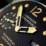
Grimlocktime Posted August 31, 2015 Author Report Posted August 31, 2015 Its a can be a bit of a misnomer or perhaps misleading to consider these dials as just lacquer filled I say that as it can suggest that its only the indices that recieve any varnish whereas on PreV dials they were always varnished across the dial which of course by definition means the indices would be filled as part of that process...The reference to fat and thin indices is not a variation of the dial printing but related to the lume applicatiion of the individual dials by the individual lumers and the consistency of the lume as its applied and the way it spreads and/or sits over or under the edfe & height of the indices impression... if you picture the lume sitting below the top of the indices this would give a thin look finish whereas if the lume was to sit over the edges of the indices it would give a fat look to the indices... hopefully that makes sense.. There is plenty of accurate information available on the Risti archives and Thai PAM sites but for example here is a guide on the varnish application on PAMs since PreV and through.. And although these are more modern pics this gives you an idea of the process of ,making the dials Pete, wonderful post as always! I greatly respect your opinion on this. But hear me out for a second... Isn't it possible that there were different dies? We know for a fact there were different dies at least for the 203/A, on which you find most of the examples of "fat" numbers, although I have seen a few 202/A fat number examples. On the flip side, the thin number dials seem to be primarily seen on the early Pre-V non-matching dials, in both 201/A and 202/A.I tend to see Pre-V dials that I would classify as thin, medium and fat. It seems reasonable that the medium dials could be thin dials with the effect that you describe. But the fat dials just seem far too different for this explanation to apply effectively. A few years ago when I first read your post describing this visual effect, I took it for face value, but this picture below changed by mind. In my opinion this shape is structurally different than the typical thin number examples. It's not just an optical illusion from lume application. Note the black space between the main body of the six and the upper hook. Also due to the high resolution of this picture, you can see that no lume is painted up onto the edge.
south105323 Posted September 4, 2015 Report Posted September 4, 2015 To me the above image looks machined, not stamped. You can see the chatter of the cutter and the slight wavy path, particularly at the inside tip, and at about 10 o'clock as it comes up around to the top, caused by the sheet material moving slightly. The picture Pete has is of more contemporary dials, which were higher volume production, where it made sense to make tooling. The Pre-Vs were low volume, it made more sense to pay a higher part price but not have to pay for tooling, they were only selling small batches.This would mean that the variation in indice thickness is easy to explain, every time they did a batch they had a different cutter, possibly even replacing them within batches. You are talking less than 0.1mm between a 'thin' indices dial and a 'thick' one, so cutter wear, cutter tolerance, or even 'Damn, broke a 0.7mm cutter, have a 0.8mm, it'll do, no one will notice' comes into play. Small company QC in Italy for tool watches, not Swiss luxury QC...Factor in 'painting over the lines' and thickness tolerance goes haywire.Another thing that is interesting on thick indice dials: sometimes you can see where the cutter goes from the top of the '6' in towards the middle, and gets so close to the edge it leaves a tiny sliver of metal, which gets pushed slightly into the vertical part of the 6. Couldn't be done by stamping, and shows they machined the '6' and '9' from the outside in... 3
mir36 Posted September 5, 2015 Report Posted September 5, 2015 This is the money shot Grim. I went to my local Panerai watch dealer (not the Panerai boutique) today and inspected a 201/a. I saw exactly this effect on the indices' lacquer fill. I was wearing my Rolli/FGD 201/a and was very tempted to do a side by side comparo. Discretion won the day.
Grimlocktime Posted September 6, 2015 Author Report Posted September 6, 2015 To me the above image looks machined, not stamped. You can see the chatter of the cutter and the slight wavy path, particularly at the inside tip, and at about 10 o'clock as it comes up around to the top, caused by the sheet material moving slightly. The picture Pete has is of more contemporary dials, which were higher volume production, where it made sense to make tooling. The Pre-Vs were low volume, it made more sense to pay a higher part price but not have to pay for tooling, they were only selling small batches.This would mean that the variation in indice thickness is easy to explain, every time they did a batch they had a different cutter, possibly even replacing them within batches. You are talking less than 0.1mm between a 'thin' indices dial and a 'thick' one, so cutter wear, cutter tolerance, or even 'Damn, broke a 0.7mm cutter, have a 0.8mm, it'll do, no one will notice' comes into play. Small company QC in Italy for tool watches, not Swiss luxury QC...Factor in 'painting over the lines' and thickness tolerance goes haywire.Another thing that is interesting on thick indice dials: sometimes you can see where the cutter goes from the top of the '6' in towards the middle, and gets so close to the edge it leaves a tiny sliver of metal, which gets pushed slightly into the vertical part of the 6. Couldn't be done by stamping, and shows they machined the '6' and '9' from the outside in...D, I feel like an idiot now after reading this... Of course! That's it! The rough edge appears to be from milling, not stamping. So that's probably the difference... Some Pre-V dials may have been stamped and some later versions milled. Awesome! And by the way... It was a rare opportunity to hold your dial next to the gen Pre-V... All I can say is wow! Beautiful work my friend. I can't fathom the skill required to get the details so close. Thanks again.
south105323 Posted September 7, 2015 Report Posted September 7, 2015 Thanks, I was getting 50% drop out rate either from luming, resin or text. Nearly went blind squinting through a magnifier filling the indices with resin with an oiler... All based spending time with a gen 201/A and a loupe. What struck me at the time was the resin fill wasn't absolutely perfect, tiny bubbles, slight uneven fill - but the fill was always flat or slightly convex, on the one I saw they never underfilled the resin, your photo looks the same.
hugop Posted September 20, 2015 Report Posted September 20, 2015 Very interesting and informative post from some of the best pre-v experts on the forums. Thanks especially to Grim and Southy for sharing info that took a great deal of time and research to uncover!
Recommended Posts
Create an account or sign in to comment
You need to be a member in order to leave a comment
Create an account
Sign up for a new account in our community. It's easy!
Register a new accountSign in
Already have an account? Sign in here.
Sign In Now