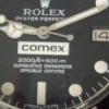
caruwe Posted January 28, 2011 Report Posted January 28, 2011 Hi experts, I need your opinions what dial is closer to gen: 1.) or 2.) Thank you very much in advance for your answer Uwe
Nanuq Posted January 28, 2011 Report Posted January 28, 2011 Gahhhhhhhhhh! I vote for #2, but there are aspects of #1 that are better. Overall, #2 is closer to gen. Sorta.
freddy333 Posted January 28, 2011 Report Posted January 28, 2011 Except for the lume color, they look about the same (note the 2 in 2000 on both dials - same font). I would go with the white lume version.
caruwe Posted January 28, 2011 Author Report Posted January 28, 2011 I have both dials here and can change the lume colour - that´s not the problem. What about the t in feets. They are different...
FxrAndy Posted January 28, 2011 Report Posted January 28, 2011 Not an expert but i prefer number 2 Uwe
ubiquitous Posted January 28, 2011 Report Posted January 28, 2011 Dial #1's ft looks more correct... Round 's' in SWISS MADE' is a buzz kill... Date window bevel is as well. Coronet shape could be a little taller... 12:00 hour index/marker also looks better on #1...
Nanuq Posted January 28, 2011 Report Posted January 28, 2011 #1 has a ginormous gap before the M in Meters #1 has better font for SCOC but the spacing is terrible #2 has better spacing for plots-to-hashes Does either one show the underlying dial texture through the "text" of the COMEX logo?
freddy333 Posted January 28, 2011 Report Posted January 28, 2011 Does either one show the underlying dial texture through the "text" of the COMEX logo? Good point. If either dial has the Comex lettering painted (black, a la the gen) instead of simply letting the dial color through, I would go with that 1. Otherwise, I would still cast my vote for the white 1.
caruwe Posted February 3, 2011 Author Report Posted February 3, 2011 Many thanks for your opinion. I decided to go with option 2 and removed the old "lume" paste because it doesn´t shine. After test with a few different lume I decide to mix my own lume and varnish. What do you think about the result?
mjmj Posted February 3, 2011 Report Posted February 3, 2011 Wow! It looks great. I like your lume job
Cats Posted February 3, 2011 Report Posted February 3, 2011 Uwe, your getting better and better every day on luming dials. Don't know if a Comex should still glow like the one you have but i like your solution. Keep up the good work. Carpe Diem Cats
Recommended Posts
Create an account or sign in to comment
You need to be a member in order to leave a comment
Create an account
Sign up for a new account in our community. It's easy!
Register a new accountSign in
Already have an account? Sign in here.
Sign In Now