
TeeJay
-
Posts
10,951 -
Joined
-
Last visited
-
Days Won
7
Posts posted by TeeJay
-
-
Cool watch designs, but absolutely nothing like any Breitling I can think of, so re-brand it, find a Chinese factory, and sell them in their own right

-
I picked this one up in Spain a few years back...
-
I have a thick enough layer of the lume on 'em so I can still read it when the alarm goes off in the morning! I was initially disappointed with the Glow, Inc. lume as I had only done little "dots" DJ style but I layed it on pretty thick on this one and it really works fantastic for about $10/bottle...
Awesome result, I'll have to look into that, I'm always keen to try new and better lumes

-
I'm havin' a hard time not wearing this!

I'm havin' a hard time not wearing this!
It's a hard watch to take off, isn't it
 The markers're so easy to read the time from
 -
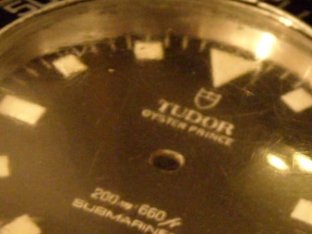
Here's a "proof of concept" dial with the peel 'n' stick stuff. I think this might stand a chance of looking respectable on regular decal paper. I need to "tone down" the "Tudor" script as it's bleeding a bit but everything else seems to look OK.
I think that'll look really nice on the decal paper
I think one of these would be ideal to case it all up in -
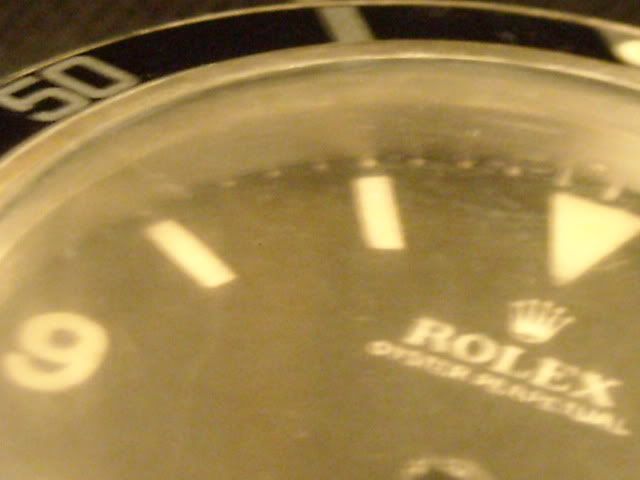
These dial decals are from late 2009... Sorry for the poor quality pics, to the eye, the black is rather stable, and the lume is a nice vintage off-white
-
@TJ: Thanks man.
Taste thing of course, but I always thought Aquaracer chrono (in blue) is one of the best looking watches. That's why I bought it anyway.

Any time, bro
 Of course, always a matter of to each his own, I was just really disappointed how the watch looked in person when I tried it on, that it didn't live up to the standard your photos had set
 -
Anything artistic like drawing, model-making etc. For a while, I got into Star Wars costuming, but not done it in years, it was too embarrassing to do as an independent hobby, and not a good community to belong to. I stopped doing it about the same time I started taking watches more seriously. I'd always been 'into watches' and tended to buy a new one each year, but it wasn't until a few years back that I decided the time had come to start acquiring nice pieces I could keep, rather than just buying a new piece each year
Always loved music to, but not in a serious enough way to be called an audiophile -
I think they both look fantastic, but if it's going to be as part of a band, design etiquette states that you really ought to go with the first one. If it was going to be a stand-alone piece, or even part of a big sleeve/thigh/back piece, then that is when the second image would be the appropriate design to go with
-
 :Jumpy: :Jumpy: :Jumpy: :Jumpy:
 That looks AWESOME!!!!!!!
Put me down for one of those, please
-
Ahh, I think I can visualize the kind of effect you mean, I hope it works out though
-
Brilliant!
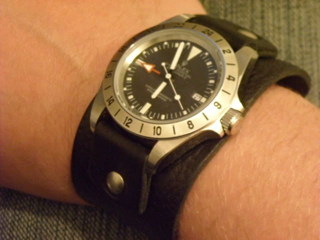
I'm wearing this old favorite.

I just wish the one I tried on looked as good as it does in your photo

-
The problem I am having is that to print in white I have to print at 600 dpi plus I'm printing onto clear vinyl peel 'n' stick material. I should get some regular waterslide decal material next week and I can make a decision.
Worse come to worse I can re-do the artwork as a negative and go the two decal method ala slarti. This would, however, probably need someone else doing the printing as I don't have anything with high enough resolution. I bought this printer (to specifically do projects like this) on advertised specs and they don't tell the whole truth.
I'll have to see how the minute "tics" look on the decal paper as I think I have the line weight set as light as Acad has a selection for but it's just the minimum dot size of the printer make's 'em print fatter...
How about if you were to just print in black, and leave the text and markers blank? Would that allow better resolution?
-
Bloom-Style this evening...
-
I'm sure quartz versions will be available soon
I'm going to give it a thumbs up, with reservations. There are several details that I like, but it's too fussy when taken as a whole.
The problem with many modern Tudor designs is that they just don't know when to stop.
The plaque around the TUDOR GENEVE text, being a prime example, as well as the round date window crammed in at 4:30...

-
I just noticed something which hadn't occurred to me before... You said you were actually printing white ink... On the ones Slartibartfast produced, they were black onto transparent decal, with the 'white areas' simply sans ink entirely. Might a similar printing procedure produce slightly different results to where you've literally printed black and white ink?
 As on the other thread, I think a yellow dial with black writing would look really sharp (best do Doxa orange as well, to keep Nanuq happy ) Other than that, I can't see any other detail differences to change
 -
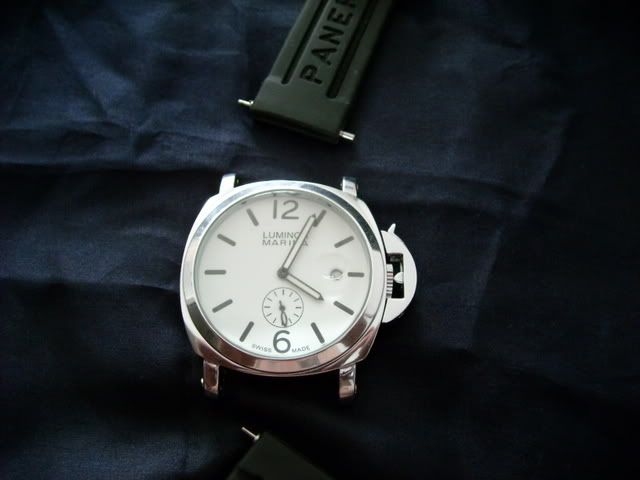
That doesn't look bad at all Teejay. How's the overall fit and finish?
Seems pretty well made so far, it's never flooded when it gets wet...
Movement ring holder quality?
Plastic
Dial?
No different to the sales picture, but I used it for re-luming practice...
is it interchangeable with gen parts?
No idea whatsoever...

-
Can't believe I missed this thread before now
 What a fantastic piece
 -
Sweeeeeet
:thumbsupsmileyanim: -
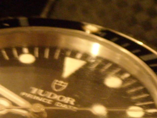
I wouldn't say this was 'the best', but it's the same watch I used for casing up my Tudor sub dial, which is etched as a 5513.
-
If you're looking for something in that price range, I would highly recommend this dealer as a source
Edit: Also, I'd like to ask a few basic simple questions:
Whats the difference between a Swiss and a Japanese replica? The Miyota movement and the ETA movement? I've done a little bit of reading on the subject, but cant really get the full coverage of it. Thanks.
Essentially, it's just different types of movement. They both do the same thing, tell the time, it's just that the 'Swiss' movement (not actually made in Switzerland, just a term applied to refer to the type/model of movement) 'ticks' more times in a second than an Asian movement (meaning the second hand sweeps more smoothly) Personally, I've always been happy with the performance of the asian movements in watches I've purchased
-
-
I would not take this site seriously.
It quotes the Telegraph, which I do follow. It has not taken this story up at all. If there was something they certainly wood.
Let's not spread conspiracy theories here.
It actually quotes Jon Snow, who is a respected journalist...
-
Since he's printing white on a clear decal, it's up to you. You could paint a dial blank orange and have a Doxaflake. Or an Irishflake green. Or a Cornflake yellow.
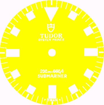 :thumbsupsmileyanim: :thumbsupsmileyanim:
 I've wanted a yellow-dialled Rolex/Tudor for quite a while now
Worst rep you've bought
in General Discussion
Posted
Actually, it is a seconds at 6 movement, and surprisingly keeps pretty good time I might actually make a project out of it one day