When you buy through links on our site, we may earn an affiliate commission.

unregistered
-
Posts
306 -
Joined
-
Last visited
-
Days Won
1
Everything posted by unregistered
-
Thanks mate, I need to see more pics of your collection! Bases are where its meant to be, they are what got me into PAMs and the only reason I'm still around rep parts is cause of them You're right, the simplicity and symmetry of the dials is what captures me. That Orloff is a stunner. I could not believe its croc grain, amazing strap maker Mario is.
-
Completely agree DSN dial vacclumed Shortened crown tube shortened lugs Steinghertz (sp??) plexi Swiss 6497 Cartel 232 case and caseback (so slightly incorrect) @PeteM: Thanks mate, yeah the pencil lead finish on the 009B is pretty accurate and has a lovely worn patina. There are more pics of it around here; Note these were done before I relumed the dial, added a H3 CP etc.
-
Dial was relumed by Taka per my requests which was to have an almondy shade rather than the deep orangy shade most seem to like (and I'm quite averse to). I left the finish as the stock anthracite style as I quite liked it rather than matte the surface. Hands were stock FGD hands with no relume. I actually have one more base which I've not included in the photoshoot and that is a PAM294 Radiomir
-
And the one I'm sure you'll all love; I'm happy
-
PAM286J Special Edition Rattrapante
unregistered replied to unregistered's topic in The Panerai Area
ahh, here are more pics. They are just recesses in the case -
PAM286J Special Edition Rattrapante
unregistered replied to unregistered's topic in The Panerai Area
erm what pushers? The chronograph version is the Spidospeed and was only just released at Basel http://www.hodinkee.com/blog/2011/3/29/the-linde-werdelin-spidospeed-chronograph-explained-by-morte.html Beautiful piece. Mine is a stock chronometer so no pushers. -
PAM286J Special Edition Rattrapante
unregistered replied to unregistered's topic in The Panerai Area
B&R...been there, done that, gens chip. Not saying that the reps don't, but the finish ain't that great. And my favorite DLCed watch is my Linde Werdelin Hard Black II I actually don't know the price thought I have 2 pieces with him right now for coating hahaha...can't remember, he's got prices on his website I think -
PAM286J Special Edition Rattrapante
unregistered replied to unregistered's topic in The Panerai Area
The gen 332 has a very shitty version, it looks like Cartel PVD mainly cause the case has not been bead blasted and is brushed. I personally prefer the 286 finish as well, its gorgeous the brushed and polished finishes but well, I wanted a 332 and it does look sexy so -
PAM286J Special Edition Rattrapante
unregistered replied to unregistered's topic in The Panerai Area
Bingo. Handed over to Taka yesterday. Beadblasting of the case should be done by Friday and hopefully by end of next week I'll have my pseudo 332 which is what brought me back into reps since I was on the fence for getting a gen 332. -
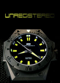
So what's a special edition J-series Rattrapante? A 286J of course, basically a rattrapante version of the 253I. For those who wonder a rattrapante is essentially a double chronograph or split second complication. The one featured in the 286 is derived off the venerable 7750 and features a double column wheel from memory, something most collectors just love gushing about (most current crops of inhouse chronos contain column wheels) due to their efficiency and design. Anyhow, on to the pics of my first chrono PAM; close up of the 6 & LSML which the 253 doesn't do as well Lume is amazing Wristie; I've since poisoned Takashi and kkj to order one. Even though its claimed to be a mineral crystal, it is absolutely stunning. Very clear, looks like colorless strong AR, great distortion (i.e. gen like very little). Great dial and printing and overall feel is one of a quality gen. The CG is near perfect, there is a mild dimple in the overall CG when viewed at an angle but well, can't be easily noticed. Movement is wrong but still looks great. So what am I about to do to this beauty? DLC it but of course! Off it goes on Wednesday to be sandblasted and coated by Taka, can't wait for my pseudo 332.
-
Very nice. Looks like a DSN?
-
This is probably my second longest project. My Franken 114F whose project log is here. From the seconds wheel not engaging properly, to the hands being too thin, to the CG irritating me with a too long lever, to the wrong sized crown with too deep a dish, to the CG screws getting stripped its been one issue after another. Now its complete and I am pretty proud of it Gen 114 dial Taka single sided AR crystal unknown case but its got nice lines modded DSN CG T-48 crown Engraved A6497, 2nd best I've seen (best being kkj's old Fiddy movement) DSN hands Ultimate F series caseback Sandave blue croc strap
-
Thanks! Its a stunner. 294 was made by PSoC (Hixxy). Plexi domed, shortened lugs and shortened crown tube. Stunner
-
More pics of my 040B with Jakobh caseback here The difference between the DSN and Jakobh is night and day. Not sure why you say its etched, sure doesn't look it. DSN on the right btw. Jakobh PeteM: The only variant I know of is the supposed brown dial Pre-A 040 which has its own controversy. w0lf discussed it with me before on here I think whereby the owner claims its a brown dial though it doesn't look brown, just a slightly less dark shade of black of the Pre-A dials. Was claimed to have been made by a Risti employee for himself. I'm sure there are other variants as with all early series Panerais, I've seen thick and think numeral 001As next to each other so wouldn't be surprised about variations in the 040B.
-
I had asked Orloff to make a 27/22 thin gold nubuck for my recently acquired pseudo PAM294. It just arrived and its amazing. I can't believe its croc grain. Very soft, great texture, very very good skills. The shaping is perfect, so much better than the last strap maker I went to for a custom Radiomir strap. Exactly what I wanted. I do not hesitate to recommend Orloff to anyone looking for a strap. Great comms and amazing attention to detail, like the small mini keeper holding the floating keeper in place on the strap back I reckon it compares very nicely to the OEM JV
-
As you all well know, I recently picked up a gen Sinn U1 which I am thoroughly enjoying and can't say enough good things about for the price and the overall style. bigmarcelo on RG was kind enough to suggest a meetup so I could do a comparison with his U1. Here I was expecting just one U1, but ended up seeing 4! Anyhow, the comparison is between a stock Sinn U1 versus a U1 SDR rep which is essentially the same except with a PVD bezel. There are some distinct tells between the two and very apparent when you have both in hand. That said, it is still a very good replica. Again apologies for the pictures, these arn't taken in the best environments (Starbucks lounge area) but I think you can see the differences clearly enough, if not please follow my numbering system as I point them out. The main stars: Gen U1 on the left, Rep U1 SDR on the right 1) The text is a mildly darker shade of red and is not as crisp 2) The bezel lume triangle on the rep is just painted white with no lume 3) You can just see it, but the hands are also the wrong shade of red, but this becomes more apparent later on 1) As mentioned above (3), the red is wrong and a lot more glossy and darker on the rep than the gen. Think blood red versus chilli red 2) The rep datewheel is not as white as the gen 3) Not so obvious here but later on, the lume on the rep is a mild tint of green, whereas is white on the gen. 1) Strip under each of the bezel numbers is longer on the rep than on the gen. Very apparent on the 15 2) As mentioned above (3), the lume is a noticeable shade of green 3) Again mentioned above, the red color 4) Bezel cutouts not as obvious here, but later on. The rep has a thicker gap between the bezel line and the cutout, the gen is nearly touching the line. 1) As mentioned above, the bezel cutouts. The gen is larger and deeper than the rep 2) The bezel screw is not flush on the rep, but this is minor 3) To me this is the 2nd biggest tell, the finish on the gen. It is noticeably darker than the rep 4) Minor thing, chamfer on the rep crystal is more obvious than the gen. 1) As mentioned above, here the difference in color of the finish is blatantly obvious. What can I say overall? I personally love the gen and for $1200 pre-loved, I think its a very affordable gen. The rep though good, has some very obvious tell. The 2 dealbreakers for me are the color of the case finish and the wrong colored hands. The U2 rep I think is a closer replication in terms of the red, but the finish is still off as evidenced by this. Gen on the left, rep on the right. The other tells are also there; 1) Wrong dot on the rep for the 6 o'clock which is a moisture indicator on the gen 2) Bezel cutouts 3) Domed sapphire crystal on the gen versus flat sapphire on the rep etc. Here are just some beauty shots of what was on the table; Sinn U1 gang Sinn U1 vs U2 gens Everything!
-
Linde Werdelin "The One" Hard Black II
unregistered replied to unregistered's topic in My Collection
Its a stunner, it reminds me of the AP EOD yet a much sleeker/meaner version hahaha -
I've always been fascinated by Linde Werdelin watches ever since the burst onto the watch scene just a few years ago. I've thought they looked very masculine, had a hint of the AP style in them, and something about the name was pretty nice. That plus their interesting ad campaigns plus the quick take up by collectors. I remember the first time I saw one was on RepGeek by another forum member whom I forget now, but whose 3 Timer stayed in my memory. Well now I've managed to pick up a Hard Black II, which IMO is the nicest watch that LW produce right now. One of the amazing things is how comfortable the watch is despite its 46mm size. It wears as comfortable as a 40mm Rolex, it molds literally to the wrist, something that I've always gripped about on APs and Hublots, and just looks stunning to behold. If you ever get the chance, please go try one on, they are amazing on the wrist. I may get another rubber strap should I find the neon thread croc strap too loud, but we'll see. Enough talk, now to the pics; This is the only area where I will dock points. I find the caseback significantly too plain and "blah" for a watch of this caliber. I'd have expected some form of design besides the LW logo. What else can I say, it looks stunning. The AR is really good giving the "no crystal" effect very often and since its a flat crystal it helps. The little details like grey faceted hands just adds to the overall feel of quality. The dial details are amazing to behold in matte and the minor trenches. The yellow lume just offsets the black stunningly well. Size comparison with the Sinn U1 and Panerai PAM009B Lume ain't half bad, but its no torch; 1sec exposure, 3min lapse. For the price I got this, I can't complain much. I am very surprised that I made this impulse buy. Let's see how long it'll stay with me, but judging by first impressions, I think quite a while. Add to that, LW seems to be going from strength to strength and is making a name for themselves.
-
Some Pre-A were slightly different to the Pre-V from the few pictures I've collected. They were as wide as the Pre-V but the lume strip did not extend as far into the tip triangle as the Pre-Vs. That said, quite a number had standard Pre-V hands like this one (http://i34.photobucket.com/albums/d102/tmac65/PreA2%20Set/DSC_0020.jpg) Interesting to note, on the M series of new PAMs, quite a number are coming with Pre-V handsets.
-
Its an Homage to the Le Grand Ploprof, the SM 1000. The current Omega SM1200 Ploprof is the reissue of the SM600. Here are a lot more pics (http://www.wrist-check.com/showthread.php?9454-Helson-Sharkmaster-(Blue-destro))
-
Unboxing time Size comparison: Seiko Monster, Sinn U1, Helson Sharkmaster, RXW MM20 Lume shot, 1s exposure, elapsed over 3+mins Lume is a little disappointing considering the sheer size of the lume areas, I would have expected at least Monster comparable intensity. Other than that, this wears great, has a really nice fit on the wrist with the 4:10 crown position, offset with the meaty buckle. I think I prefer it on the rubber to the tegimented bracelet. I've always wanted to try this one out since I saw it a number of years ago and loved the hands, but its just one of those pieces that is just so "cheap" pre-loved you always think, ah, I'll get it next time. I think for the money, this this a very very well done diver with great features. I don't like how the prices have increased this year, but c'est la vie, that's what happens to popular brands, but I'd suggest anyone on the fence, to get one. Between this and the rep, its amazingly close, I had to call a mate to confirm with him what the tells were before I picked this up and they are really small. I'm going to try and get one from a local guy and do a side by side photoshoot.
-
Visually it looks better, especially since I put thin straps on the Rads (Don't like thick straps on Radiomirs personally) and the gap between strap and case is now smaller. In terms of comfort, not a huge difference since its about <1mm shorter on either end.
-
I've made no small secret my love of the 232 and its more recent evolution the 294. Well now, thanks to PSoC (Hixxy) I have my 294! He's done amazing work on a Vacclumed 232. Some of which included shortening the crown tube and the lugs. Two of the biggest tells on the DSN/Cartel franken 232 most people get (you can read the review here). On top of which, he's added a low distortion plexi ala the 294 to make this a pseudo 294 (gen has a display caseback and engravings between the lugs). Right now I couldn't be happier. 232 on the left, 294 on the right unless otherwise stated, though it should be obvious. My 232 was one I built very long ago and had been upgraded once when DSN came out with a better dial (you can read that review here). Now some alone shots of the pseudo 294 Wristie Here is something you guys should like, DSN stock dial and hands on the left, Vacclumed dial and hands on the right; 2sec exposure, 2.5mins in between shots In person, the DSN glows a smidgen brighter and a little more aqueous. We know this dial of his really burns, you can see it right in the middle next to the gen MM20 Though its a fantasy right now, this is perfect for me and as such you know the 232 is going up for sale soon. The watch actually wears a slight bit smaller now as the plexi makes the dial visually look smaller, interesting change to note. Also, there are minute differences between the two dials, with the 294 dial having a mildly thinner top plate but thinner cutouts and the 232 having thicker cutouts. Uncharged lume color is whiter on the 294 as well. Text printing is mildly different with the 232 slightly sharper. Merry Xmas everyone!
-
Ordered this for a friend of mine and just arrived from Hont. I had already tried the gen on at the ADs and quite liked it, though found the button a little gimmicky and not suited as a daily wearer. That said, the quality and overall "gen-ness" feel to this rep is amazing. It wears very well too. Just adding some pics of the numerous available of this lovely piece With that said, it makes me want a Helson Sharkmaster all the more
-
That was a nice shot. Nice watch too that has since gone on to a more appreciative owner I hope