When you buy through links on our site, we may earn an affiliate commission.


freddy333
-
Posts
15,787 -
Joined
-
Last visited
-
Days Won
194
Everything posted by freddy333
-
Yes, I probably should have said 'flatbed' scanner, which, as you said, scans progressively from one end of the scanner bed to the other. Depending on the speed (dictated by the size and quality of the scan), it can take anywhere from a few seconds to a few minutes to scan an entire image. Since the second hand is in motion throughout this time, the scanner accurately records its location at each point during the scan and that is why the second hand appears to bend (sort of Einstein's theory of relativity in action) . An update on the Watchmeister overlay (the 2nd of 2) -- Although I had the 4 almost perfectly centered in the date window 6 hours ago, I think it may already be shifting ever so slightly north & east of its previous location. We may be heading for another showdown (I was unable to get the 1st one to remain centered either).
-
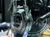
hahaha No, the superdome is not quite that bad. The picture was shot using my scanner (batteries in the camera were dead) and what you see in the photo -- the bending of the second hand -- is the amount of time that passed while the scanner scanned the watch. It is an interesting effect if you do photography with a scanner or with a VERY slow shutter speed, but it confuses alot of people.
-
That is what I did last night (or was it this morning). But the paper kept getting caught under or in some of the guides, so I removed it (though I did not have the patience to test different types & gauges of paper). I wonder how much of the inner diameter of the overlay can be removed (cut off) without being seen through the date window? But that question may prove to be academic because (regardless of what the vendor promised) I am more worried about that adhesive breaking down over the next several months to a year, which would then allow the overlay to slide out of position again. I hope I am wrong.
-
New pearl?
-
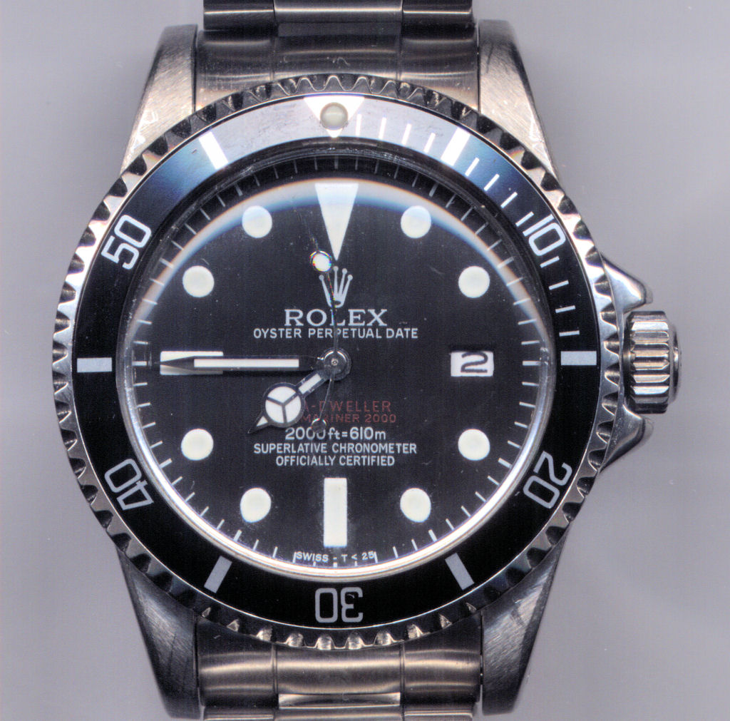
Following your guide above and after a 2nd round (and nearly 3 hours) of datewheel wac-a-mole, I think I finally got all of the 31 numbers more or less centered in the date window However, I discovered something that does not bode well for long-term reliability of either the Watchmeister datewheel sticker or the datechange function on any watch fitted with the Watchmeister -- the adhesive on the bottom side of the sticker is migrating onto the datechange gearing. All over it in fact. What some have reported as the date sometimes 'sticking' due to the tight spacing below the dial may, instead, be the datechange mechanism getting gummed-up in the adhesive. When I removed the datewheel to readjust the Watchmeister sticker, I immediately noticed the adhesive all over everything. I dismantled & cleaned the mechanism with denatured alcohol & then reassembled the datewheel with the readjusted Watchmeister sticker, but I have a strong feeling that the sticker will either slide back out of adjustment again or, worse, gum things up so bad that the datewheel gets stuck requiring another disassembly. In any case, I would definitely keep an eye on it as I suspect a more permanent datewheel will ultimately prove to be a necessity.
-
Bosk - The CGs do not look too bad, but I am less familar with modern Subs than vintage ones. So someone else might want to weigh in on that. The spiral is one of those 'features' that some rep makers like to use in place of components (like a modern He valve) that they cannot or do not know how to make. Unfortunately, that pretty much marks the watch as a bad fake. I am not aware of any way, short of drilling the spiral part out and implanting a better looking (or gen) He valve, assuming the hole is the right size. You might be better off just taking it as a loss & marking the experience up to a learning exercise (we all have made similar mistakes) and buying your next rep from one of the 'collectors' here. You might start with Joshua or Andrew.
-
Will do. First, I have to track down a V72. Good luck next weekend. The He mod is a breeze (as long as nothing else breaks in the process) and definitely makes the left side of a DRSD MBW case look gen (just be careful not to overpolish it after you finish -- I purposely left some tool marks all over the case to keep it from looking like it just came off 'the assembly line').
-
Yes. I love Clark's hands, but the superdome, I like but do not love. There are a few things about the hands that are improvements over the stock MBWs. For one thing, the lume sections are wider, dead center in the middle of the hands (the MBWs lume is slightly off center) and have a very tritium-like surface (slightly granular). Second, the mercedes symbol is larger (or appears larger because the metal frame is a lighter gauge, which leaves more surface area for the white lume) than on the MBW hands. And the stock MBWs (especially the hour hand) had a slight curve across the top (if you lay the hour hand on a flat surface and look at the mercedes symbol, it has a slight bowing downward). Clark's hands, like the gen's, are flat. One note - the second hand from Clarks did not fit the 2846 movement (the hand was too small). I guess the ETA used in the Tudor has a smaller cannon pinion. I probably could have broached the hand, but there was little difference between it and the OEM MBW second hand, so I just used the MBW hand, which looks fine. Altogether, the hands on this watch no longer catch my eye (because something about them does not look quite right) when I look at the watch. Clark's superdome is crystal clear and, from the side, could very easily pass for a gen T39. But now that I see it on the watch, that slight refraction I (and Nanuq) mentioned in previous posts that runs around the circumference of the lens, is apparent. It manifests itself as an ever so slight waviness in any straight line that crosses the point of refraction. The lens is so good otherwise that you probably would never have been aware of this minor anomaly had you not known it was there. As they are, I am more than happy with the parts I got from Clark's. But I will probably pay the nearly triple price for a gen T39, so I will have it in 5-10 years when the Clark's lens needs replacement.
-
Thank you, Avitt. Coming from you it means all that much more. Alot of the research for this watch came from your posts, which were invaluable to me. But, as always, it is relatively easy when you have a hard drive packed to the gills with photos of gens to use as models. Actually, barring any more unforeseen problems with the movement, I am turning my attention back to my Paul Newman project, which is where I was when this DRSD thing rudely interrupted me (though I remain on the lookout for a better DRSD dial and will continue to work on the caseback).
-
cskent -- thank you for the compliment. But, like Ziggy, I had a relative that was a watchmaker and he was my inspiration. Although I have always been mechanically inclined, I have NO special watchmaking skills. If I can do this stuff, anyone (with the time & will to persevere even when you make sometimes costly mistakes) can do it.
-
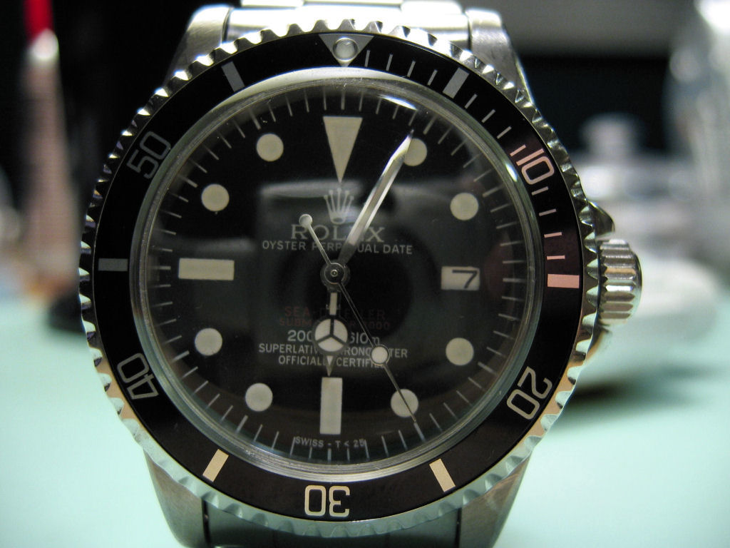
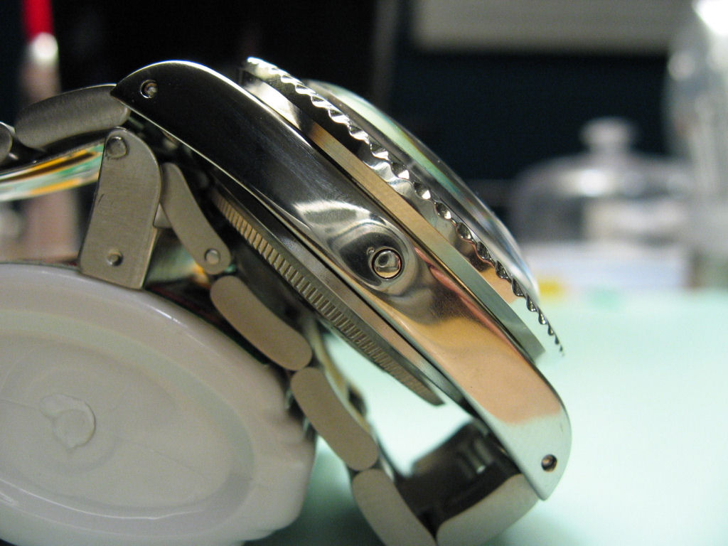
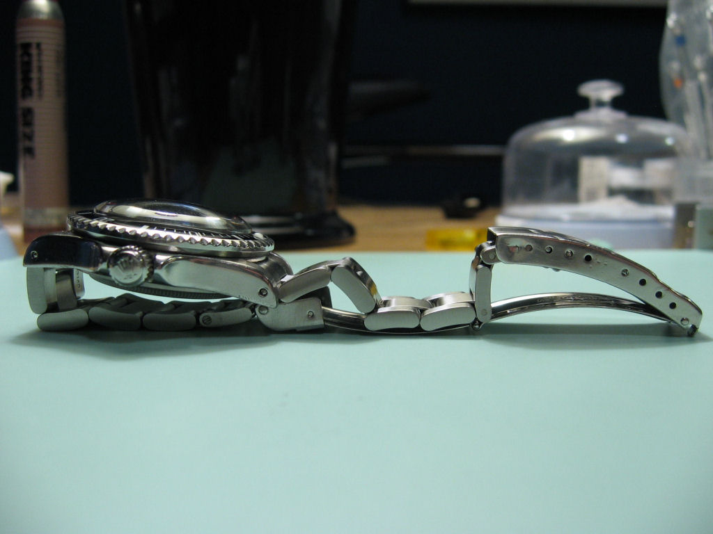
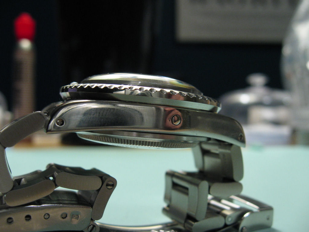
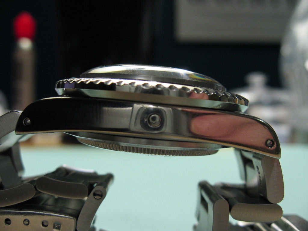
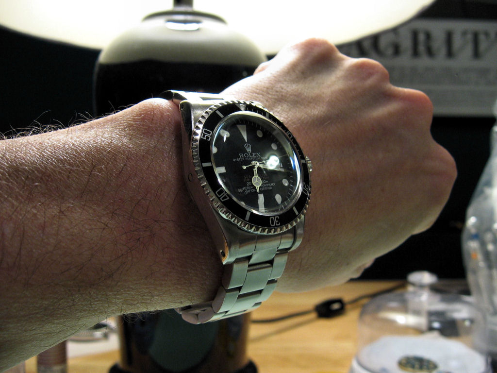
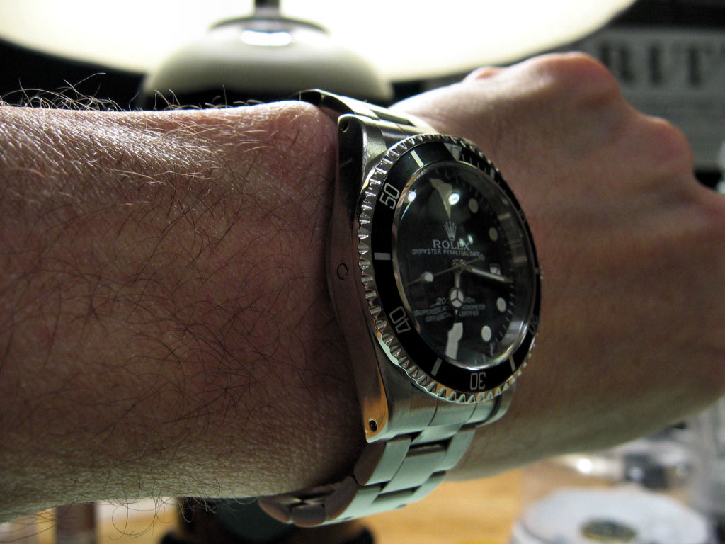
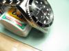
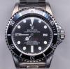
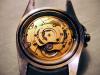
The proof is in the pudding. Here is the completed DRSD (with working He valve, Clark's superdome & Tudor hands, and final case reshaping (previous mods discussed in earlier threads)) Here is a final shot with the watch set to the correct time & date The offset of the Watchmeister datewheel is less noticeable today than on the 7th. I was able to adjust the 20s to near perfection, but everything else is either too high, too low or too far to one side of the window. And this is after an hour of gyrations with the datewheel.


-
Great work. The hands & dial make that watch a real beauty. I think the cyclops magnification may be a bit low though. But other than that the amount of effort you obviously put into that project definitely shows.
-
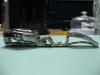
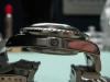
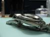
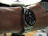
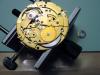
Thank you to EVERYONE who contributed their enlightened comments, experience, observations and VERY useful installation tips. Just minutes ago, the DRSD was completed. All that now remains is to mod the caseback (still working out the details on that), dial lume (I have purposely held off doing this because I am working on a different method of recreating the tritium look without reluming & the MBW dial contains so many inaccuracies that the search continues for a better alternative) and, possibly, to ice the cake and close the book, swapping the 2846 out for a 1570. As I write this, I am processing several new photos (including wrist shots) from my Canon A80 and I will post these along with additional details of the story in the He men don't take Subs thread. But, as this thread is about the datewheel, I will say this -- Due to a number of mistakes, foul ups & nightmarish accidents (all my fault), I ended up using the Watchmeister datewheel in the end. As you probably already know, I ran into a problem with the stem and keyless works (for those who do not know, the 'keyless works' are the set of gears that connect to the crown/stem in a wristwatch that replaced the key winding system used in old clocks (like grandfather and cookoo clocks)) in the 2846 after I had finished all of the remaining mods (He valve, superdome, Clark's Tudor hands & final case contouring). The problem turned out to be that the clutch lever had gotten bent (how? I do not know?) and then slipped out of the groove in the clutch wheel, which left the clutch wheel sliding freely along the stem, so it never came into contact with the setting wheel, etc. Bad turned to worse when, while working on the keyless works, I accidentally broke two of the teeth on the ratchet wheel and then had to start swapping those parts (I am laughing about it now, but that is probably because I have not slept for 24 hours). This picture shows the broken teeth on the ratchet wheel and the missing spring that used to be under the crown wheel Well, after spending nearly 20 straight hours on my hands and knees looking, first, for that tiny 'u' shaped spring that sits under the crown wheel (which I never found), second, for the ratchet wheel screw (which I never found) and, third, for another screw from another 2846 (this was the OEM MBW movement that died a few months after I got the watch, which I overhauled and was saving to use in my 5514 Comex -- also which I never found), I finally got the watch reassembled before something else happened. And the really strange thing was that, until yesterday, I have never lost a single part. At least, not that I was unable to locate within 30 minutes of searching. Sheesh. What a nightmare.
-
Yup, it looks exactly like that.
-
Yeah, now I know what you are talking about. I wish I didn't, but I do. Dang. I guess I will be taking it apart again. Thanks Pug.
-
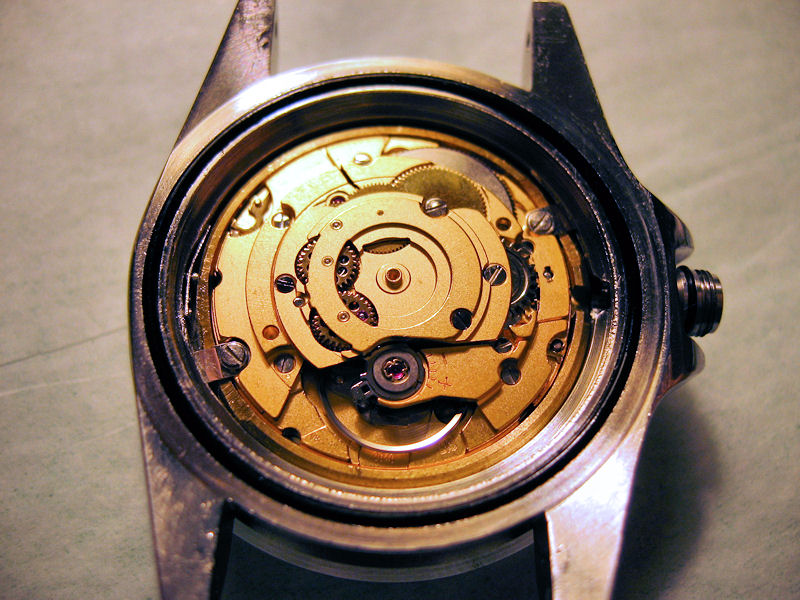
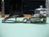
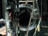
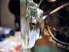
Pug -- You are definitely not talking to yourself, but I am not sure I understand which part you are talking about? Here is a picture of the movement (by the way, you can see the He valve & spring in the left side of the case between the case wall and bronze spacer ring) Pug, can you be more specific about the part's location?
-
Thanks Avitt. I agree about water pressure testing for anyone who wants to swim or dive with their watch. I am only interested in making sure the watch does not get damaged from the rain or when I wash my hands. If I cannot get the watch working tonight, I will put it back together to shoot some pictures for you in the meantime. I cannot for the life of me figure out what the problem is? Very weird.
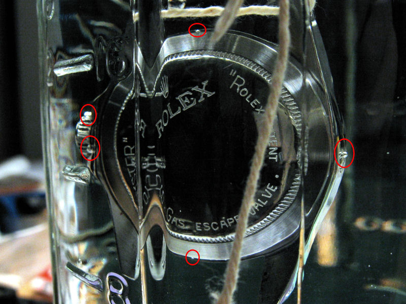
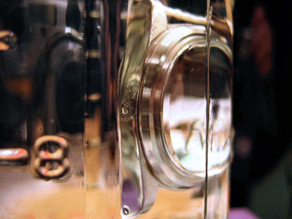
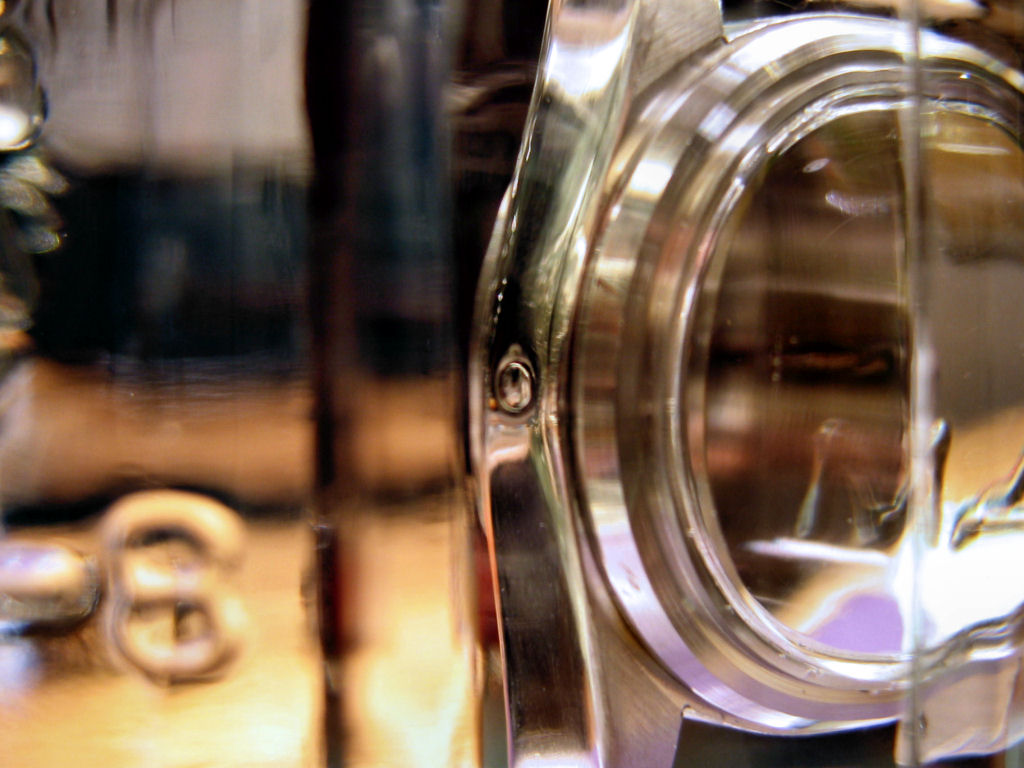
-
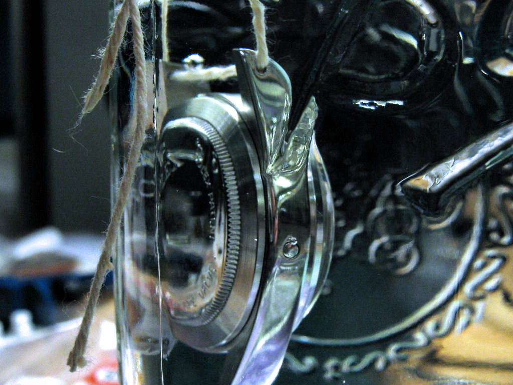
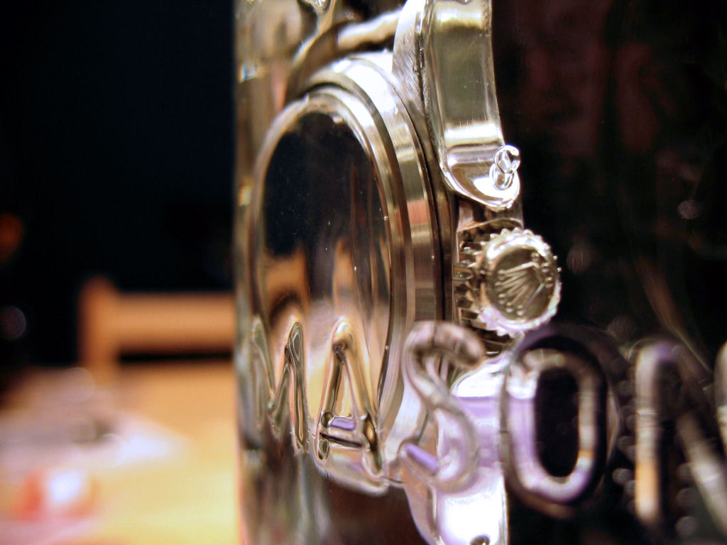
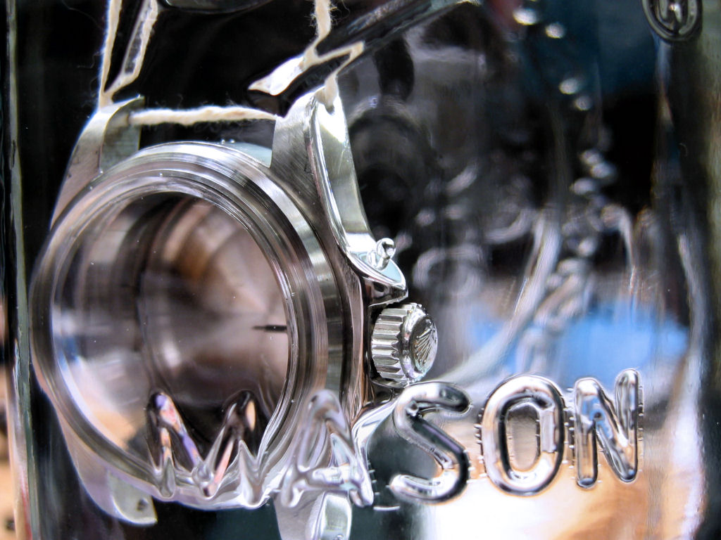
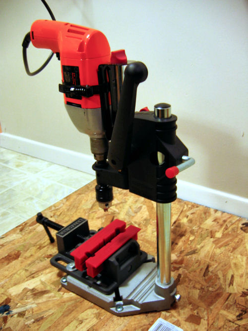
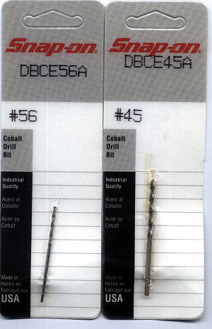
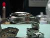
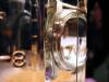
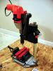
I am still trying to sort out a stem/misaligned keyless works problem (a gear in the keyless works appears to be misaligned or not connecting with the stem, because the crown either just spins freely or it changes the date. I cannot pull or push it into the winding or hand-setting positions), but here are some shots of my DRSD with its newly installed (working) He valve bathing in a Bell jar This was the first shot I took within seconds of lowering the watch into the water. I have indicated where air bubbles appeared. There were 2 very small bubbles around the edge of the caseback, 1 at the top and the other at the bottom. There were 2 larger bubbles around the bottom of the Triplock crown. There was another around the new He valve (right side of the picture). Although I did not take a shot of the front of the case at that time (I was busy searching for active leaks (none were found)), there was also 1 very small bubble that appeared at the top of the case along the seam where the crystal retaining ring meets the case. The bubble was about the size of the bubble you can see at the top of the caseback in this shot, and I believe these are just residual air that was trapped in seams and tight spaces. After a few minutes, all of the bubbles disappeared (except 1 of the 2 that came from below the crown, which slowly floated up to the top of the crown guard where it sat and became the focus of some of the interesting composition shots below). After sitting for a few hours, I saw no moisture either inside the case or condensing on the inside of the crystal. Of course, the watch is not under pressure (I do not have a pressure tester) and I have to say that I do not know for sure that the bubbles I saw initially were not not the result of small, slow leaks. So if someone else with more knowledge or experience with one of the Bergeon water pressure testers has more info, please chime in. I guess these are the money shots. This is how the new He valve looks in the wild (on a watch under water). I do not have any photos handy of He valves on gen Sea Dwellers, but I used over a dozen of them when designing this mod and it looks the same. For this one, I filed down the side of the case including about 1/3 of the He valve hole and I added a couple of dings to give it some age. The result looks like a valve that has been knocked around a bit. What I did not want to end up with is a valve that looked pristine on a watch that is supposed to be 30-35 years old. But you can judge for yourself. These two shots show the air bubble that formed at the He valve just after the watch was submerged into the water. Again, it along with all but 1 of the other bubbles vanished within a few minutes. And these last 2 shots are of this bubble that came from below the Triplock crown and slowly floated to the top of the crown guard where it sat the whole time I shot these photos. There was something quite compelling about the way that delicate bubble sat motionless on the watch as I took shots of it through the glass. I thought it made an interesting photo composition juxtaposed above the word Mason on the jar, which is the only reason I shot these. Hope you enjoy them. The He valve procedure was outlined in a previous thread (this updated procedure is partly based on repaustria's brilliant mod, but it should be noted that my MBW DRSD did not have the metal plug pressed into the side of the case like repaustria found in his - my case had only a surface etching on the side). I cannot remember which post it was, but it outlined the basic procedure and I included pictures of the parts I used for the valve. Since, unlike CGs, you are drilling into virgin metal (no existing hole for the drill bit to follow), you will definitely need a drill press for this mod. However, if you do not have one, I found this little universal drill press at Sears ($40) that works with most standard hand drills and it worked perfectly (also pictured are a drill press vice ($30 at Sears) and, just to be safe, I added a pair of rubber vice covers ($9 at Sears)) You will also need #56 and #45 cobalt drill bits. The He valve hole is actually 2 holes in 1. The smaller hole runs all the way through the side of the case and the larger hole, which is only about 1/32" deep, allows the head of the valve (which is wider than the valve shaft) to inset into the side of the case). As soon as I can figure out what is going on with the stem and winding gears and get the watch put back together again (it now has a new superdome crystal, a correct set of hands and more accurate case shaping) I will post some new pictures and wrist shots. In the meantime, comments welcome.


-
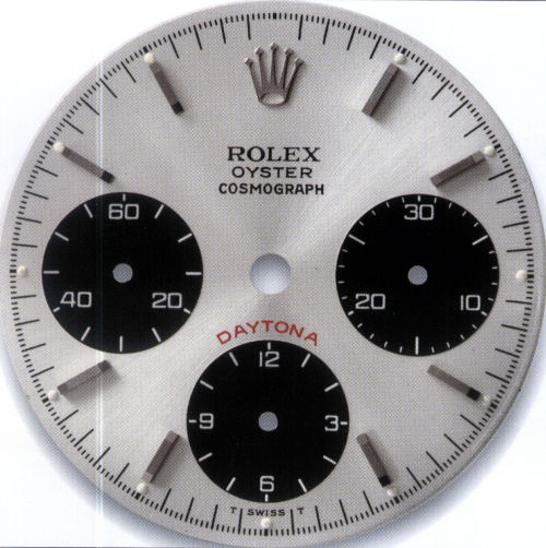
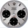
The white lettering, especially the relatively large and prominent ROLEX, is probably the most important text on the dial and I usually use that as a benchmark. That is one of the reasons I do not like the OEM MBW DRSD dial (the font is sort of close, but not right). Also, it is harder to see the details of the red lettering against the black background. But having mismatched 'A's would drive me crazy. Actually, knowing that I have the wrong style font on a few dials has been keeping me up late at night. The He valve went in without a hitch (I will shoot some pictures as soon as I get the watch reassembled), but somehow a gear inside the 2846 movement (probably inside the keyless works) went out of alignment after I recased the movement and reinstalled the crown/stem for what I thought was the final time. With all the hand changing and adjusting, and time spent playing musical datewheels (I ended up back with the MBW, but that is another story), I must have R&Red the stem over a dozen times tonight and never had a problem until I finished everything and recased the movement. The stem goes in like usual, but when I try to wind or set the time, it just either spins freely or is locked in the date-setting position. I cannot pull it out to the time-setting position or press it in to the winding position (but I can remove it without any problem). At first, I thought I must have compressed something by tightening the case screws too much (even though I know better). But after I removed the movement and checked it again, the stem is still not connecting somewhere. So I spent most of the evening (after completing the He valve, installing the superdome and Tudor hands, and doing some additional contouring of the case) trying to figure out why the stem will not seat properly. I think this happened once before and then it just magically started working again without my doing anything other than putting it in and taking it out, putting it in and taking it out............... If you have any ideas what the problem is?
-
I think sometimes it can be hard to tell if the alignment is off due to the way light and shade hit the date window. But when looked at from directly from the front and under direct lighting, I have only seen 2 gen Rolexes that had misaligned dates (1 of these had just been serviced by Rolex Beverly Hills, so they took the watch back and put it right). I do not doubt that there may be some out there, but I think they are more the exception than the rule. Rolex QC checks and corrects for things like that. And in those rare cases when someone on Timezone mentions having a misaligned date, the entire Rolex group tells him to send the watch right back to Rolex so they can fix it.
-
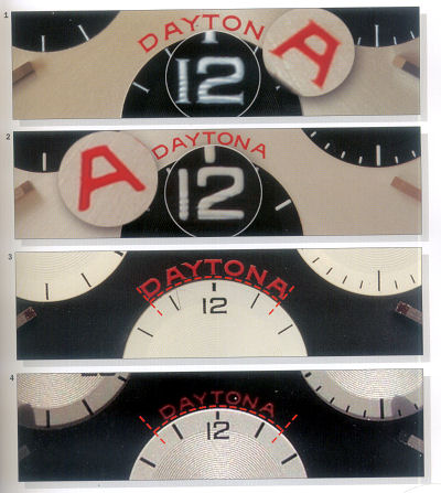
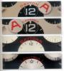
Avitt -- I am in the middle of drilling He valves, but these may help Here is a post-production 6263 dial (I am posting the silver face because it is easier to see the fonts & details) This photo shows the differences in the DAYTONA fonts between the serifed versions used on production dials and the non-serifed versions used on post-production dials. The serifed DAYTONA is larger and wider and the non-serifed DAYTONA is smaller and narrower The 1st & 3rd pictures are production dials with serifed fonts. The 2nd & 4th pictures are post-production dials with non-serifed fonts. Note that the non-serifed DAYTONA font is smaller and spans a shorter distance around the subdial below it.
-
Sherrington -- No surprises from you on this subject, but I am glad to get your input again. I have been thinking along the same lines, which is why I swapped the original MBW datewheel back. But I do like those flat 3s and KKS and Alli make good points in their favor. If only I could get the damned datewheel to center as well as the OEM wheel. I will be starting (and hopefully completing) the He valve mod this evening along with fitting the Tudor hands and Superdome from Clark's and finishing up some other odds and ends, so I will take another look at the datewheels while the dial & movement are in front of me.
-
Avitt -- It has been awhile since I have seen a full frontal of your current dial (hard to see the fonts from the wrist shot). If the 'ROLEX' font looks better on the current dial, I think I would probably keep that one in place. If you are not sure, can you post a direct front shot of the current dial so I can compare it to the new one?
-
Overall, it looks pretty good. The only things that would really bother me are the location of the 3 lines of text (slightly too high) & the fonts used for ROLEX & DAYTONA. The lines that make up each letter of ROLEX should have varying widths (the ''O' in ROLEX should be thicker on the sides than at the top & bottom). And the 'A' in DAYTONA should be either flatter (for the original version) or the font size should be smaller and the length of the word shorter (for the later san-serifed versions). The only thing that really sticks out marking the watch as questionable is the incorrect font on 'ROLEX'. I think the other things would be hard to detect unless you knew what to look for and inspected the dial closeup with a loupe.
-
No problem. It is confusing when you are starting out. Just read and read and re-read the guides until you understand and are comfortable with the procedures. None of this is really that difficult or complicated. It is very much like learning to ride a bike. It takes more practice than knowledge.