P4GTR Posted May 7, 2010 Report Posted May 7, 2010 Seriously, ubi. You are the pearl, insert, and CG master..... bater!
ubiquitous Posted May 7, 2010 Author Report Posted May 7, 2010 ROFL... I greatly dislike doing CGs!! One of my least preferred mods to do...
panerai153 Posted May 7, 2010 Report Posted May 7, 2010 Beautiful job. Ubi, as usual, your generosity and skills exceed all expectations. i'm sure ronin will be thrilled with this one.
dbutlerman Posted May 10, 2010 Report Posted May 10, 2010 So, who makes the best subs I think we may have an answer!
highoeyazmuhudee Posted May 11, 2010 Report Posted May 11, 2010 love it! whatd you tint the hands with?
UT Horn Posted May 11, 2010 Report Posted May 11, 2010 That watch is sweet and the insert looks perfect! Any plans to age the case or are you going to leave it as is?
Ronin Posted May 11, 2010 Report Posted May 11, 2010 Hate to use the word daily beater, but I figure I will wear the heck out of it and let it pick up some aging. Right now it has the appearance of a "well cared for" almost 40 year old watch that would seemingly have had the crystal / bracelet replaced. BTW: Had this pressure tested for waterproofness. Passed with flying colors. 10 BAR / 100m IIRC.
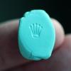
ubiquitous Posted May 11, 2010 Author Report Posted May 11, 2010 Yeah, I'd let this one age naturally with wear. The big trend right now is to have completely unpolished examples when it comes to vintage. Scratches, scuffs, scars are all okay if not excessive or egregious, but the key characteristics to strive toward are the chamfered edges, as-original condition case sides and meaty lugs. The dial that was installed has the most interesting patina... Difficult to capture in pics, but if the light hits at just the right angle, it looks very nice and age appropriate. And the insert, though difficult to capture in pics, turned out a bit darker than my prior attempts. FxrAndy has one of my inserts on his watch as well; his is even darker (I'm getting a feel for varying up the tones)... Ronin's insert on top; FxrAndy's on bottom: And a stack of inserts with a couple of vintage gen fat fonts and a gen lumi mixed in as well... Had a lot of fun with this one! Thanks for letting me be a part of it... //ubi
UT Horn Posted May 11, 2010 Report Posted May 11, 2010 ubi, Those inserts look fantastic. What are you doing to age them? Bleach?
highoeyazmuhudee Posted May 11, 2010 Report Posted May 11, 2010 hah! you might as well ask the wall, Ubi's never giving up that secret publicly. what works for me is some straight bleach for a minute (give or take) and some high grit (2000 and up) light sanding around the edges. one of these days i may try some brake fluid, but im currently all out.
ubiquitous Posted May 11, 2010 Author Report Posted May 11, 2010 I encourage all to be creative and give different methods a try!
UT Horn Posted May 11, 2010 Report Posted May 11, 2010 hah! you might as well ask the wall, Ubi's never giving up that secret publicly. what works for me is some straight bleach for a minute (give or take) and some high grit (2000 and up) light sanding around the edges. one of these days i may try some brake fluid, but im currently all out. I didn't know it was his secret. I've had pretty good success with bleach, but it took about 20 minutes before the look started to take. I hear it really depends on the insert as they can be different from each other. The high grit sandpaper is a great idea. I ran a Scotchbright pad over mine and it seemed to give it a nice effect.
omgiv Posted May 11, 2010 Report Posted May 11, 2010 You work Ubi is just great. I hope that the 5513 I am trying to put together turns out a third that nice!!! Major props to you!!!!!
Ronin Posted May 12, 2010 Report Posted May 12, 2010 Another compliment to Ubi's aging that I don't think many people pay attention to is where there is/should be more wear. If you look closely the right half looks slightly more aged, as well as a bit of the left half. In the real world, the constant "pushing your shirt sleeve back to check the time" will wear the insert more on that side. Likewise a "not quite long enough - long sleeve shirt, or a watch worn low and loose on the wrist" will pick up extra wear and tear on the left side. The least amount of wear should be between 50 and the Pearl. (Speaking about a Right Handed person, wearing on the left wrist of course) Not sure if this was "conscientiously" done by Ubi, but the end result does help emulate "sleeve" wear and tear.
ubiquitous Posted May 12, 2010 Author Report Posted May 12, 2010 Slap 4 rings on that silver rig, and you're not too far off (though technically, it's Mrs. Ubi's car)
Recommended Posts
Create an account or sign in to comment
You need to be a member in order to leave a comment
Create an account
Sign up for a new account in our community. It's easy!
Register a new accountSign in
Already have an account? Sign in here.
Sign In Now