When you buy through links on our site, we may earn an affiliate commission.
-
Posts
171 -
Joined
-
Last visited
-
Days Won
8
Everything posted by jimcon11
-
Thanks, I wish I had gotten this rundown a lot earlier, this post oughta be stickied for everybody. The Long 5 insert really makes your 5513 stand out. Oh and I guess the dark lord dial doesnt hurt either It is one of the nicest watches on here IMO.
-
So there's basically the early big and small crown inserts, maybe 4 or 5 different types (red triangle, no hashmark, etc.) Next would be the Long 5 (I love these but they seem awfully rare) Then the MKIII fat or slim Then the MKIIII one like you posted above with the more compressed numbers. And there's also a later "service insert" where the numbers are really thin.. Is that a pretty accurate rundown of all aluminum sub inserts?
-
cherry blossoms
-
I had to open up a Western Union investigation the one and only time I chose to deal with MQ. Then the funds magically appeared for him. Good luck
-
lol thanks, definitely needed a translation there. They all look nice. I wish these weren't so expensive because the rep ones suck by comparison. Hopefully @slay will release a nice MKIII next 
-
What's going on with the site.. people are multiposting all over the place, and certain threads like the Rolex wristies one are not allowing replies. Is someone working on this?
-
What's going on with the site.. people are multiposting all over the place, and certain threads like the Rolex wristies one are not allowing replies. Is someone working on this?
-
She will probably help you out if you tell her there's a problem with the case you received.
-
So wonderfully tropical. I see a tan perlon in my future.
-
Awesome post, awesome watch. I am planning to grab an action shot or two like this this summer.
-
Congrats man, that is a beautiful watch. The gilt dial without chapter ring is quite a cool look.
-

[Custom Made] Rolex MK1 "Kissing 40" FAT FONT Bezel Inserts
jimcon11 replied to slay's topic in The Rolex Area
Not to go too far off topic, but what is this? Explorer? this watch has no crown Love the insert though.- 95 replies
-
- fat font
- kissing 40
-
(and 5 more)
Tagged with:
-

[Custom Made] Rolex MK1 "Kissing 40" FAT FONT Bezel Inserts
jimcon11 replied to slay's topic in The Rolex Area
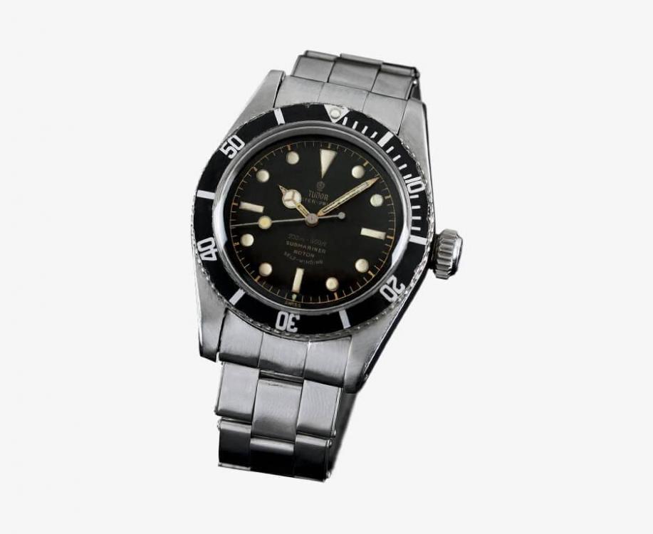
Also a good point slay. Here's the example I was thinking of, from official Tudor website. Numbers are very very fat. Your insert doesn't quite capture the absurd look of this one, though I still love it- 95 replies
-
- fat font
- kissing 40
-
(and 5 more)
Tagged with:
-
So wonderfully tropical. I see a tan perlon in my future.
-

[Custom Made] Rolex MK1 "Kissing 40" FAT FONT Bezel Inserts
jimcon11 replied to slay's topic in The Rolex Area
That is a really good catch. Something very hard to notice unless you compare right next to the real one, but has a noticable visual effect on the watch.- 95 replies
-
- fat font
- kissing 40
-
(and 5 more)
Tagged with:
-
Interesting insight here. The one thing that always bothers me is that I might have difficulty getting my rep with an ETA movement serviced by a good watchmaker. I know I could always just take the movement out and have them tackle the movement by itself, but that doesn't work if I want to pass the watch on to someone. Other than that downside, the advantages of using ETA are immense, the biggest one being you can actually use your watch as it was intended.
-
Awesome looking project, I can't wait to see it together. I agree there's something strange about the first insert, it appears to be a very thinly printed mkiii. Excellent choices with the dial and hands, this is going to be a stunner.
-
-
-
-
That looks pretty nice to me, you should tell us more about it. Im having a hard time placing a date on that watch just by looking at it... looks vintage but the hands seem more modern to me.
-
The arguments on those boards are epic. Don't get me wrong, there's some amusing arguments on the rep forums too.. especially in the ones that aren't this one.. especially in the member trade area.. but something about the persnicketiness of their users combined with the extremely high values at stake leads to some hilarious all-out wars in Rolex land. I've noticed threads where a trivial disagreement leads to whole pages displaying "content removed for personal attack". One of my favorites was the one about the 'teen watch dealer', where various old timers faced the affront that some rich kid was apparently dealing huge value vintage pieces on instagram, and proceeded to character assassinate him for selling a 6202 Turnograph that nobody could actually agree was "real" or not.
-
Hmm I got 24 for both Your big crown is amazing; it's greater than the sum of its parts, even though they're mostly gen. I'd take it over almost any of the real 6538s I see for sale. I'm doing the best I can with mine, but I kind of like pushing the envelope of the "no gen parts" build. Like you said, it's all about seeing the details that aren't generally too noticable, but can nonetheless throw the complete package off. Thanks for the reference there, that crown really is a beauty. I'm starting to see that the Athaya crown does not hold up to scrutiny quite as well as I thought, but I still think it's a great aftermarket part in that it captures the spirit of the real thing nicely, unlike a lot of aftermarket parts. It would be great if Adrian stepped up his Rolex game and developed some more parts: hands, crystals, bezels, etc.
-
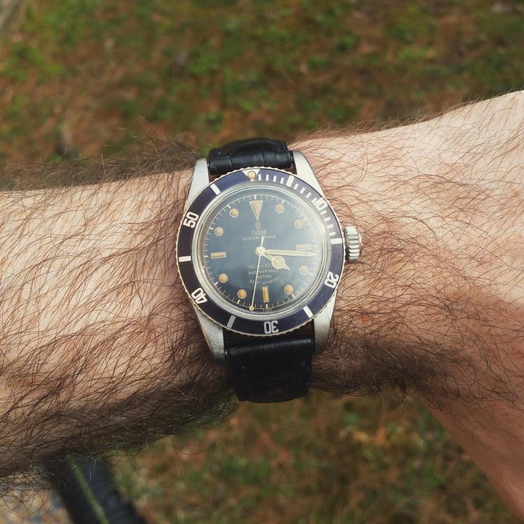
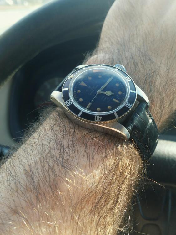
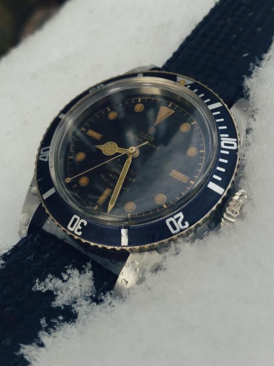
That's interesting, I certainly hadn't noticed this before. It looks like an almost uniform tool mark from cutting the teeth that is left unfinished. Or is it just a by-product of jacketing the brass? My knowledge of metalwork is woeful. I have a spare Athaya crown that's all chewed up (from bending my tube slightly to the correct pitch) so I might experiment a bit. The Athaya crown looks really accurate to me, but this is one issue. Another is that the Brevet and crown markings are a bit flat and less 3D than gen. And I believe the concavely curved "top cap" portion after the teeth is a little short, and I mean just a hair. I genuinely appreciate the feedback. It seems like constructive criticism is often lacking in these forums because nobody wants to sour someone's mood on a watch they are happy with, but it's totally necessary in order to achieve the best possible work and something you're truly satisfied with. This watch looks great in some lighting conditions but rather off in others. I'm adding this to my long list of improvements: -early 7922 case engravings -gen 390 movement (have it, needs slight modification to fit the case) -gold plated dial instead of brass, with more matte textured surface, slightly increase chapter ring size -smoother lume work, less yellow color, and white paint under the plots (this is probably the biggest issue for me) -better evenness on hand aging, slim down minute hand a bit (right now it completely covers the batons markers and I think it should be slightly thinner) -proper big ball seconds hand -gen insert (mkiii with big serifs is my favorite ) -gen crown or roughen inner edges
-
Nice man, that insert is accurate for an early 7922, See Thanks, I'm glad the thread was helpful. The 7922 is a special watch to me, something about the dial text captivated me when I first saw it. I love the calligraphic styling, and the fact that it flies under the radar being a "big crown Submariner" but not a Rolex. I've tried to learn everything I can about this reference, but I haven't gone as far as ordering books or corresponding with collectors or historians. I wish I had become interested in this watch 20 years ago, when you could actually buy one for peanuts. Collectors have realized how close these are to the famous 6538 and prices are in the stratosphere. There are several other vintage watches that I'd like to research and replicate to this degree, but you can only wear one watch at a time and I hate seeing them sitting on the shelf


