When you buy through links on our site, we may earn an affiliate commission.


jimcon11
-
Posts
171 -
Joined
-
Last visited
-
Days Won
8
Everything posted by jimcon11
-
Here you go http://rubyswatch.com/Products/watch-cases/sub-c6204 Stick hands from raffles, dial from MQ or make your own. Gen 6mm crown. Phong 6200 insert. Would be a killer build, good luck. And go easy on the attitude around here.
-
What do Chuck Yeager, Jacques Cousteau, and Elvis Presley all have in common? . . . . . . . . . . . . No, I'm not trying to goad anyone toward hemorrhaging obscene amounts of cash into a grail 6538 build..
-
I appreciate it guys! Valentin- I've seen Bart and Nanuq's watches... it can get better

-
That looks good to me, is the text sharp enough for you? My printer does those vertical pinhole marks on the decal too and they're a pain in the ass.. they basically leave a weak point where brass can start showing through. I researched it some and there's no easy fix, but if you're brave you could try removing those ninja star wheels from your printer. I found that after a few coats of lacquer and some careful sanding and polishing I could make them disappear.
-
I've actually had the exact same issue on my 6538 case from Ruby taking a FEF390. I don't find it too egregious since very few Tudor subs were put into 6538 cases and it's possible that the movements were specially machined. I think just shaving down the slots where the movement tabs screw in should solve the problem.. kinda kills the resale value of the movement though.
-
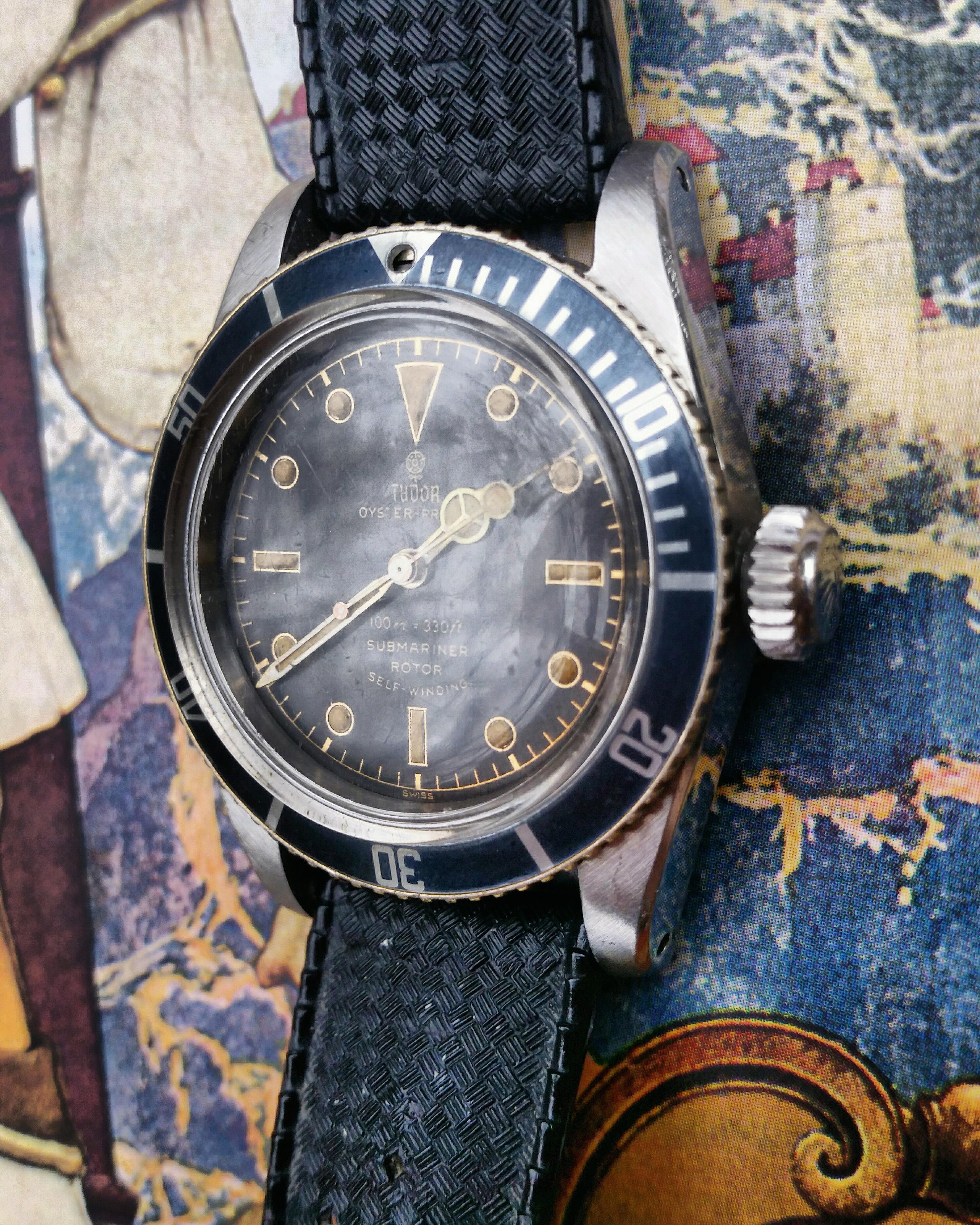
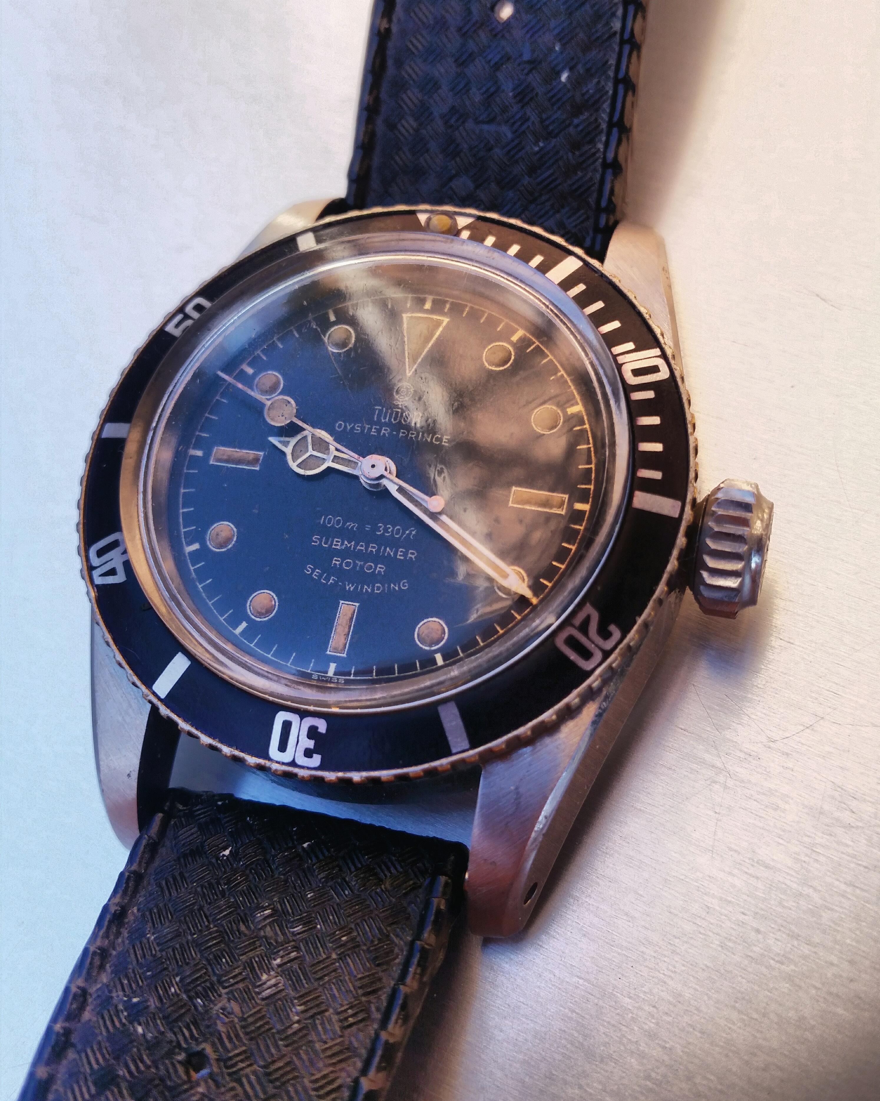
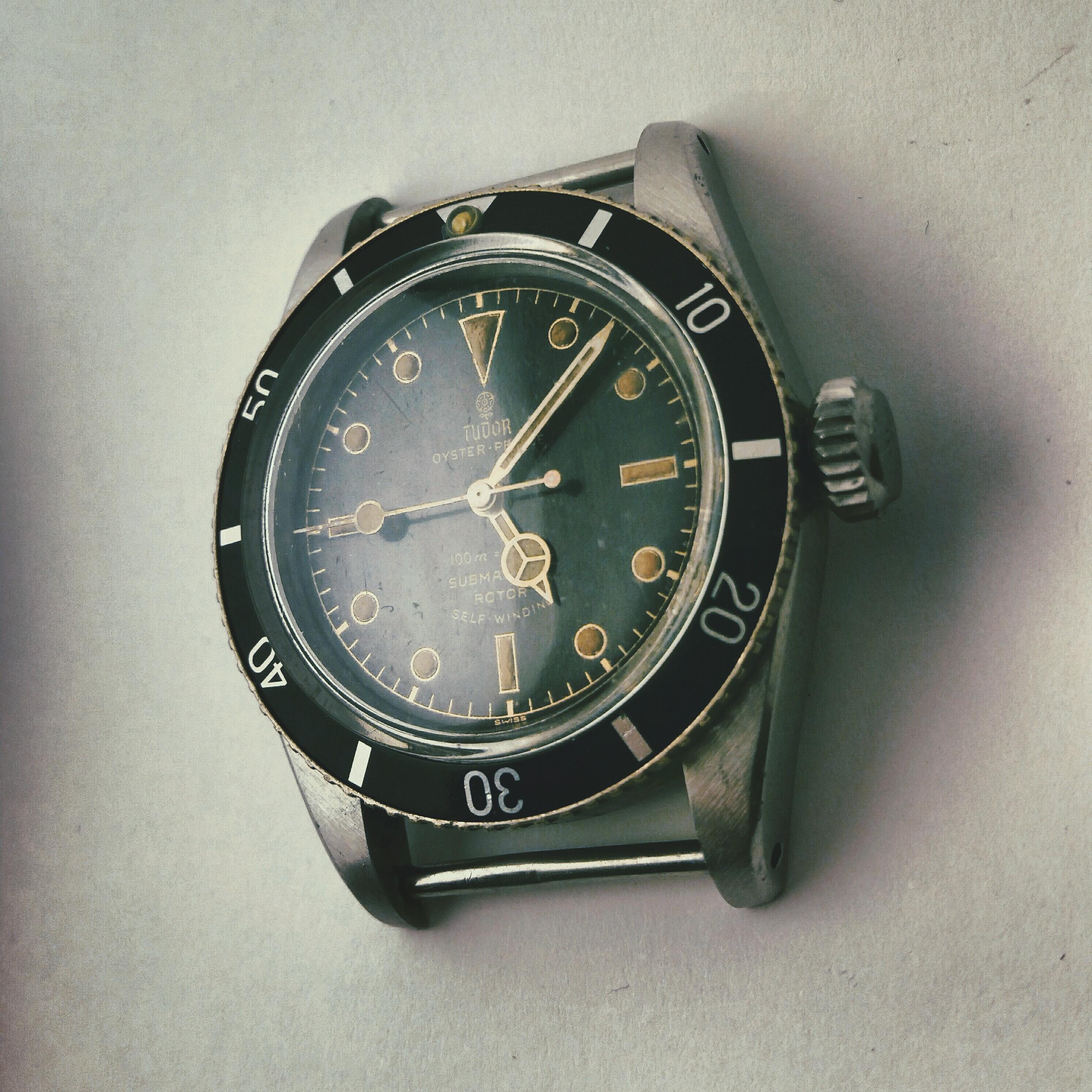
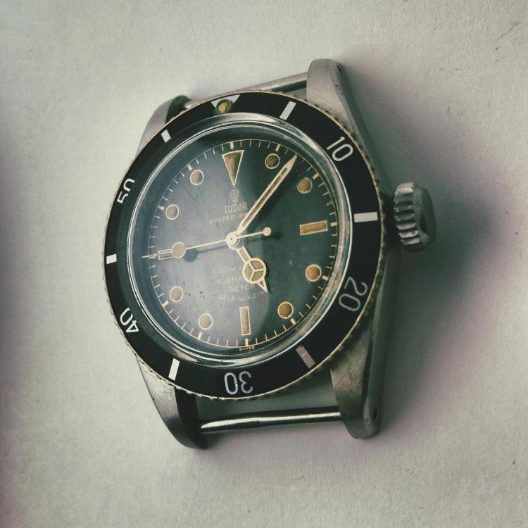
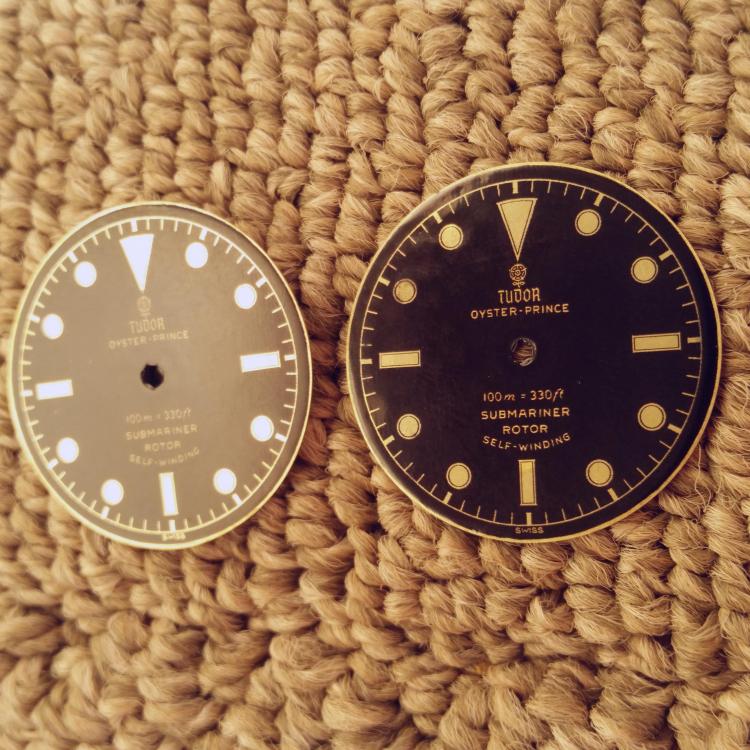
I've made some progress on this build so I thought I'd update the thread. As nice as the Vietnam dial is for this watch, its typographic style resembles the later 1960s text in the 7928, which is subtly different from the earlier Submariners. The only thing to do is print your own dial, so that's what I did. The text on this one is lifted straight from a front-on pic of a gen dial. It's interesting to note that there's some variation in the text and especially the exact position of the two text blocks in different examples of the 7922 and 7924. After a while of looking at gens I realized that the text on the Tudor subs isn't negative relief gilt, it's printed-on gold ink. Similar to how some Rolex gilt dials have the depth or chronometer information printed on later, Tudor seems to have done this with all of the text, probably a cost saving measure. For my dial, I let the brass surface show through on the chapter ring and swiss text, and covered the middle area with a thin layer of gold paint. The result is pretty interesting; in some light the Tudor rose and calligraphic logo jumps out in bright gold, and at other angles the inner text disappears almost completely and the chapter ring shimmers instead. I'm really happy with that result. The lume on the other hand.. I need to get better. I also replaced the hands with the closest things I could find to the 50s flat style hands. Still not perfect but much improved. I've saved many pics of gen 50s Tudor subs and about 75% of them are found with a later service bezel insert with serifs and hash marks, so I went with the awesome, recent fat font insert produced by slay. I'm pausing to enjoy it for a while now, but still in the works for this watch: -Fleurier 390 movement -dial gold electroplated rather than brass relief, with better lume work -case engravings to make this a crossout 6538 case with the correct range serial number -gen Tudor hands, although this one is more like wishful thinking Any other ideas? Thanks for looking, and thanks to several people in particular who have really helped me with this project: @Bart Cordell @Alan72 @hologramet @JSebWC @slay

-
I just noticed that people often post Tudor stuff here and not in the Rolex section.. doh! First off, it's a really nice looking build despite the issues you had. I like the kind of gunmetal coloring which is complimented perfectly by the eggshell lume. I think interest in Tudor subs is on the rise after that cool Talking Watches episode with the Navy SEAL talking about his issued Tudors. I wasn't aware that HR can do dials like this; that makes this reference a pretty economical build, aside from the snafu with the MQ case. Speaking of which, I also had a pretty negative experience with MQ recently. I was looking for an MKIII insert with nice serifs and they were the only one I could find, so I payed the exhorbitant price and prayed. MQ originally insisted they didn't receive my money transfer for several days, to the point that I had to open an investigation with Western Union, at which time the funds magically appeared and he apologized for the error. It was kind of suspicious to say the least. Then the insert arrived and it was faded far beyond what was shown in the QC pic I was sent, to a light blue color that doesn't match my watch at all. I decided it wasn't worth the effort to return it and I'm just going to try to darken it myself. I am definitely through dealing with this guy, especially now that slay is producing his inserts, which are comparable quality and far less expensive. I always assumed MQ was the highest quality since the prices he quoted me were so outrageous, like $700 for a dial, but I'm starting to doubt that now. It certainly feels that way. I think that they just find us to be a nuisance. Most of their business is probably done with tourists or people with more money than brains who just throw a few grand in their direction for a finished replica. The guys that do their own modding and go for low cost builds probably hassle them a lot about exact details and they've just decided it's not worth it to go above and beyond for us. I get that there's a cultural barrier but sometimes it's just miserable to do business with these people. That said, I've had decent experience with Phong and very good experience with Ruby, who would be my default first choice for parts in the future.
-

[Custom Made] Rolex MK1 "Kissing 40" FAT FONT Bezel Inserts
jimcon11 replied to slay's topic in The Rolex Area
holiday season-sized font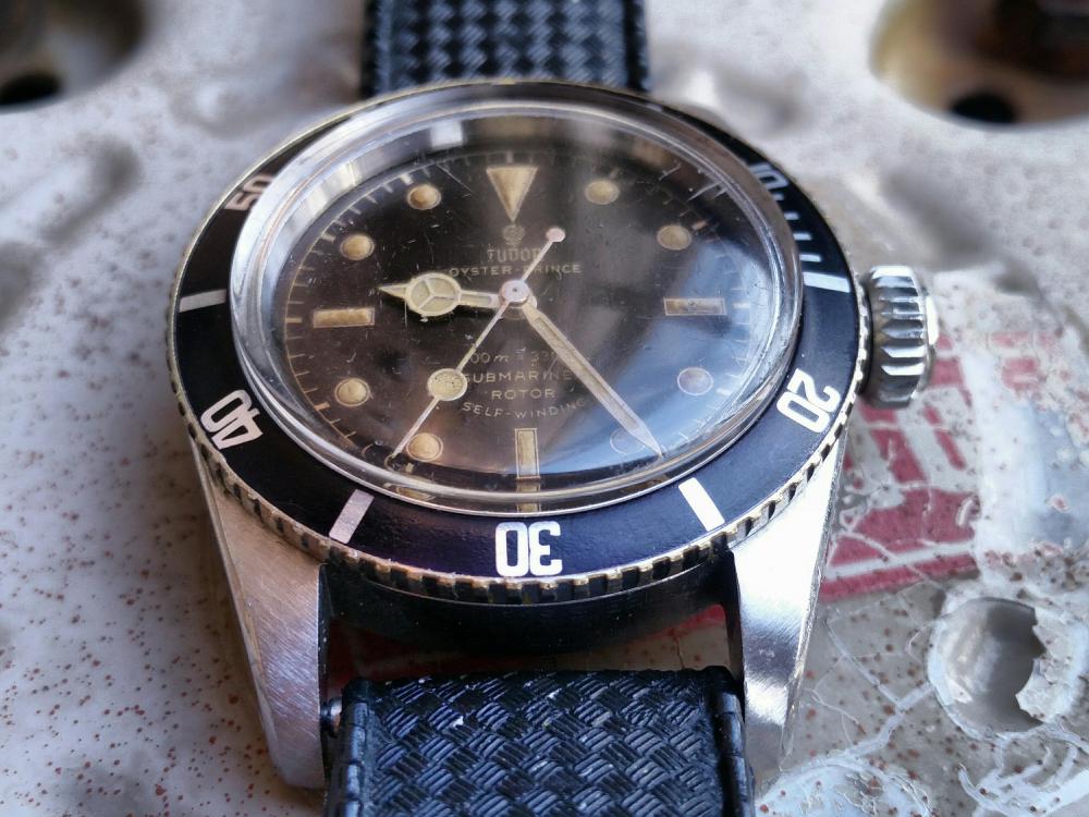
- 95 replies
-
- 1
-

-
- fat font
- kissing 40
- (and 5 more)
-
"The one we can't pronounce his name" lol... honestly the secrecy surrounding this guy is a little much. I think everyone should have access to a gilt dial with the correct typography. Thanks for your help Bart, I couldn't have gotten this result without your posts and tips. Thanks for the lume advice Joey. Right now I want to take a break but eventually I'm sure more dials are in the works. You mentioned pictures of gens taken in the 1950s.. I've barely been able to find any of these vintage pictures. It's a topic that interests me, since they give insight into how these watches looked in a nearly new condition, how they were worn, etc. I might start a thread about it some time. Anyway, is my lume a bit too yellow? I always lume in lamp light and the lume seems too grey and dull so I add some yellow paint, then when I get out in sunlight it seems I went overboard.. Also in this pic you can see what I mean a bit that the brass chapter ring is perhaps a bit too dark compared to the gens.

-
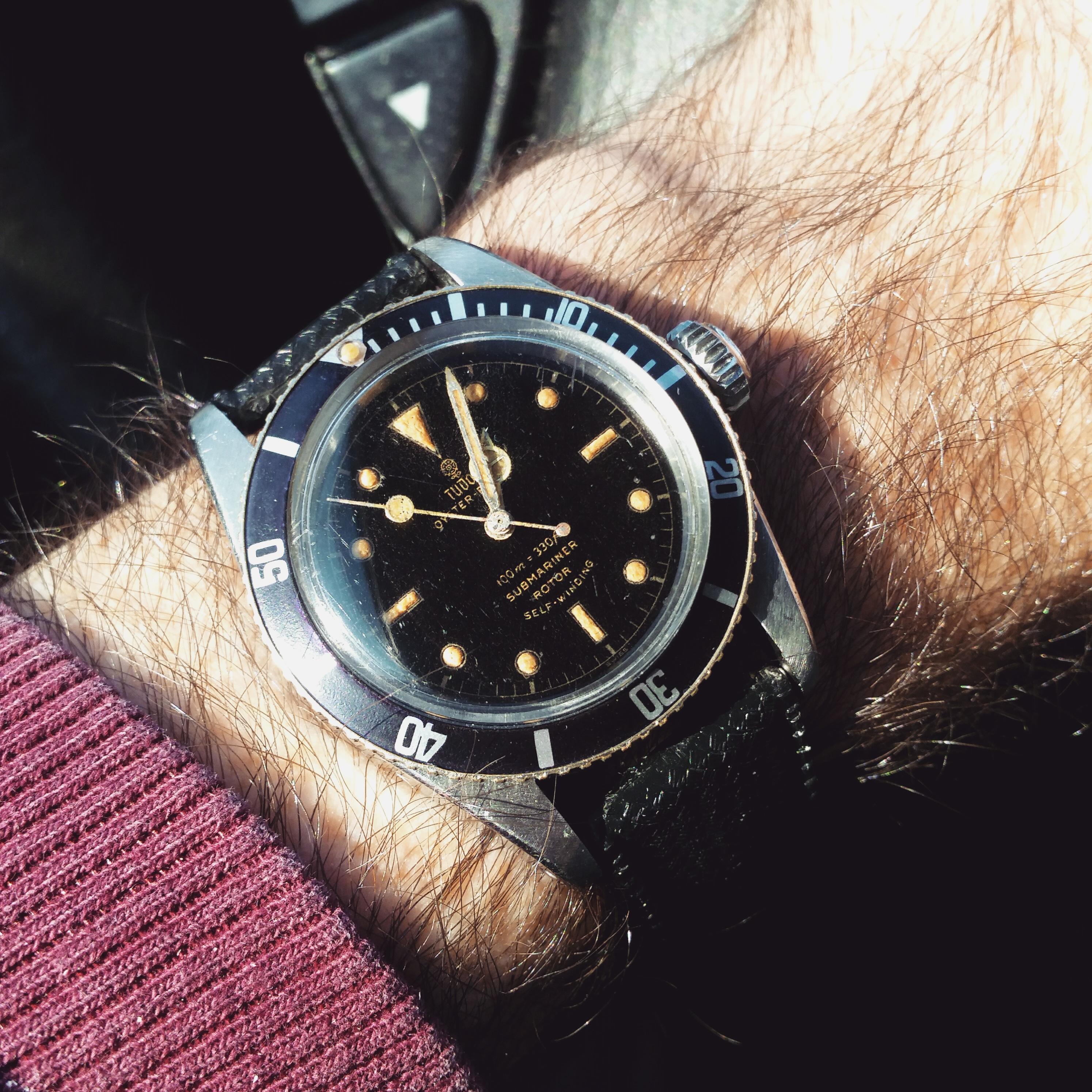
Thanks for the info Joey. Your lume there looks perfect, I have no idea how you painted that so neatly. Perhaps the decal paper I'm using is too delicate, but I found that even the microset solution coated on the dial to begin was causing the decal to bleed and weaken, or maybe it's just my imagination. Compared side by side to one of my Vietnam dials, the brass did not look yellow enough. But now that I have a dial done and cased up, I feel like it looks pretty convincing. I did something a little crazy on this one. I noticed that my dial was fading and somehow moisture was getting under the acrylic coating and leaving little silvering marks. I found earlier that the oil from my fingers would deepen the black of the dial, so I decided to try giving the dial a very light coat of leather oil with a q tip just before installing it. The oil coating made the black really shine and totally masked all the little imperfections. I have no idea how it will hold up, but as it stands now I'm pretty amazed that I saved this one. My luming still needs improvement but overall I think this looks alright. I've gained a ton of respect for the people who make the Vietnam dials... I think they are quite a bargain really.
-
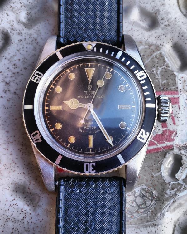
Stage 2: Gilt chapter ring with gold print text Some things I've noticed in working on these: -Decal setting solutions like microset/sol are not a good idea. The decal paper you can buy to print on, at least the stuff I got "Kodiak", is too delicate for them. The microsol solution, which is supposed to make decals basically sink into the surface of the base, just eats right through the decal. -Be prepared to cut out and apply about 5 decals for every 1 you get to set properly with no damage. Between defects in the paper and print, trying to smooth out wrinkles, and random ink bleeding from the water, most decals do not end up looking pristine and you have to start over. -There is a perfect medium of gloss lacquer over the decal. Too little and the decal isn't protected, too much and all the gold detail starts to look dull. I found that 3 coats of about 4 quick spray passes each is the ideal. The stuff I've been using, Krylon crystal clear, dries really quickly, so this step can be completed in just a couple hours. -There is such a thing as too glossy. After the lacquer dries, the dial is super glossy but the blacks are full of a vertical "scan line" texture from the decal film that looks very bad. Sanding with polishing cloth is a must. I found that anywhere between 1200 and 4000 grit looks good, with 4000 retaining the deepest black but 1200 doing the best at removing the annoying scan line texture. It sounds paradoxical, but the less glossy your dial, the more the gilt details will stand out. -For this to be done right you really need to gold plate the dial. I haven't tried this yet, but the polished brass, while attractive, is really too dark and pale to be convincing. -If you need to produce colored text, oil based paint pens work very well. These dials have gold paint text with the polished brass chapter rings and indices, similar to how Tudor produced them. Next step is luming these and hopefully not ruining them as I did my first batch. All I can say is that getting the right lume mixture is not easy.
-
I used Krylon Crystal Clear and sprayed the dial sitting directly on a cold metal table at close to 0°C and left it outside. I think this result should be reproducible, although it wasn't desired in my case. I'm able to get good detail at 1200dpi, which is the max horizontal on my Canon printer. I noticed a big improvement when I set the paper type to High-Resolution Paper, even though I'm using decal paper. I didn't notice much of a difference when setting to print color vs black and white. Sounds like you're doing everything else right, might want to try scaling down to 1200 dpi.
-
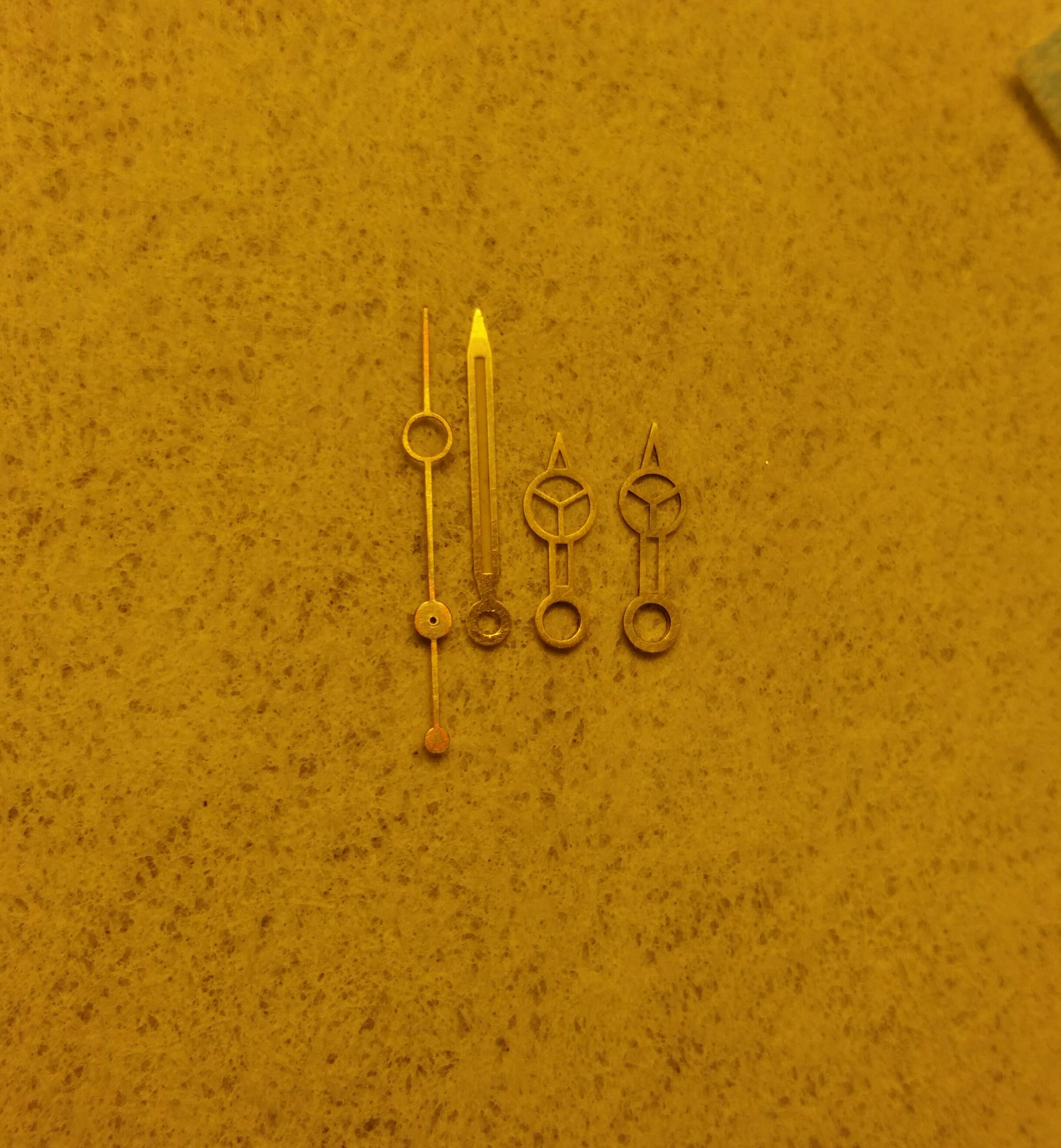
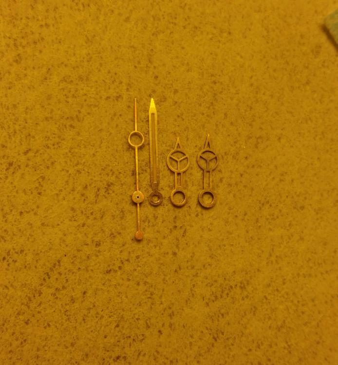
I noticed that the Raffles 6204 minute hand looked pretty good so I decided to take a shot and order the set. It arrived today, and to my surprise it was actually too long for the chapter ring on my Viet 6538 dial. I was able to trim the tip about .5mm with a hobby knife and reshape the point with sandpaper to get it just the right length. It doesn't look super sharp anymore but I think I solved the issue of short minute hands on our 50s Rolex builds Thanks to Jonathan (JSebWC) for taking a look at his 6204 handset to confirm it could work. L to R: Old HR seconds, Raffles 6204 minute, JK hour, new HR hour
-
Looks really nice so far. I think you'll be able to get the keyless fixed. Working on the front of a movement is pretty straight forward, it's the back that scares me I found that the Fleurier 390 movement is actually a tiny bit tall for my 6538 case, strangely enough, so I'm having the same parts fitting luck you are lately.
-
What to use with Rolex cal 3000 dimensions?
jimcon11 replied to hologramet's topic in The Rolex Area
I'm always amazed looking back at some of the decades-old posts on this forum. It really has an identity in a way the others don't, imo. Im not familiar with the Air King but it looks cool, the bezel is a nice throwback. Keep us updated on the build. -
My first decal dial. On its third coat of gloss, I decided to let the dial dry on a cold metal table.. this was the result! For anyone wishing to produce a spider dial, now you know how 😁
-
I can't get enough of these big crowns you all are posting. Inspiration to keep improving ..
-
[Custom Made] Rolex MK1 "Kissing 40" FAT FONT Bezel Inserts
jimcon11 replied to slay's topic in The Rolex Area
It's here, beautiful. 20 min in the bleach bath was just right for me. Thanks again slay- 95 replies
-
- 2
-
-
- fat font
- kissing 40
- (and 5 more)
-
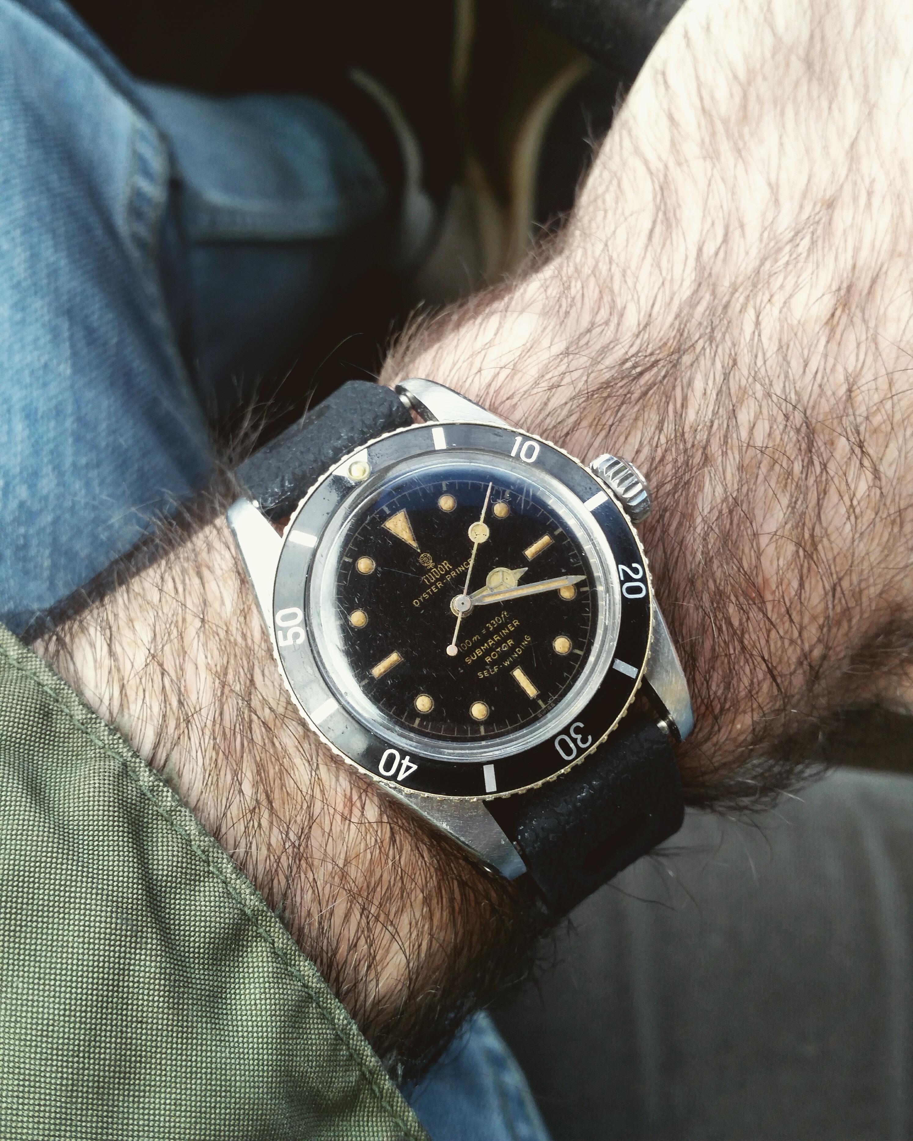
I agree with autimatico.. for gilt dial 50s Rolex watches, the minute hand is the biggest stumbling block (I believe the early subs, explorers, turnograph, etc, all used the same flat handset). A proper 13mm length with the right size and shape lume plot is impossible to find. People want $1000 for gen ones in crummy condition. I'm always looking for a better minute hand but all the current sources have their flaws. HR did tell me she will have gold 13mm in stock soon so I'm holding out that this batch will be more correct. Nanuq's hands above are perfect and I'm willing to bet they are gen. From L to R: older HR 13mm, JK, new HR 12mm, standard silix, Tiger Concept ...all wrong 😩. I go back and forth on which is the least bad. I should add that later service hands from the 60s are usually shorter , 12mm, and tend to look pretty similar to the rep ones.
-
I can't tell what's new with the dial, but your 6538 is looking better than ever. I never thought to varnish the insert, the sheen on yours where it catches the light looks a lot like the pics of gen ones, so I guess I'll be trying that now. I have some upgrades for my big crown in the works too 😀
-
Ah, beautiful build, all the details are just right. I think you've reached the limit of what can be done reasonably without paying a fortune for gen parts. Now just start the aging process 😀
-
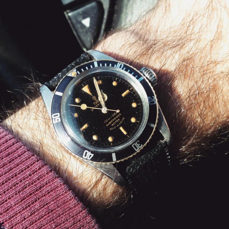
I've been close to buying a gen waffle dial Tudor because I keep seeing this watch^😫
-
A source for Vietnamese Dials and Rolex movements
jimcon11 replied to altesporsche's topic in The Rolex Area
Care to elaborate on this? Her website is still up.. -
I really appreciate the history and all but in reading some of the weapon forums I get this kind of vibe from certain people. Sure humans make things and they're tools but you can't ignore how the tools then feed back into how we understand and act in the world.