When you buy through links on our site, we may earn an affiliate commission.


chad
-
Posts
909 -
Joined
-
Last visited
Everything posted by chad
-
The numbers are about 10 times too big...haha I have seen that dial with big numbers in one place..... Here in Chinatown on the 20 dollar fakes.
-
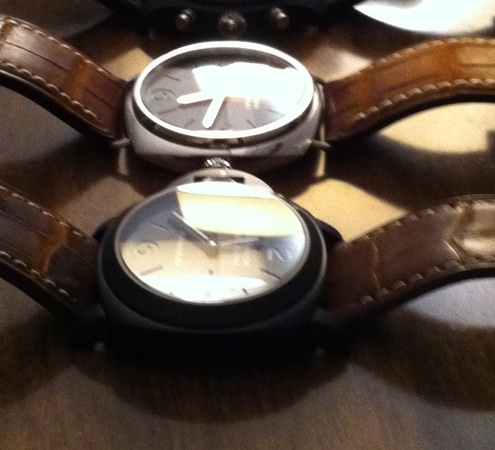
Yea I am not super impressed, The dial looks strange like the numbers are too close to the edge. It just does not have quite the quality look as the 005 and 26k to my eye.
-
It is a work of art but I cannot get over that white dial text. It's just too bright. Maybe it is per gen but I have not seen one that bright.
-
Looks like crap.
-
I hunted with the search engine and could not find anything good Anyone have any thoughts? Chad
-
I could not agree with those choices more. Looks great.
-
great stuff! Tell us about that last fgd dial? Any extra lume or finishing?
-
Couldn't you write this response to almost any post on the forum? What's the point of saying that on a forum where 60-70 percent of the posts are about improving reps and mods. The crown is too close to the case.... buy a gen dumbass The crown is not thick enough....What's wrong with you? buy a gen The lume is too weak......If you want bright lume buy a gen My datewheel is sunken and the print is weak, anyone have lello's email?.......buy a gen and shut your piehole My 7750 died after 1 day, where is The Zigmeister?........ The Zigmeister is out buying gens and cannot answer pms. Do you need tourneau's number? I heard they have gens.
-
By the way, I know they are 200 bucks and I know I am nitpicking. Again, I love the watch and nitpicking is what RWG is for. So let me have my fun. If I want unicorns and rainbows I go to for paneristi for that
-
Dani, I do not know about where you are but the panerai AD's here in the US such as tourneau and the like could not tell ANY watch on perfect clones from the real deal. At columbus circle here in NYC they are complete morons. Low paid people working on commission that usually know nothing about watches. Some of the stuff I hear them tell other potential buyers is comedy gold. Even at the panerai boutique here I have had them misdescribe which movements are in which watches and tell me the 111 is a 005 etc etc etc.... That is beside the point, I do not care about being "called out" I just know what I like and what i do not like. I like this watch but the AR and crystal do not pop like the gen. My wife can tell this, my co workers see this and most importantly I see it. It is still one of the best pam reps around. We had 3 watches at work last night my 26k rep, a 111h gen and a 176k gen. I asked 3 non watch people the differences in the "glass" and "dial". 2 people asked if the 26k had a grey dial. That pretty much sums it up. It is washed out from weak AR. My point to all this, the maker has done so much to make these better but he needs to get a better source for AR.
-
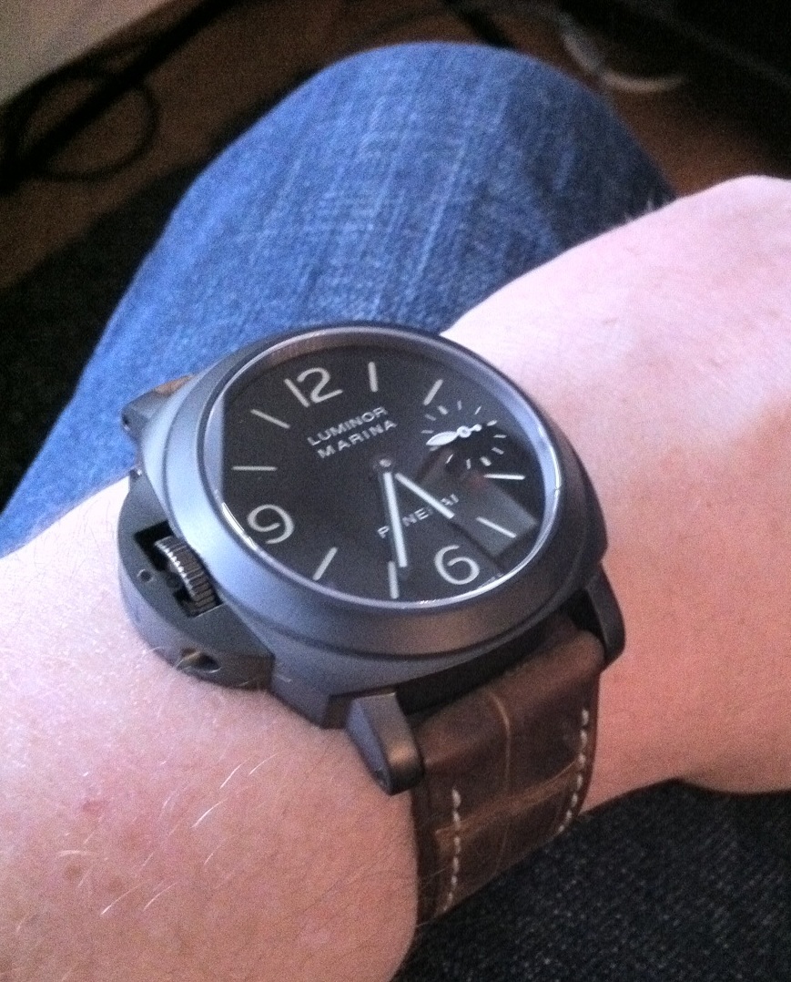
Most "watch dudes" could not spot a fake 26k if there life depended on it. I can only speak from my personal experience and i am not concerned with what others think because I know 90 percent of out reps fool 99.9 percent of people out there but I buy watches for my own enjoyment and I like the little details. Don't get me wrong my review was meant to be positive, very positive. Do I notice the cutouts are too shallow? Yes Do I notice the AR being not gen spec? Yes (i even notice this from across the room on a coworker wrist.) Do I notice the crown being to close to the case? Actually i do not but I respect the fact that it could bother people. Would 99.9 percent think this is a gen? For sure! Sorry for the bad photos my SLR is not charged right now. In the photo is the 26k and the gen 232. In both positions the watches had the same reflections so they are accurate. One refection around 9-12 and the other at 2-5 o clock. Identical when watches were swapped also. 1. If you look at the 232 it has a single reflection and the second reflection has been almost completely subdued and the areas outside of the refection are rich and show the dial well. No haze. You can see the the gold hands are getting hit directly with a light source like the 26k at that point near 4 o'clock but the 232 has little to no reflections there. On an interesting note the 232 actually has a similar color to the 26k rep. Yellow with a hint of purple. My 176g gen has blue purple. 2. The 26k shows one reflection and then another at almost the same intensity but just colored. The areas that are not hit with a light source directly are greyish and washed out. You can see this because the brown dial of the 232 looks more black than the black dial of the 26k. Does not have that gen feel where you get a single a refection and then richness and pop everywhere else. You can see even in this not great photo. The gen just pops and the 26k does not. That's just my take and this applies to my 005 as well. Are this crystal and AR better than any other offerings such as older cartel and DSN? Hell yea! (notice the rehaut and distortion in the photo compared to gen. It is excellent. Should you get this piece? Without a doubt. P.S. I find the DLC coating to be as good as the Jack coated gen 112G i owned a year ago. That is just my opinion though. I cannot speak for the gen 26k since I have only tried it on and not owned it.
-
I was sweating the dial fonts and they are still wrong but i got mine today and it's just worlds above the DSN/older cartel offerings. Real great piece! The AR which many have described as perfect on the 005 and now this watch is not perfect in my eyes. It is almost colorless and for all purposes not effective compared to the gen. My gens are blue or purple(subtle) and block a single set of reflections almost totally. This like a no ar crystal casts two reflections and one of them is slightly tinted but hardly reduced like my gen. The crystal however is cut at the correct angle and offers gen like distortion and viewing angles but has a hazy grey cast to it when hit with reflections. This is in direct comparison with two gens here. I love it! (here with my oem JV well worn)
-
I like the rep and think it is a good looking watch unlike the dsn alternative but seeing the dial side by side you really see they did a sloppy job on the dial. It does just come down to fonts and spacing and with just a little care it could have been so much better. i know these are great reps for the money but as they improve the flaws become more apparent especially ones that are easily fixable.
-
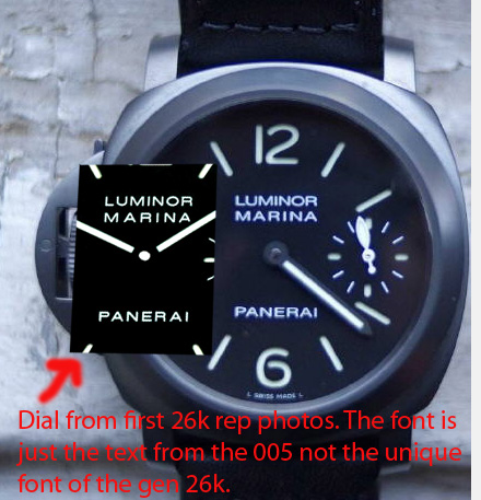
They are different of course than 177 but gen 26k has unique fonts different from both.
-
Thanks for the update, The font on my QC pics was still wrong. Is your watch different from your QC pic?
-
I think they are bent downwards and upwards on the gen
-
Yea and we got the old 26 dial font
-
Nah its the same font. Looks good but not correct
-
Luminor marina and panerai are slightly too bold. Font is close but too thick.
-
I sent swiss 7750 to him once that got lost. Communication was also quite delayed and I was treated as if I was an annoyance.
-
Really? The font? It is the statement of the brand and watch not the CG pin or torch like lume. What if there was a rolex sea dweller and the font was completely different than the gen? Also what a gen owner would notice and not notice is not the standard that should be used. Most guys on risti could not tell a dsn rep from the gen.
-
The cut out and dial font are far more noticeable than some of the other discussions here on accuracy such as case feet, movement finishing and dial finish etc etc etc. It's never a good idea to say that it is ok for one of the best factories to just use a previously released dial font because they are too lazy to spend a few hours trying to find the right one. If the word "hublot" was completely the wrong font and the numbers were a different shape on the big bang you bet there would be hell to pay by most members. No reason we cannot be picky with panerai also. Our expectations govern our wallets and our wallets govern how hard these guys will try to please us. Otherwise they could careless.
-
Ironically some people on paneristi did not like the change in cut out and dial font and many would have prefer the "rep" As always I am about what looks good and less about accuracy. A thin crown looks bad, green weak lume looks bad, but this watch does look nice and thats what really counts
-
For those that like details. I do not think the number cut outs are correct either but that is for another day It still looks good and I ordered one but just to be very picky.
-
Pure time just posted his and the photo appears different than Josh Anyone else think he is using a gen photo? edit: oh he states he is using a gen image, sorry. Sadly it is easy to spot that because of the fonts.