When you buy through links on our site, we may earn an affiliate commission.
Leaderboard


Popular Content
Showing content with the highest reputation on 02/20/2015 in all areas
-
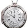
I'm sometimes tempted to go into my photo archives, and start a catalog of all the dial variants that were used on the 1016 during its production lifespan. But then I wonder if I'd have more fun cleaning the Augean Stables...2 points
-
Dear esteemed vintage Rolex fans, I have come to the end of my tether. I have waited, I have prayed, I have hoped (in vain), I have wished, I have put my faith in the Lord. All to no avail. The challenge is simple. Can a competent individual who is good with computers and printing stuff produce a flat top 3 open 6 & 9 DWO that actually lines up correctly with the date window on a rep dial? I mean - does that sound like the greatest challenge we have ever faced? I think not. Considering the amazing and ingenious solutions our brethren have come up with in the past, some of which leaves me speechless with admiration I can not believe that producing a printed datewheel to the correct radius is beyond our collective abilities. I have even got a hi-res vector (whatever one of those is!?!) that a skilled member posted some time ago - free for all use (thankyou) and yet, still no decent DWO. So I say it here and now, come on chaps - knuckle down use your skills (PM me for the vector) lets solve this once and for all then all us vintage 1665 and 1680 owners with rep dials and ETA engines can finally complete the picture and actually look at our watches without having to work out independently if it is the 7th of the month of the 17th! Anybody up to the challenge? Consider the gauntlet well and truly thrown down....1 point
-
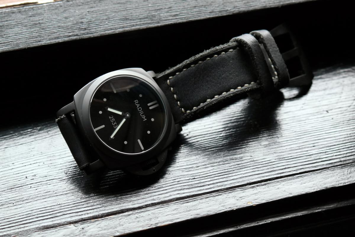
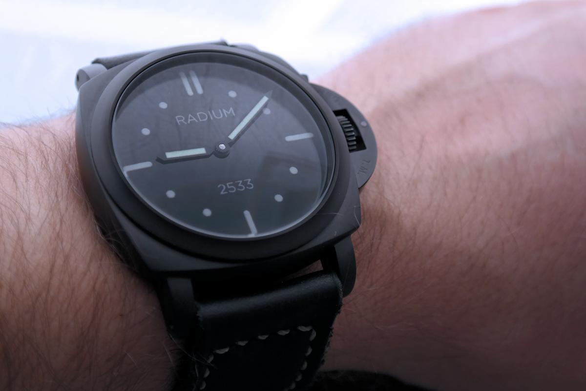
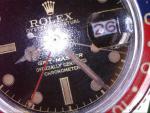
Ordered this one from Sead on the 13th and arrived today the 19th! I wanted to post some photos and let the people with more knowledge chime in. My observations on the watch: - Awesome fit and finish. Brushed steel looks really nice! Solid feeling in the hand. - CG lever snaps nicely. - Dial looks very nice but the color of the letters and dates look to be darker than the gen photos I've seen online. However they match perfect to the photo on the official P.com. - Strap quick release system works flawlessly. Nice surprise, the watch came with the tool included with it. - REG. T.M. nicely engraved but font size bigger compared to gen pics. - Lume is on par with the superlumed reps of today. - Tick tock is not audible and can only be heard if I press the watch to my ear. - Rotor is surprisingly quiet (however the only other Pam auto I have owned recently was a 388 v1 which I sold because the rotor was annoyingly loud). Please understand these observations could just be my sample so ymmv. I really like how it sits on my wrist. Not top heavy at all. Very good balance (imho) of not too big not too small. My wrist is 7" but round shaped and not flat. Hopefully this post will help anyone trying to decide on buying this or not.1 point
-
Here is the thread with the vectorized open 6, flat top 3 DWO. I used this to make the roulette red/black used on the 6542. The water slide decals are far too difficult to work with when that small. It's like trying to center an egg noodle. http://www.rwgforum.net/topic/150660-vintage-dwos/page-2?hl=%20overlay So, I took another member's idea, I don't remember who it was, and I print on clear, self sticking address labels Avery #18660. I size the numbers to 2.04978cm, and print 2 on the label. I know for certain I will mess up one. I print at the photo setting for highest resolution, and size it using a Photo Shop program. Any basic photo program will do. The attached pic is saved in my computer at 3000dpi, which is why it is so big here. Obviously, when sized it becomes more crisp. I paint the blank overlay to the color I want, white, aged, etc., and then the fun begins! Centering the label on the overlay is a pain, but you can gently pull it off and reposition a few times for correct positioning. I try to apply about half way and judge the position from there. Once centered, the next bit of fun begins. Positioning the finished overlay on the date wheel may take a few attempts before you get it right. I use a spare dial so that the on and off isn't being done with a good dial. Too many things can go wrong, broken dial feet, or messing up the dial face itself. Be certain to secure the dial feet to the movement, clamps on ETA, screws on DG, as that will make the dial move. Been there, done that. Once you have it set, triple check it! I have experienced 'magical wandering' of date wheels with an overlay. Quickset all around, but then use the hand set a few times to make certain it has not shifted. It's a real pain to think it's all lined up, and find that you have to tear the whole thing down because it is off a bit. Done that too. In regards to the problem of the date showing "if it is the 7th of the month of the 17th", that is an issue with the dial. The rep manufacturers have done a good thing finally positioning the date window in the correct place for Rolex crystal magnifiers, but they make the window a tad too small. I think it's about 1mm too narrow, and needs to be enlarged to the inside - towards the pinion - using a small file and large testicles. Making my own dials with the decals makes this easier. As always, better ideas and methods are not only welcome, but garner eternal gratitude!

 1 point
 -
OOOh not good, the "dutch oven"1 point
-
@ droptopman Your thinking and observations are exactly along the same lines as mine. I have a 1016 with a whoopy dial and I looked into the SWISS positioning. To be honest I got cross-eyed looking at so many dials on google images that I just gave up and trusted that whoopy had done his homework correctly. I'd be intrigued to find out what he says about his dial design. Also he is doing another print run which I am looking forward to receiving. I wonder if this time the SWISS is high or low?1 point
-
Love the dial and lume textures! Nice watch!1 point
-
LHOOQ is perfeclty correct. The FFHS is unique in that case but the it is relatively simple to explain why it has the "high SWISS" markings. Your last picture shows the last version of the gilt dial, after that one the first matte dials appeared which were FFHS as well as frog foot (first picture). It is very likely that Rolex used the same cliche (or template) from the latest gilt dial for the printing of the first matte dials. That's why these gilt dials and the FFHS look the same (coronet, text, hour markers and SWISS text).1 point
-
1 point
-
1 point
-
For large volume, good quality text and graphic images in the early 50s, the newest best process was phototypesetting, images and text of the same color were arranged and photographed to produce an image carrier for each color. Pretty much the same as color ads in magazines until the newer computer processes took over in the 90s... The only better printing would be gravure (intaglio) which produces raised ink like you would find on invitations, business cards, and money. The photomechanical processes produce 'dots' because the plates have various sized holes that carry the ink, but the dots are not in line like a dot matrix printer, the youngster writing that one story I glanced at that you posted is an idiot. The magazine 'print' of the painting is a multi-screen photomechanical process, which is exactly what I would expect to see on old docs with graphics printed in the thousands of copies. If THAT old document were scanned and then printed with a modern inkjet process, the color dots would be run together more by the scanning and then pixelated by the printing process, and would show distinct lines and square edges that your document doesn't display.1 point
-
dear all, currently the preV basic dials 201a + 202a are ready to send them to rc tritec for indices filling in non-matched color. my plan is for the christmas days to finish the next vector graphics for further dials with our graphic design engineers. so.. it would be nice you would give a selection of dials which you would like to see and have. please post your statement. many thanks rolli1 point
-
I did it by hand with a dremmel and a grinding stone. The took some fine grit sandpaper to smooth any rough edges. Watch the dial paint. It can flake of you're not careful. Sent via my mobile1 point
-
1 point