When you buy through links on our site, we may earn an affiliate commission.

projectologist
-
Posts
1,381 -
Joined
-
Last visited
-
Days Won
2
Everything posted by projectologist
-
 Cool color effect... even the wood surface looks interesting I was wondering if you may have the viewfinder setting in "classic" mode. No matter how you center you subject in the viewfinder, it keeps getting pushed to one side or the other. I finally figured out if you open Settings for your phone, scroll down and click on the Hipstamatic icon, open Viewfinder Mode and select Precision Framing... your subject will appear in the photos postioned as seen through the Hipstamatic viewfinder. Classic was driving me crazy, always a surprise.
 -
One of the color option effects and border effects from the Hipstamatic phone app...
-
UPDATE... Just got another camera/phone app...Hipstamatic. Lots to pour over. Lenses, film types, frames and filters. Very, very cool for only $1.99. Plus it works with several different phones. All processing is done in-camera/phone. Color later, b&w tonight. Default image size is 600x600 and can be saved up to 1500x1500.
-
I received the pic via email Feb. 2009.
-
As far as I know, this is how many he made (left vertical row are the Ti ones). He sent this pic out prior to confirming those of us still on the fence about purchase and/or configuration. This is how far the machine shop took them, he added the final polish and wire lugs. It was taking so long I decided to pass.
-
OMG moment... okabum's crown arrived today.
projectologist replied to projectologist's topic in The Panerai Area
PM okabum. He might be doing another run of these. Price for the first run was 90 euro for the tube and the spring loaded crown. -
I've been excited about this 6152/1 crown project for a long time, and when I opened the package today I was blown away. Worth every penny is an understatement. I'd like to thank okabum for following through with this one and look forward to more good things to come from his work bench. That includes the following members as well... nightwatch, neckyzips, south105323, donerix and PatronSaintofChainsaws. Their efforts have kept me coming back for more and it's also been a pleasure getting to know them. Is this awesome or what ... can't get any closer to gen than this.
-
No problem... nothing you said was directed at me, you're only describing your personal reaction to if you wore a dial done via this method. I tried it on a whim and was not anticipating that it would look indistinguishable from the real thing at normal viewing distance. You'll probably find it interesting to know that I'm working with another member on printing this same file onto an aluminum disk. The disk will have cutouts for the indices. There'll be a clear film over these to simulate the plex layer. More updates, hopefully soon. Here's the photo of the gen dial I started with. I removed the hands in PS, then resized it.
-
Thanks! If I had the skills to do sausage lume, then Pre-A dials via this method is doable.
-
Well I had some uber hi-res files of a couple of gen vintage dials on my desktop, so I had been wondering how they would look resized to 36.5 and 39mm. I printed this one at 300dpi after the usual PS/PP along with variations of light and dark fading. I used a higher-end printer that produces excellent tack sharp, grain-free exhibition prints and was surprised at the results. Also, the paper used was heavy weight with a matte finish. This gave the dial face a very convincing textured surface. Then I went in with a 10/0 paint brush and coated the indices with a semi-gloss clear acrylic finish (pics below were taken before coating in case it didn't work). The only difficult part was cutting them out neatly. I wish there was some inexpensive way to die cut them. Something I didn't expect... I discovered that the dial texture imparted by the matte surface of the printing paper is more convincing than spraying on a matte coating over an already painted dial. Plus when spraying a coating you run the risk of orange peel and fogging from applying it too thick. Here are the first 2 I printed and cut out (it was harder to cut out perfectly round with scissors than I thought it would be). Below are some quick phone pics for now. Shot in the shade and partial sun. The dial changes from warm to cool just as a real dial would. I used my leather hole puncher to make the small center hole. I'm happy. Also my first attempt at luming hands. Disclaimer: I am in no way suggesting that this method is a replacement for an actual metal based dial with an applied finish.
-
Agree with all of the comments... it's 100% gen. But only buy IF you can see it in-person or have someone you trust look at it. If you do not know the person and they can't give you references of someone you know... then pass. There are plenty of used PAM's out there. Patience is almost always rewarded.
-
It's a great time for Vintage aftermarket parts...
projectologist replied to projectologist's topic in The Panerai Area
Silixx on the left. -
It's a great time for Vintage aftermarket parts...
projectologist replied to projectologist's topic in The Panerai Area
Type C bezel (high) to go with the thicker Type C Silixx case. Pics when I get back home this evening. -
It's a great time for Vintage aftermarket parts...
projectologist posted a topic in The Panerai Area
Great time indeed... except for the buckle coming in 2 weeks ago, all of the others parts were picked up yesterday after meeting up with member PSofC. -
5218-218A Slytech Black Seal Blueprints
projectologist replied to redwatch's topic in The Panerai Area
There are 11 different Pre-Vendome blueprint files here (full-size versions are 6461 x 4601 pixels) with spec data for each model. Make sure to click twice to get the full-size version. These look great framed and on the wall. http://www.connectin...s-news-835.html -
The 360 and a little bit of wrist time...
projectologist replied to projectologist's topic in The Panerai Area
I think at the end of the day, the only way to get the true PVD look we all strive for in our builds is to have it done via the actual PVD process. OP has gotten very close with their current DLC coatings, but very close still isn't the same as being there. It's like trying to make acrylic paints look like oil paints... it's just not possible when you're painting a landscape. The artist can get very close, but the keen observer will always be able to see the difference. -
The 360 and a little bit of wrist time...
projectologist replied to projectologist's topic in The Panerai Area
Thank you for the compliment. However, I must add that in-person there was a subtle, but noticeable, difference between the DLC coating of the 360 and the PVD coatings that graced the early series PAMs. The surface of the 360 has a slightly dull look to it. True PVD finishes appear to have more of a subtle sheen and depth to their surface (by comparison). And I don't think this is necessarily the result of the patina that appears with the build-up of oils from the handling of the watch over time. It's almost as if the DLC coating is too perfect. And having observed several recent DLC coated PAMs over a period of time, they do not build up the same beautiful and natural patina that true PVD does. I don't know, maybe I'm splitting hairs here. Looking at the pics, these subtlties seem to go away, but in-person, they are very evident. -
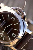
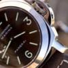
Met up with a friend for lunch this afternoon and he brought along his 360. The watch is like a chameleon... depending where I stood, the coating could look like a blueish gray pencil lead PVD or a darker, DLC coating. The lume was the same way. If a bit of sun hit it, it would take on a pale yellow tint and back in the shade, more of a typical T-dial patina. The lume wasn't applied like the current sausage dial lume. This was a little flatter and slightly feathered at the edges per early-series PAMs (see the edge of the 9 in the first pic). Huge thumbs up for OP capturing the historic look so well with this watch.
-
The 360's DLC coating is nearly identical to the pencil-lead PVD finish we all love so much. 360/DLC on the left... gen PreV/PVD on the right...
-
This one for today's SoCal gtg...
-
New pic... I wanted to show some respect for FGD's dial...
-
Great pics! An excellent mini-collection. Well done!
-
The Closest Pam 249 dial See page 10 for the Final Piece
projectologist replied to Rolexfinder's topic in The Panerai Area
I didn't make that one... someone else did over 60 years ago -
Zigmeister nailed it! Perfect NM combo... nice watch too
-
Thanks! The strap with the sewn-in buckle is a NOS Kodiak Dirk. Do a search for a "2nd generation Dirk" FS... they turn up fairly often , especially in Europe. All too true... the 1680 Single Red just came back a second time, went out again... so in 2 or 3 months I may go for my first 3-timer