When you buy through links on our site, we may earn an affiliate commission.
Leaderboard


Popular Content
Showing content with the highest reputation on 08/11/2013 in all areas
-
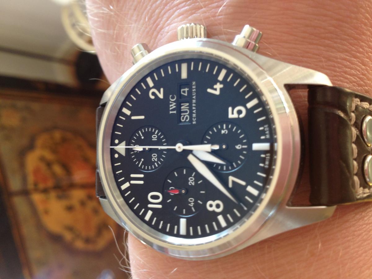
V2: best inner bezel of all, wrong font on the dial, need relume on the inner bezel V3: best case, best caseback, correct cyclop shape with blue AR, correct font on the dial, lumed inner bezel but thin font V3.5: same as before more colorless AR V4/4.1: fatter bezel font1 point
-
1 point
-
1 point
-
Hi all, I started this tread a while ago because I wanted to find out which is the best or ultimate out of the box Rolex sport model Noob factory or BP Factory. I read almost all the post which followed on my question and I also asked some of the RWG TD's about their opinion. I found out that there is only a difference between the Noob and BP version Submariner No Date when you look at the case and dial. There is no difference in the lume; although some of the TD's told me that only the BP would have SuperLumed dial. When you see this model either on the website of Puretime, Trusty Time, Precious Time or Toto's you will see the pictures with a SuperLumed dial. I will show you that there is no difference at all. First I will post the Submariner No Date Noob and second the Submariner No date BP. Both watches have the A2836-2 movement. Submariner No Date Noob http://www.fotos-hochladen.net]1 point
-
"How good are the general after market bracelets that are offered for example from S-T supply and others?" S-T bracelets may have solid middle links, I do not know for sure. They always had solid mid links in the spare links they sold one at a time up until about a year ago and they started offering hollow mid link replacement links. I bought a few and they looked very good but the last few I ordered for 20mm DJ oyster came with solid mid links again like they used to sell. Bummer. Their catalog pictures of individual links for sale showed solid mid links for years then they started showing hollow mid links and supplied hollow mid links when ordered. Now they are showing solid mid links again on 20mm DJ/sub links and hollow links for 19mm oysters like on OPD. Don't know what you might get when ordering one. The solid link bracelets were high quality and very well made. I still have a couple solid mid link submariner type bracelets from 10 or 12 years ago and never used them because of the solid mid links.1 point
-
Sundays choice timing the roast dinner. 5 minutes to go and the cat knows it! Sent from my iPad using Tapatalk 21 point
-
Hi Everyone, I just couldn't wait any longer, I put together all the spare parts I had lying around and had to put this thing together. Unfortunately I did not have all the parts to match the case so you will notice the dial is a little large for the case and I had to trim down the hands so they wouldn't hit the bezel. However I just needed to see how this thing was going to look assembled. The movement bridge is one of my test bridges so it too is not perfect, but since I got bit by the vintage bug I have loved the look of the 3646 Brevettato, so I just could no longer contain myself. Here are all the pictures, though not perfect it looks great. This watch was my inspiration..... It's a modem burner, so here we go..... Made my own front and back crystals from some of the old Molly pocket watches I had. They were so old and weathered I couldn't pass them up. I trimmed them down and vuala, nothing more vintage than vintage.. Here are some close ups of the dial I made with rodium burns at 3:41 to simulate where the hands were sitting for a very long time while the watch sat undiscovered for years. You'll notice the hour hand left a stronger imprint because it sits closer to the dial. Too bad the "ROLEX" engraving came out so bad, the rest of the engravings were pretty good.. Finally, the vintage lume seen thru the cracked indices [ Thanks for looking.......1 point
-
1 point
-
Just a quick update: I used a hair dryer as suggested by bamcky2k to heat up the glue, and gently pushed the pearl in until a decent position. This worked perfectly, and the watch was not damaged during the process. Also glad I didn't have to take of the bezel. Easy mod suggestion for everyone who gets the SMP-c and doesn't want their pearl sticking out like mount everest.1 point
-
Similar to denimhead but in white!1 point
-
Off to Swim with the fishes in Southern Spain tomorrow!

 1 point
 -
Here's the shot I was looking for earlier:1 point
-
I disagree, respectfully sunny, we are all aware of the reality of reps in comparison to gen. In this instance we have a truly outstanding rep, and the release is completely marred by the simplest of issues, drilled dial holes ffs. I do agree with you that the basic rep level of the PO has come on leaps and bounds since the last v5/UPO 3 years ago, but that is why the dial issue is such a disappointment, improve everything..... everything...AR/endlinks/clasp/lume/bezel/pearl/case/He/crown/logos etc and then fall short on the most basic finishing touch, crooked markers. As said on another thread, this is a very very simple issue to correct, and it is now affecting sales and pissing people off who are involved in 5 or 6 qc rejects over the past month, ....noobs loss I guess, do they care, probably not. It's like this, complain and we might get it corrected sooner rather than later, don't complain and say 'ah its a rep' and they will happily use the same dial drillers for the next 6 months-year+ etc. Some are not so bad in batch 2, much better than the first batch which were awful, but they still need work, and its not just the 1 and 2, its lucky if just that, it is more often 1 and 2 and the 9 marker 12 marker and the logo etc.....this could be a superrep, but most people are holding off, and for good reason. Look at the BP 45mm ti and ss, do you see many dial rejects due to crooked markers on those? No, because they used a sub contractor who could drill the dial holes straight. As mentioned on another thread, this is not a rep QC vs gen QC issue, straight markers are not beyond the ability of the rep factories. To be honest I'm surprised at some of the comments over on the thread on RWI, it seems we must not complain about a $400 rep with basic fixable flaw! There is no incentive for the factories to fix it if we don't! Also most people don't seem to be aware of how awkward it is to home fix polished markers/numerals/logos on a polished dial, so they need to be good out of the factory.1 point
-
Hi guys It's been a long time. How are things going? Stock pic of what I'm wearing today: Have a great weekend, all. Val.1 point
-
Arrived yesterday so just had to be worn!
 1 point
 -
Squale have a long professional diving heritage that goes back to the early 60's. Some models ran neck to neck with Rolex divers back then.1 point
-
JLC NSD today:
 1 point
 -
I have a couple of favourites, my Sea Dwellers are great, but the ultimate piece is my almost gen IWC 3717. The color of the dial, and the crystal still amazes me.
 1 point
 -
In the end, your character/reputation is your most precious possession and nobody can take it from you. To lose it, you have to throw it away.1 point
-
Chaps - I've attempted a mini review on this focussing on the colour issue. I could be way off the mark, or colour blind, and I welcome criticism - but this is an interesting issue or rumour that seems to of destroyed the reputation of this rep, which I feel a shame, as in person its a real beauty, military and modern paying homage to the vintage, with great wrist presence. I have the V.1.1 rep, and overall, in most lighting conditions the colour and mix is brown (Brown being a colour produced by mixing red, yellow, and black) The gen must have a similar mix in order to achieve the as advertised 'brown' composite finish. The rep has a beautiful finish in reality, in some ways like a two tone paint job. I've caught glimpses of it looking grey, charcoal, brownish, reddish or purplish. Quite often you can see several of these mixing hues at once. Thats the nature of this finish and I can understand that is not for everyone. As a side note, the model seems to be removed from Panerai's main web site - composite case cracking issues? - I may not of been looking in the right place, but I had a good dig. As a community we are used to pencil grey, charcoal or black PVD/DLC - This brown finish and colour mix is a little different from those. Ok - so potentially the rep has more red in the colour mix than genuine, but I personally think they have done a reasonable job. There seem to be few gen photographs on the web, and the gen stock photos don't tell the truth IMO - This type of product photography is always heavily photoshopped, and more obviously photographs are one lighting condition specific / static, whereas the eyes ability to pick up light is dynamic. To move this on, see photo below of a gen Clearly the lighting in the image above is picking out the red / purple hues in the colour mix. Now check the image below of gen stock (Notice the rear case edge has a red hue) but agreed the overall look is a lot more grey/brown. Also I found a you tube video from SIHH 2011 - This is not the best quality and is not conclusive, but you can see some evidence of this 'two tone' effect: The V1.1 addresses the major construction issues of the V1 (Purple crown, bezel thickness, roller ball, date font, central rotor screw etc) - all in all the V1.1 stacks up as a decent rep, even though the movement engraving (or lack thereof) is way off the mark and arguably the dial tone isn't perfect. I've noticed that Kuvarsit are offering a V2 - The jury is still out on whether this a different model to Puretimes V1.1. Judging by the other upgrades listed with their V2, I would say its the same watch. They've photographed it in detail, worth a look. http://www.kuvarsitw...roduct_id=31823 I've also been snapping some Iphone photos in different lighting conditions to try and capture some of the different hues, to help people feel closer to living with this rather uniquely finished piece. Theres a saying in the UK about a popular vegetable spread that springs to mind - This finish is like marmite! You either love it or you hate it. You decide. The Purple Comparison.


 1 point
 -
J... the green is in the AR.. as at different angles it morphs to a clear crystal.. instead of a blue or plum hue it has a very strong green.. AC Lani1 point